Charts - Basic Usage
Step 1: Datasource & Type
Once the data is imported and is ready to use follow these steps for chart creation.
- Go to the page layout of your application and drag-and-drop the required chart widget. Here, we are creating a column chart.
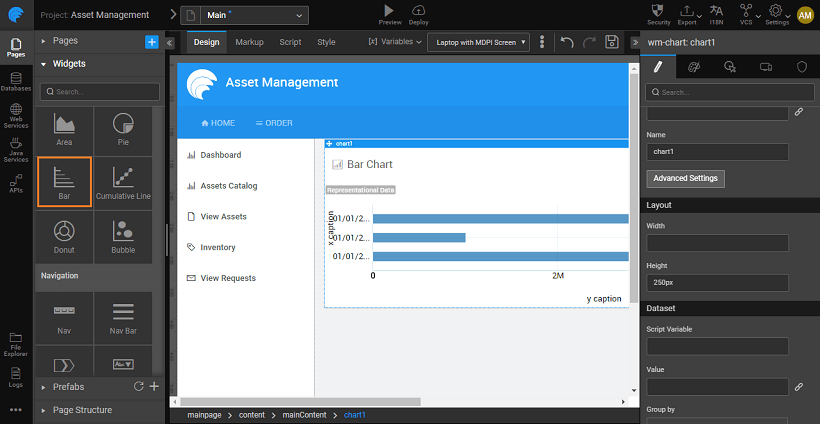
- Bind the chart to the appropriate data source.
- Click on the link _icon next to the _Value Property and choose the appropriate variable for data binding. In this example, we are using the transformed data from a web service, Quandl imported earlier.
Step 2: Properties
- Select the values to be depicted on the x-axis and the y-axis. You can select multiple columns for the y-axis. You can add a caption for the axis, else by default the column names from the database table is taken as the caption.
note
You can not use string data for plotting on the y-axis.
note
For Donut and Pie Charts, you can specify the Label and Value Data fields for representation instead of x- and y-axis.
 2. Run your application to see the data represented in the chart format.
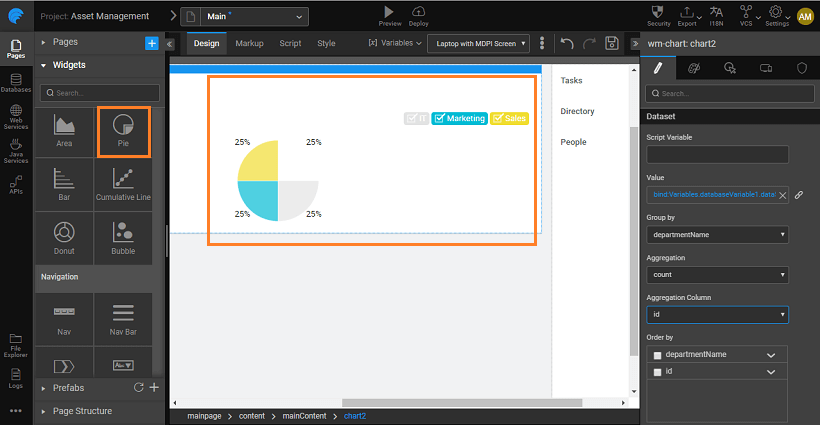
Step 3: Aggregation & Group by
We will see how to use this functionality using the in-built HSQL Database which ships with WaveMaker Studio. Let us plot the number employees working in each city from the database.
- In the Aggregation property select count and select eid as the Aggregation column and state for Group by. You can also use the Order By property to set the column by which the data needs to be sorted. By default, it will be set to the Group by column selected.
- The values to be depicted on x- and y-axis are set to state and eid columns respectively. These are the group by and aggregation columns respectively.
- Run the application to see the chart.