WaveMaker Docs

WaveMaker Docs

  • Get started
  • Widgets
  • Mobile
  • How-to
  • Enterprise
  • Releases
  • Blog
  • Sign-in

›Nav

Widgets & Prefabs Library

  • Widgets Library
  • Widgets Composition

Cards

  • Overview
  • Creating a Card
  • Data Source
  • Templates
  • Configuration
  • Behavior Settings
  • Properties, Events & Methods
  • Use Cases

Data Table

  • Overview
  • Creating a Data Table
  • Data Source
  • Layouts
  • Styles
  • Configuration
  • Field Configuration
  • Summary Row
  • Row Expansion
  • Actions
  • Events & Methods
  • Use Cases

List

  • Overview
  • Creating a List
  • Data Source
  • Templates
  • Configuration
  • Behavior Settings
  • Properties, Events & Methods
  • Use Cases

Form

  • Forms Overview
  • Creating a Form
  • Data Source
  • Layouts
  • Configuration
  • Fields Configuration
  • Field Validations
  • Events & Methods

Live Form

  • Overview
  • Creating a Live Form
  • Data Source
  • Layouts
  • Configuration
  • Fields Configuration
  • Actions
  • Events & Methods
  • Use Cases

Form Widgets

  • Button
  • Button Group
  • Text
  • Number
  • Textarea
  • Select
  • Chips
  • Currency
  • Radioset
  • Checkbox
  • CheckboxSet
  • Toggle
  • Switch
  • Date,  Time and  Datetime
  • Calendar
  • FileUpload
  • Color Picker
  • Slider
  • Rating Widget
  • Select Locale

Live Filter

  • Overview
  • Creating a Live Filter
  • Data Source
  • Layouts
  • Configuration
  • Field Configuration
  • Actions
  • Events & Methods
  • Use Cases

Container

  • Layout
  • Flex Layout
  • Grid Layout
  • Accordion
  • Container
  • Panel
  • Tabs
  • Tile
  • Wizard

Basic Widgets

  • Label
  • Anchor
  • Icon
  • Picture
  • Tree
  • Video
  • Audio
  • HTML
  • Iframe
  • Message
  • Spinner
  • Search
  • Search - Basic Usage
  • Richtext Editor
  • Progress Bar
  • Progress Circle

Charts

  • Chart Widgets
  • Callback Event

Navigation

    Nav

    • Nav Overview
    • Creating navigation

    Nav Bar

    • Nav Bar Overview

    Breadcrumb

    • Breadcrumb Overview
    • Creating a Breadcrumb

    Dropdown Menu

    • Dropdown Menu
    • Creating a Dropdown Menu

    Popover

    • Popover Overview
    • Creating a Popover

Advanced Widgets

  • Login
  • Marquee
  • Carousel

Dialog Widgets

  • Modal Windows/ Dialogs
  • Design Dialog
  • Alert Dialog
  • Confirm Dialog
  • IFrame Dialog
  • Page Dialog
  • Login Dialog

Mobile & Device Widgets

  • Camera
  • Media List
  • Segmented Control
  • Barcode Scanner

Prefabs

  • Prefabs Overview
  • Create Prefab
  • Prefab with Partials
  • Use Cases - Prefabs
  • Prefabs Directory

    • Youtube
    • Googlemaps
    • QRCode
    • Barcode Scanner Prefab
    • Box Viewer Prefab
    • Entity Extraction Prefab
    • Docusign Prefab

    OAuth

    • OAuth Prefabs
    • Box
    • Facebook
    • Google
    • Instagram
    • LinkedIn
Edit

Navigation - Basic Usage


Steps to Create Navigation

In this post, we will walk through the steps to create a simple navigation, with icons and links to pages.

We will be using a Model Variable for the purpose of this example:

  1. Create or Open page where you want to use the Nav Widget.
  2. Open the Variables dialog from the Variables menu and using New Variable create a Model variable (Know more about variables).

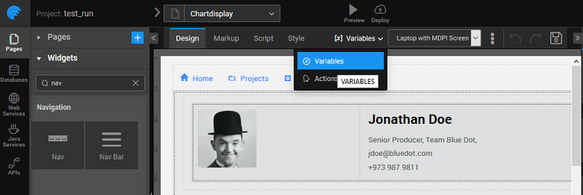
  1. Create a new Model Variable called as navvar and select isList.

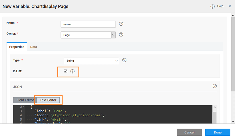
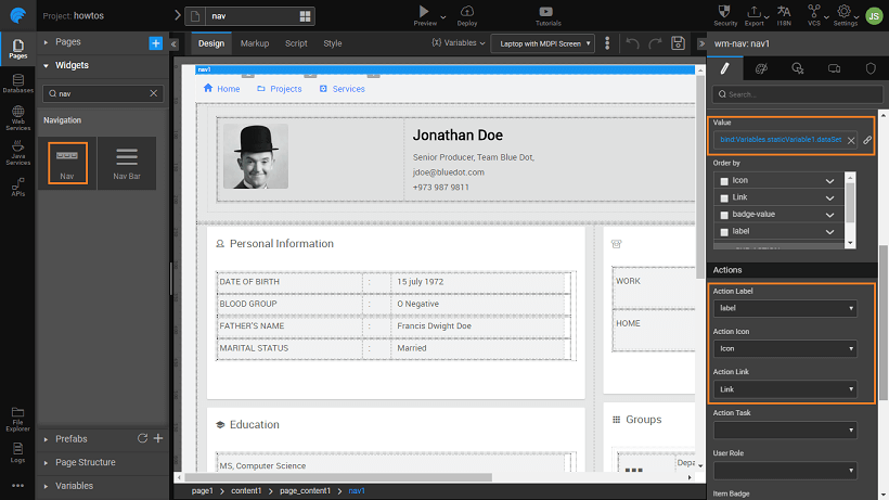
  1. Add the following in the Text Editor, this defines the structure for Menu identifying Label, Icon, Link, Badge Value and sub-action. Icons can be halflings from glyphicons or font awesome icons.
[
  {
    "label": "Home",
    "Icon": "glyphicon glyphicon-home",
    "Link": "#Main",
    "badge-value": "2",
    "sub-action": {
      "label": "Sub-action"
    }
  },
  {
    "label": "Projects",
    "Icon": "wi wi-folder-open",
    "Link": "#projects",
    "badge-value": "3"
  },
  {
    "label": "Services",
    "Icon": "wi wi-settings-applications",
    "Link": "#services",
    "badge-value": "1"
  }
]
  1. Bind the Value property of the Menu widget to the variable created in the previous step.
  2. Set the
  • Action Label to label,
  • Action Icon to Icon,
  • Action Link to Link,
  • Item Badge to badge-value,
  • Sub Actions to sub-action.

If you need you can modify the JSON structure given for the Model Variable and do the appropriate settings.

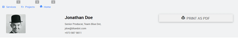
  1. Run the application and see the menu in action.
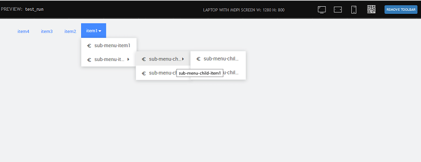
Multilevel Nav

You can have multiple levels of nav-items. Follow the steps from the above example, replace the Variable JSON with the below code:

[
    {
    "label": "item1",
    "icon": "wi wi-euro-symbol",
    "children": [
    {
    "label": "sub-menu-item1",
    "icon": "wi wi-euro-symbol"
    },
    {
    "label": "sub-menu-item2",
    "icon": "wi wi-euro-symbol",
    "children": [
    {
    "label": "sub-menu-child-item1",
    "icon": "wi wi-euro-symbol",
    "children": [
    {
    "label": "sub-menu-child-item1-item1",
    "icon": "wi wi-euro-symbol",
    "path": "/item1/item2/item1/item1"
    },
    {
    "label": "sub-menu-child-item1-item2",
    "icon": "wi wi-euro-symbol",
    "path": "/item1/item2/item1/item2"
    }
    ]
    },
    {
    "label": "sub-menu-child-item2",
    "icon": "wi wi-euro-symbol"
    }
    ]
    }
    ]
    },
    {
    "label": "item2",
    "icon": "wi wi-euro-symbol"
    },
    {
    "label": "item3",
    "icon": "wi wi-euro-symbol"
    },
    {
    "label": "item4",
    "icon": "wi wi-euro-symbol"
    }
]

You will get the following nav.

Last updated on 2/17/2020 by Swetha Kundaram
← Nav OverviewNav Bar Overview →
  • Steps to Create Navigation
  • Multilevel Nav
WaveMaker
  • PRICING
  • PARTNERS
  • CUSTOMERS
  • ABOUT US
  • CONTACT US
Terms of Use | Copyright © 2013-2023 WaveMaker, Inc. All rights reserved.