Notification Action
Notification Action is an action to show UI notifications in the app in the form of a toaster, alert or a confirmation box. It provides message capabilities, a way for the app to notify the end users. Based on the operation selected app can notify the user through an Alert/Confirm dialog or a simple toaster message. This action can be useful in cases like error handling, confirm user action, etc.
Action Creation
There are two ways of creating a Notification Action:
- Select the Action option from Variables on the Workspace Toolbar
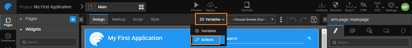
- and click New Action from the Actions dialog.

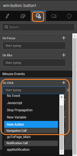
- or, as a New Action event on any widget

In both the cases, a New Action wizard will open.

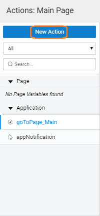
Steps in Action Window
Choose Notification Type. It can be from the following.
Alert
For alert, you can further specify:
- Text: Message to be displayed
- Title: for the alert pop-up
- OK button text: message on the button to dismiss the alert pop-up
- Alert Type: to be set to error, information, success or warning.
Confirm
For confirm, you can further specify:
- Text: Message to be displayed
- Title: for the alert pop-up
- OK button text: message on the button to dismiss the alert pop-up
- Cancel button text: message on the button to dismiss the alert pop-up.
Toast
For toast, you can further specify:
- Content: Message to be displayed can be inline or from a partial page
- Text/Page: Message to be displayed/Partial page containing the message to be displayed
- Duration: number of milliseconds for which the toaster should be displayed
- Class: type of toast message in case of inline content, can be success, error, warning or info
- Toaster position: where the message should be displayed – a combination of top, center, bottom, left, right.
Name
Set by default which can be modified.
Owner
The scope of the Action being created. By default it is set to Page, you can change it to Application if you want this action to be available across the app.
Click Done to complete the action creation process
- You will be directed to the Actions dialog, with the new action listed. As you can see:
- a Notification Action is created,
- With the selected target,
- The properties tab with action properties
- The events tab containing the events that can be customised (know more)
Properties
| Property | Description |
|---|---|
| Operation | The type of notification to be performed through the Action. Options are: - alert - a dialog with a message and button; - confirm - a dialog with a message and two buttons (for positive and negative confirmations); - toast - a toaster box with a message Based upon the operation selected following properties are available: |
| Alert operation | |
| Text | The text message to be shown in the dialog. It can be a static text or can be bound to a component for dynamic behavior. |
| Title | Dialog’s header title |
| Ok button text | Text to be displayed on the OK button of the dialog |
| Alert type | Display type of the dialog. Available options are information, success, error and warning |
| Confirm operation | |
| Text | The text message to be shown in the dialog. It can be a static text or can be bound to a component for dynamic behavior. |
| Title | Dialog’s header title |
| Ok button text | Text to be displayed on the OK button of the dialog. This button is to receive the positive response from the end user. E.g. “YES”, “YES, I AGREE”, “CONTINUE”, etc. |
| Cancel button text | Text to be displayed on the CANCEL button of the dialog. This button is to receive the negative response from the end user. E.g. “NO”, “NO, I DON’T AGREE”, “GO BACK”, etc. |
| Toast operation | |
| Content | Type of content to be displayed in the toaster. It can be: - inline – plain text can be provided or bound for dynamic text; - page – a partial page can be loaded into the toaster area. This is for more customized display. |
| Text | Available if “Content” property is selected as inline. Text to be displayed in the toaster |
| Page | Available if “Content” property is selected as the page. Partial page to be loaded into the toaster area. |
| Duration | The time period (in milliseconds) after which the toaster should fade away once it is shown. Select 0 if the toaster should stay. |
| Class | Determines the display type of toaster. Available options are success, error, warning, info. |
| Toaster Position | Determines where to display the toaster in the app. Available options are a combination of top, center, bottom, left, center, right. |
Events
Notification Action Events
Based on the operation different events are available for a Notification Action.
Alert
- OnOk: The event is fired on click of the OK button of the alert dialog. The event receives action and data as params. This data can be useful in some validation where the dialog is opened from various places. Click here for an example of passing data through invoke method and receiving it in the onOk event of the action.
Confirm
- OnOk: The event is fired on click of the OK button of the confirm dialog. Please note, this event takes the positive response from the user.
- OnCancel: The event is fired on click of the CANCEL button of the confirm dialog. Please note, this event takes the negative response from the user.
- OnClose: The event is fired on the close of the confirm dialog.
Toaster
- OnClick: The event is fired on click of the toaster box.
- OnHide: The event is fired on the hide of the toaster box.
Methods
| invoke |
invoke(options)
This method invokes the notification action
Parameters:
- options(object): This object can have optional fields like:
- data: some data can be passed from here, which will be received in events like onOk, onCancel, onClose, onHide
Options specific toaster type action include
- message - text to be displayed in the toaster.
- position - where to display the toaster. Possible values:
- "top left"
- "top center"
- "top right"
- "center left"
- "center center"
- "center right"
- "bottom left"
- "bottom center"
- "bottom right"
- class - type of toaster. Possible values:
- ‘success’
- ‘error’
- ‘Info’
- ‘warning’
Return Value: None
Example: