List - Configuration
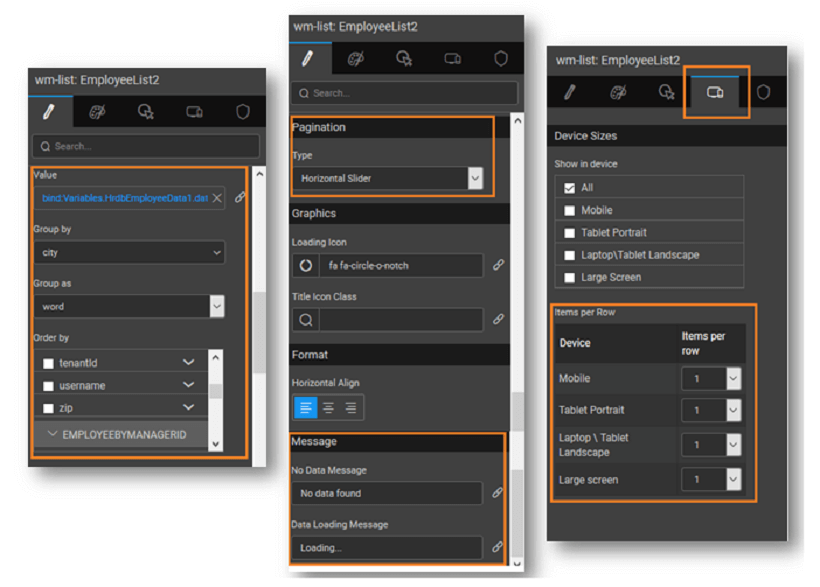
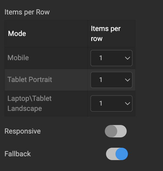
Items per Row
Items per row determines the number of items that can be shown in each row. This can be specified independently for different target devices from the Device tab of the Properties panel.
Responsive (React Native Only): The Items per row property is only applied if the Responsive property is enabled. By default, it is disabled.
Fallback (React Native Only): Enable this property to automatically use the Items per row value from the next closest smaller screen size when one is not specified for the current screen size.
Grouping & Ordering
These include:
Group by
Choosing a field from the data source as Group By field, will display collectively the list items which have the same value for that field.
- Each List Group can be collapsed by setting the Collapsible property. Thus if you are displaying a list of employees grouped by Department, then a group header will be displayed for each Department. This header when clicked will display the employee list for that Department. By default, each group is expanded.
- Count of list items within the group can be displayed on the group header by setting the Show count property. This displays the item count for each group in the header, without the need for writing additional code or query.
Group as
This property defines the group-by behavior. The following options are available:
- alphabet – grouped based on the first alphabet of the field
- word – grouped based on the first word of the field
- TIME – grouped based on TIME: hour, day, week, month, year
Order by
This property will help to order the list items based upon a field from the data source. You can also set the order as ascending or descending – by clicking on the arrows provided on the side of the field name.
Pagination
Pagination is dividing the set of data rows into discrete pages that will allow users to view data in the form of rows across pages. This should allow for easy navigation across pages for viewing and editing of data.
Pagination Type: To make complete use of pagination, the List provides five unique types of pagination.
- Basic – This option gives a next and previous arrow along with the page numbers at the right bottom of the page.
- Classic - A bar with the total number of pages and number of items in the current page will be displayed along with arrows for pagination.
- Horizontal Slider – This option gives next and previous arrows on both the sides of the page for pagination, carousel style.
- Pager – This option gives the next and previous buttons at the bottom of the page which when clicked goes forward or backward one row.
- Infinite Scroll – In this option on the scroll over the list will cause the next page to load and display.
- None - No pagination option will be given, use this when you want to display single-page records.
- On Demand - allows users to load list items when needed. A 'Load More' button is displayed at run-time, which on click will load next page records. The label 'Load More' can be configured using 'On Demand Message' property.
Message
Messages to be displayed at the time of data loading and in case no data is found can be configured.