Live Form - Fields Configuration
Configure form fields display options
You can set the following properties of the elements of the Live Form from the Advanced Settings properties:
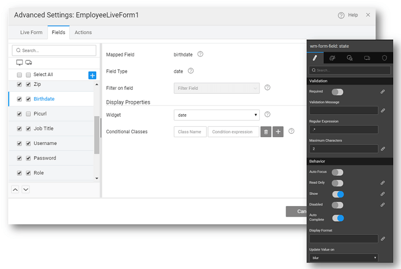
- set cascading data, i.e., restrict the display values for the current field based on the value of the field set against Filter on Field property. For example, the values displayed in the city field should depend upon the value selected for state field; then correspondingly for city field, filter on field property should be set to state.
- specify the widget to be used to represent each data field. Based on the data type of the field, the available widget options would vary.
- create custom columns by clicking on the '+' icon. Note: If a custom column is not selected for display, it will be deleted when the Form Designer is saved.
- modify the behavior of individual fields, from the canvas, by selecting any field on the form and setting the properties:
- The display Title for the field - can be bound to another variable,
- Input Type to perform on screen validation of the user input, for example, setting the Input Text to email will ensure that the user enters the text in an email id format,
- set the Default Value or bind it to a variable
- choose when to Update the data value - on blur or on keypress
- set the Update data value delay in milliseconds
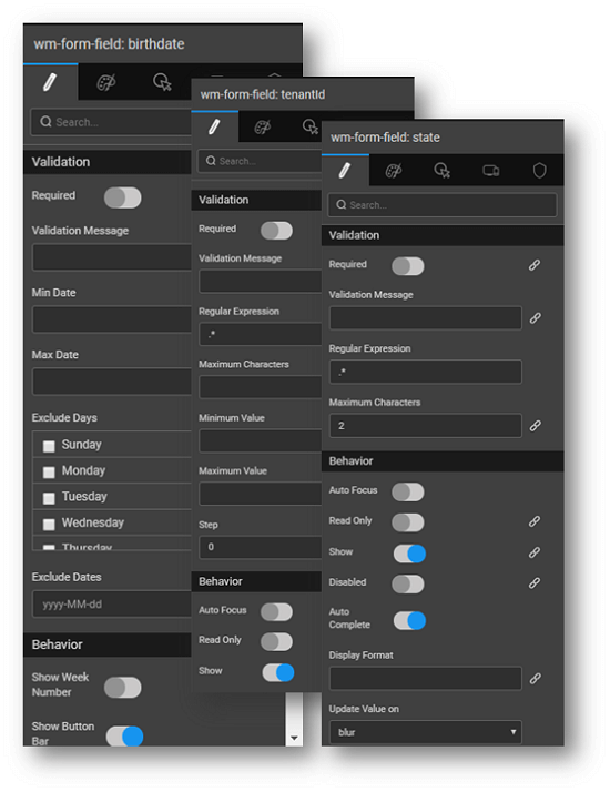
- additional Validations like Required, pattern matching in the form of Regular Expression and Maximum Characters allowed
- behavior like Auto Focus, Read Only, Show etc can be set;
- filter criteria can be applied to referenced entities (see here for usage).
Live Form Validations
There are various ways in which Form fields can be validated depending upon the underlying data type. You can see these options in the properties panel for the selected field on the canvas.
- For each field, check Required check box to make it as mandatory field while submitting the form, this will issue an error in case the user hits save without making an entry
- For Text Type fields, Regular expression field can be used to provide valid and desired formats.
- For Text Type fields, you can restrict the Maximum characters to be entered
- For Number Type fields, Minimum and Maximum Values permissible can be set
- For Date Type fields, Min Date, Max Date, Exclude Days and Dates can be set. In this case, the date picker will not have the invalid dates available for selection.
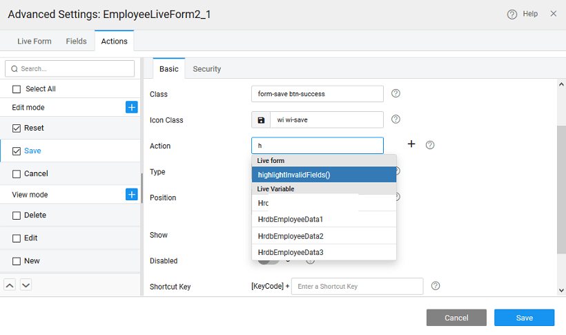
- You can invoke the hightlightInvalidFields method on Save action from the Advanced Settings, to highlight all invalid fields in red and display appropriate error messages.

- For additional checks, you can use the Before Service Call event to perform any validation checks. For example, we want to make sure that the password entry is at least six characters in length. Select the Events panel and select Javascript for Before Service Call and enter the following code. This will ensure that before updating the data source, the JavaScript is executed.

Using Widgets for Live Form Fields
Widgets like select, autocomplete, radioset, checkboxset and switch can be used for various fields within Live Form. These widgets can be used to show the predefined options to the user.
- When they are limited number of options: Select, Radioset and Switch widgets can be used,
- When number of options are more - autocomplete widget can be used, as user can search from list of available options,
- When multiple options are to be selected - Checkboxset and Select (with multiple options) widgets are recommended.
- Drag and drop a Live Form and bind it to a Database CRUD Variable.
- Configure layout options, as per your needs.
- In fields configuration step, change the required field widget type to Select.
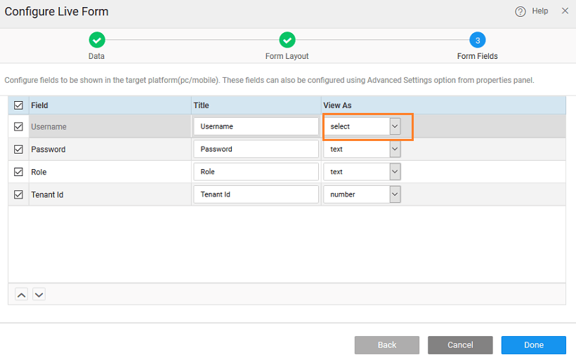
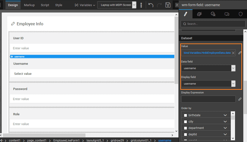
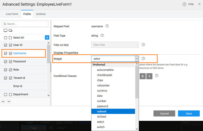
- Select the field from the canvas.
- The dataset for the form field widget is auto populated with the Variable Dataset field. Data field and display field is set to field’s key. Here, the dataset value can be bound to any other variable or widget.

- The widget can be changed from Live Form Advanced Settings also.
- Now, at runtime, the user can use this widget to select a value from predefined options.