Design Dialog
Overview
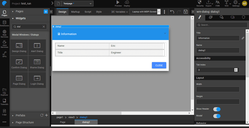
Dragging and dropping a dialog creates a view containing the dialog. The view can be selected from the Page Structure or from the tabs given at the bottom. The display of the dialog box at runtime is usually associated with the onClick event of a Button widget. You can also trigger the dialog by calling methods from JavaScript.
Design Dialog
Design Dialog gives a Form for obtaining additional information from the user, like the name. It is a composite widget with Labels and Text widgets. It comes with two buttons Cancel and Save.
Script Access
Dialog widget in your project can be accessed by associating the open and close properties of the dialog with an event of any other widget. The dialog can be accessed through scripting by adding DialogService to the page controller and adding the code for open and close as shown below, here we are displaying an alert dialog on click of a button: Click event of the button should trigger the following JavaScript code:
For hiding dialog:
Properties & Events
Design Dialog Properties
| Property | Description |
|---|---|
| Title | Set the title of the design dialog. |
| Name | The name is a unique identifier for design dialog. |
| Accessibility | |
| Tab index | The tab index attribute specifies the tab order of an element. You can use this property to change the default tabbing order for widget access using the tab key. The value can range from 0 to 32767. The default is 0 and -1 makes the element non-focusable. NOTE: In Safari browsers, by default, Tab highlights only text fields. To enable Tab functionality, in Safari Browser from Preferences -> Advanced -> Accessibility set the option "Press Tab to highlight each item on a webpage". |
| Layout | |
| Width | The width of your widget can be specified in px or % (i.e 50px, 75%). |
| Height | The height of your widget can be specified in px or % (i.e 50px, 75%). |
| Show Header | Show/hide header of the design dialog. |
| Modal | This property, if set true, adds a backdrop for the dialog restricting the closure of the dialog when the user clicks outside of the dialog. The default value is false, which allows close of dialog on click outside. |
| Behavior | |
| Enable Default Close Action | This property allows the user to access close action from header through an "x" icon; and also enables close through ESC key. |
| Animation | This property controls the animation of an element. The animation is based on the CSS classes and works only in the run mode. |
| Graphics | |
| Icon Class | This property defines the class of the icon that is applied to the button. |
| Icon Width | Optional property; but you will need this if you are using the button's iconUrl. Please enter the width of your icon. WARNING: It's best to specify size in pixels, not percent. |
| Icon Height | Optional property; but you will need this if you are using the button's iconUrl. Please enter the height of your icon. WARNING: It's best to specify size in pixels, not percent. |
| Icon Margin | Optional property; only has meaning if you specify the button's iconUrl. Values should all have "px" next to them. Use this to adjust the space between the icon and the button text. |
Design Dialog Events
| Event | Description |
|---|---|
| Callback Events | |
| On close | This event handler is called whenever a close event is triggered. |
| On open | This widget gives a pop-up window. It can be used to give a warning message to the user. For example, you are about to leave this page. |
