Camera
The camera is abutton based widget that opens device camera for taking photos or videos. The path of the photo or video captured is exposed as outbound property ‘localFilePath’.
Features
The camera can be used for taking a picture or video. To specify the mode of the camera, set the Capture Type property to Image or Video.
Following Image Properties can be further configured:
- Target Width - A picture is scaled to this property’s value while maintaining the image’s aspect ratio.
- Target Height _-_A picture is scaled to this property’s value while maintaining the image’s aspect ratio. If both target width and target height are specified, then the image will be scaled to the minimum of them.
- Encoding Type - the format in which the image has to be saved. Supported formats are JPEG and PNG.
- Image Quality - This is JPEG compression level in percentage. So, this value is used only when JPEG is selected as encoding type. If the value is 100, then no compression is applied to the image.
- Save To Gallery - If turned on, then photos taken using this widget will be saved to the device gallery.
- Edit - If this property is checked, then the user can edit or crop the picture taken.
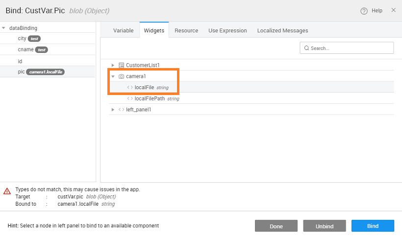
You can use the localFilePath and localFile to further enhance the app functionality. These properties are passed as parameters for Camera Success Event. See Use Case for more details.
Properties
| Property | Description |
|---|---|
| Name | The name is a unique identifier for the Camera. Special characters and spaces are not allowed in widget name. |
| Accessibility | |
| Hint | Any text or HTML you enter for this property will be shown as a tooltip if the mouse hovers over this widget for 1.5 seconds. |
| Default Value | |
| Value | This is the default value to display value for an editor widget. Note that the display value is just what the user sees initially, and is not always the dataValue returned by the widget. |
| Behavior | |
| Show | Showing determines whether or not a component is visible. It is a bindable property. |
| Load on Demand (visible only when show property is bound to a variable) | When this property is set and show property is bound, the initialization of the widget will be deferred till the widget becomes visible. This behavior improves the load time. Use this feature with caution, as it has a downside (as we will not be able to interact with the widget through script until the widget is initialized). When show property is not bound the widget will be initialized immediately. |
| Capture Type | This specifies whether the image or video that is to be captured. |
| Graphics | |
| Icon Class | This bindable property defines the class of the icon that is applied to the button. |
| Icon Size | This property defines the size of the icon. Value has to be specified along with the units (em or px). |
| Format | |
| Horizontal Align | This property specifies how the elements should be aligned horizontally - left, center or right. |
| Image Properties | |
| Target Width | This property specifies the width in px to resize the image. |
| Target Height | This property specifies the height in px to resize the image. |
| Image Quality | Quality of the saved image expressed as a range of 0-100, where 100 is typically full resolution with no loss of file compression |
| Encoding Type | Choose the returned image file's encoding. The default is JPEG. |
| Save to Gallery | Save the image to the photo album on the device after capture |
| Edit | Allow simple editing of the image before selection. |
Events
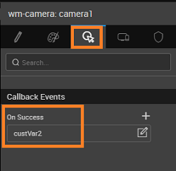
- On Success - The event listener to call when a photo or video is successfully captured. This can be bound to a Database CRUD Variable of Insert operation, to save the picture into a database
Usage
Capture an image using camera and store in the database using CRUD variable (we are using a Customer Database with pic as the blob type field):
- Bind the Input Fields from the Data tab for the CRUD Variable to the Camera -> localFile field
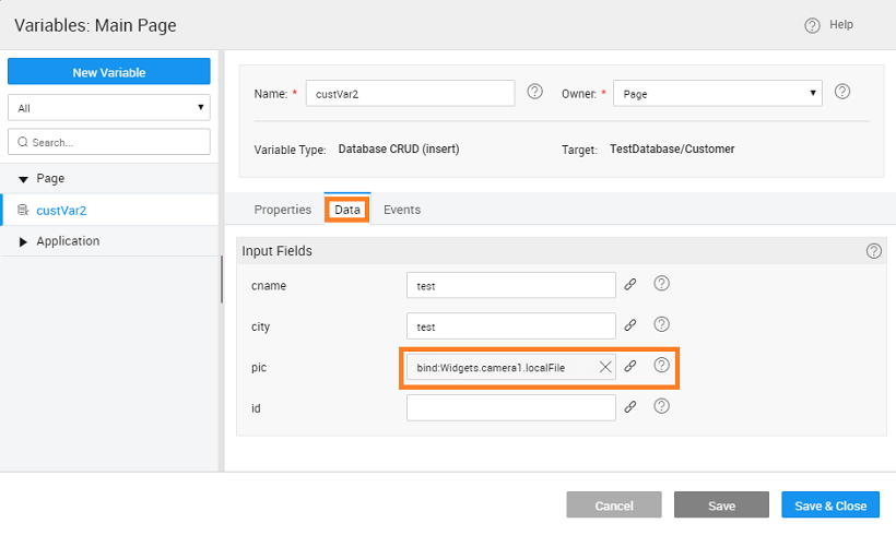
- On Sucess event of Camera widget needs to invoke the above Insert Variable


Use Cases
Overview
Camera Widget can be used to capture images and videos from a Mobile App In this post, we will create a mobile app to capture and display a photo. 
Step 1: Building Page
- Create or Open a Hybrid Mobile App.
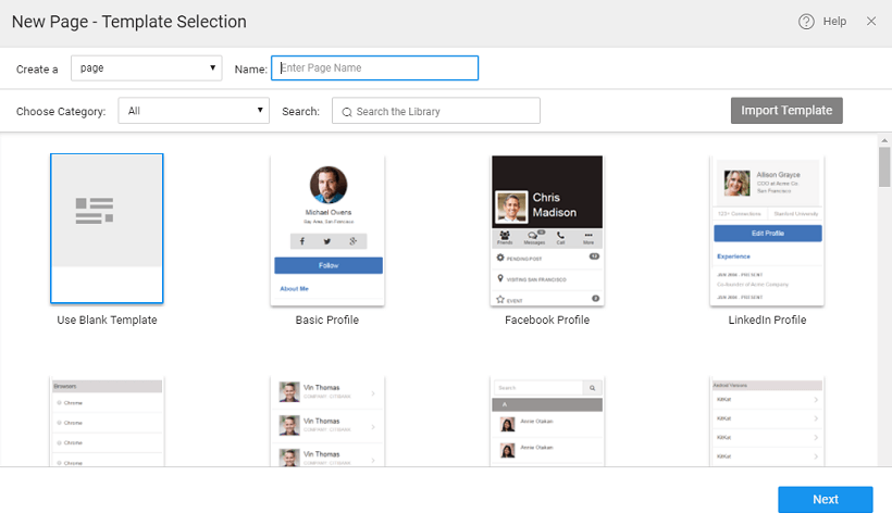
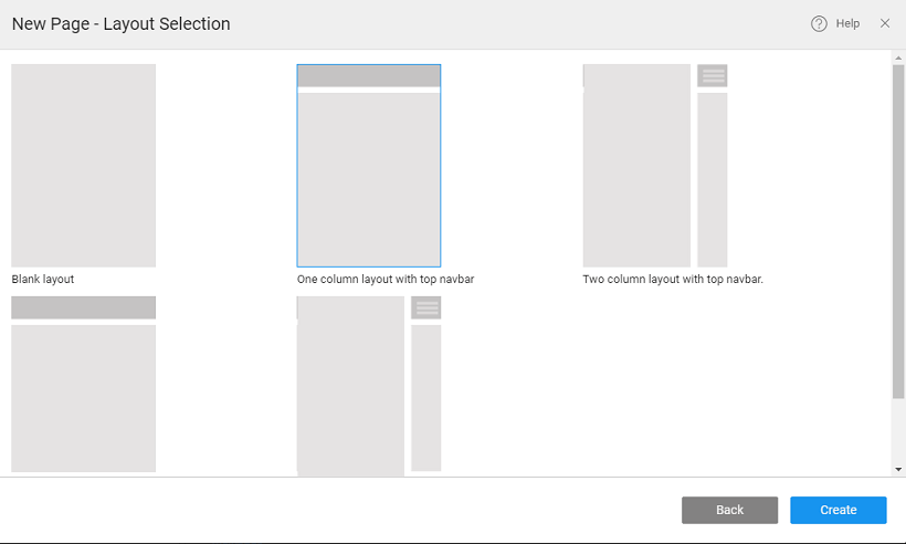
- Create a page using blank template and layout as ‘One column layout with top navbar’

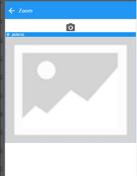
- Drag and drop a container widget and set horizontal align property as the center.
- Drag and drop a camera widget.
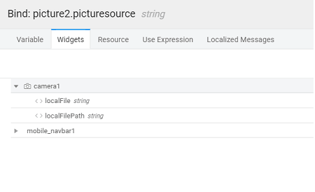
- Drag and drop a picture widget and set its width to 100%.

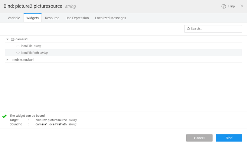
- Bind the source of the picture to the ‘localFilePath’ of camera widget.


Step 4: Build & Run
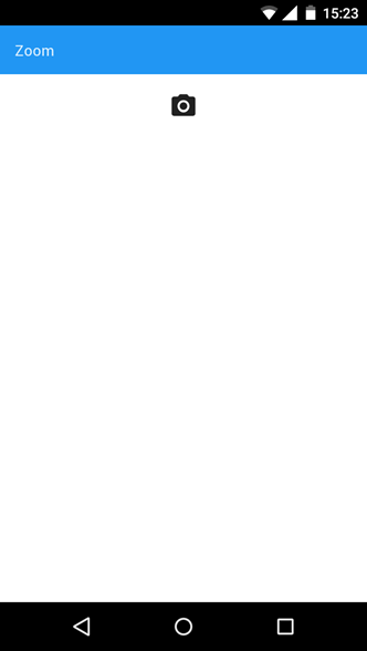
- Build the apk, install it on an android phone and open the app.

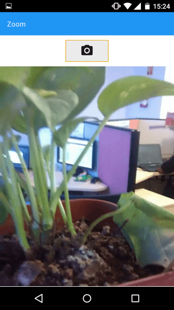
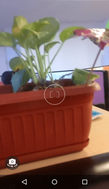
- Open the app and click camera button and take a photo.

- The captured image will get displayed in the app.