Media List
NOTE: Media List is available only for mobile apps.
Media List Widget can be used for displaying a list of pictures. Initially, a list with thumbnails of the pictures is displayed. When the user clicks on a thumbnail, then the original picture will be displayed.
Layouts
Media List has two layout options:
- Single-row where all the thumbnail images are displayed in a single row with horizontal scroll, and
- Multi-row where the thumbnail images are displayed in multiple rows.
Features
Dataset of a Media List has the following properties:
- Value - An array of objects that has the data for media list.
- Thumbnail URL - The data property which contains the URL for the picture’s thumbnail URL.
- Media URL - The data property which contains the URL for the picture.
Media template is a child container in Media List for which the width and height can be set. By default, the thumbnail will be shown in media template. Additional widgets can be added by drag and drop.
Properties
| Property | Description |
|---|---|
| Name | The name is a unique identifier for the Media List. Special characters and spaces are not allowed in widget name. |
| Accessibility | |
| Hint | Any text or HTML you enter for this property will be shown as a tooltip if the mouse hovers over this widget for 1.5 seconds. |
| Tab index | The tab index attribute specifies the tab order of an element. You can use this property to change the default tabbing order for widget access using the tab key. The value can range from 0 to 32767. The default is 0 and -1 makes the element non-focusable. |
| NOTE: In Safari browsers, by default, Tab highlights only text fields. To enable Tab functionality, in Safari Browser from Preferences -> Advanced -> Accessibility set the option "Press Tab to highlight each item on a webpage". | |
| Layout | |
| Width | The width of your widget can be specified in px or % (i.e 50px, 75%). |
| Height | The height of your widget can be specified in px or % (i.e 50px, 75%). |
| Layout | This property controls how contained widgets are displayed within this widget container - single-row or multi-row. |
| Dataset | |
| Value | Set this property to a variable to populate the list of values to display. |
| Thumbnailurl | Field from the above Dataset value that holds the Thumbnail URL. |
| Mediaurl | Field from the above Dataset value that holds the Media URL. |
| Behavior | |
| Show | Showing determines whether or not a component is visible. It is a bindable property. |
| Load on Demand (visible only when show property is bound to a variable) | When this property is set and show property is bound, the initialization of the widget will be deferred till the widget becomes visible. This behavior improves the load time. Use this feature with caution, as it has a downside (as we will not be able to interact with the widget through script until the widget is initialized). When show property is not bound the widget will be initialized immediately. |
Use Cases
Overview
Media List can be used to display images in a Hybrid Mobile App.
In this post, we will be creating a page with Media List to display employee’s pictures. We will be using the Sample HRDB for this example.
Step 1: Data
- Open or Create a Hybrid Mobile App.
- From the Resources section, select Database and click on Add icon. Select Connect to a DB option >> Sample HRDB.
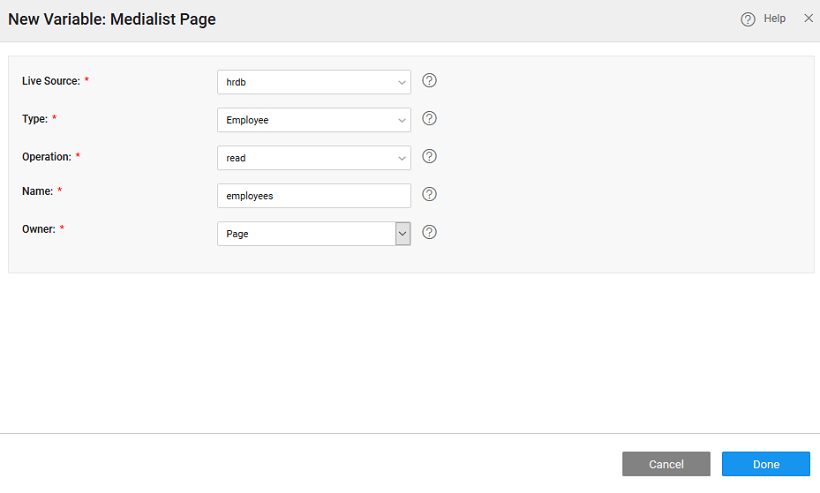
- To create an appropriate variable, select the Variables >>New Variable>> Database CRUD option. In the New Variables window, select the source as ‘hrdb’, type as ‘employee’ and operation as read.

Step 2: Design
- Drag and drop Media List widget on the page.
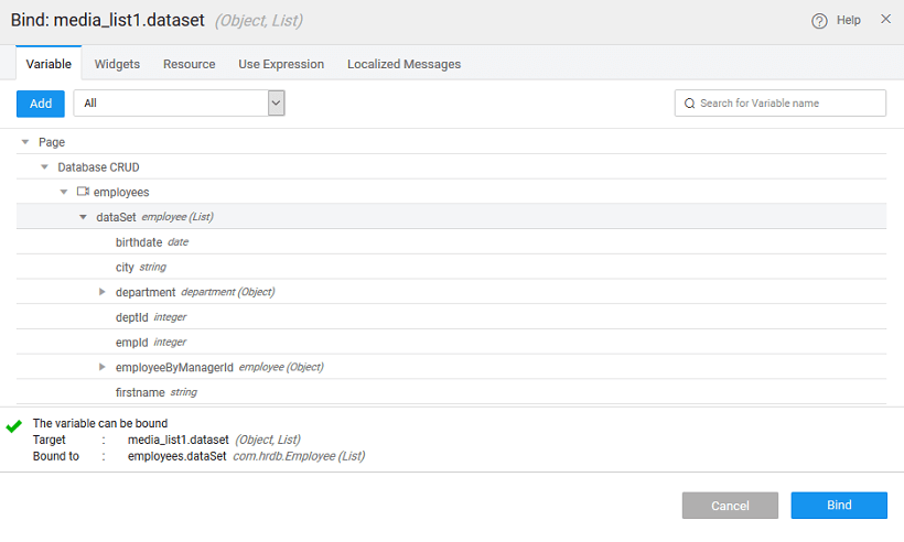
- Bind the dataset value property of Medial List to ‘employees’ live variable dataset created in the previous step.

- From the Properties panel set Thumbnailurl and Mediaurl to the picurl property of the CRUD Variable. NOTE: In this example, we are using the original picture for both Thumbnail and Media.