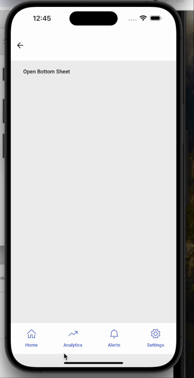
Bottom Sheet
A Bottom Sheet is a sliding panel that emerges from the bottom of the screen, commonly used to show additional content or user actions without leaving the current context.
It’s ideal for use cases like:
- Filters
- Shopping carts
- Media controls
- Map details
- Quick actions
Features
Tap Outside to Close
Automatically dismisses the bottom sheet when the user taps outside its boundaries.Swipe Down to Dismiss
Enables a natural swipe-down gesture to close the bottom sheet.Swipe Up to Expand
Allows the user to expand the sheet to a larger height via an upward swipe.Smooth Open/Close Animations
Offers fluid transition animations for an enhanced user experience.
Props
| Properties | Type | Description | Default Value |
|---|---|---|---|
| Bottom Sheet Height Ratio | number | Sets the initial height as a ratio (0 to 1) of the screen height. Example: 0.3 means 30%. | 0.5 |
| Show On Render | boolean | If true, the sheet opens automatically on page load. | Disabled |
| Expand | boolean | Enables expansion on swipe-up, if set to true. | Disabled |
| Bottom Sheet Expanded Height Ratio | number | Sets the height for Bottom Sheet in expanded form. | 0.8 |
| Auto Close | string | Controls when (or whether) the bottom sheet closes automatically. It supports two values: • outsideClick — sheet will close when user taps anywhere outside the sheet content.• disabled — tapping outside does not close the sheet. | Outside Click |
| Disable Swipe Down Close | boolean | When true, prevents fully closing the sheet via swipe down. Instead, on swipe-down it collapses to a minimum sheet height. | Disabled |
| Enable Drag Settle | boolean | When true, after the user swipes down and releases, the sheet remains at the position where it was released (rather than auto-closing or snapping). | Disabled |
| Disable Scroll on Rest | boolean | When enabled, prevents content inside the Bottom Sheet from scrolling when the sheet is in collapsed (rest) state. | Disabled |
Callback Events
| Event | Description |
|---|---|
| On Open | Triggered when the bottom sheet is opened. |
| On Close | Triggered when the bottom sheet is closed. |
| onExpand | Triggered when the Bottom Sheet is expanded. |
| onCollapse | Triggered when the Bottom Sheet is collapsed. |
| onDragHandleIconClick | Triggered when the bottom sheet drag handle icon is clicked. |
Methods
Below methods are available for Bottom Sheet widget.
open()- Opens the bottom sheet.close()- Closes the bottom sheet.expandBottomSheet()- Expands the bottom sheet height to the specified Bottom Sheet Expanded Height Ratio value.collapseBottomSheet()- Collapses the bottom sheet height to the specified Bottom Sheet Height Ratio value.isSheetExpanded()- Returns true if the bottom sheet is currently expanded; otherwise false.
These methods on Bottom Sheet widget can be triggered by selecting as Tap Events for other supported widgets like Button. You can also call them on Bottom Sheet widgets in Script tab. Example
This widget provides a modern, mobile-friendly way to present additional content without navigating away from the current view.