WaveMaker Docs

WaveMaker Docs

  • Get started
  • Widgets
  • Mobile
  • How-to
  • Enterprise
  • Releases
  • Blog
  • Sign-in

›Breadcrumb

Widgets & Prefabs Library

  • Widgets Library
  • Widgets Composition

Cards

  • Overview
  • Creating a Card
  • Data Source
  • Templates
  • Configuration
  • Behavior Settings
  • Properties, Events & Methods
  • Use Cases

Data Table

  • Overview
  • Creating a Data Table
  • Data Source
  • Layouts
  • Styles
  • Configuration
  • Field Configuration
  • Summary Row
  • Row Expansion
  • Actions
  • Events & Methods
  • Use Cases

List

  • Overview
  • Creating a List
  • Data Source
  • Templates
  • Configuration
  • Behavior Settings
  • Properties, Events & Methods
  • Use Cases

Form

  • Forms Overview
  • Creating a Form
  • Data Source
  • Layouts
  • Configuration
  • Fields Configuration
  • Field Validations
  • Events & Methods

Live Form

  • Overview
  • Creating a Live Form
  • Data Source
  • Layouts
  • Configuration
  • Fields Configuration
  • Actions
  • Events & Methods
  • Use Cases

Form Widgets

  • Button
  • Button Group
  • Text
  • Number
  • Textarea
  • Select
  • Chips
  • Currency
  • Radioset
  • Checkbox
  • CheckboxSet
  • Toggle
  • Switch
  • Date,  Time and  Datetime
  • Calendar
  • FileUpload
  • Color Picker
  • Slider
  • Rating Widget
  • Select Locale

Live Filter

  • Overview
  • Creating a Live Filter
  • Data Source
  • Layouts
  • Configuration
  • Field Configuration
  • Actions
  • Events & Methods
  • Use Cases

Container

  • Grid Layout
  • Accordion
  • Container
  • Panel
  • Tabs
  • Tile
  • Wizard

Basic Widgets

  • Label
  • Anchor
  • Icon
  • Picture
  • Tree
  • Video
  • Audio
  • HTML
  • Iframe
  • Message
  • Spinner
  • Search
  • Search - Basic Usage
  • Richtext Editor
  • Progress Bar
  • Progress Circle

Charts

  • Chart Widgets
  • Callback Event

Navigation

    Nav

    • Nav Overview
    • Creating navigation

    Nav Bar

    • Nav Bar Overview

    Breadcrumb

    • Breadcrumb Overview
    • Creating a Breadcrumb

    Dropdown Menu

    • Dropdown Menu
    • Creating a Dropdown Menu

    Popover

    • Popover Overview
    • Creating a Popover

Advanced Widgets

  • Login
  • Marquee
  • Carousel

Dialog Widgets

  • Modal Windows/ Dialogs
  • Design Dialog
  • Alert Dialog
  • Confirm Dialog
  • IFrame Dialog
  • Page Dialog
  • Login Dialog

Mobile & Device Widgets

  • Camera
  • Media List
  • Segmented Control
  • Barcode Scanner

Prefabs

  • Prefabs Overview
  • Create Prefab
  • Prefab with Partials
  • Use Cases - Prefabs
  • Prefabs Directory

    • Youtube
    • Googlemaps
    • QRCode
    • Barcode Scanner Prefab
    • Box Viewer Prefab
    • Entity Extraction Prefab
    • Docusign Prefab

    OAuth

    • OAuth Prefabs
    • Box
    • Facebook
    • Google
    • Instagram
    • LinkedIn
Edit

Breadcrumb Overview


note

Breadcrumb is available only for web responsive apps.

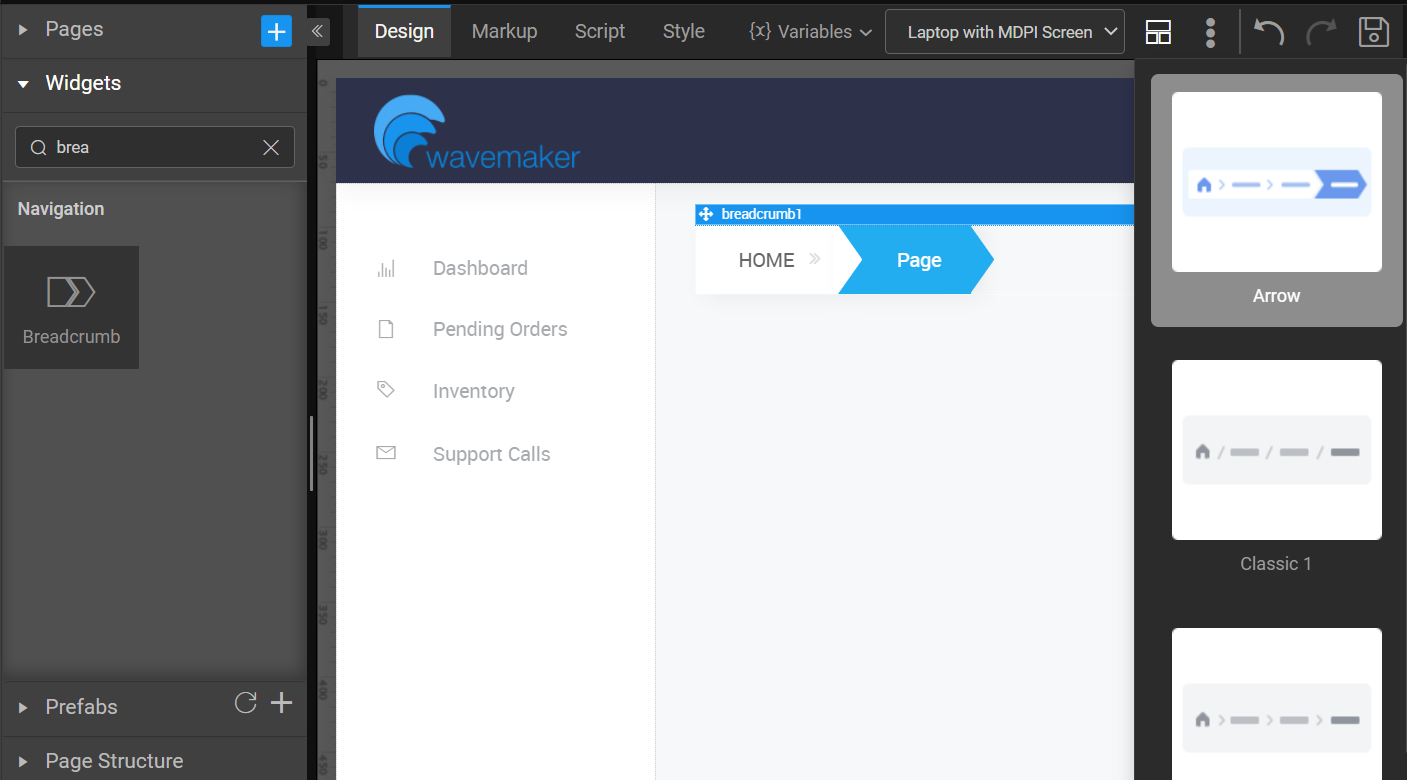
Breadcrumb is a Navigation widget which will specify the path taken to reach the current page. Breadcrumb widget is to show the site hierarchy. Breadcrumb navigation can greatly enhance the accessibility of the websites by indicating the user where they are in relation to the rest of the site when they navigate.

Most websites organize their content by a hierarchy. Some are shallow and some are deep depending on the amount of content. It is advisable to use breadcrumb navigation if the user’s hierarchy contains 3 levels or more.

note

You can apply Smart Template and Layout for Breadcrumb widget. For more information, see How to apply Smart Template and Layout for Widgets.

Properties

PropertyDescription
NameThe name is a unique identifier for your widget. Each page element and component must be uniquely identified. WaveMaker automatically renames any non-unique element. Special characters and spaces are not allowed in widget name.
Layout
HeightThe height of breadcrumb can be specified in px or % (i.e 50px, 75%).
WidthThe width of breadcrumb can be specified in px or % (i.e 50px, 75%).
Dataset
ValueSet this property to a variable to populate the list of values to display.
Actions
Action LabelLabel for the breadcrumb item. Bindable or pick from the list generated from the Dataset Value variable specified.
Action IconClass for the icon in the breadcrumb. Example- 'fa fa-ban' or 'glyphicon glyphicon-cloud'. Bindable or pick from the list generated from the Dataset Value variable specified.
Anchor LinkLink for the breadcrumb. Bindable or pick from the list generated from the Dataset Value variable specified.
Behavior
ShowShowing determines whether or not a component is visible. It is a bindable property.
Load on Demand (visible only when show property is bound to a variable)When this property is set and show property is bound, the initialization of the widget will be deferred till the widget becomes visible. This behavior improves the load time. Use this feature with caution, as it has a downside (as we will not be able to interact with the widget through script until the widget is initialized). When show property is not bound the widget will be initialized immediately.
Format
Horizontal AlignSet text alignment horizontally.

See Also

Creating a Breadcrumb
Dropdown Menu
Creating Navigation

Last updated on 12/8/2020 by Swetha Kundaram
← Nav Bar OverviewCreating a Breadcrumb →
  • Properties
  • See Also
WaveMaker
  • PRICING
  • PARTNERS
  • CUSTOMERS
  • ABOUT US
  • CONTACT US
Terms of Use | Copyright © 2013-2022 WaveMaker, Inc. All rights reserved.