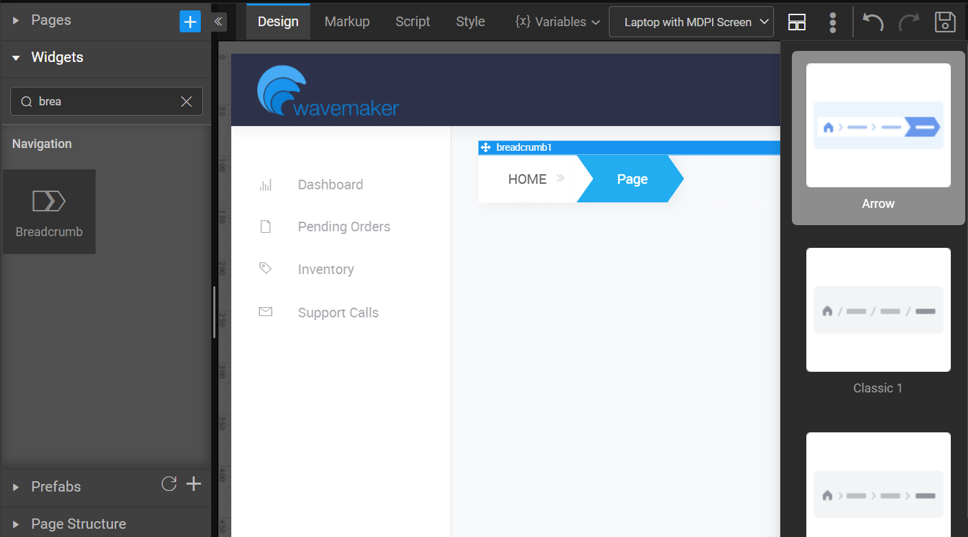
Breadcrumb Overview
note
Breadcrumb is available only for web responsive apps.
Breadcrumb is a Navigation widget which will specify the path taken to reach the current page. Breadcrumb widget is to show the site hierarchy. Breadcrumb navigation can greatly enhance the accessibility of the websites by indicating the user where they are in relation to the rest of the site when they navigate.
Most websites organize their content by a hierarchy. Some are shallow and some are deep depending on the amount of content. It is advisable to use breadcrumb navigation if the user’s hierarchy contains 3 levels or more.
note
You can apply Smart Template and Layout for Breadcrumb widget. For more information, see How to apply Smart Template and Layout for Widgets.
Properties
| Property | Description |
|---|---|
| Name | The name is a unique identifier for your widget. Each page element and component must be uniquely identified. WaveMaker automatically renames any non-unique element. Special characters and spaces are not allowed in widget name. |
| Layout | |
| Height | The height of breadcrumb can be specified in px or % (i.e 50px, 75%). |
| Width | The width of breadcrumb can be specified in px or % (i.e 50px, 75%). |
| Dataset | |
| Value | Set this property to a variable to populate the list of values to display. |
| Actions | |
| Action Label | Label for the breadcrumb item. Bindable or pick from the list generated from the Dataset Value variable specified. |
| Action Icon | Class for the icon in the breadcrumb. Example- 'fa fa-ban' or 'glyphicon glyphicon-cloud'. Bindable or pick from the list generated from the Dataset Value variable specified. |
| Anchor Link | Link for the breadcrumb. Bindable or pick from the list generated from the Dataset Value variable specified. |
| Behavior | |
| Show | Showing determines whether or not a component is visible. It is a bindable property. |
| Load on Demand (visible only when show property is bound to a variable) | When this property is set and show property is bound, the initialization of the widget will be deferred till the widget becomes visible. This behavior improves the load time. Use this feature with caution, as it has a downside (as we will not be able to interact with the widget through script until the widget is initialized). When show property is not bound the widget will be initialized immediately. |
| Format | |
| Horizontal Align | Set text alignment horizontally. |
