In my last blog post, we saw how the Corona Tracker app works and we discussed how to build a dashboard using WaveMaker. I recommend you to read the part-1 of the blog first. In this post, we will see how to build visualization for charts and visualization for maps.
Quick Recap
Link to the app: http://apps.wavemakeronline.com/CoronaTracker/
Previously, we covered how to import REST API as datasource for the app and how to create a variable to access the REST API, and binding the widgets to the created variable.
For more information, see Corona Tracker App, walkthrough of the app, and how to build the dashboard.
How to build Charts Visualization
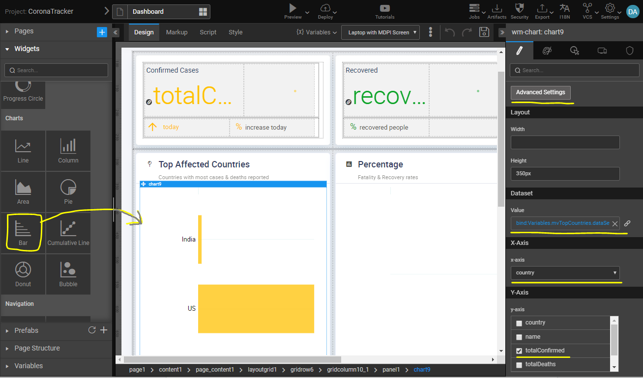
WaveMaker has in-built nvd3 based charts which are used for building plots for visualization in this app. Drag-n-drop any chart widget to canvas and bind the dataset property to the Variable for plotting data as shown below.
Configuring axes
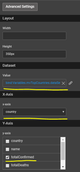
After binding the variable for the dataset, configure x-axis and y-axis from the attributes of the dataset. By just picking these attributes your chart will be ready for viewing.
In this particular case for the bar chart, we have picked country on x-axis and confirmedCases attribute from API, to be depicted for each country on y-axis.
Configuring titles
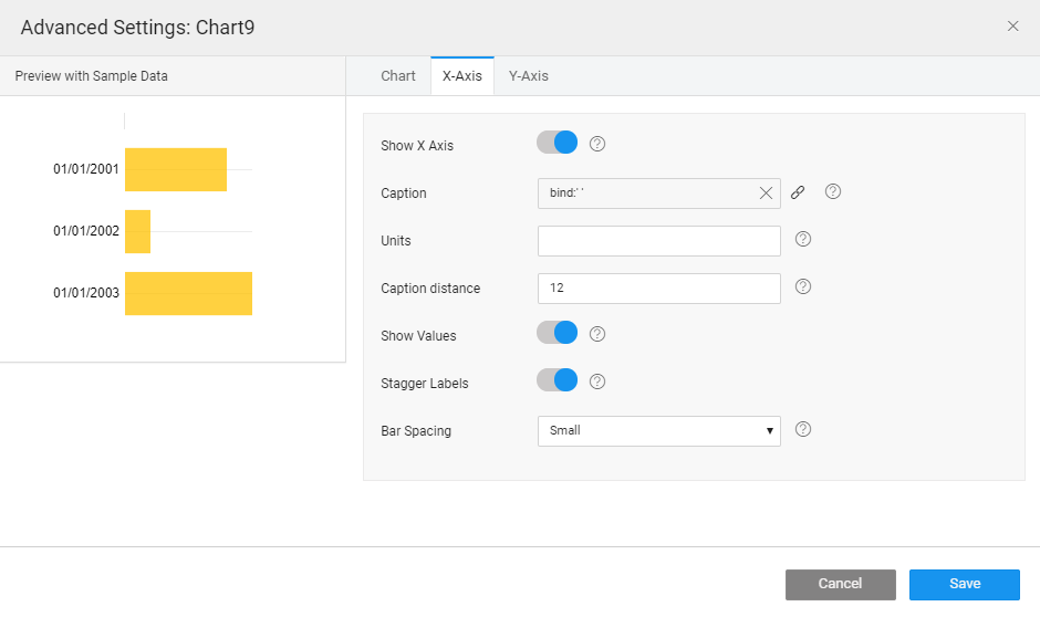
In the advanced settings for chart widget, there are several configuration options provided for configuring the axis titles, values, bar spacing etc.
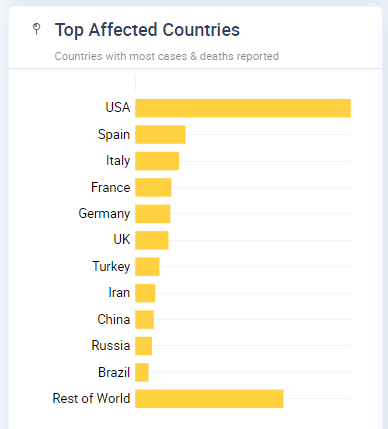
Top countries bar chart is ready!
Wait, How did we pick only 10 countries from the entire list of 180+ countries returned by the API?
Also, how did we calculate the metrics for “Rest of World”?
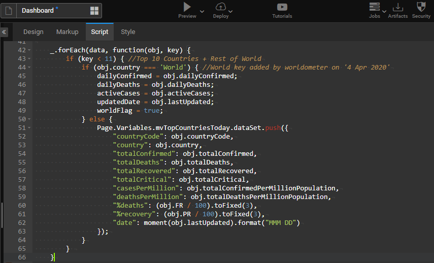
This is where low-code comes into play, you can write javascript code to customize your dataset. After fetching the API response, you can calculate any custom metrics and also create a separate dataset for top countries as shown.
How to build Maps Visualization
Maps is not an in-built widget in WaveMaker, using datamaps javascript library a Prefab is created. Datamaps takes JSON input for countries with their code and a colormap to plot the visualization.
Prefabs are typically built by a javascript developer who knows the nuances of working with a javascript library and creates a widget or prefab out of it. The Prefab developer will provide attributes that are available to WaveMaker low-code developers when the widget is dropped onto the canvas.
Creating a Prefab
Download the D3Maps.zip, and import it the Prefabs section to use it straightaway. For more information about how to use it, see Importing Prefab.
To create a Datamaps Prefab, see a detailed documentation of How to Create a Prefab Using D3 Library DataMaps.
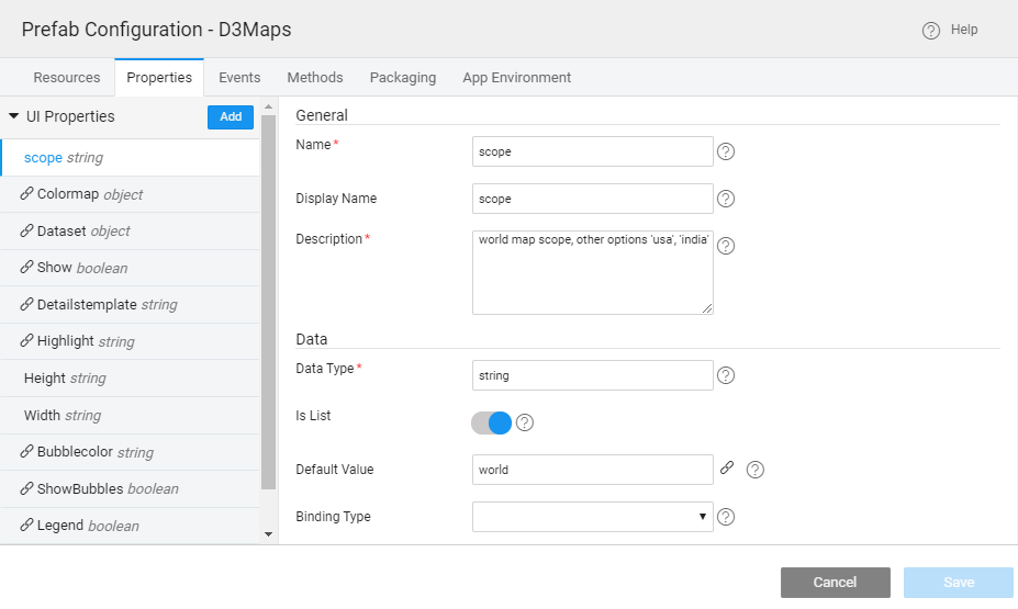
The following are the attributes provided by the Datamaps prefab developer that will appear in the Studio properties panel for binding.
Testing the prefab independently
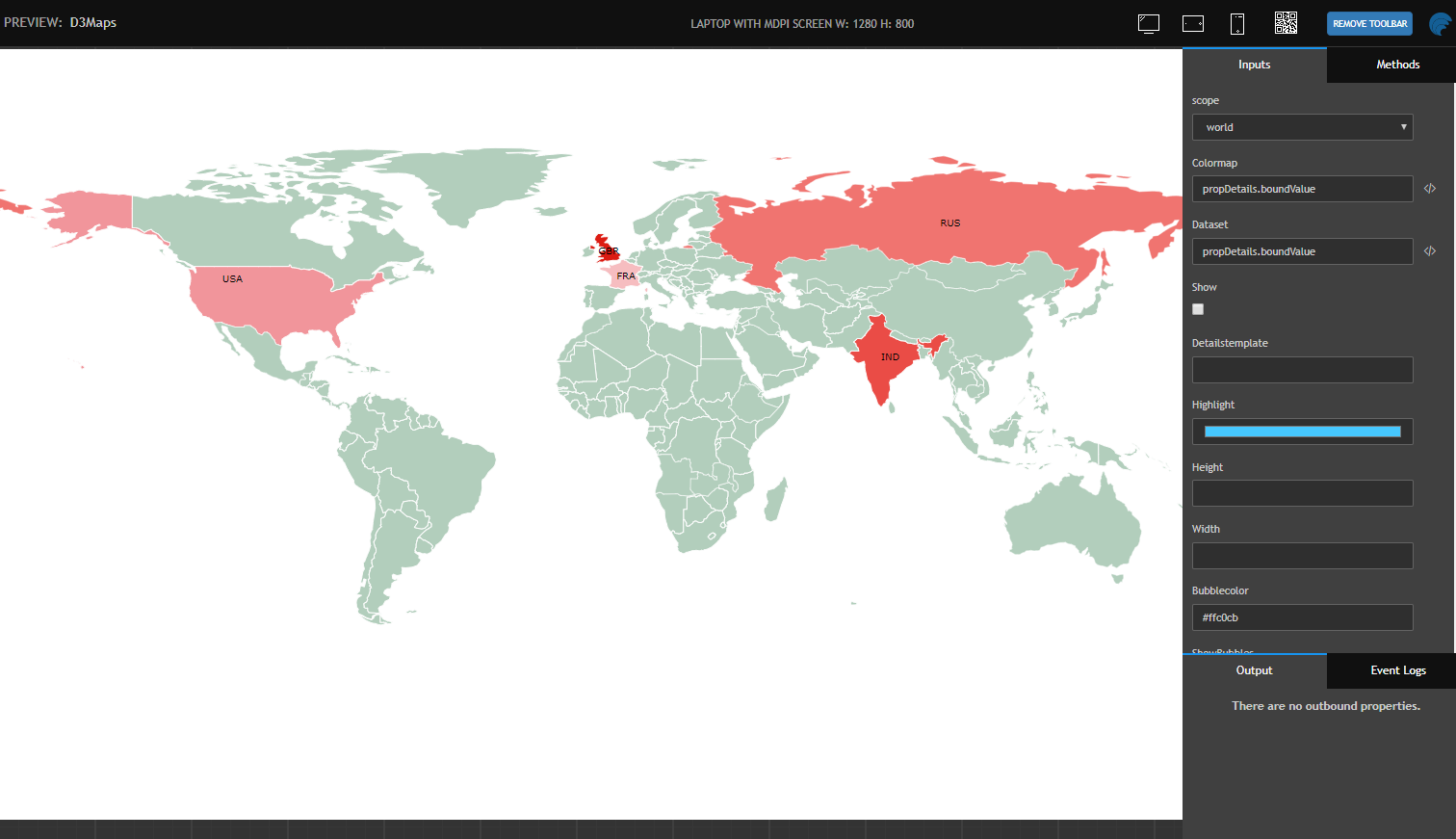
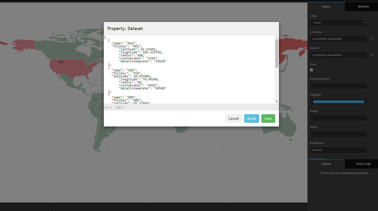
A Prefab project is another type of a project, where you can build a reusable component or widget and publish it to the workspace. Prefab developers will be able to test the prefab independent of the application by providing test data through an editor, as shown.
Publishing a Prefab
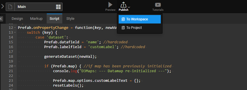
After the prefab is tested independently, it can be published to the workspace so that WaveMaker developers can start using it as a widget in the Studio.
Using Maps Prefab as a widget
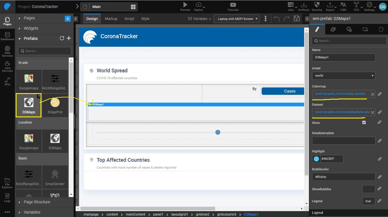
After the Prefab is published, under the prefabs section in Studio the maps prefab appears just like any other widget.
Defining Color Map and Dataset
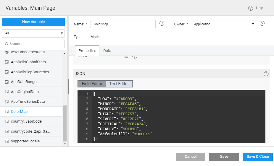
Color map needed for the maps prefab can be created as a variable, shown below.
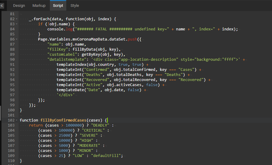
Using javascript, we have created a custom maps dataset from the REST API response, by calculating the color codes based on the confirmed cases in each country as shown.
Summary
Using single-click deployment from WaveMaker, the app is deployed on to containers and made available publicly. Entire application was built by a single developer in 1 week.
