Accessibility Support in WaveMaker
Accessibility is essential for individuals and organizations that want to create high-quality websites and applications. It enables people with disabilities to use different Assistive Technologies (AT) and Adaptive Strategies for the business benefits of Web Accessibility. WaveMaker also focuses on enabling their product with international standards for Web Accessibility from World Wide Web Consortium (W3C), including Web Content Accessibility Guidelines (WCAG) and Web Accessibility Initiative - Accessible Rich Internet Applications (WAI-ARIA) as the first step in applying them.
For more information, see the blog post about Accessibility in WaveMaker.
How it Works
To make components accessible, all the text on the web page must be unique, along with its captions and roles. To make it possible, we have introduced aria-labels attributes for all the wm-widgets which are configurable and certain Role to identify every component as per their standard behavior. This ARIA "roles" and "attributes" will benefit the group of people using Assistive Technology Readers (ATR) to read the text and the purpose of the widget aloud to the users.
WaveMaker Accessibility enhancements will cover Web Content Accessibility Guidelines (WCAG) "A" and "AA" compliance for all non-text content, including the following.
Name Role & Value, Info & Relationships, Meaning Sequence, Sensory Characteristics, Identify Input Purpose, Non-Text Contrast, Page Titled, Headings and Labels, Label in Name, Language of Page, Status Messages, Error Prevention.
Steps to Follow
Labels
- On every drag and drop of a widget, check for the Accessibility section.
- Copy or Bind the captions of the label widgets to the Hint property from the properties tab below the Accessibility section.
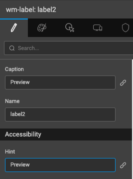
All labels and texts will have a default hint value specified as "Label text", which you can edit.
- Manipulating the Hint will result in a "tooltip text" on-hover and "aria-label" attribute visible in the browser preview URL that only AT screen readers can understand.
- The "aria-label" attribute will be added to all widgets wherever text is bound from the Hint property.
Images
- Add proper description for the images used on a page under the Hint parameter.
- Modifying hint property with meaningful caption will add aria-label to make it accessible.
Other widgets are taken care of to make them accessible easier and faster with "aria-labels" like, Page layouts, Dialogs, Form Fields, Anchors, and Live Forms, etc.
Predefined ARIA Attributes
| Components | Aria Labels | Role |
|---|---|---|
| App logo | aria-label="Image" | |
| Header | aria-label="Page header" | banner |
| Page | aria-label="Main page content" | |
| Mobile Navbar | aria-label="Title" | link |
| Mobile Tabbar | aria-label="Home" | link |
| Heading | aria-label="Label text" | heading |
| aria-level="1" | ||
| Login Input | aria-label="Text field" | |
| Login button | aria-label="Login" | |
| Validation Errors | aria-label="error message" | alert |
| aria-hidden="true" | ||
| aria-live="polite" | ||
| Anchors | aria-label="Link" | |
| Button | aria-label="Button" | |
| Checkbox | aria-label="Checkbox" | checkbox |
| aria-checked="false" | ||
| Toggle switch | aria-label="Toggle" | |
| aria-checked="false" | ||
| Rating | aria-label="1 out of 5 ratings" | radio |
| aria-checked="true" | ||
| aria-multiselectable="true" | ||
| Currency | aria-label="country currency" | |
| Datetime | aria-label="Date and time field" | |
| Time input | aria-label="Time field" | timer |
| aria-atomic="true" | ||
| Pagination | aria-label="Page 1" | |
| Calendar View | aria-label="Month view" | |
| Search input | aria-label="search field" | |
| Slider | aria-label="slider" | slider |
| aria-orientation="Vertical/horizontal" | ||
| Selectbox | aria-label="Select options" | listbox |
| aria-expanded="false" | ||
| aria-hashpop="true" | ||
| Selectbox options | option | |
| Accordion tabs | aria-expanded="true/false" | tab |
| List | list, listitem | |
| Datatable | table | |
| Panel | aria-label="panel" | |
| aria-label="panel-header" | ||
| aria-label="panel-content" | ||
| aria-label="panel-footer" | ||
| Charts | aria-label="pie chart" | |
| Left panel | aria-label="Left navigation" | navigation |
| Right panel | aria-label="Right navigation" | complementary |
| Top nav | aria-label="Second level navigation" | navigation |
| Footer | aria-label="Page footer" | contentinfo |
| Partials | complementary | |
| Spinner | aria-label="Loading..." | alert |
| aria-live="assertive | ||
| aria-busy="true" | ||
| Picture | aria-label="Placeholder Image" | |
| Icon | aria-label="user icon" | |
| Popover | aria-label="user icon" | menubar |
| Dialog | aria-modal="true" | dialog |
| Audio | application |
Appropriate Use of Headings
To make good use of headings on a page, add CSS class name from the Style properties tab, for example .h1, .h2, .h3, etc. Using any of the above headings class name, an attribute "aria-level" will be assigned to the HTML structure to make the screen readers understand the text specificity while scanning a page. You can copy the heading caption to the hint property to make it ARIA accessible.
Classname with .h1 will set the aria-level="1", and .h2 will set aria-level="2" attribute following the rest.
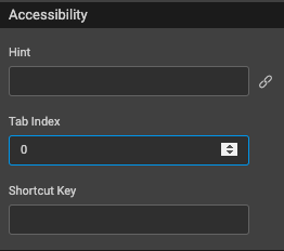
Keyboard Navigation
To navigate well within a form, use the Tab Index property from the Properties tab.
For form inputs in a live form, the hint text will not only add an aria-label attribute but also a Help Text below the input field.
Good Practices
Effective use of color contrast is also an important aspect of making your app accessible.
- WCAG 2.0 level "AA" requires a contrast ratio of at least 4.5:1 for normal text and 3:1 for large text.
- WCAG 2.1 requires a contrast ratio of at least 3:1 for graphics and user interface components (such as form input borders).
- WCAG Level "AAA" requires a contrast ratio of at least 7:1 for normal text and 4.5:1 for large text. [
For more information about the color contrast ratio before designing or developing any application, see Contrast Checker.