Page Elements
Learn how to design and navigate across pages and use rich themes to your WaveMaker apps.
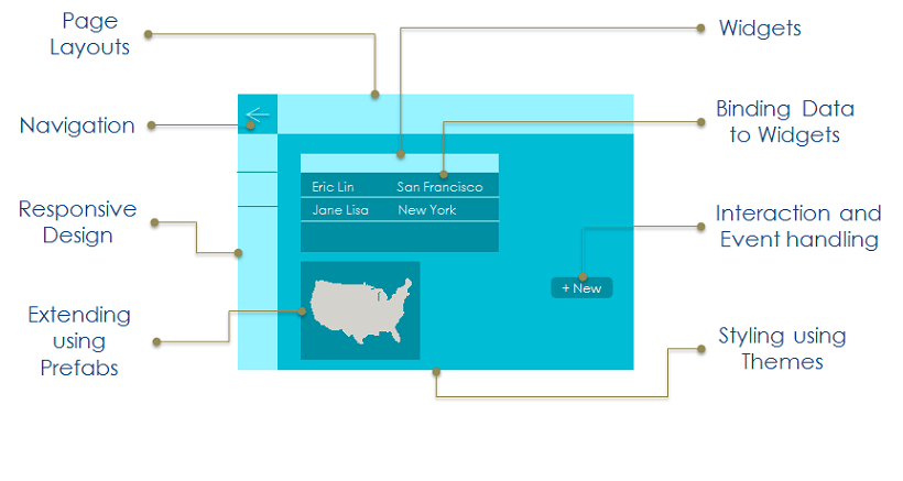
In this section, you wil learn about page components and how you can customize it. You can choose a Page Layout for a composition of Widgets or UI Elements.
Page Structure
A page is divided automatically into different areas, with the content of all areas except the main area, repeated across all pages of the app. This helps achieve UI consistency throughout the app, easily.
Responsiveness
WaveMaker supports responsive design, i.e. the apps are rendered automatically based upon the device they are viewed on.
Grid Layout
The responsiveness of apps is achieved using the 12-column grid layout defined by bootstrap. For more information, see Grid Layout.
Dragging-and-dropping of UI Components
Widgets are the building block for any application. WaveMaker Pages are built using the drag-n-drop approach by placing widgets in the corresponding responsive layout grids. Widgets enable users to interact with the App and can get their data (binding) from backend Services.
They can be dropped into the Grids or Containers, making UI well-aligned and ready for consumption.
Page Layout
Based on the Page construction system WaveMaker provides different options for Page Layouts, which can be picked based on the interaction required for the app. Depending upon the app platform the layout will differ.
Page Layout can be set a default one at the time of Page Creation and later can be changed from the Workspace Toolbar.
For more information, see Page Layouts
