Icon
Many widgets like Panel, Button etc. have a way to display an icon. You can choose the icons from the list of wavicon (thin fonts that abide the iOS and Android mobile style guidelines) or font-awesome icons.
Features
There are two ways of setting the icon class for a given icon:
- Use the bind icon next to the Icon class property and bind it to any resource,
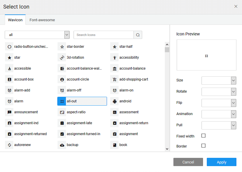
- From the icon selector on the left of the Icon Class property, you can:
- Choose a font-awesome or wavicon icon. NOTE: Wavicon icons are thin fonts that abide the iOS and Android mobile style guidelines.
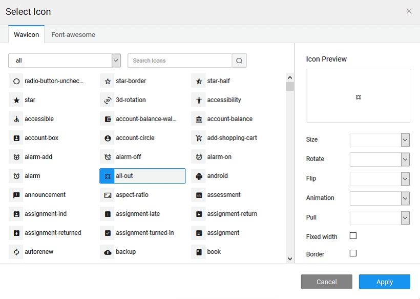
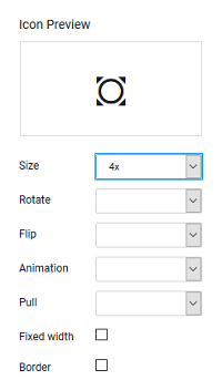
- You can see the icon preview. You can:

- Choose a font-awesome or wavicon icon. NOTE: Wavicon icons are thin fonts that abide the iOS and Android mobile style guidelines.
- set the size of the icon as the regular 1g, 2x, 3x, 4x, or 5x
- choose to rotate of the icon by 90, 180 or 270 degrees,
- choose to flip of the icon horizontally or vertically,
- set the animation of the icon to spin or pulse,
- choose to pull the icon to left or right for the placement of the icon,
- set the Fixed width of the icon for a uniform look while using multiple icons, and
- set the border for the icon
Properties
| Property | Description |
|---|---|
| Caption | This bindable property is the text that the end user sees on icon. |
| Name | The name is a unique identifier for icon widget. |
| Accessibility | |
| Hint | Any text or html you enter for this property will be shown as a tooltip if the mouse hovers over this widget for 1.5 seconds. |
| Behavior | |
| Show | Showing determines whether or not a component is visible. It is a bindable property. |
| Load on Demand (visible only when show property is bound to a variable) | When this property is set and show property is bound, the initialization of the widget will be deferred till the widget becomes visible. This behavior improves the load time. Use this feature with caution, as it has a downside (as we will not be able to interact with the widget through script until the widget is initialized). When show property is not bound the widget will be initialized immediately. |
| Animation | This property controls the animation of an element. The animation is based on the css classes and works only in the run mode. |
| Graphics | |
| Icon Class | This property defines the class of the icon that is applied to the button. |
| Icon Size | This property defines the size of the icon. Value has to be specified along with the units (em or px). |
| Icon Position | Property to set the position of icon - can be left (default) or right. |