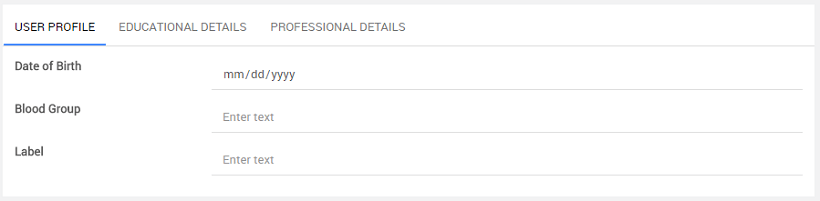
Tabs
Tabs can be used when you need multiple containers within a single window. Tab-based navigation provides an easy and powerful mechanism to handle a large amount of content within a limited area by separating content into different panes where one pane is viewable at a time. The user can quickly access the content by switching between the panes without leaving the page.
In interface design, a Tabbed Document Interface (TDI) or Tab is a graphical control element that allows multiple documents or panels to contain within a single window. You can use these Tabs as a navigational widget for switching between sets of documents. It is an interface style most commonly associated with a web browser, web application and text-editor, and preference panes.
Types of Tabs
Static Tabs
Static Tabs do not need a dataset to add Tab Panes to the Tab bar. You add them using the Add Tab Pane button from the properties panel. The Static type is the default behavior of Tabs.
Dynamic Tabs
You can create a fully dynamic tab component using a data source by binding a dataset to the Tabs widget. Based on the dataset, a number of Tab panes will generate. For more information, see Using Dynamic Tabs and Accordions.
Features
When you drag and drop a Tab widget, it comes with three default three panes. Each pane can have a separate header and content.
Tabs
- Add Tab Pane.
- Tabs Position to change where the Tab header will be displayed, with respect to the content.
- Default Pane Index - to set a specific Tab to be open by default.
- Set Tab order for the display order.
Tab Pane
- Title - Provide a title to the Tab pan.
- Disabled - Not allowing users to view or perform any operation on the Tab.
When to use Tabs
- To organize content at a high level.
- To alternate between views within the same context.
- To logically chunk the content behind the Tabs.
- When users don't need to see content from multiple Tabs simultaneously.

Methods
Tab has few methods exposed on widget scope that can be accessed via JavaScript. See below for usage example
- To navigate to the previous Tab pane:
- To navigate to the next Tab Pane:
- To navigate to a specific Tab Pane:
- To select a specific Tab Pane:
Script Access
Learn how you can access Tab events using the JavaScript option. Also, you will learn to navigate to the previous, next, and goToTab functions to switch between the tabbed content. In this case, we are using the sample HRDB with the Employee table as an example to load the data.
Prepare data and widgets
- Create three variables of type
Employeeentity. For the first variable:- From the variables tab, select the variable and go to the Data tab.
- For
deptid, keep the value as 1, and follow the same for others, includingdeptid4. - Name the respective variables as
EngineeringEmployeesData,SalesEmployeesData,MarketingEmployeesData. - For more information, see Learn how to create variables.
- Drag and Drop Tab widget. By default, you will see a tab with three Tab Panes.
- Name the Tab widget as
EmployeesTaband name the Tab Panes asengineeringEmpPane,salesEmpPane,marketingEmpPane. - Change Tab panes titles to
Engineering,Sales,Marketing. - Drop the List widget in each of these Tabs and bind it to the respective variables. Map template widgets to the respective fields.
- Drop three buttons. Name the first button as
previousBtn, the second one asnextBtn, and the last one asgoToSalesBtn. Also, change the titles toPrevious,Next, andGo To Sales.
Scripting with Tabs
- Select JavaScript for the on click event of
previousBtnand use the following as javascript function with the following script:
- Select JavaScript for the on click event for
nextBtnand use the following script:
- Select JavaScript for the on click event for
goToSalesBtnand use the following script:
Run
- Run the application. The first tab pane will open by default.
- When you click
nextBtn, thesalesPanewill open. - When you click
previousBtn, theengineeringPanewill open. - When you click
goToSalesBtn, thesalesPanewill open.
Properties
| Property | Description |
|---|---|
| Name | The name is a unique identifier of the Tab. |
| Type | This property specifies the type of Tabs widget. - Static: The Tab Panes will be static, which is the default behavior of Tabs. - Dynamic: The Tab Panes will be generated based on the Dataset bound to the widget. |
| Add Tab Pane | This action allows one to add multiple panes to the Tab. NOTE: This property applies when you set the Type propety to Static. |
| Layout | |
| Height | The height of the Tab can be specified in px or % (i.e 50px, 75%). |
| Tab Position | This property determines if the Tabs should be displayed on the - left, - top (default), - right or - bottom of the Tab content. |
| Behavior | |
| Default Pane Index | This property sets the default active pane on a load of the widget based on the provided index. The Tab Index is an integer starting from 0, 1, 2, and so on. That is, setting this property to 0 will display the first Tab pane; setting to 1 will display the second Tab pane. |
| Retain State | This property will allow users to maintain widget states using state handling on the URL, Local Storage or Session Storage. This property, that is enabled by default enables applications that are using Tabs to deep link specific tabs using URL rewriting approach. If state information being visible in URL is not desired, other approaches to linking to specific tab includes localStorage & sessionStorage. - URL : The state information will be stored in the app URL(This is the default option selected by the platform). - Local Storage : The widget state information will be stored in the browser local storage. - Session Storage : The state information will be stored in the browser session storage. - None : No state information will be applied to the widget. |
| Show | Showing determines whether or not a component is visible. It is a bindable property. |
| Load on Demand (visible only when show property is bound to a variable) | When this property is set and show property is bound, the initialization of the widget will be deferred till the widget becomes visible. This behavior improves the load time. Use this feature with caution, as it has a downside (as we will not be able to interact with the widget through script until the widget is initialized). When the show property is not bound, the widget will be initialized immediately. |
| Transition | This property defines the transition effect to be applied when switching Tabs. You can choose from none or slide. When the transition property is slide, the selected Tab will be animated into the viewport. Swipe events will work only when the transition value is slide. |
| Format | |
| Horizontal Align | Set text alignment horizontally, can be left, center or right. |
| Tab Order | The order of the Tabs can be changed using the arrow icons next to the Tab names. |
Tab Pane
SubWidget of Tabs, to hold the Tab content.
| Property | Description |
|---|---|
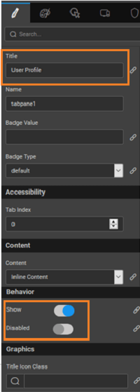
| Title | This property defines the heading or title for the Tab panes. |
| Name | The name is a unique identifier of the Tab pane. |
| Badge Value | Value to be displayed in the badge span for the Tab pane |
| Badge Type | The property controls the color of the badge. These values are: - default, - primary, - success, - info, - warning, or - danger |
| Accessibility | |
| Tab Index | The Tab Index attribute specifies the Tab order of an element. You can use this property to change the default tabbing order for widget access using the Tab key. The value can range from 0 to 32767. The default is 0 and -1 makes the element non-focusable. NOTE: In Safari browsers, by default, Tab highlights only text fields. To enable Tab functionality, in Safari Browser from Preferences -> Advanced -> Accessibility set the option "Press Tab to highlight each item on a webpage". |
| Content | |
| Content | Inline content or Partial page's content to be included in the widget. |
| Behavior | |
| Show | Showing determines whether or not a component is visible. It is bindable. |
| Disabled | If the disabled property is true (checked) the value of the editor cannot change. The widget becomes display-only. It is bindable. |
| Graphics | |
| Title Icon Class | This property can assign an icon for the pane. |
Events
| Event | Description |
|---|---|
| On load | This event handler is called when the widget is loaded. |
| Callback Events | |
| On select | This event handler is called when the Tab is selected. |
| On deselect | This event handler is called when the Tab is deselected. |
Apply Retain State
When application uses Tabs, it is possible to deep link to specific tab in the tab list as user selects them. Deep linking is a way to retain the state such that even when the user refreshes the page or shares the URL with someone else, they land on the page at a particular tab.
Retain State will store the state information either in the browser URL or in local or session storages of the browser. Query param called wm_state is appended to the URL which contains the state information.
Example:
See Also
How to Use Dynamic Tabs and Accordions
How to Build Tabbed Live Form