Dropdown Menu
A menu displays grouped navigation actions. The drop-down menu is typically used inside the navigation header to display a list of related links on a mouse hover or click on the trigger element.
Dropdown Menu can be used as:
- Command menus, which initiate an action based on the option user selects. Each menu item consists of a discrete option or action that can affect the app, the view, or selected elements within a view.
- Navigation menus, which take users to a new location. Note that menus should not be used as a primary method for navigation within an app.
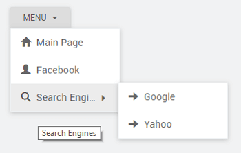
WaveMaker Dropdown Menu widget allows one to display a label, an icon and a link to be opened on click event. The data source for the Menu can be a Model variable or from a database. The structure of the data source should contain fields which can be set:
- Action label - usually caption;
- Action icon - some graphic image;
- Action link - specifying the action to be performed and
- sub action for a nested menu structure.
The Menu Layout - horizontal or vertical and Menu Position can be set as per the app requirements
Properties
| Property | Description |
|---|---|
| Caption | The caption is the text that the end user sees on the Menu label. |
| Name | The name is a unique identifier for Menu. |
| Accessibility | |
| Hint | Any text or HTML you enter for this property will be shown as a tooltip if the mouse hovers over this widget for 1.5 seconds. It can be bound to a variable. |
| Tab index | The tab index attribute specifies the tab order of an element. You can use this property to change the default tabbing order for widget access using the tab key. The value can range from 0 to 32767. The default is 0 and -1 makes the element non-focusable. |
| Shortcut Key | The shortcut key property specifies a shortcut key to activate/focus an element. (*See below for details) |
In Safari browsers, by default, Tab highlights only text fields. To enable Tab functionality, in Safari Browser from Preferences -> Advanced -> Accessibility set the option "Press Tab to highlight each item on a webpage".
| Layout | |
| Width | The width of your widget can be specified in px or % (i.e 50px, 75%). |
| Height | The height of your widget can be specified in px or % (i.e 50px, 75%). |
| Menu Layout | Vertical layout arranges the menu items vertically. Horizontal layout arranges the menu items horizontally. |
| Menu Position | Position of the menu list items - inline, down-right, down-left, up-left, up-right. |
| Dataset | |
| Value | Set this property to a variable to populate the list of values to display. |
| Order by | Set this property to order the Menu items. |
| Actions | |
| Action Label | Label for menu items. It can be bound to a variable or set to a field from the Dataset Value variable. |
| Action Icon | Label for menu items. It can be bound to a variable or set to a field from the Dataset Value variable. |
| Action Link | Link for the items. It can be bound to a variable or set to a field from the Dataset Value variable. |
Item link has priority over onSelect actions i.e. when the link is selected the onSelect actions won't get executed.
| Action Task | Task for menu items generated dynamically. This is the action that will be triggered when the user clicks on the Menu Item. It can be a script like: Widgets.label1.show or Variables.v1.invoke() Execution order on click of Node: 1. If provided onSelect will be executed first. 2. If provided Action will be executed next. 3. If provided Action link will be executed last. |
| User Role | Role for menu items generated dynamically. You can assign the property to 'userrole' which contains comma separated user roles. Each item will be evaluated with given 'userrole' for that item to that of the logged in user roles, from security. If any of the user roles bound to 'userrole' property matches then that menu item will be shown else will be hidden. |
| Sub Actions | When a menu widget is required the sub-items can be mentioned in the children. It can be bound to a variable or set to a field from the Dataset Value variable. |
| Behavior | |
| Show | Showing determines whether or not a component is visible. It is a bindable property. |
| Load on Demand (visible only when show property is bound to a variable) | When this property is set and show property is bound, the initialization of the widget will be deferred till the widget becomes visible. This behavior improves the load time. Use this feature with caution, as it has a downside (as we will not be able to interact with the widget through script until the widget is initialized). When show property is not bound the widget will be initialized immediately. |
| Link Target | This defines the app behavior on click of the Item Link. - _blank Opens the linked document in a new window or tab; - _self Opens the linked document in the same frame as it was clicked (this is the default value); - _parent Opens the linked document in the parent frame; - _top Opens the linked document in the full body of the window. |
| Auto Close | This property defines the behavior of menu closing, it can be: - outsideClick - close the menu when clicked outside of the menu, - always - when a menu item is selected or on click outside menu, or - disabled - do not close once opened. |
| Animation on to content | This property controls the animation of the menu items. It can be set to slide, fade, or scale. Note: This feature works only in the run mode. |
| Graphics | |
| Icon Class | This bindable property defines the class of the icon that is applied to the button. |
| Format | |
| Horizontal Align | This property specifies how the elements should be aligned horizontally. It can be Left, Centered or Right |
Shortcut key: The shortcut key property specifies a shortcut key to click the button. The way of accessing the shortcut key is varying in different browsers:
| Browser | Shortcutkey Trigger |
|---|---|
| Internet Explorer | [Alt] + shortcut key |
| Chrome | [Alt] + shortcut key (Windows/Linux) |
| [Control][Alt] + shortcutkey (MAC) | |
| Firefox | [Alt][Shift] + shortcutkey (Windows/Linux) |
| [Control][Alt] + shortcutkey (MAC) |
Events
| Event | Description |
|---|---|
| Callback Events | |
| On Select | This event handler is called when the tab is selected. |
See Also
Creating a Dropdown Menu
Creating Navigation
Restricting Menu Items based on the User Role
Dynamic Menu based on the User Role
Implementing Localization for Dropdown Menu