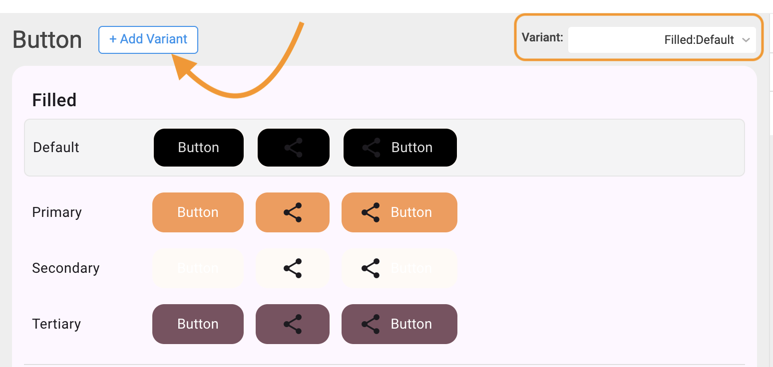
Component Variants
Component Variants define the different visual styles or appearances of a single UI component while maintaining the same structure and functionality. They allow designers and developers to create multiple looks — such as filled, outlined, or text-only buttons — without rebuilding the component from scratch.
Each variant adapts to a unique use case or level of emphasis (for example, primary vs. secondary), while preserving accessibility and consistency across the app.
Variants make your design system:
- Flexible — one base component can serve multiple purposes or themes.
- Consistent — shared design logic ensures all variants align with the same brand guidelines.
- Efficient — designers and developers edit or extend visual styles without duplicating components.
For example:
- Primary Filled: Solid background for high-emphasis actions.
- Primary Outlined: Border-only style for medium emphasis.
- Primary Text (No Fill): Minimal style for low-emphasis or secondary actions.
Each of these looks different but uses the same base anatomy — label, icon, and padding — while applying different tokens for color, border, and elevation.
Variants and States
Each variant supports multiple interaction states to reflect user feedback visually:
| State | Description |
|---|---|
| Default | The standard appearance of the component. |
| Hover | Indicates an interactive element when hovered. |
| Focus | Visual focus ring or outline for accessibility. |
| Active / Pressed | Represents interaction in progress. |
| Disabled | Indicates an inactive, non-interactive state. |
Creating and Editing Variants in Style Workspace
The Style Workspace lets you visually manage and customize component variants without editing code.
To Create or Edit Variants:
Open the Style Workspace
- In WaveMaker Studio, open your app.
- Click on Style Workspace from the left sidebar.
- The workspace opens in Global Tokens view by default.
Select a Component
- In the left panel, expand a component category such as Button, Input, or Card.
- Choose a Variant
- Use the dropdown menu to select an existing variant (e.g., Primary, Secondary, Destructive) or create a new one.
- Switch Between States
- Use the tabs or state selector to view how the variant looks in Default, Hover, or Disabled states.
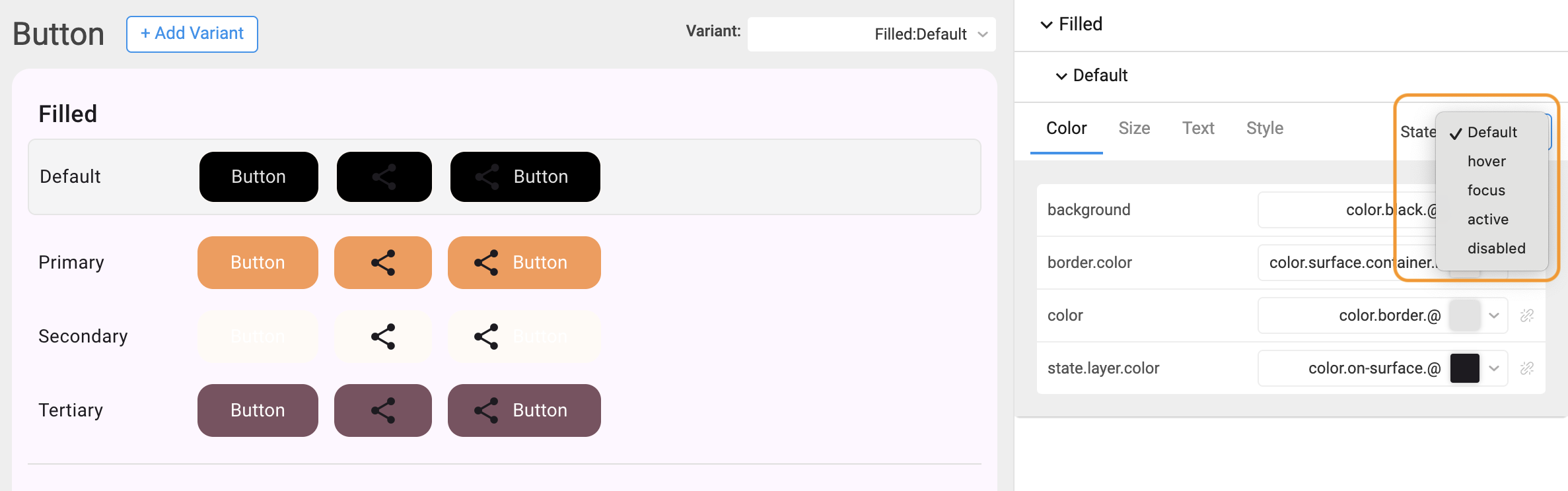
Edit Tokens
- Modify properties such as:
- Color (background, text, border)
- Typography (font family, weight, size)
- Spacing / Padding
- Shadow / Elevation
- The changes appear instantly in the preview panel.
- Modify properties such as:
Preview and Save
- Review your updates live in the Preview Area.
- Once satisfied, the changes are automatically saved to JSON overrides.
How Variants Are Stored
When you create or modify variants, the changes are saved in structured JSON files inside your project.
These files ensure that all variant updates are reusable, traceable, and consistent across builds.
File Path Structure:
Example:
If you update the “Primary Button” background color:
overrides/components/button/button.primary.json
will contain the modified token values.
JSON Example
These values are automatically compiled by WaveMaker’s Style Dictionary into platform-ready formats (CSS variables, JS objects, etc.), ensuring all variant updates appear in your app UI.
Preview
As you adjust component variants:
- Changes reflect immediately in the Preview Canvas.
- The App UI preview on the right updates with the new design (e.g., button color, font, or radius).
- This instant feedback helps validate theme consistency and accessibility before applying changes globally.
Test each variant across Light and Dark themes to ensure proper contrast and visual balance.
Example Workflow
Scenario:
You want to create a Secondary Outlined Button variant.
Steps:
- Open Style Workspace → Button.
- Select Variant → Secondary.
- Under Appearance, set:
- Background: Transparent
- Border: {color.brand.primary}
- Text: {color.brand.primary}
- Adjust Border Radius → 6px.
- Preview the variant in Hover and Disabled states.
- Changes are saved automatically in:
- Run your app — all buttons assigned this variant will now display the new outlined style.