Working with Style Workspace
The Style Workspace in WaveMaker Studio is your visual control panel for managing and customizing your application's design.
It allows you to modify design tokens, preview changes in real time, and maintain brand consistency across all UI components.
You can:
- Browse and edit Global Tokens (colors, typography, spacing, radius, shadow).
- Expand Components (Button, Input, Card, etc.) to update their specific tokens.
- Switch between Appearances, Variants, and States to fine-tune the visual style.
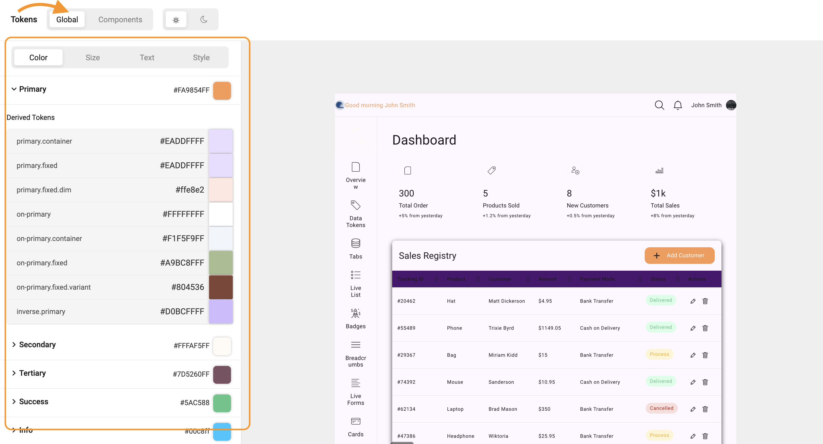
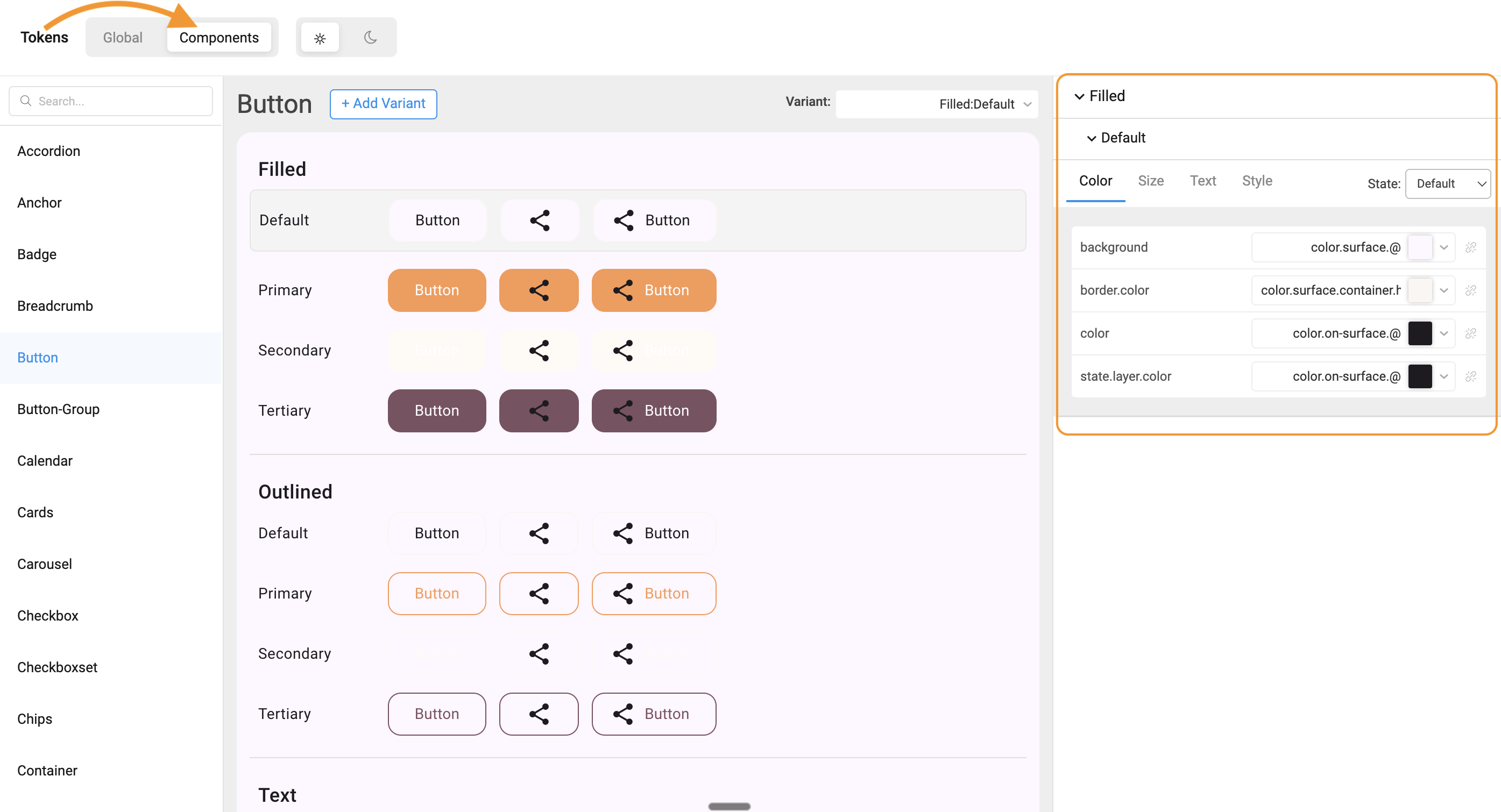
Navigating the Style Workspace
To open the Style Workspace:
- Open your app in WaveMaker Studio.
- Select Style Workspace from the left sidebar.
- The workspace loads Global Tokens by default.
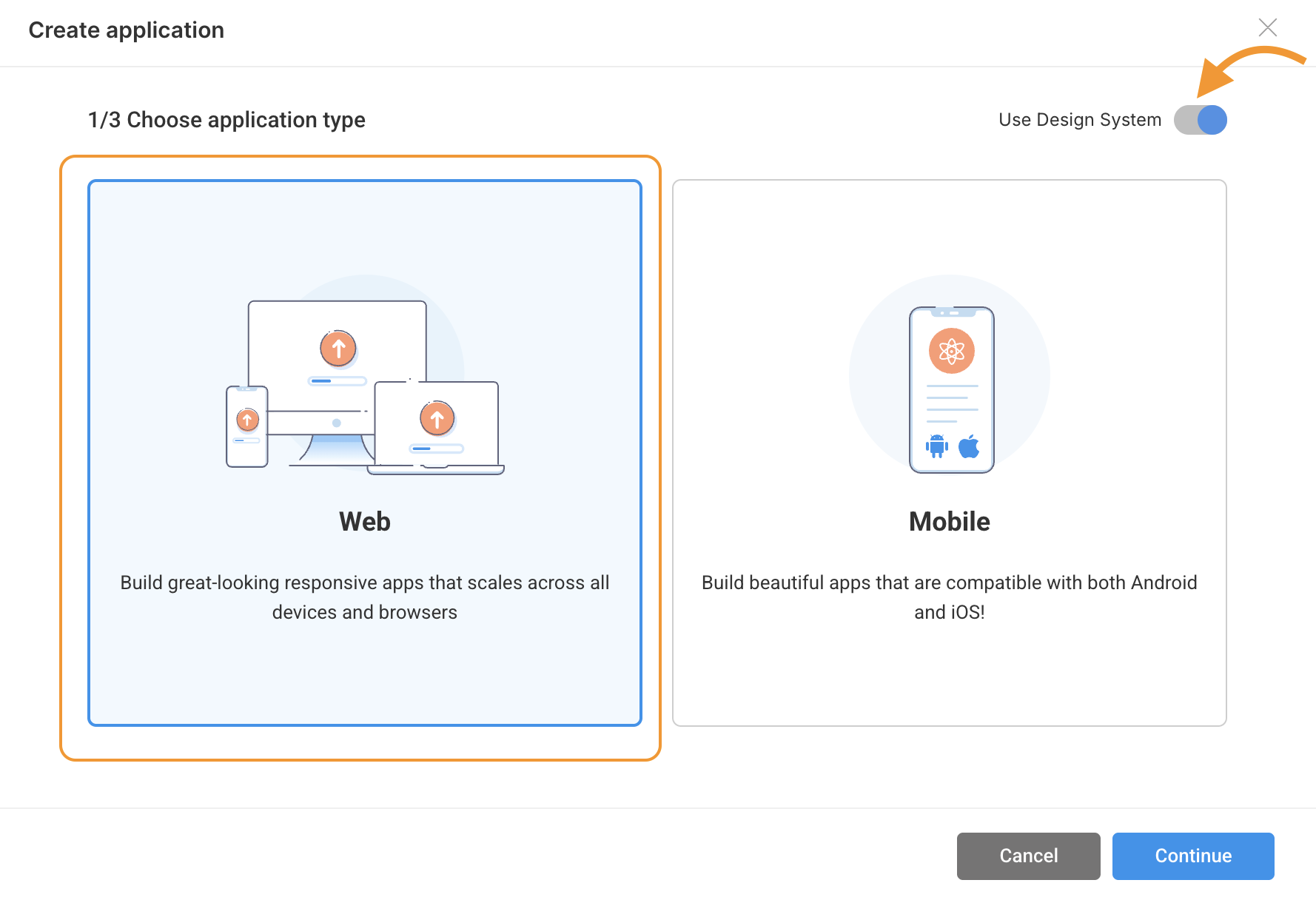
Note: Currently, Style Workspace is enabled only for Web Applications.
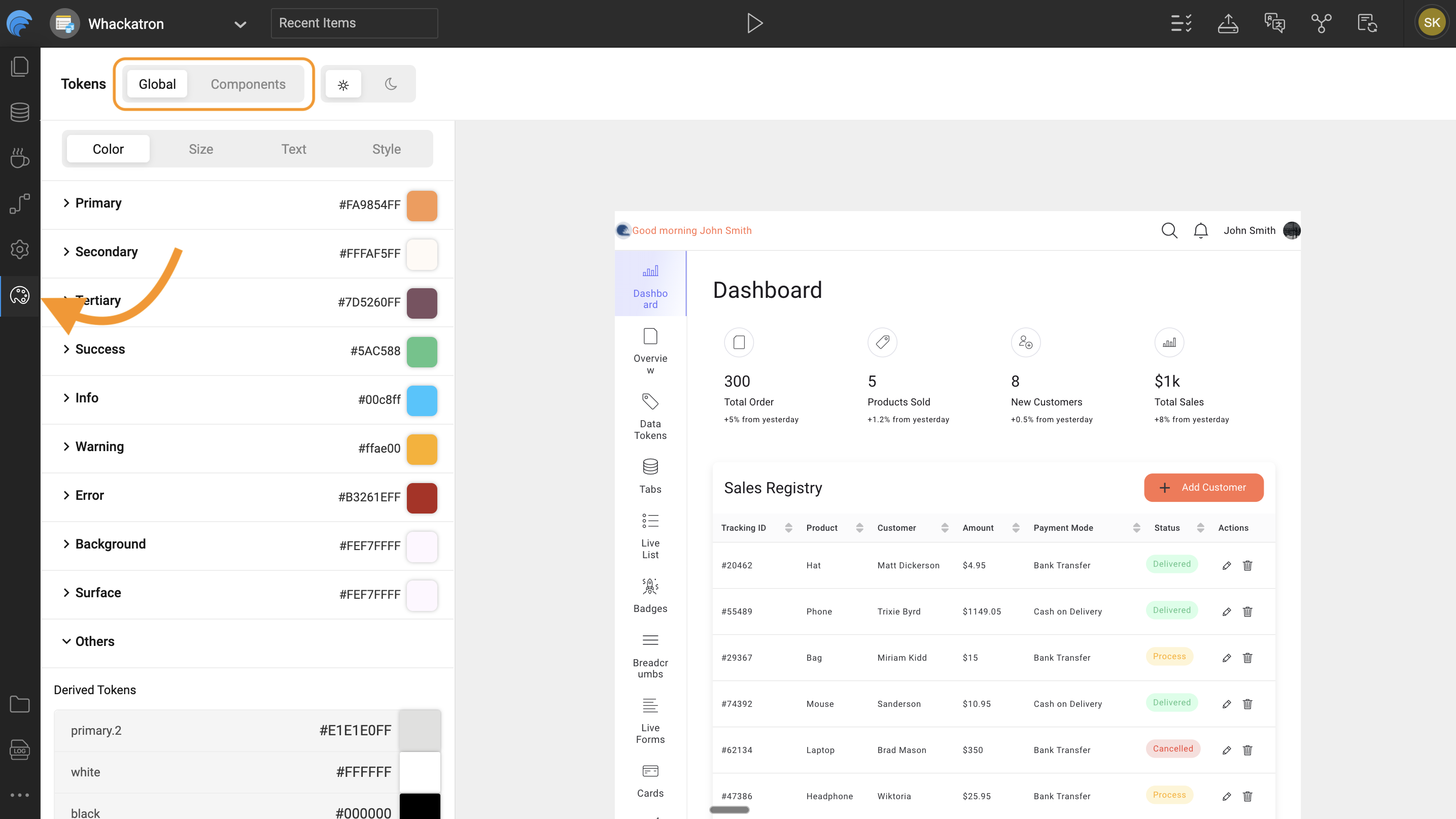
Key Navigation Areas
| Area | Description |
|---|---|
| Global Tokens Panel | Displays foundational design properties like color, font, spacing, radius, and shadows. |
| Components Panel | Lists all UI components (Button, Input, Card, etc.) that use tokens from the design system. |
| Preview Area | Shows real-time changes as you edit tokens. |
| Appearance / Variant / State Tabs | Allow you to define how a component looks, behaves, and adapts in different contexts. |
Appearances, Variants, and States
| Category | Description | Example |
|---|---|---|
| Appearance | Defines the overall component style. | Default, Outline |
| Variant | Represents the purpose or hierarchy of a component. | Primary, Secondary, Danger |
| State | Shows how a component responds to interaction. | Hover, Focus, Disabled |
Editing Tokens (Color, Size, Typography)
You can edit both Global Tokens and Component Tokens directly within the Style Workspace.
All edits are instantly reflected in the live preview.
1. Global Tokens
Global Tokens define universal design values used throughout your app.
They represent the foundation of your brand identity, ensuring that colors, typography, spacing, radii, and shadows are consistent across all screens.
Examples:
color.primaryfont.family.primaryspacing.mdborder.radius.sm
When a global token is updated, every component that references it updates automatically.
This keeps your app consistent while making broad design updates effortless.
How to Edit:
- Expand a token group (e.g., Colors, Typography).
- Click on a token value (e.g.,
color.primary). - Adjust it using the color picker, dropdown, or numeric input.
- The preview area instantly updates to reflect your changes.
2. Component Tokens
Component Tokens apply global styles to specific widgets such as Button, Card, or Input.
They control the look and feel of individual UI components, including background, padding, shadow, and text.
Each component token can:
- Inherit values from global tokens for consistency.
- Override global values locally for custom styling.
This flexibility allows designers to maintain a consistent theme while giving developers control over component-level design.
How to Edit:
- Expand a component accordion (e.g., Button).
- Navigate to sections like Background, Typography, Padding, or Shadow.
- Modify a token value.
- Observe real-time updates in the preview panel.
Real-Time Preview and Live Updates
The Style Workspace offers an interactive preview that updates instantly as you edit.
This allows you to:
- Validate color contrast and accessibility visually.
- Compare component variants and states before applying changes.
- Avoid context-switching between editing and testing.
Tip: Always preview changes across Light and Dark themes to ensure visual balance.
Saving and Viewing Generated JSON
Every change made in the Style Workspace is automatically saved as a JSON entry in your project’s overrides folder.
These JSON files form the single source of truth for all your design decisions.
Folder Structure:
Examples:
- Editing
color.primaryupdates:overrides/global/colors/color.light.json - Changing a Button background updates:
overrides/components/button/button.json
When your app is built or run, WaveMaker automatically compiles these JSON files into a CSS output:
This ensures that every token change made in the Style Workspace is reflected in the final UI styling without manual intervention.