Creating AutoCode-Friendly Designs in Figma
When designing in Figma for the WaveMaker AutoCode plugin, following these guidelines will help ensure that the generated code accurately reflects the design. Keeping these points in mind will lead to an expected output with minimal adjustments in the development phase.
Proper Use of Auto Layout
Auto Layout organizes elements into responsive hierarchies, ensuring better behavior during conversion. This is especially important in complex designs. To simplify this process, try Figma’s Suggest Auto Layout feature.
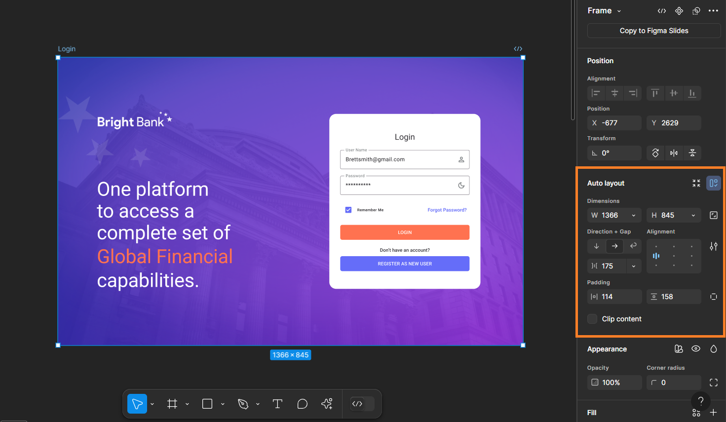
The image below shows where to find Figma Auto Layout. If it's not there, search the help menu for Auto Layout and select Add Auto Layout.

Below are some of the suggestions on using auto layout.
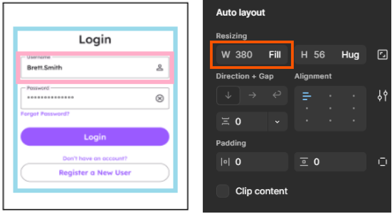
- When a child element needs to match the width of its parent frame, set its width to "Fill". Example: In the image below, the Text Field width is set to "Fill," ensuring it occupies the entire width of the parent frame (blue border).

Fixed widths are treated as fixed sizes and will not adjust to different screen sizes.
For any extra space around the element, please use the padding feature from figma.
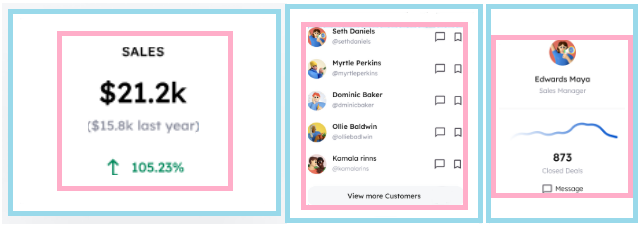
- For certain elements on a page, height and width are dynamically calculated based on the screen resolution. This applies to components like navigation bars, containers holding lists of cards, etc. Since these containers adapt to screen size, the gap between their child elements cannot be fixed and should be set to Auto instead. The image below illustrates this scenario.

A fixed gap will be considered as intentional spacing and will be maintained regardless of screen size when converting to code.
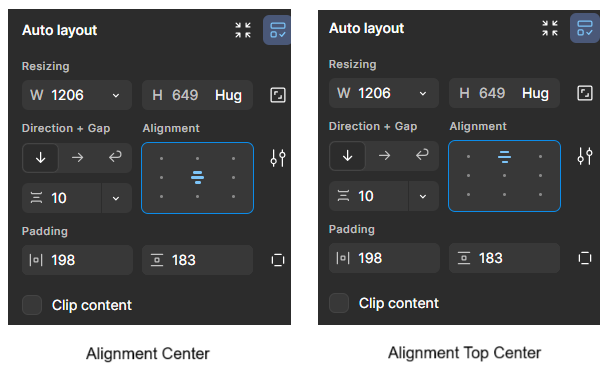
- If the parent frame has only one child frame, set the child layout to either center-center or top-center. This ensures proper alignment and structure. The examples below highlight child frames (pink border) aligned in the center within parent frames (blue border).


Preserve UI Kit Component Structure and Naming
Avoid modifying the structure or name of components in a UI kit, as these changes can lead to issues during code generation. If a component’s structure is altered, the plugin may still recognize it, but the corresponding code will not be generated.
Instance Properties
Ensure instance properties are applied at the correct level in the tree structure, not just at the top level. For example, in the first image below, the background color is applied at the topmost layer of the Tab Component instance. However, in the original UI kit, it should be applied at the second layer (State Layer), as shown in the second image.


Avoid Unnecessary Children
Minimize nested frames or groups whenever possible. For example: Instead of adding a rectangle inside a frame for background image, directly apply it to the frame itself.


In the first image above, notice the Fill property of the frame—no background is applied directly to it. Instead, a separate rectangle inside the frame holds the background image, which is incorrect.In the second image, the Fill property of the selected frame directly contains the background image, which is the correct approach. This ensures a cleaner structure and proper rendering in the generated code.
As a rule of thumb, if you're creating a unit solely to add a single property, try applying that property to the parent element instead.
Images as Fills
Do not turn images into components. Instead, use images as fills inside frames or rectangles.
Vectors for Icons Only
Use vectors exclusively for icons and avoid using them for other design elements. If you are using vectors, ensure they are flattened into a single shape to prevent rendering issues.
Logos
Use images or SVGs for logos. Include the word logo in the name. If logos are components, ensure the component name also contains the word logo.
This is important because WaveMaker projects store logos in a separate folder, and including "logo" in the name ensures they are correctly identified and placed. It also helps with better file management and organization within the project.
Color Management
Use colors from local variables or local styles. Do not apply colors without first defining them in local variables or styles.
Always use the variables provided in the UI Kit to maintain consistency. If needed, you can modify colors in the Variables pane, ensuring a well-structured and cohesive theme.
Figma API Issue with Hidden Elements
If a vector, image, or logo exceeds the defined page bounds, Figma may fail to export the “hidden” element as an SVG. To resolve this, increase the page height in Figma to include the element.
Frame Naming
Avoid naming frames with numbers or special characters at the beginning. These names are used for CSS classes and ids, and CSS naming rules must be followed. For example, start frame names with letters, use hyphen - or underscore _ for spaces, etc. Learn more about CSS naming conventions
Avoid Wrap Property in Auto Layout
Avoid using the Wrap property in Figma's Auto Layout. While it is supported, it can lead to inconsistent and inaccurate sizing. This happens because the Wrap property requires the parent element to have a fixed width, which prevents it from dynamically adjusting based on different screen resolutions.
By following these guidelines, designers can ensure that AutoCode accurately translates their Figma designs into WaveMaker-compatible code, reducing the need for manual adjustments.