Application Loader
WaveMaker 11.3 brings some new design capabilities to include in your React Native mobile app.
Using Application Loader, you can show page loading animation in your React Native app. Application Loaders render at the time of loading application data, i.e., when the app triggers an API call. There are two types of Application Loaders that WaveMaker supports.
Skeleton Loader
Skeleton Loader is an animated placeholder that automatically adapts to the page layout and content. When API call is made, Skeleton Loader creates an animation of the page structure, such as blocks, images, text, and more. This enables seamless transition on the page and data, preparing users get idea of the page format when data loads.
Skeleton Loader uses Widget's size and styles to match with the theme. Furthermore, you can customize Skeleton Loader styles and colors through code.
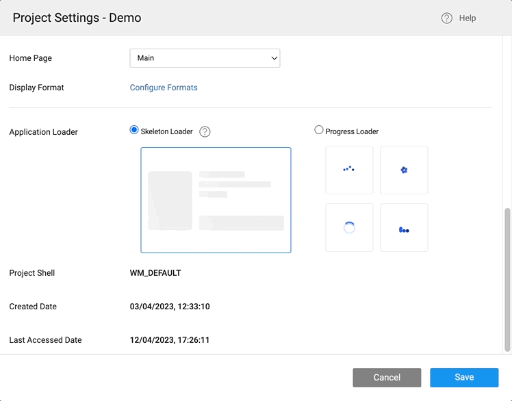
Skeleton Loader is enabled by default when creating an application. To change the loader type, go to the Project Settings dialog and choose a different type of Application Loader, as shown in the image below.
Adding Skeleton Loader to a Widget
You can apply Skeleton Loader for only a Specific widget instead of applying it to the whole page. For this, use the showskeleton property.
Customize Skeleton Loader using Code
In the following documentation, find code examples explaining multiple scenarios that you can use for Skeleton Loader.
Set Time for Skeleton Loader
In the following example, apply child Widgets of widgetName to show the Skeleton Loader and hide it in 5 seconds.
    Page.widgets.submit.showskeleton = true;
    setTimeout(()=>{
        Page.widgets.widgetName.showskeleton = false;
    }, 5000)
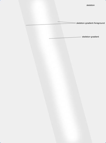
Change Skeleton Colors
You can control Skeleton Loader colors using styles. There are three style properties as following:
- skeleton
- skeleton-gradient
- skeleton-gradient-foreground
Apply Style to Page
In the following example, you can apply style on the page.
.app-skeleton{
    background-color: #292753;
    opacity: 1;
}
.app-skeleton-gradient{
    background-color: #ffffff;
    opacity: 1;
}
.app-skeleton-gradient-foreground{
    background-color: #292753;
}
Apply Style to Widget
- Using the following example, apply style for a specific Widget on the Page.
.app-label .app-skeleton{
    background-color: #c1c1c1;
    border-width: 0px;
    opacity: 1;
}
.app-label .app-skeleton-gradient{
    background-color: #ffffff;
    opacity: 1;
}
.app-label .app-skeleton-gradient-foreground{
    background-color: #292753;
}
Apply Style to Class Name
- You can use a class name of the widget for a specific widget if needed.
className: headerLabel
.headerLabel .app-label .app-skeleton{
    background-color: #c1c1c1;
    border-width: 0px;
    opacity: 1;
}
.headerLabel .app-label .app-skeleton-gradient{
    background-color: #ffffff;
    opacity: 1;
}
.headerLabel .app-label .app-skeleton-gradient-foreground{
    background-color: #292753;
}
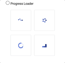
Progress Loader
Use Progress Loaders such as spinners while the app data is being fetched from an API. WaveMaker provides four types of Progress Loaders to choose. The styling for the progress loader is generated from the default theme or the applied theme.
This will show the selected spinner animation, while the data is loading, which creates an overlay on top of the page and the colors of the spinner change based on the theme.
Variable Settings
In WaveMaker service calls, to fetch data, these are abstracted as Variables, when these calls are made the App Loaders will show.
When the Variable Spinner context is selected as a Page.
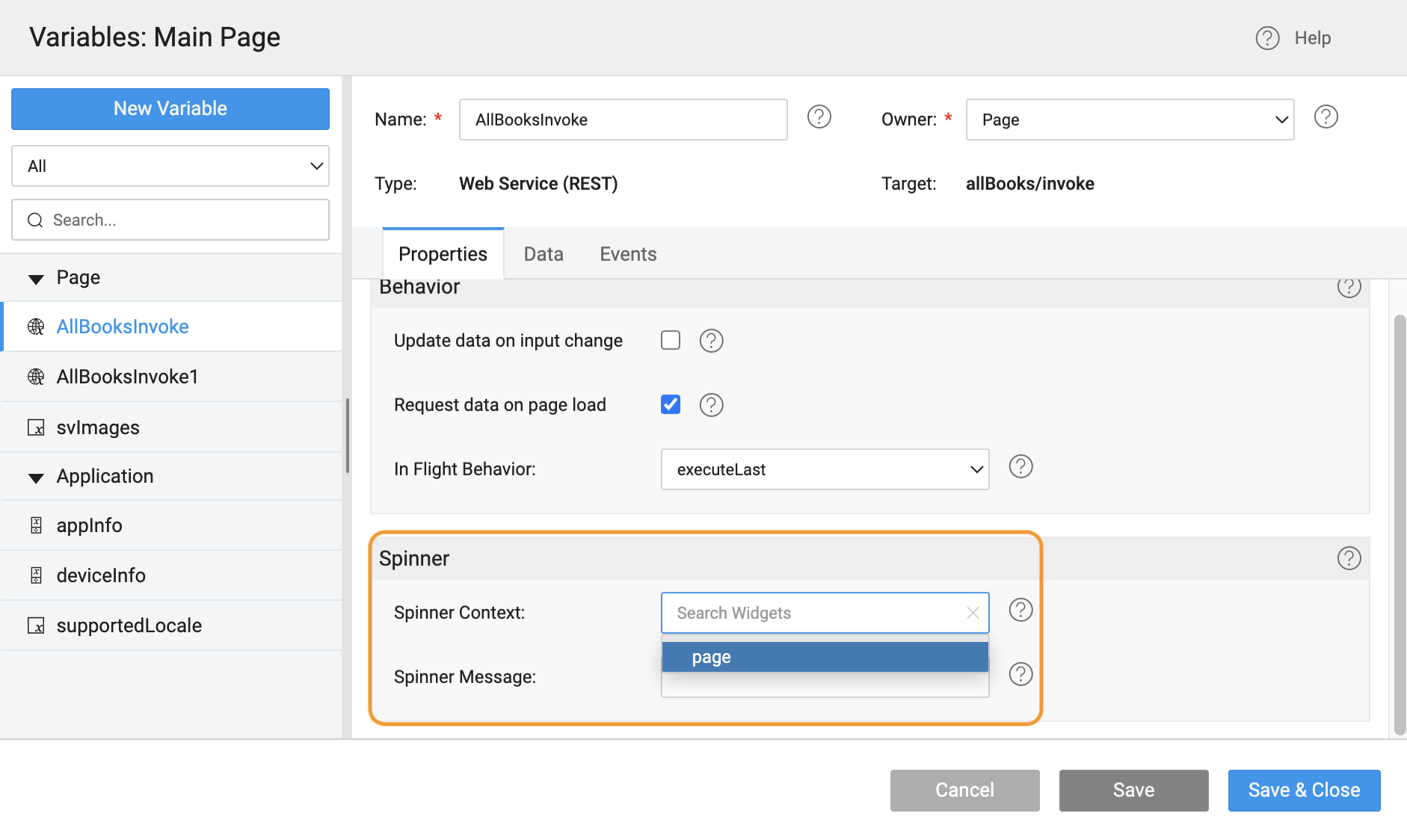
For Skeleton, all Widgets on the page show a Skelton Loader. For Progress, the selected animation will show on top of a while overlay.