Splash Screen
A Splash Screen is the first screen your users see when they launch your app.
It appears instantly after the app icon is tapped and remains visible until the app is fully loaded.
A well-designed splash screen not only masks loading time but also delivers a smooth, branded experience by displaying your app’s logo, colors, or animations right from the start.
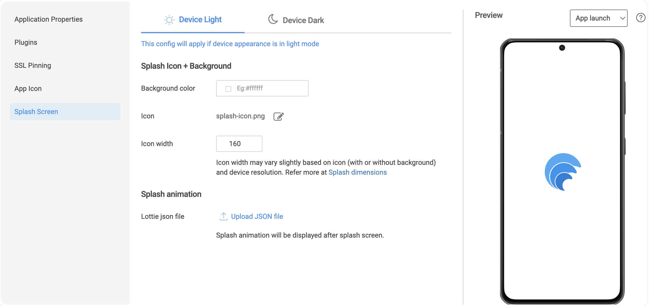
The splash screen includes a centered icon with an optional background color, and an optional animation.
Accessing Splash Screen Settings
- In Studio, go to Settings → Build Preferences.
- In the Build Preferences page, select the Splash Screen tab.
How the Splash Screen Works
A splash screen consists of two parts:
1. First Part – Background & Icon
- Background: Set a background color.
- Icon: Displayed in the center, with customizable width.
2. Second Part – Lottie Animation (Optional)
- Upload a Lottie JSON animation to play after the first part is displayed.
- The animation continues until the app finishes loading.
- If no animation is added, the first part stays visible until the app loads.
Dark and Light Mode Support
- All configurations (background, icon, animation) can now be defined separately for when the user's device is in Light or Dark mode.
- If no Dark mode configuration is provided, the Light mode splash screen is shown by default.
Live Preview
Use the preview feature to see your splash screen instantly:
- Background – Displays the background and icon.
- Animation – Plays the Lottie animation alone.
- App Launch – Simulates the complete flow: background → animation → mock home page.