Skeleton Loader
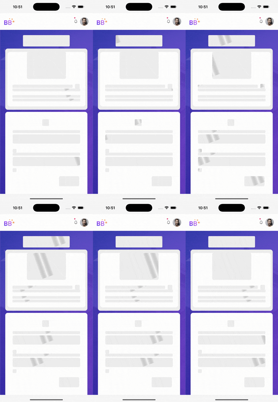
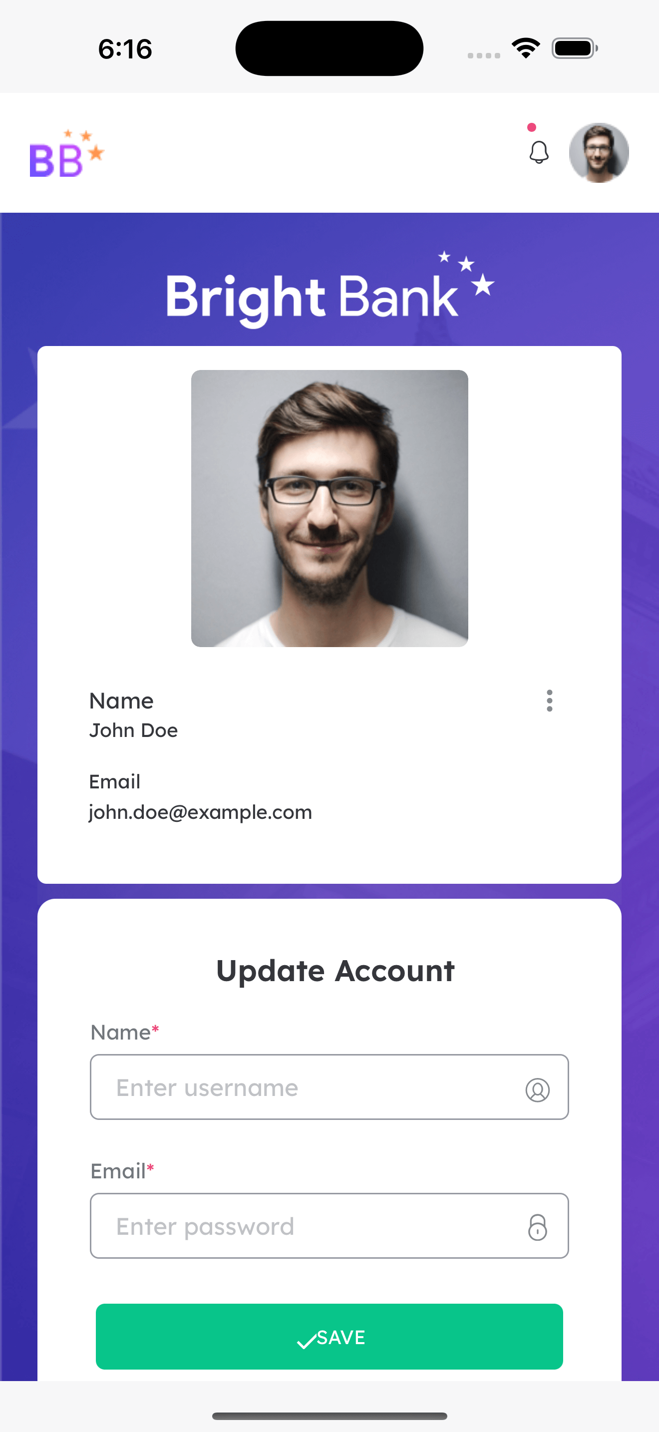
A Skeleton is an animated placeholder that mimics the structure of the content, content can be widgets of the page that will load when an API call is triggered. It creates an animation of the page structure, such as blocks, images, text, and other UI elements. This enables a seamless transition between the page and data, preparing users to get an idea of the page format in advance.
Example
When scrolling through any social media platform, you might notice gray bars in place of text, or blank squares where images will load. As the content is fetched, these placeholders are smoothly replaced with the actual content.
Key Features
Skeleton Loader offers the following benefits.
- Flexibility: You can apply Skeleton Loader to entire page or individual UI components (widgets).
- Customizability: Modify the appearance (colors, animation speed) to suit your app’s design.
Key Considerations
There are two conditions to apply Skeleton Loader
- Applying to supported widgets: This is the default behaviour and it requires customization for further beautification.
List of Widgets to which the Skeleton Loader can be applied
Below is the list of widgets that can be directly applied with the Skeleton Loader.
- ButtonGroup
- Icon
- Label
- Picture
- Tab
- Form
- Radioset
- Carousel
- List
- Card
- Anchor
- Button
- Custom
- Container Video
- Switch
- Checkbox
- Floating label
- Currency
- Number
- Rating
- Chips
- Toggle
- Legend
- Select
- Audio
- Appnavbar
- Date
- Datetime
- Calendar
- Anchor
- Tooltip
- Using Lottie animation: This method can be used for widgets that are not supported or when users prefer a more customized approach.
Adding Skeleton Loader to Your App
It is necessary to enable the Skeleton Loader at application level to use the Skeleton Loader throughout the application.
Skeleton Loader can be enabled at application level when creating an application.
To apply the Skeleton Loader:
- Go to the Project Settings dialog and choose Skeleton Loader as the Application Loader.
This applies the Skeleton Loader to all the available pages in an application along with all the supported widgets.
Skeleton Loader Implementation
You can apply Skeleton Loader to:
Apply to Page
When Skeleton Loader is applied to Page, all the available components in the Page get the Skeleton Loader applied. It gets internally applied at Page level by default when it is enabled at application level. To apply the Skeleton Loader at application level, see Enabling at Application Level.
You can disable the Skeleton Loader at the page level if you do not want it to be applied.
Apply to Prefab
You can use only Lottie Animation to apply Skeleton Loader to Prefabs.
For Prefabs, you can use the skeletonanimationresource property in the Markup tab. To use Lottie animation, it is necessary to first upload the animation resource file.
- Go to Markup tab of the Page.
- For the Prefab, add the
skeletonanimationresourceproperty. - Provide the animation resource path as value for the
skeletonanimationresource. Use the below code.
Apply to Partial
In case of Pratials, it is recommended to use the Lottie animation as Skeleton Loader as few of the components are yet to have Skeleton support. Using Lottie animation would ensure no failure and proper implementation.
See Using Lottie Animation to apply Skeleton Loader to Partial.
To use Lottie animation, it is necessary to first upload the animation resource file. You can apply the custom animation to a specific Partial by using the Skeleton Animation Resource property in the Properties panel.
In the below video, see how the Skeleton Loader appears after using the animation resource in a Container widget set as Partial.
Steps to create:
- Drag and drop the components and select the Content property value as PartialScenario. This would treat the container widget as a Partial.
- Navigate to the
Skeleton Animation Resourceproperty in Properties panel to provide the animation resource file. - Click bind icon and go to Resource section in the Bind dialog. Here, the animation resource file can be selected and attached.
- Select partial_skeleton.json file. Click Bind to apply the custom animation to the Partial components.
Customizing Skeleton Loader Appearance and Behavior
You can customise the color, width, and other properties of Skeleton Loader . These changes can be applied to:
Skeleton Loader CSS Classes
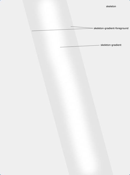
During Skeleton customization, Skeleton Loader is categorized into three classes that can help you to create the Shimmer effect in the Skeleton Loader.
skeleton: It is the outer container of the Skeleton component.skeleton-gradient-foreground: It is to provide the shadow effect to the Skeleton.skeleton-gradient: It is the center part that shows the shimmer or moving effect in the Skeleton Loader.
Apply Style to Page
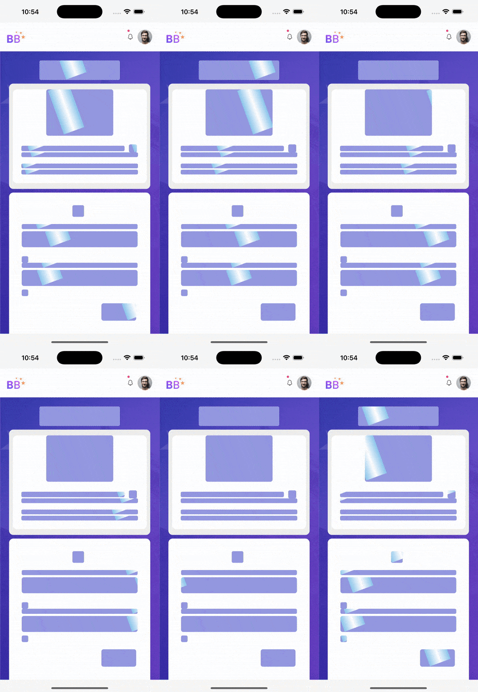
In the following example, you can customise background color and other properties in the page.
Apply Style to Widget
Using the following example, you can customise background color, border width of Skeleton and other properties for a specific widget in the page.
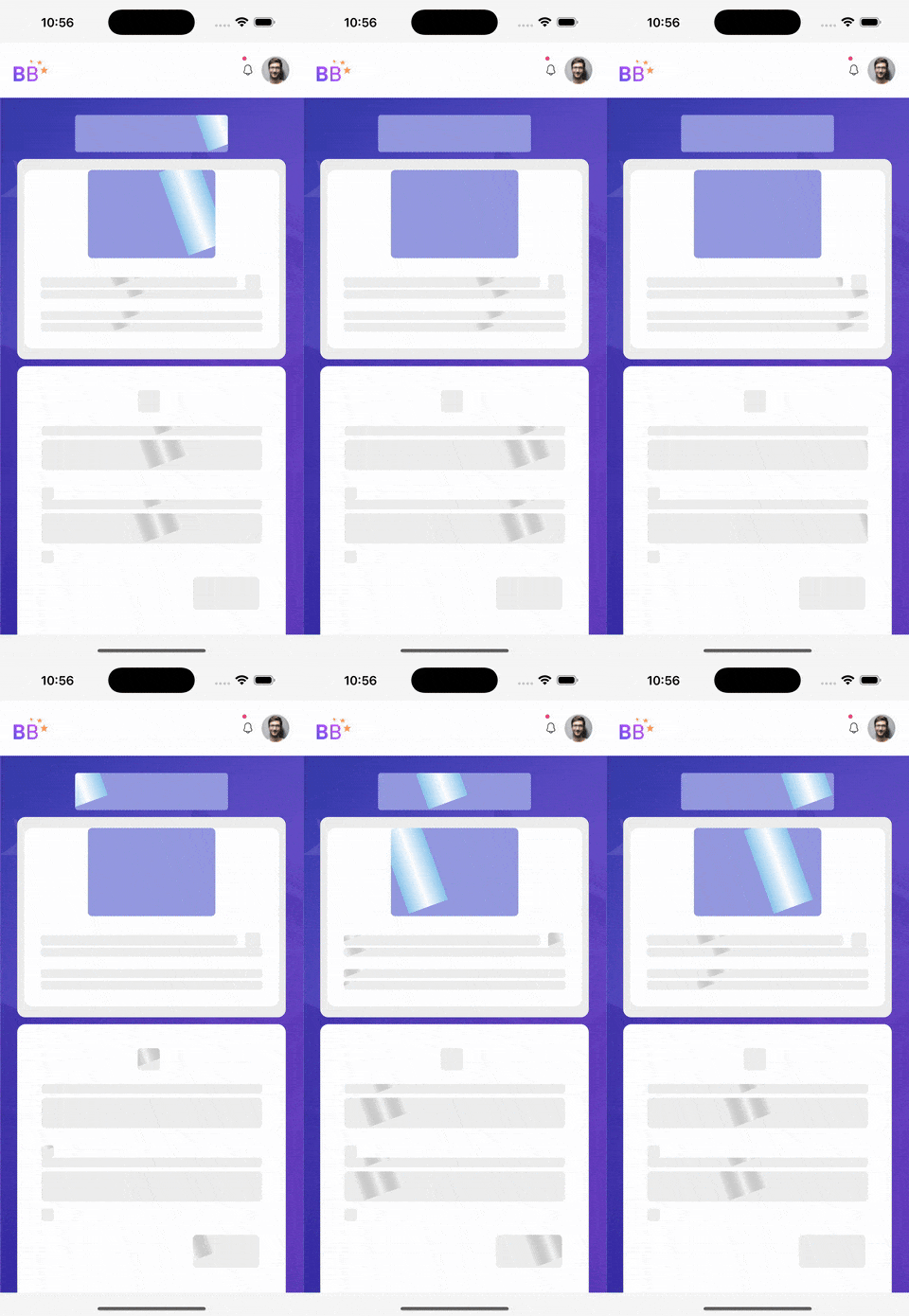
Apply Style to Class
Using the following example, you can customise background color, border width of Skeleton, and other properties for a specific class inside a widget in the page.
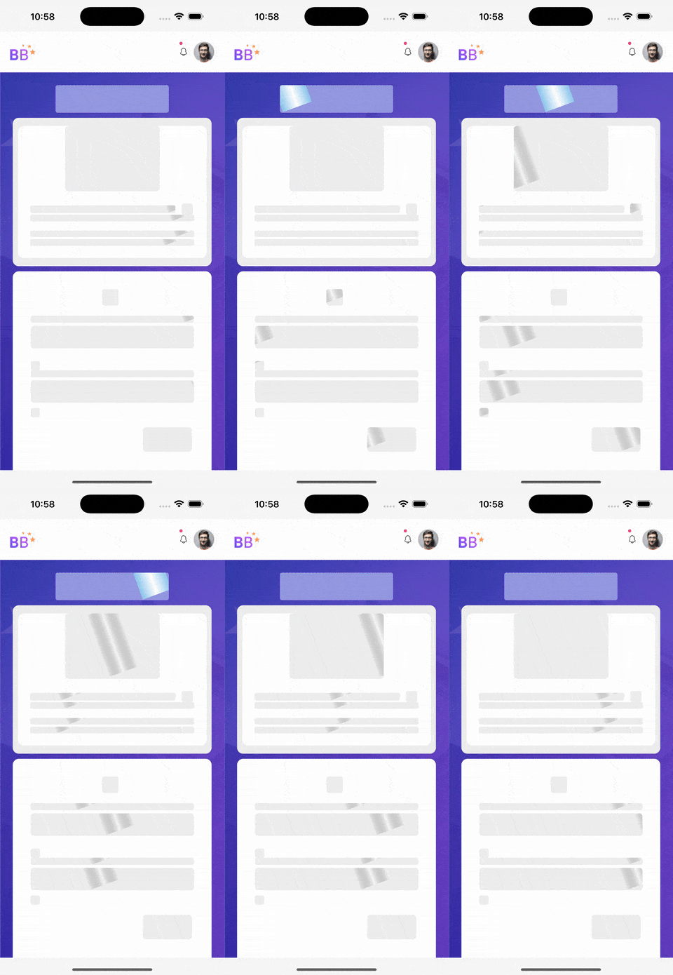
Using Lottie Animations
You can create engaging user experiences using Lottie animations, which helps add visuals to your app, making it more engaging and memorable. Before implementing Skeleton Loader using Lottie animation, ensure the following steps are taken.
Prerequisites for Using Lottie Animation
- Resource File: Keep the resource file handy, for example, a JSON file.
- Lottie Animation Resource as Skeleton Loader: Ensure the resource path provided in the
skeletonanimationresourceproperty is correct for Page, Prefab, and Partial. See Uploading Animation Resource File.
Uploading Animation Resource File
If you want to apply the custom animation resource using Lottie, you need to first download and upload the animation resource JSON file.
- Go to File Explorer > click + icon to add new resource.
- Click Upload Files the required resources under animation in resources folder. You can also view it in the studio.
Applying Lottie Animation to Page
To add more dynamic animations, you can integrate Lottie. The uploaded custom animation can be applied to the Page using the Skeleton Animation Resource property in the Properties panel.
- Click on the page components.
- Navigate to the
Skeleton Animation Resourceproperty in Properties panel. - Click bind icon and go to Resource section in the Bind dialog.
- Select pagecontent_skeleton.json file. Click Bind to apply the custom animation to all components at the Page level.
In the below video, you can see how the Skeleton Loader appears after using the animation resource.
Previewing Skeleton Loader During Developement
To ensure the Skeleton Loader implementation and make development easier, you can enable the Skeleton Loader throughout your application to test the visual design while building your UI.
- After applying the Skeleton Loader in your application, click Preview.
- Right click on the screen to click Inspect.
- Go to Console, and set the
showskeletonproperty as true to enable the Skeleton Loader and false to disable it. Add the following code.
Debugging Skeleton Loader
Applying Skeleton Loader to all Widgets
When the Skeleton Loader is enabled at the application level, it applies to all components on all the pages. However, users can override this behavior for specific components by setting the showskeleton property to false. This means all components will show the Skeleton Loader, except those where this property is disabled.
For example, the showskeleton property value of one of the three button components is set as false in the Markup tab.
If you want to apply the Skeleton Loader to all components on the page, including button3, set the showskeleton property to true.
Skeleton Loader Styles
You can use CSS classes to customise the Skeleton Loader. For example, the below code can be used to customize the skeleton of a button.
In the CSS file add the below code in the given format.