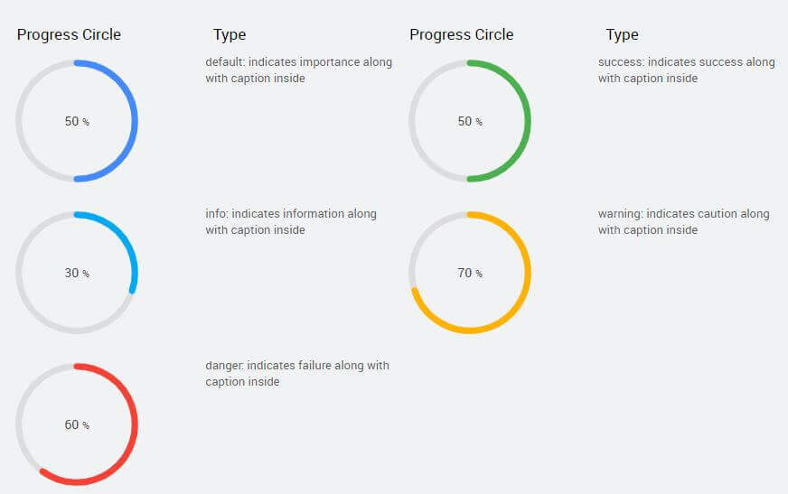
| Title | Title of the progress cirle. |
| Subtitle | Subtitle of the progress circle. |
| Name | The name is a unique identifier for the progress circle widget. |
| Type | Indicates the format you want to use to display the progress circle. Choose from - default, - success, - info, - warning, - danger, |
| Accessibility | Hint Any text or an HTML you enter for this property will be shown as a tooltip if the mouse hovers over this widget for 1.5 seconds. |
| Layout | |
| Width | The width of your widget can be specified in px or % (i.e 50px, 75%). |
| Height | The height of your widget can be specified in px or % (i.e 50px, 75%). |
| Value | Set this property to a variable to populate the list of values to display. |
| Default Value | |
| Value | Value is the default value to display value for an editor widget. Note that the display value is just what the user sees initially, and is not always the dataValue returned by the widget. |
| Minimum Value | Enter minimum number for the Progress bar. |
| Maximum Value | Enter a maximum number for the Progress bar. |
| Behavior | |
| Show | Showing determines whether or not a component is visible. It is a bindable property. |
| Display Format | The format in which the progress needs to be displayed. You can choose from a list of decimal options like 9, 9.9, 9.99, etc. If the progress bar's data value is 30.7056 and the selected display format is: - 9.9 then label will be rounded as 30.7 - 9.999% then label will be rounded to 30.706% |
| Caption placement | Placement of progress bar value can be - inside or - hidden |
