Chart Widgets
Use chart widgets to represent data in a pictorial format. Using chart widgets, you can transform data into various chart types.
Chart Types
In WaveMaker Studio, you can use the following chart types as specified below.
This documentation page and charts may take a few seconds longer to load. Wait for the charts to load fully.
1. Line Chart
2. Area Chart
3. Column Chart
4. Bar Chart
5. Pie Chart
6. Donut Chart
7. Bubble Chart
Chart Comparison
The chart type property can be used to portray the data in various forms. Each type has its own advantages and disadvantages. Select the appropriate type depending upon the data and what you want to represent.
- Comparison of data is the most common usage of charts. It can be:
- Comparing quarterly sales figure over a period of 3 years in which case a column chart would be best
- Comparing the sales figures of say 10 different brands of any given product, wherein a bar chart would be most ideal
- Trying to follow a trend like population over a period of time would be best depicted by a line chart
- A composition of data like types of users for a product can be depicted accurately through a pie chart.
- Bubble chart can be used to show three dimensions in a chart. Apart from the x-axis and y-axis, the size of the bubble can represent the third dimension.
Choose the type according to your need, you might want to try different types before settling for the best.
Features
Charts are used for graphical display of data and WaveMaker charts come with the following features:
- The Title, Sub Heading, and Icon can be set.
- Data can come from various sources like database, web service or another widget and can be accessed through binding to Live or Service Variables
- The layout can be set in terms of themes, positioning, formats for labels, captions, axis etc..
- Types of charts for various purposes.
- Data aggregation and grouping for displaying summary graphs.
- Run-time user-interaction
- Capturing user selection
Data Sources
Data can come from various sources as listed below:
- From Database,
- From Live Filter,
- From Web Services.
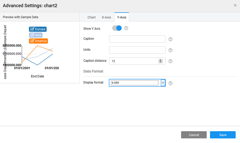
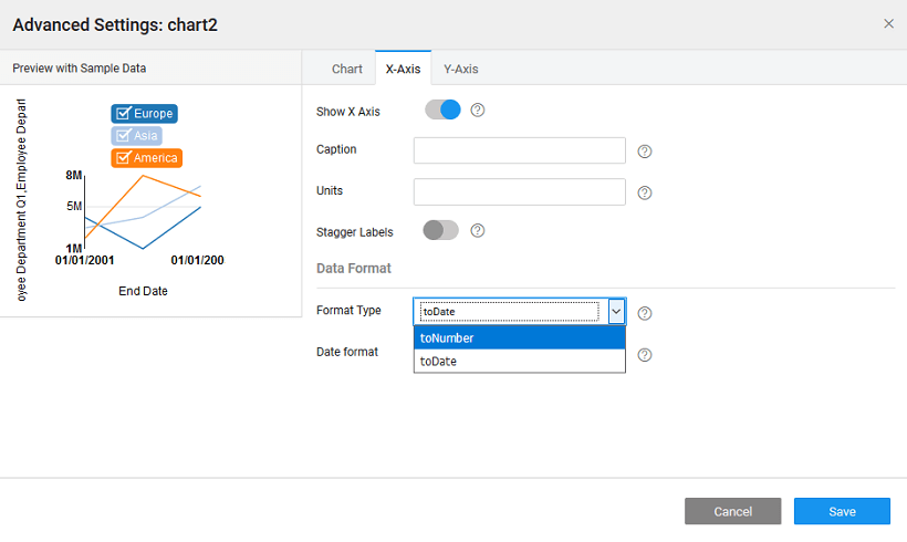
The X-Axis and Y-Axis values can be set to the fields from the data source, the chart is bound to.
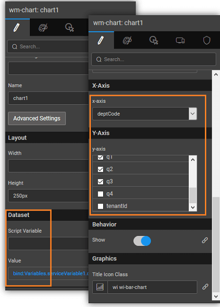
Depending upon the data type of the underlying fields, you can choose the Data Display Format.
In the case, when the data source is from Web Services or Web Socket, you can choose the Format Type to be toDate or toNumber.
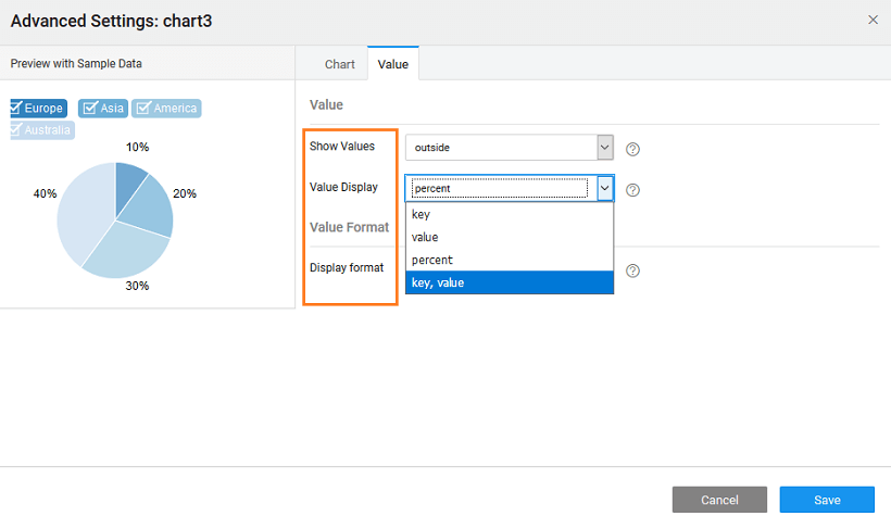
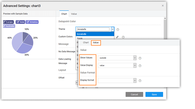
 For Pie and Donut charts, the options include Label and Value fields. You can specify
- the position of the Values - hidden, outside (default) or inside
- the Value to be displayed - as key, value, percent (default) or key-value pair
Layout
- The theme for charts can be chosen from a list of options.
- Custom Colors can be used to change the set of colors that comes predefined with the selected theme. The values for this property can be
- comma separated values, eg. red, green, blue
- bound to a static variable containing the color names or the color hash codes
- The position of the chart can be defined in terms of the offset values.
- Legend position can be set to be top or bottom.
- Layout of the values can be defined in terms of location, value format, caption for line charts and more
These options are available from the Advanced Settings of the chart. Apart from these properties, a Title, Sub Heading, and Icon can be assigned for the chart as a whole to be displayed on the top left corner of the Chart.
Data Representation
This property defines how the data is represented in the chart.
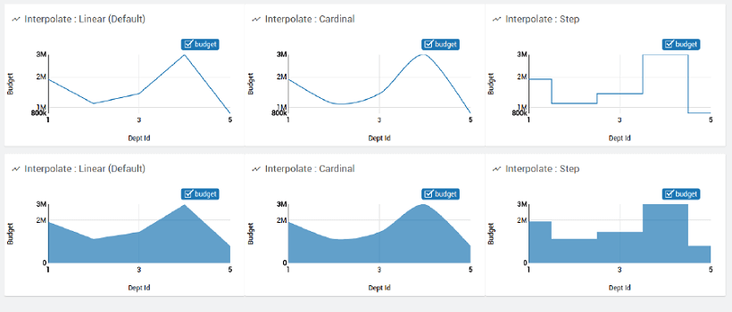
Datapoint Interpolation
Property determines how data points are joined and represented in the chart. This property is applicable to Line, Area and Cumulative Line Charts. Value can be set to:
- Linear,
- Cardinal for smooth curves, or
- Step
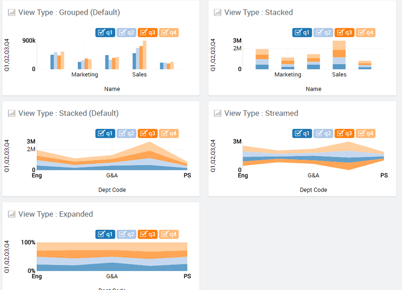
Data Arrangement
Data Arrangement Property (available only for Column, Area and Bar Charts) controls whether to show the areas in:
- stack,
- stream, or
- expand
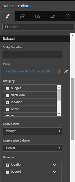
Data Aggregation and Grouping
When dealing with charts bound to live variables, you can add additional functionality to these charts. You can order the data, group the data and show the aggregate functions in your chart. The aggregation functions available are average, count, minimum, maximum and sum.
- In the Aggregation property and Group by property can be used to set the aggregation functions.
- Order By property can be used to set the column by which the data needs to be sorted. By default, it will be set to the Group by column selected.
- The values to be depicted on x and y-axis are set to the group by and aggregation columns respectively.
Interaction
- You can interact with the charts by selecting/unselecting the column names from the legend.
- Hovering mouse over any column displays the values of X and Y-Axis for that data point.
- These data points can be captured and used to bind to a widget for further display or computational purposes from the selected item of the chart widget
Capturing User Selection
You can capture user selection in two ways:
- The various outbound properties of a chart are available for binding to other widgets or variables. The fields under selecteditem will be from the underlying dataset used for binding.
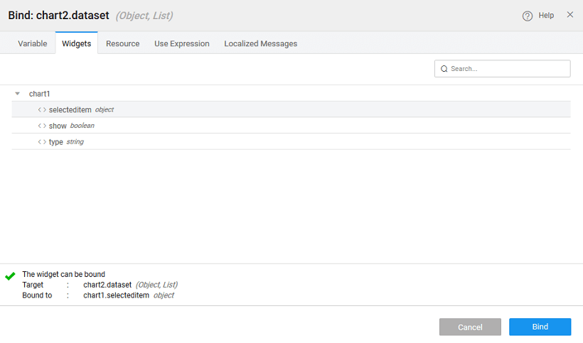
- These selected values can be accessed via JavaScript
Here we have used the On select event of the chart:
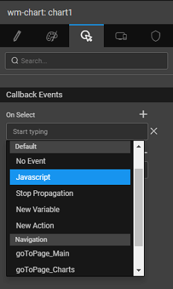
Chart Legend Captions
Chart legend caption is the label or description that gets displayed when you hover over the chart legend item in the chart. These labels help you in interpreting the chart by associating each data series or category with a descriptive label.
WaveMaker internally uses the nvd3 library to load the charts. But with the nvd3 1.0.3 version, the captions are not populating as expected in the chart. You can upgrade to the nvd3 1.8.1 version to fix the caption issues.
To upgrade the nvd3 library version to 1.8.1 you need to provide the below in the index.html file.
Populating Chart Legend Captions
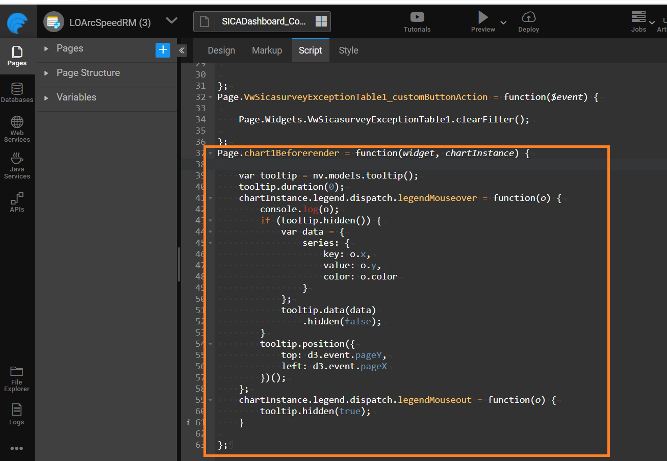
In WaveMaker studio, to populate the chart legend captions, you need to add the below specified JavaScript snippet on the chart On Before Render event.
- Create a Pie Chart.
- Set the Pie Chart's "On Before Render" property to JavaScript.
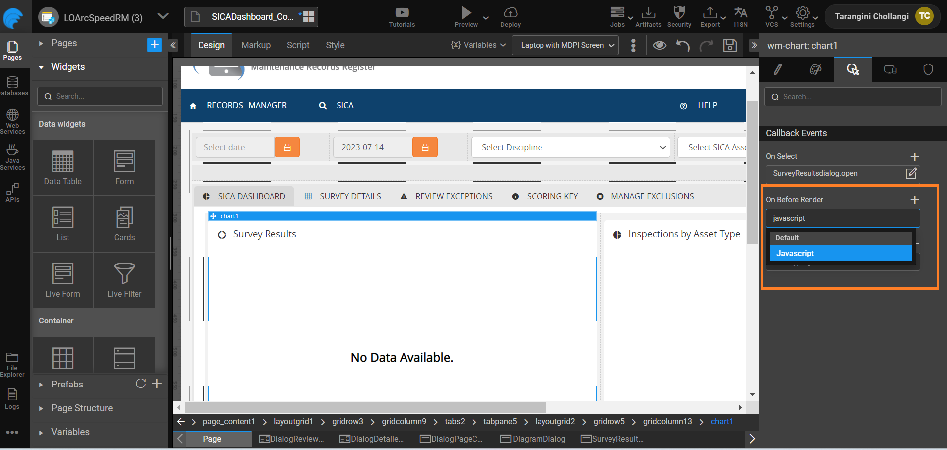
- Go to the Script and add the below code snippet in it.
Customizing charts with rounded corners
Inorder to achieve rounded corners for column and bar charts add class 'rounded-cornered-chart' and for area chart add class 'rounded-area-chart' to the chart widget.
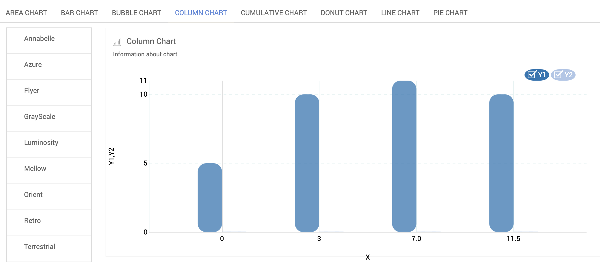
Column Chart
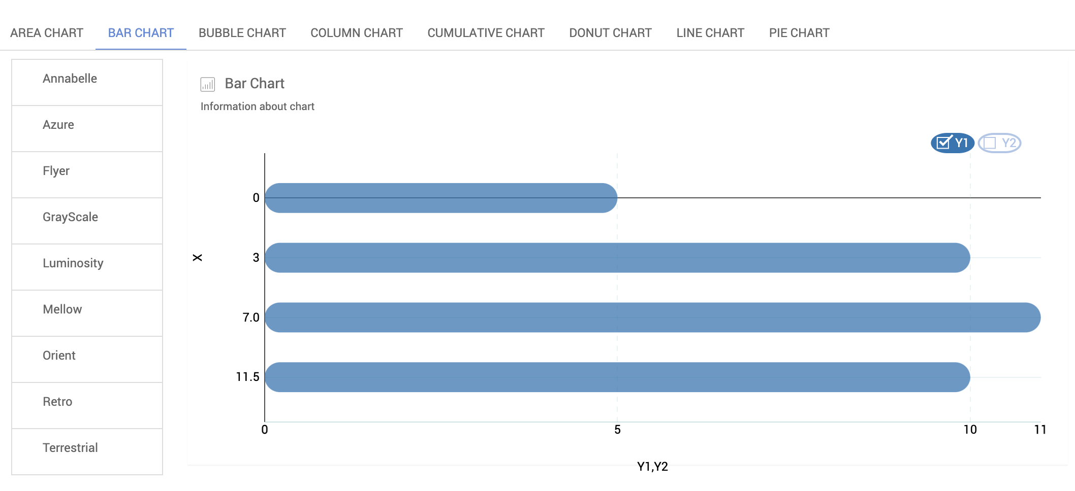
Bar Chart
Customizing grid line on the charts
Solid stroked line on x-axis and y-axis zero line can be achieved by adding 'stroked-zero-axis-line' class and dotted grid lines on y-axis can be achieved by adding 'dotted-yaxis-grid-line' class.
Stroked Zero line and Dotted Y-axis grid lines
](/learn/assets/rounded-column-chart.png)](/learn/assets/rounded-column-chart.png)