Accordion
An accordion is a stacked list of UI components, with only one focused component expanded at any point of time and the rest collapsed.
WaveMaker Accordion Widget is a collection of accordion panes where users can either place the content or include the partial pages. 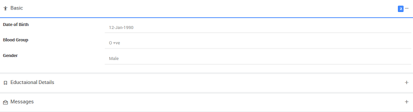
Features
When you drag and drop an Accordion, by default three accordion panes are provided. More accordion panes can be added by using Add Accordion Pane action. Within each accordion pane, widgets like Data Table, List etc can be dragged and dropped and you can hide/show accordion panes according to the app requirement. In addition, you can provide the content as Partial Pages – for example – create a partial page and use that content within an accordion pane.
Basic Features - Accordion
- Panes - Collection of AccordionPane controls
- Height - Set height to the Accordion. This will restrict the height of the accordion and scrollbar will appear in case the content is more.
- Close others - Check/Uncheck to allow multiple accordion panes to be visible parallelly.
Basic Features - Accordion pane
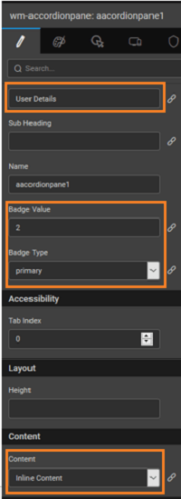
- Header - The Header of accordion pane contains a title and icon
- Sub Header - Sets subheading for the accordion pane
- Content - The content in the accordion pane. This can be either
- inline - HTML content, widgets etc.,
- partial - any partial you have created within the app can be used as pane content
- Badge - Indicated the small meaning information. The badge type can be set different styles - primary, success, info, warning, or danger on the accordion pane components to customize the look and feel. It can be bound to a variable, for example, to indicate the number of employees in a department
- Is pane default - Sets a default pane to be opened when the accordion is rendered

Accordion Types
Usage
Methods
The accordion has few methods exposed on widget scope which can be accessed via JavaScript. See below for usage example.
- to Collapse a pane:
- to Expand a pane:
- to toggles a pane i.e. opens if closed, closes if opened:
Script Access
Step 1:- (Prepare data and widgets)
- Create three variables of type ‘Employee’ entity and for 1st variable from variables tab select the variable and go to data tab and for deptid keep value as 1, do the same for others also as deptid 4, 2 for respective variables, name these variables as ‘EngineeringEmployeesData’, ‘SalesEmployeesData’, ‘MarketingEmployeesData’. Learn how to create variables from here.
- Drag n Drop Accordion widget. By default, you will see accordion with 3 accordion panes.
- Name ‘Accordion’ widget as ‘EmployeesAccordion’ and name accordion panes as ‘engineeringEmpPane’, ‘salesEmpPane’, ‘marketingEmpPane’.
- Change accordion panes titles to ‘Engineering’, ‘Sales’, ‘Marketing’.
- Drop ‘List’ widget in each of these tabs and bind to respective variables and map template widgets to respective fields.
- Drop two buttons and name the first button as ‘collapseSalesBtnPane’, the second one as ‘expandSalesBtnPane’ and also change the titles to ‘Collapse Sales Employees Pane’, ‘Expand Sales Employees List’.
Step 2:- (Scripting with accordion)
- Select JavaScript for the on click event of ‘collapseSalesPaneBtn’ and use the following as JavaScript function with the following script:
- Select JavaScript for the on click event for ‘expandSalesPaneBtn’ and use the following script:
Step 3:- (Run)
- Run the application and by default first accordion will be expanded by default or if any pane is set as isDefaultPane that particular pane will be expanded on a load of the page.
- Now click on ‘expandSalesPaneBtn’ and see sales accordion pane will be expanded.
- Now click on ‘collapseSalesPaneBtn’ and see sales accordion pane will be collapsed.
Properties
| Property | Description |
|---|---|
| Name | The name is a unique identifier for the Accordion. Special characters and spaces are not allowed in widget name. |
| Add Accordion Pane | This action allows one to add multiple panes to the Accordion. |
| Accessibility | |
| Tab Index | The tab index attribute specifies the tab order of an element. You can use this property to change the default tabbing order for widget access using the tab key. The value can range from 0 to 32767. The default is 0 and -1 makes the element non-focusable. |
| NOTE: In Safari browsers, by default, Tab highlights only text fields. To enable Tab functionality, in Safari Browser from Preferences -> Advanced -> Accessibility set the option "Press Tab to highlight each item on a webpage". | |
| Layout | |
| Height | The height of your widget can be specified in px or % (i.e 50px, 75%). |
| Behavior | |
| Show | Showing determines whether or not a component is visible. It is a bindable property. |
| Load on Demand (visible only when show property is bound to a variable) | When this property is set and show property is bound, the initialization of the widget will be deferred till the widget becomes visible. This behavior improves the load time. Use this feature with caution, as it has a downside (as we will not be able to interact with the widget through script until the widget is initialized). When show property is not bound the widget will be initialized immediately, irrespective of this property setting. |
| Close Others | This property specifies whether, on clicking of an accordion panel, other panels should close or not. |
Accordion Pane SubWidget of Accordion, to hold the accordion header and content.
| Property | Description |
|---|---|
| Title | This bindable property defines the heading or title for the accordion pane. |
| Sub Heading | This bindable property defines the subheading for the accordion pane. It is displayed right below the Title of the Pane. |
| Name | The name is a unique identifier for the accordion pane. Special characters and spaces are not allowed in widget name. |
| Badge Value | Value to be displayed in the badge area on the right edge of title next to the expand/collapse button. It is a bindable property. |
| Badge Type | This bindable property controls the color of the badge. The values are: - default, - primary, - success, - info, - warning, - danger. |
| Accessibility | |
| Tab Index | The tab index attribute specifies the tab order of an element. You can use this property to change the default tabbing order for widget access using the tab key. The value can range from 0 to 32767. The default is 0 and -1 makes the element non-focusable. |
NOTE: In Safari browsers, by default, Tab highlights only text fields. To enable Tab functionality, in Safari Browser from Preferences -> Advanced -> Accessibility set the option "Press Tab to highlight each item on a webpage". | | Layout | | Height | The height of the widget can be specified in px or % (i.e 50px, 75%). | | Content | | Content | Bindable property, specifies the content to be displayed within the Accordion Pane: - Inline Content - HTML content or any widget. - Page Content - in the form of Partial pages created within the app, choose from the available list. | | Behavior | | Show | Showing determines whether or not a component is visible. It is bindable. | | Is Default Pane | This bindable property determines if this pane is the default pane. | | Graphics | | Icon Class | This bindable property defines the class of the icon that is applied to the button. |
Events
The following events are available on the Accordion Panes
| Event | Description |
|---|---|
| On load | This property defines the event handler for the load event of the accordion panes. |
| Callback Events | |
| On expand | This property defines the event handler for the expand event of the accordion panes. |
| On collapse | This property defines the event handler for the collapse event of the accordion panes. |