Panel
A panel can be used to group a set of widgets together. It has a collapsible title bar and you can add multiple panels and any number of multiple panes can be open at any given point of time.
A panel has designated sections such as header, body, and footer. 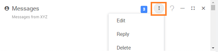
Features
- You can define the content of the panel to be another page, partial page or place widgets in the panel.
- The various properties can be set for the panel as per your needs:
Actions - entering a comma separated items or binding to a variable, would give a drop-down menu widget which can be handled.
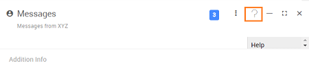
Help Text - entering text either in plain format or an HTML format will enable help icon on the title bar of the panel which on click would display the help content.
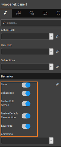
Collapsible - lets the user collapse or expand a given panel at runtime. Note: When the content of Panel widget is set to a partial and the initial state is collapsed, the loading of the partial is deferred/delayed until the widget is expanded for the first time.
Enable Full Screen - lets the user make panel full screen
Expanded - defines the default behavior of the panel
Enable Default Close Action - lets user close the panel. This triggers an onClose event, which the developer can choose to handle through JavaScript code.
Animation - controls the animation behavior of the panel
Icon Class - defines the icon to be displayed on the header


Usage
Panel Styles
Panel style can be set by using the Class Name option from the Styles tab of the Properties panel. You can also use the Conditional Class property to set the class based upon a condition. See here for How to.
Methods
The panel has few methods exposed on widget scope which can be accessed via JavaScript. See below for usage example
- to close a panel:
- to expand a panel:
- to collapse a panel:
- to toggle panel status:
- to displays panel in full screen:
- to show the help text as set from the properties panel:
Script Access
Step 1:- (Prepare data and widgets)
- Create three variables of type ‘Employee’ entity and for 1st variable from variables tab select the variable and go to data tab and for deptid keep value as 1, do the same for others also as deptid 4, 2 for respective variables, name these variables as ‘EngineeringEmployeesData’, ‘SalesEmployeesData’, ‘MarketingEmployeesData’. Learn how to create variables from here.
- Drag and Drop two Panel widget.
- Name first ‘Panel’ widget as ‘engineeringPanel’ and second ‘Panel’ widget as ‘salesPanel’.
- Check ‘collapsible’ and ‘closable’ on both the panel widgets from properties panel options.
- For ‘engineeringPanel’ uncheck the ‘expanded’ property from properties panel as shown above and for ‘salesPanel’ check the ‘Enable full screen’ option from properties panel.
- Change title of ‘engineeringPanel’ to ‘Engineering’ and subheading to ‘Dept’ and change title of ‘salesPanel’ to ‘Sales’ and subheading to ‘Dept’.
- Drop ‘List’ widget in each of these panels and bind to respective variables and map template widgets to respective fields.
- Drop three buttons and name the first button as ‘collapseSalesBtn’, the second one as ‘expandEngBtn’ and last one as ‘closeSalesBtn’ and also change the captions to ‘Collapse Sales Panel’, ‘Expand Engineering Panel’, ‘Close Sales Panel’.
Step 2:- (Scripting with accordion)
- Select JavaScript for on click event of ‘collapseSalesBtn’ and use the following as javascript function with the following script:
- Select JavaScript for the on click event for ‘expandEngBtn’ and use the following script:
- Select JavaScript for the on click event for ‘goToSalesBtn’ and use the following script:
- Select JavaScript for the on click event for ‘closeSalesBtn’ and use the following script:
Step 3:- (Run)
- Click on ‘Collapse Sales Panel’ and see it toggles the sales employees panel i.e if expanded closes it and if closed expands it.
- Click on ‘Expand Engineering Panel’ and see it toggles the sales employees panel i.e if expanded closes it and if closed expands it.
- Click on ‘Close Sales Panel’ and see it closes the Sales panel.
Properties
| Property | Description |
|---|---|
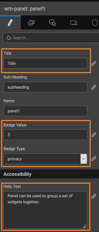
| Title | Set the title of the panel. It is bindable. |
| Sub Heading | Set the subheading of the panel. It is bindable. |
| Name | The name is a unique identifier for the panel. |
| Badge Value | Value to be displayed in the badge span. It is bindable |
| Badge Type | This bindable property controls the color of the badge. These values are default, primary, success, info, warning, danger. |
| Accessibility | |
| Help Text | If this property has a value, a "?" icon is added next to your editor. If the user points the mouse at this icon, the text you put into this helpText property will popup for the user. |
| Layout | |
| Height | The height of your widget can be specified in px or % (i.e 50px, 75%). |
| Content | |
| Content | Html content(in the case of an HTML widget) or Page's content(in the case of page container widgets) will be included in the widget. |
| Actions | |
| Menu Actions | This bindable property sets the actions for the widget. To set the data and events see dropdown menu widget. |
| Action Label (available only when the above Menu Actions is bound to a variable) | Label for anchor or menu tags generated dynamically. | | Action Icon (available only when the above Menu Actions is bound to a variable) | Class for the action. Example- 'fa fa-ban' or 'glyphicon glyphicon-cloud'. | | Action Link (available only when the above Menu Actions is bound to a variable) | Link for the action item. | | Action Task (available only when the above Menu Actions is bound to a variable) | Task for menu items generated dynamically. This is the action that will be triggered when the user clicks on the Menu Item. It can be a script like: Widgets.label1.show or Variables.v1.invoke() Execution order on click of Node: 1. If provided onSelect will be executed first. 2. If provided Action will be executed next. 3. If provided Action link will be executed last. | | User Role (available only when the above Menu Actions is bound to a variable) | Role for menu items generated dynamically. You can assign the property to 'userrole' which contains comma separated user roles. Each item will be evaluated with given 'userrole' for that item to that of the logged in user roles, from security. If any of the user roles bound to 'userrole' property matches then that menu item will be shown else will be hidden. | | Sub Actions (available only when the above Menu Actions is bound to a variable) | When an action is required the sub-items can be mentioned in the children. | | Behavior | | Show | Showing determines whether or not a component is visible. It is a bindable property. | | Load on Demand (visible only when show property is bound to a variable) | When this property is set and show property is bound, the initialization of the widget will be deferred till the widget becomes visible. This behavior improves the load time. Use this feature with caution, as it has a downside (as we will not be able to interact with the widget through script until the widget is initialized). When show property is not bound the widget will be initialized immediately. | | Collapsible | Enable control for collapsing and expanding the panel. | | Enable full screen | Enable control for making the panel full screen. | | Closable | This property defines if the panel should be allowed to be closed. | | Expanded | Set the default state of the panel whether it is expanded or collapsed. | | Auto Close | This property defines the behavior of menu closing, it can be: - outsideClick - close the menu when clicked outside of the menu, - always - when a menu item is selected or on click outside menu, or - disabled - do not close once opened. | | Animation | This property controls the animation of an element. The animation is based on the CSS classes and works only in the run mode. | | Graphics | | Icon Class | This property defines the class of the icon that is applied to the button. |
Events
| Event | Description |
|---|---|
| On load | This event handler is called when the panel is loaded. |
| Mouse Events | |
| On mouse over | This event fires when the mouse hovers over this widget. |
| On mouse out | This event fires when the mouse moves away from this widget. |
| On mouse enter | This event handler is called whenever the mouse enters the widget. |
| On mouse leave | This event handler is called whenever the mouse leaves the widget. |
| Touch Events | |
| On swipe up | This event handler is called whenever a swipeup event is triggered. |
| On swipe down | This event handler is called whenever swipe down event is triggered. |
| On swipe left | This event handler is called whenever swipe left event is triggered. |
| On swipe right | This event handler is called whenever a swiperight event is triggered. |
| On pinch in | This event handler is called whenever pinch event is triggered. |
| In pinch out | This event handler is called whenever a pinchout event is triggered. |
| Keyboard Events | |
| On enter key press | When the user hits ENTER/Return while the focus is in this editor, execute the specified event handler. |
| Callback Events | |
| On close | This event handler is called whenever a close event is triggered. |
| On expand | This property defines the event handler for the expand event of the accordion panels. |
| On collapse | This property defines the event handler for the collapse event of the accordion panels. |
| On actions click | This event handler is called when the actions icon is clicked. |
| On full screen | This event is called on the full-screen state of the widget. |
| On exit full screen | This event is called on the full-screen state is exited. |