Wizard
Wizards UI are suitable for tasks that have multiple independent steps, wherein the user is taken through each step to comprehend the task in a structured manner. Wizards have steps with a specific UI style that facilitates easy navigation. Wizards provide previous and next step buttons for the user to confirm their selections/actions in each of these steps. Users can also cancel the task at any step. Wizards also provide Done or Finish button at the end of the final step, to indicate that all the steps are finished.
There can be many use case scenarios where a wizard can be used. Examples of some common use cases are as follows:
- On-line Payments
- Product Orders
- Review of Documents
- Software Installations
- Register Accounts in Websites
- Project/App Configurations
Features
Wizard widget facilitates the user through the procedural interface to perform tasks in a specific pre-defined order.
- WaveMaker Wizard widget has one step by default and user can add multiple steps using the Wizard Add Step property.
- Next Step button is added to all steps except the last step where a Done button is used to complete the wizard process.
- Previous Step button is added to all steps except the first step.
- Custom Caption for Action Buttons:
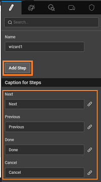
Next and Previous: To navigate through the steps of the wizard we have Next and Previous buttons in the wizard widget. The caption for these buttons can be changed using the Next caption and Previous caption properties available in the Wizard basic properties. The captions are also bindable.
Done and Cancel Buttons: The Wizard also has a Done and Cancel Button which perform actions for Completion of the task or for Canceling of the task respectively. These button captions can be changed using the Cancel action caption and Done action caption properties respectively. Each of the above captions is also bindable.
Previous and Done Buttons: These buttons can be disabled from the Script using the disabledone and disableprevious properties. For example, using productStep.disabledone = !paymentOption.datavalue;, will enable the Done button only when a payment option is checked.
Layout
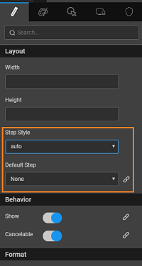
Step Style: can be set as auto or justified
Default Step: bindable property acting as the starting point for the wizard. For instance, if default step is set to step 3, then at runtime the third step is the active step on a load of the wizard with the previous two steps marked as complete.

Behavior: Show property of the wizard can be used to show/hide the wizard based on a variable’s value. Show feature is bindable and can be bound to a boolean field in a dataset.
headernavigation:
headernavigationproperty can be added in the Markup script and set as False to disable the navigation through Wizard stepper header numbers.Events in Wizards:
The callback events for Wizard will fire on the trigger of the specific event:
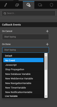
- OnDone: This is a callback which fires when the Done button is pressed at the end. For Example, when Done button is clicked by the user, the order status can be set to Order Shipped and Tracking Details page can show up.
- OnCancel: This is a callback which fires when the Cancel button is pressed at the end of the steps.
Wizard Step Features
The Step UI is designed with a unique style to differentiate from a tab and to start with the first step will be enabled and the remaining steps are disabled. Each of these steps has the following features that can be manipulated.
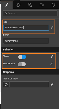
- Title: This is the title that appears on the step, which is changed by the user in the wizard step properties.
- Content: The content can only be an inline content which means that you have to design each step of the wizard like you design every page in WaveMaker. You cannot use partial content in any step of the wizard.
- Behavior: consists of the following properties that can be configured:
- Show: The Wizard step can be shown or hidden by checking it on/off. The step can also be shown or hidden by binding the show property to a boolean field.
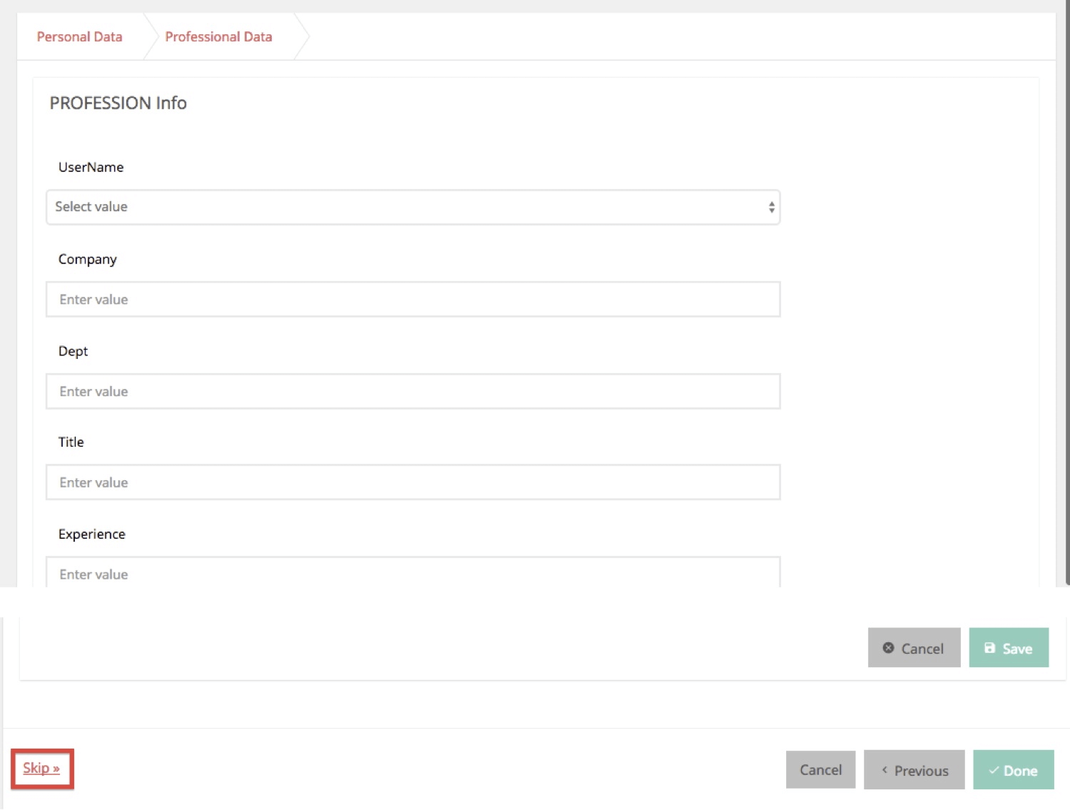
- Enable Skip: This feature will allow you to skip a step and jump to next step. This can be turned on or off in the wizard step properties. It appears only as a link when turned on and at run-time when clicked it moves to the next step without doing anything in the current step. The user can plugin JavaScript handlers to apply some logic when the skip link is clicked.
- Other Step Features include:
- Disable Next: This feature is not exposed as a property in the wizard and it is only available through scripting. The user can avail this feature by writing a JavaScript to disable the next step that can get invoked on Load event of the step to be disabled. Disable Next will be useful if the user has provided some information in the current step wherein next step information may become irrelevant to the user. For example: In an Employee Application form Wizard, there may be some step which would expect the user to provide information regarding previous employment. If the user has entered No for a question on Previous Employment in the current step and if the next step is for giving details on Previous Employment, Disable Next is a viable option.
- Enable Done button: This feature is also not exposed as a property in the wizard widget and it is only available through scripting. This can be done by on Load event of that step. The user can write a javascript function to enable Done button in a step if responses and actions for the step by the user are good enough to complete the task at that step itself. In the case of Configuration Management, a Config Wizard can take you through many steps wherein some initial steps will be mandatory and later steps may be for an advanced user. In that case, the Done button can be enabled in the step where all basic information has been provided by the user so that user can complete the task.
- Wizard Step Events: There are callback events for every wizard step that will fire on the happening of such events. Based on user entries and confirmations in the current step, the next step contents can be populated. Wizard scope and step scope will be passed as an argument to the respective callback event. Hence, your javascript function will have access to the Wizard scope and step scope.
- On Load: This is a callback which fires when onLoad of the particular step happens and only the wizard scope will be passed on to the callback event. If a user is writing a JavaScript function to handle this event, the user will be able to access the wizard scope and using that can access any widgets in that scope. OnLoad on a step can be used to populate some values in a widget based on other widgets. For example, one can populate the orders pending for a department based on the Dept id or Name.
- On Next: This is a callback which fires when the next step button is clicked by the user in a step. When the event fires the wizard scope and step scope will be passed as arguments to On Next callback. If you plan to invoke a JavaScript function when the event occurs, you will be able to have access to these scopes and access the widgets with respect to wizard scope and access the properties with respect to the steps. This can be used to do some updates to a field based on the user’s response in the step and the next step can show the result of the updates made. For example, once the user confirms the order, the order status field in the orders table can be set to Confirmed and it can take the user to payment step.
- On Prev: This is a callback which fires when the Previous button is clicked by the user in a step. When the event fires the wizard scope and step scope will be passed as arguments to On Prev callback. If you are implementing a JavaScript function to invoke when the event occurs, you will be able to have access to these scopes within your function. The user can make some edits or deletes to some content in the previous steps. For example, once the user has added items to the cart in one step and has moved to next step and later decides to remove that from the cart, the user can use the previous step to make such edits.
- On Skip: You will be able to skip steps by enabling skip on these steps by setting the Enable Skip property on the step to on. Once Enable Skip is on, the user will be able to see a Skip link at the left bottom of the wizard in the step for which Enable Skip is on. This callback fires when the skip link is clicked by the user in that step. If the user wants to set some defaults for the required fields in the step before he jumps to the next step, he can handle this callback. On Skip event will not take the scopes as arguments. The user can use this in case you want to assign some flags or some required values to some of the fields in the respective step UI. The user can also skip in case he does not have the necessary details to complete that step. While Registering an Account in any e-commerce site, after giving the profile information, the wizard may have one of the steps which asks for payment related details like credit card number etc. We normally skip that step as it is not necessary to provide that information while registering.
Widgets in Wizard
- Each step in the wizard can have any kind of widgets depending on the usage scenario – for example -Live form widget, Data Table Widget, a list widget, Grid Layout with Label and Text Widgets.
- The Widgets are to be dragged and dropped into Wizard Step Area. Once a step is selected, the wizard step is highlighted and the appropriate widget can be dropped on that area.
- For user entries in a step, the recommended widget is a Live Form where the wizard’s next button of that step will be disabled until all required fields in a form are entered by the user. The validations which are by default available in a form will be available within the wizard step also.
- You can also have a Dialog and drag and drop a wizard into the Dialog which will give a Dialog with steps which can be hidden once the steps are completed by clicking the Done button on the wizard.
- You can drag and drop any Live and Data widgets as well as basic widgets onto a wizard step.
Usage Scenarios
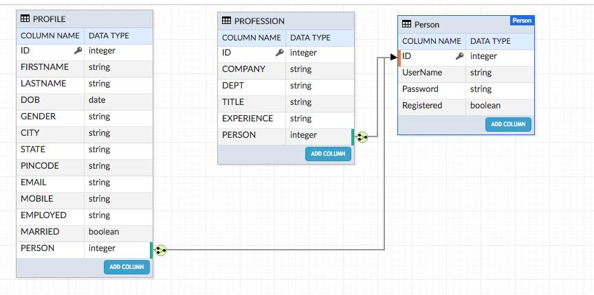
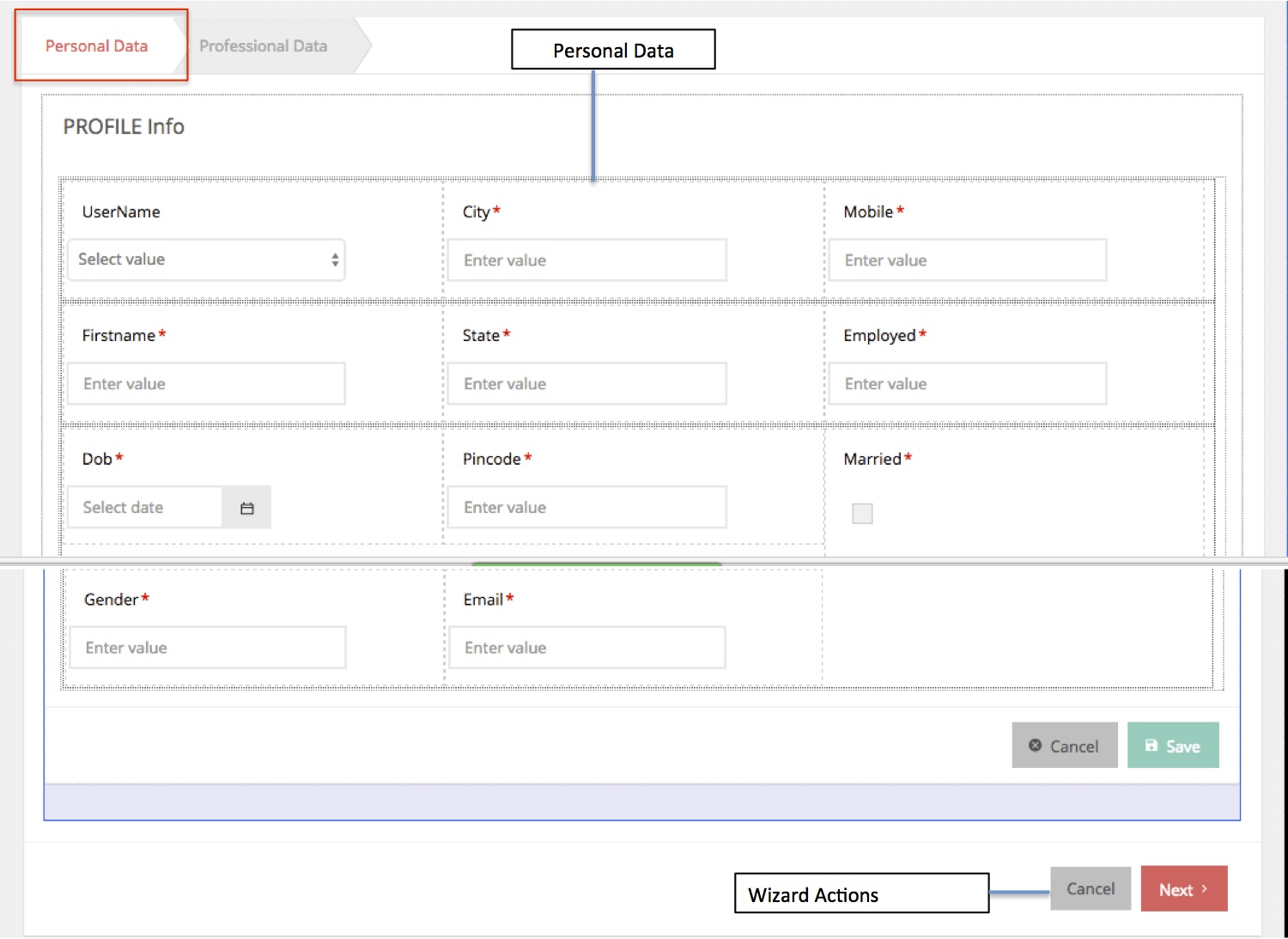
A basic usage scenario is used to go through the wizard interface step by step trying to build a Registration Form. A Generic Registration Form that can be used by any websites to get their users registered to their sites, for example, accessing trial versions of products, or for buying goods online etc. In this scenario, the user is asked to register when they need to access some resources that need registration. To register, the user is provided a Registration form for creating username and password for that user. Once the user has given the inputs, the user navigates to a page where the user has to add personal information and if the user is employed the professional data also has to be supplied by the user. Once the required data is provided by the user the user is registered and is informed of the success of registration. The scenario assumes that you will be creating the required data model for taking the login data (Person Entity), profile (Profile Entity) and professional (Profession Entity) data inputs from the user.
Step 1: Setup
This is the set-up of an existing page - Getting Basic Details from the User for Registration with a button to invoke the Wizard to add Profile and Professional data.
- Create a page named UserRegistration to take the basic user data for Person entity.
- UI Design for the Page: use Data Table to display/add/edit person details
- Add button to invoke wizard to add profile and profession data - Click event should navigate to the wizard page (WizardBasic) which will be designed in the next step
- Run the App and give the inputs as needed.

Step 2: Basic Properties
- Create a Page named WizardBasic in WaveMaker App
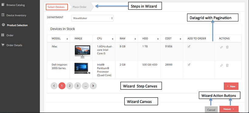
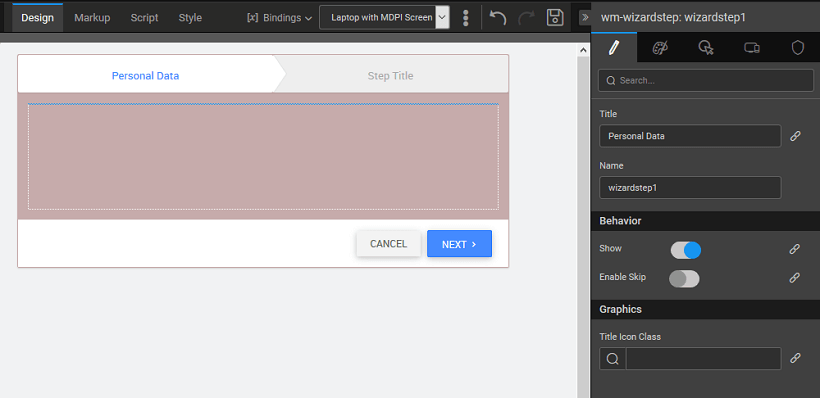
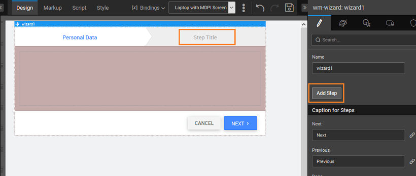
- Drag and Drop a wizard on the canvas. Once the Wizard is dropped onto the canvas, you will see the UI as shown below. By default only one step with the Title as Step Title is created. Note there are two action buttons – Cancel and Done respectively

- Edit the Title of the Step: Click on the step and in the properties panel change the Title to Personal Data.
- Adding More Steps to the Wizard: Add one more step – click on the wizard canvas and click on Add Step. Change Step Title to Professional Data by using the Title property of the step.
Step3: Design UI
Design the UI for Personal Data Step: Live Form bound to the Personal entity, using 3-column layout.
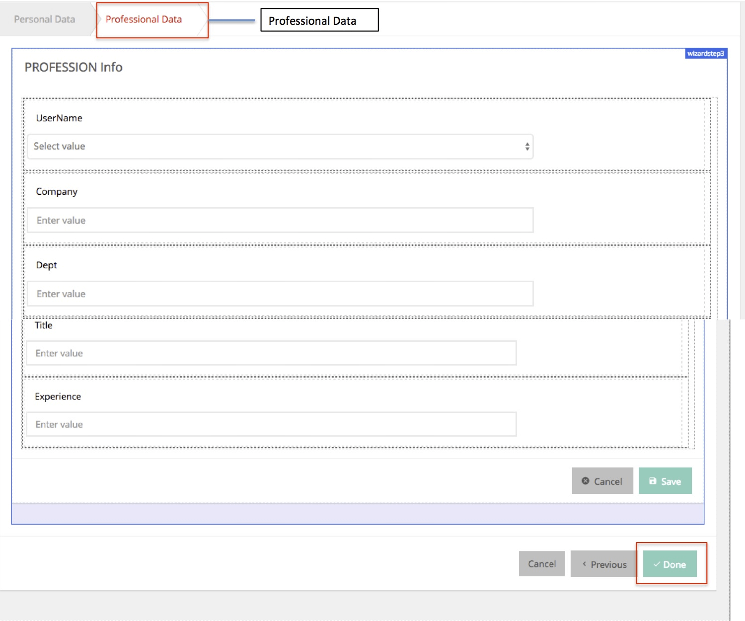
Design UI for Professional Data Step: Live Form bound to the Professional entity, using 1-column layout.
Step 4: Event Configuration
- Writing Event on the Wizard Step1 (Personal Data)
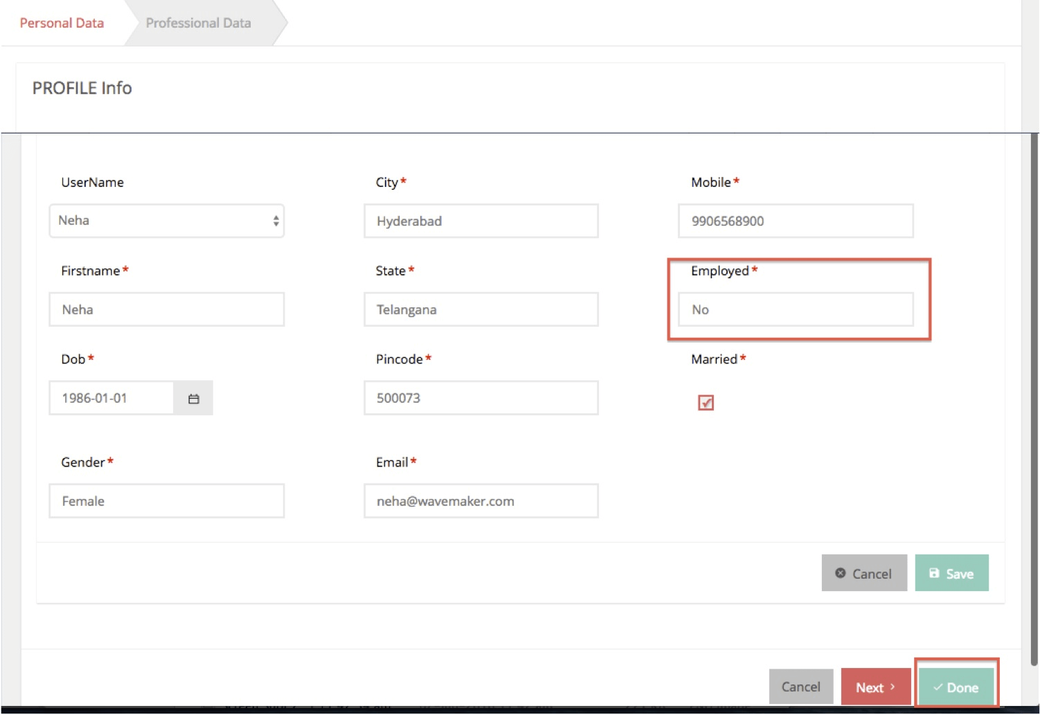
- On Next: Use Case – When the User is not Employed – On Blur Event of employed field In Personal Data Step when the user tabs out after entering a value in employed form field of Live Form On Blur event is fired. In the above use case, if the user does not wish to proceed to input Professional data as the user is not employed; then the appropriate handler has to be plugged into the On Blur of the employed field. This example has an On Blur JavaScript handler that does the following:
- Gets the data value of the employed widget and assigns it to the employed variable.
- If the employed data value is “No” it enables the Done button in this step itself as the user can complete the registration in step 1 itself without going to step 2.
- On Next: Use Case – When the User is not Employed – On Blur Event of employed field In Personal Data Step when the user tabs out after entering a value in employed form field of Live Form On Blur event is fired. In the above use case, if the user does not wish to proceed to input Professional data as the user is not employed; then the appropriate handler has to be plugged into the On Blur of the employed field. This example has an On Blur JavaScript handler that does the following:
- Writing Event on the Wizard Step 2 (Professional Data) – On Done:
- On Done: Use Case –When the User is Employed. In this case, the user is allowed to move to the next step to enter professional data. Once entered and Done button is clicked, On Done event fires. A JavaScript handler is added to On Done Event which does the following:
- Gets the UserName from the Live Form Dataset
- Sets the UserName Input for the Update Query on the Person Service Variable to set the Registered field to true.
- Updates the service variable.
- Shows the Alert Dialog with Successful Message – Registration Successful – To create Alert Dialog and show up in a page – Refer Dialog Documentation
- Navigates to Registration Details Page
- On Done: Use Case –When the User is Employed. In this case, the user is allowed to move to the next step to enter professional data. Once entered and Done button is clicked, On Done event fires. A JavaScript handler is added to On Done Event which does the following:
Test Run
- Run the app and click on Update Personal Data on User Registration page

- Enter the Personal Details and click on NEXT to enter Professional Data
- Run the app again and Enter the Personal Details with Employed set to NO, observe the DONE button with no navigation to Professional Data step