Data Table - Field Configuration
The following features are available from the Advanced Settings property of the Data Table.
Configure column display options
The columns or fields to be displayed in a Data Table can be further configured:
- to be displayed based upon the platform i.e. for desktop and mobile. This enables you to keep your mobile display clutter free, you can choose to display only limited columns or fields for mobile platform;
- the order can also be specified as different from the underlying data source ordering by using the arrow keys given below the column listing;
- group columns under a common heading;
- add a custom column;
- to choose a representational view based upon the field content, like picture field can be depicted as an image for the picurl field, boolean fields as a checkbox etc.;
- to define the display format of the column or field, based upon the content including date, currency, decimal and many more formats;
- to style the fields for a better readability and for highlighting a particular value;
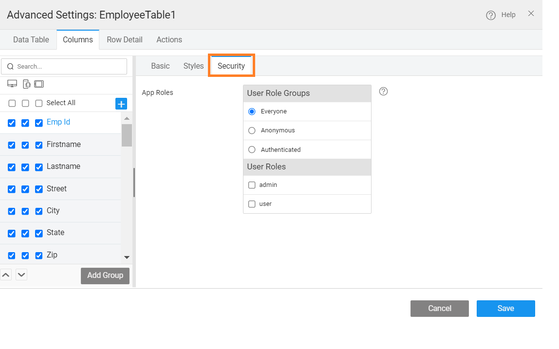
- to restrict the display based upon the security roles;
- filter criteria can be applied to referenced entities for Inline Editable and Quick Edit Data Tables (see here for usage).
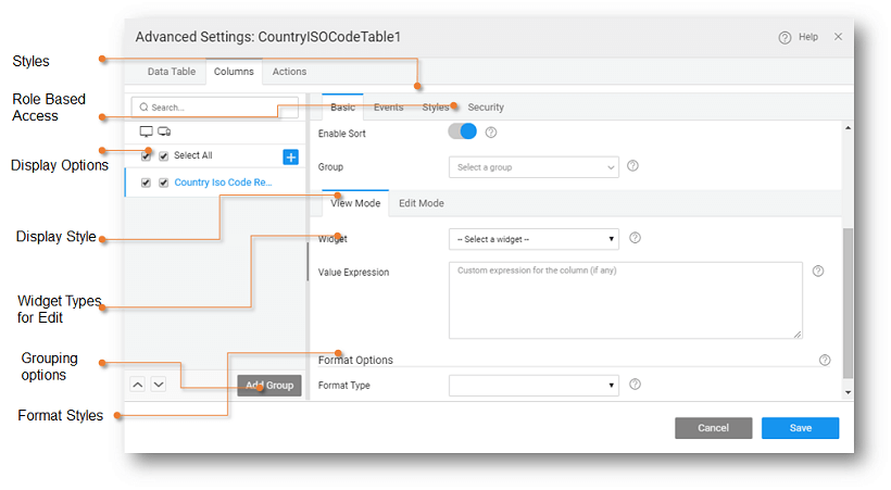
All the above-mentioned options are available from the Columns tab of the Advanced Settings property.
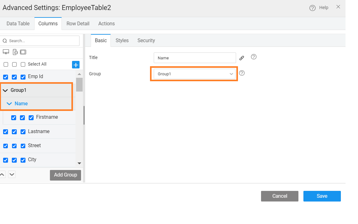
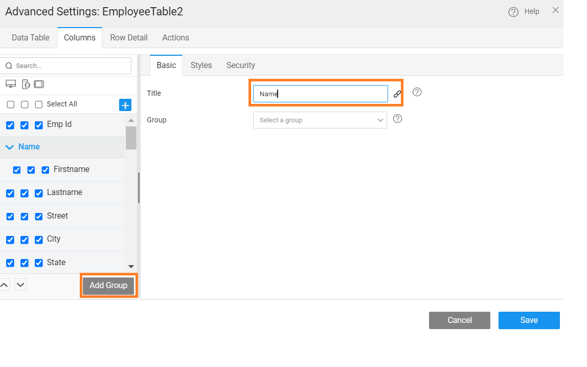
Column Grouping
This feature helps you group columns under a heading for better readability and convenience. 
- Use the Add Group button under Columns tab of Advanced Settings. This will allow you to give a title to the group.

- Add columns to the group by either
- using the drag or reorder option from the column tree on the left panel within the Advanced Settings dialog, or
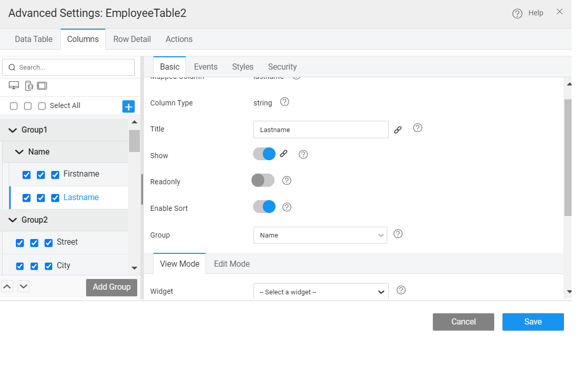
- by selecting the Group from the Basic properties tab
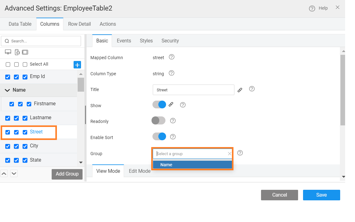
- You can also have nested groups by selecting the parent group while adding the group or use the drag feature.


View Mode Options
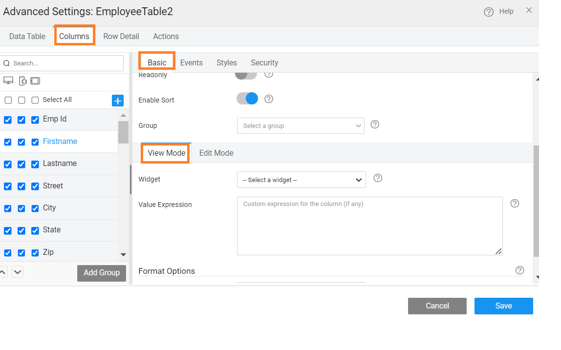
Widget Representation
Anchor Mode Options
- Widget Class - style class for the entire column
- Conditional Widget Class - specify the style class name to be applied to select rows satisfying the given condition.
- Widget Title - title to be displayed on the button at run-time, set by default to the column name, can be edited as per the needs
- Widget Hyperlink - link to the page to be opened on click.
- Value Expression - You can write a custom expression to change the display setting for a table column. The expression needs to follow AngularJS conventions for binding. A sample expression is given which can be enhanced as per the needs of the application.
Button Mode Options
- Widget Class - style class for the entire column
- Conditional Widget Class - specify the style class name to be applied to select rows satisfying the given condition.
- Widget Title - title to be displayed on the button at run-time, set by default to the column name, can be edited as per the needs
- Widget Icon - icon name, including the class name, for example, glyphicon glyphicon-home
- Widget Action - method, as defined in Script, to be invoked on the click event of the button. The method will be auto-generated upon the selection of JavaScript option with a parameter set to selectedItem.
- Value Expression - You can write a custom expression to change the display setting for a table column. The expression needs to follow AngularJS conventions for binding. A sample expression is given which can be enhanced as per the needs of the application.
Checkbox Mode Options
- Widget Class - style class for the entire column
- Conditional Widget Class - specify the style class name to be applied to select rows satisfying the given condition.
- Disable - code example given to disable the checkbox in the table
- Value Expression - You can write a custom expression to change the display setting for a table column. The expression needs to follow AngularJS conventions for binding. A sample expression is given which can be enhanced as per the needs of the application.
Icon Mode Options
- Widget Class - style class for the entire column
- Conditional Widget Class - specify the style class name to be applied to select rows satisfying the given condition.
- Widget Title - title to be displayed on the button at run-time, set by default to the column name, can be edited as per the needs
- Widget Icon - icon name, including the class name, for example, glyphicon glyphicon-home
- Icon Position - to set the position of the Icon; choose Left (default) or Right
- Value Expression - You can write a custom expression to change the display setting for a table column. The expression needs to follow AngularJS conventions for binding. A sample expression is given which can be enhanced as per the needs of the application.
Image Mode Options
- Widget Class - style class for the entire column
- Conditional Widget Class - specify the style class name to be applied to select rows satisfying the given condition.
- Image Source - by default it is populated with the column name, it can be replaced with any external source path.
- Value Expression - You can write a custom expression to change the display setting for a table column. The expression needs to follow AngularJS conventions for binding. A sample expression is given which can be enhanced as per the needs of the application.
Label Mode Options
- Widget Class - style class for the entire column
- Conditional Widget Class - specify the style class name to be applied to select rows satisfying the given condition.
- Widget Title - title to be displayed on the button at run-time, set by default to the column name, can be edited as per the needs
- Value Expression - You can write a custom expression to change the display setting for a table column. The expression needs to follow AngularJS conventions for binding. A sample expression is given which can be enhanced as per the needs of the application.
Format Options
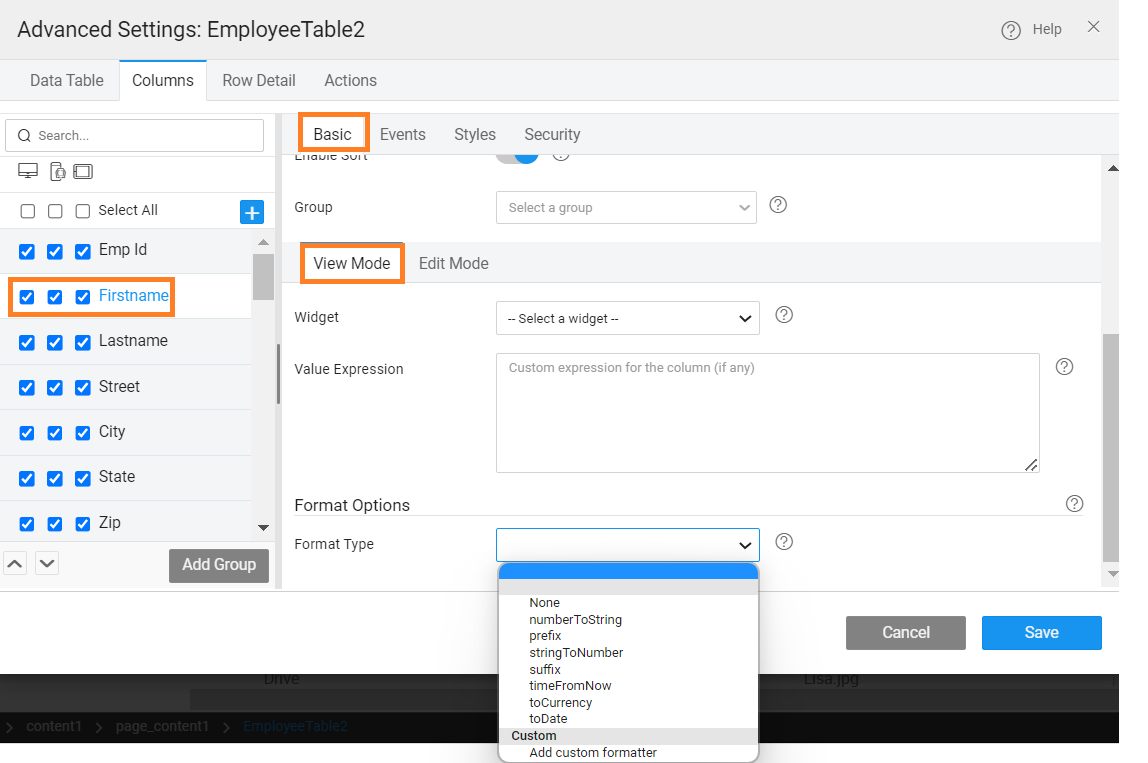
Format Options enables you to define the display format of the column at runtime. The options include toDate, toCurrency, prefix, suffix, and srtingtoNumber. Be aware that these format types selected are only for display purpose. During runtime, edit row will display the values as defined in the data source.
Prefix/Suffix Options:
- Prefix/Suffix value can be specified
Currency Options:
- Symbol by name can be selected from the drop-down list and the currency symbol will be inserted in the column
- Fraction Size can be set
Date Options:
- Date Pattern can be selected from the drop-down list
Number Options:
- Fraction Size can be set
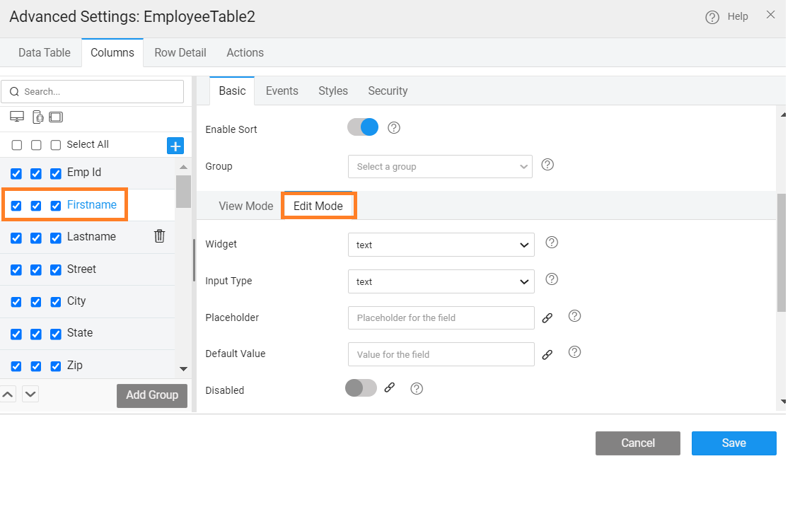
Edit Mode Options
For Quick Edit and Inline Editable Table, you can specify the Display Format and Validation criteria for the columns (non-primary key) when the row is in Edit Mode.
Display options include:
- Widget - text, select, datetime etc.,
- Placeholder
- Default Value
- Filter on Field to set cascading data, i.e., restrict the display values for the current field based on the value of the field set for this property. For example, the values displayed in the city field should depend upon the value selected for state field; then correspondingly for city field, filter on field property should be set to state.
- Widget - text, select, datetime etc.,
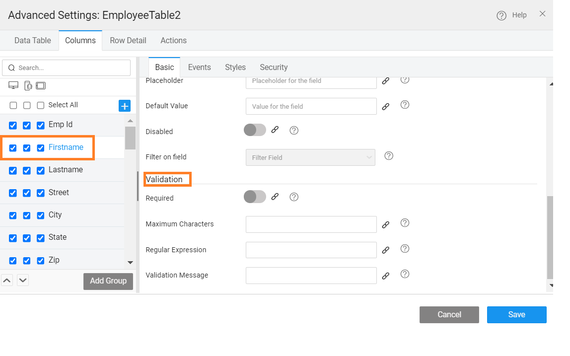
Validation options:
- Required: whether the column entry is mandatory or not;
- Validations: depending upon the data type of the column you have the option to set
- maximum character for text type,
- minimum length and maximum length for number fields and
- regular expression for validations for text and numeric fields.
- Validation Message to be displayed if the field fails the validation specified. in case of validation failure, an error icon is displayed, hovering over which will display the validation message.
- Validations: depending upon the data type of the column you have the option to set
- Required: whether the column entry is mandatory or not;


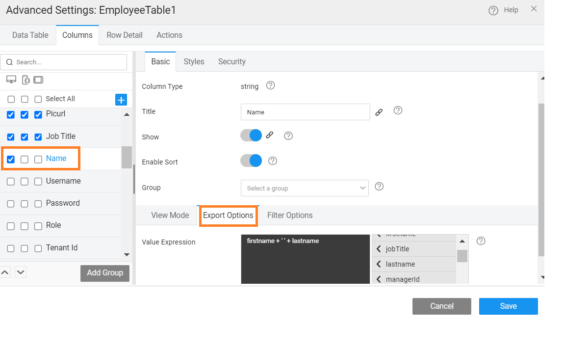
Export Options
In the case where the export option is set by selecting the Export Format as EXCEL or CSV, the Export Options can be used to customize the export values by setting the Value Expressions. This is particularly useful to display name column as a combined value like 'firstname+lastname' while export.
NOTE: Value Expression has to be set for custom fields.
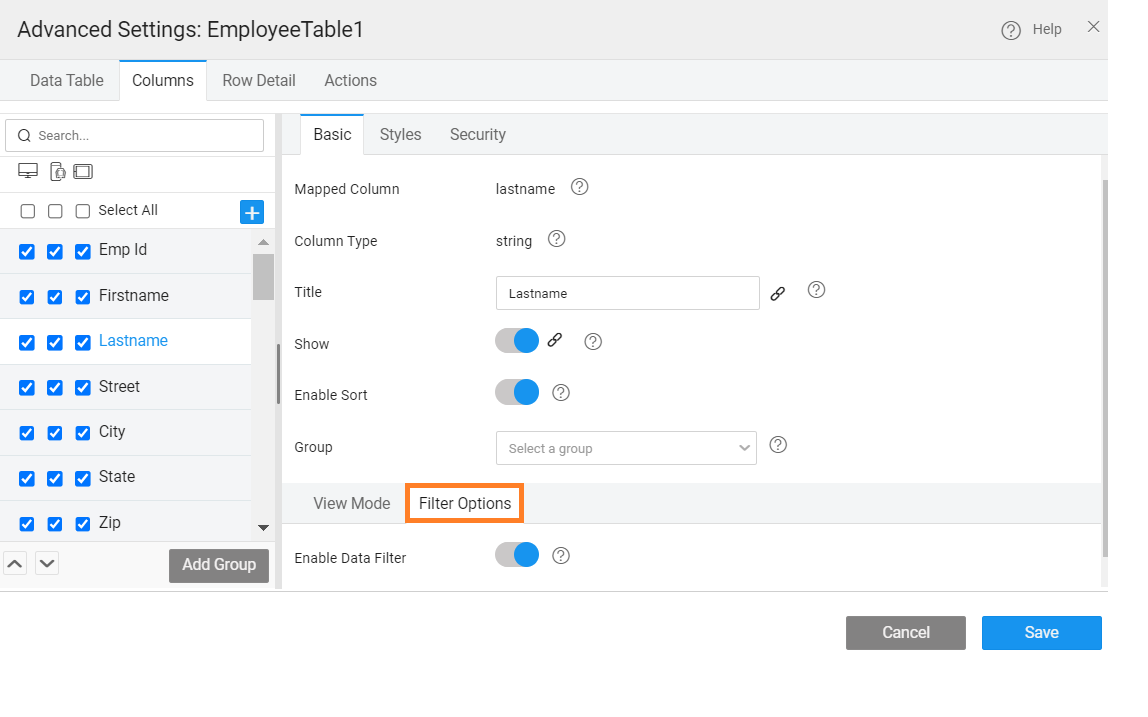
Filter Mode Options
In the case, Filter Option is set to Row while designing the Data Table, then the Filter Options can be enabled or disabled for the specific column.
Styling Options
Styles can be used to change the styles for the selected field.
For more information about styles and properties, see Data Table Styles.
For examples, see Custom Styling Data Table Columns & Rows
Security Options
Role-based access can be set to enforce security at column-level: If the security has been enabled in your app, then you can define the app role which has access to a specific column.