Chips
Chips represent complex entities in small blocks, such as a contact. Contact chips may represent contact information in a compact way. Chips can be used for various types of entities, including free-form text, predefined text, rules, or contacts. Chips may also contain icons.
Using Chips Widget
Using Chips widget is a growing trend across social and communication-related apps. This can afford recipient selection using tokenized auto-completing text fields. This kind of UI is more concise than list-based interfaces and more visually rich, intuitive and directly manipulable (manage recipients by touching their token).
Where can Chips Widget be used in WaveMaker
Chips Widget is one of the Form Widgets. It is available to be used as a standalone widget or as a part of Live Forms, Data Entry Dialogs etc.
Features
- The Chips widget Value property can be bound to a dataset of valid values for example, Email Addresses, Hobbies, Skillset, Categories, and more. You can add new values but these new values will not be added to the dataset.
- It acts as search/autocomplete widget. When you starts typing in the Chips widget, it triggers the selection of values from the dataset and shows the corresponding values for the character pressed.
- Allow Only Select (Default: false) - If Allow Only Select is set to true, Chips will restrict adding values other than in the selection. By default, there is no restriction. But note that these new values will not be added to the dataset.
- Max Size (Default: 0) - By default, there is no limit on the number of chips to add. If it set to true, after Max Size is reached the input box to add more will be hidden and will be shown again after some of the elements are deleted.
- Enable reorder property can be used to allow you to reorder the Chip Elements at runtime, using a simple drag and drop operation.
- Runtime Functionality: You can navigate between the chip items using the keyboard right and left keys. Also using the delete/backspace keys the Chip item can be Deleted.
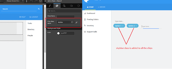
- Chip item class name property from the styles tab can be used to apply styles for individual items of the Chip:
- a class can be added conditionally when bound to an expression (see below for use case example), or
- class names can be entered (without any condition), these classes will be applied to all the chips.
Difference between Search and Chips widget
- In Search, you can select only one element, whereas in Chips multiple elements can be selected.
- In Search, you cannot edit or remove selected items, whereas Chips support these features.
Adding a Chip
- Search for a field by typing it in the input box. Select the required chip and by clicking on to it or enter key press
- Enter add chip other than listed items and hit enter that will add to the existing list.
- If you want to add an item which is not there in the populated list, type the item and press enter. It will be added to the chips list but it will not be added to the dataset.
Deleting a Chip
- Click on to the cross button of each Chip element.
- You can also select a Chip element and press the DELETE button.
- Hitting backspace in the input will select the last Chips element and later deletes it.
Reorder Chip Elements
- You can drag and drop the element in the required place.
Properties
| Property | Description |
|---|---|
| Name | The name is a unique identifier for the chips. Special characters and spaces are not allowed in widget name. |
| Placeholder | A placeholder is a text to show in the editor when there is no value. A common use of this is a search box that says in faint gray italicized text "Search..." which disappears as soon as the you starts to edit the text box. This is a useful alternative to a caption if you are constrained in space and asking for something simple to enter. |
| Accessibility | |
| Tab Index | The tab index attribute specifies the tab order of an element. You can use this property to change the default tabbing order for widget access using the tab key. The value can range from 0 to 32767. The default is 0 and -1 makes the element non-focusable. NOTE: In Safari browsers, by default, Tab highlights only text fields. To enable Tab functionality, in Safari Browser from Preferences -> Advanced -> Accessibility set the option "Press Tab to highlight each item on a webpage". |
| Layout | |
| Width | The width of Chip widget can be specified in em, pt, px or % (i.e 50px, 75%). |
| Height | The height of Chip widget can be specified in em, pt, px or % (i.e 50px, 75%). |
| Input Width | Use this property to set the width of the chip item input box. You can select from: - Default – which is the normal Chip widget size, 170px, or - Full – 100% width of the container |
| Dataset | |
| Value | Set this property to a variable to populate the list of values to display. Can be bound to a Variable. |
| Search Key | The field from the above Value dataset is based on which the search needs to be performed for fetching Chip Elements for the selection. |
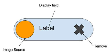
| Picture Source | This property sets the image to be displayed in the search results. Pick from the fields from the above Dataset Value. |
| Data field | This property is useful when the dataSet is an array of objects. It decides the dataValue to be returned by the widget. If set to All Fields, the whole object is returned against the selection. If set to a particular field, the returned value will be the value of that field in the selected object. In the case of multi-selection, the returned dataValue will also be an array. |
| Display Field | This property sets the displayValue to show in the select editor when the list is populated using the dataSet property. |
| Display Expression | This is an advanced property that gives more control over what is displayed in the drop-down select list. A Display Expression uses a Javascript expression to format exactly what is shown. |
| Order by | This allows for multiple selections for ordering the display of rows based on fields in asc or desc order - up arrow for asc and down arrow for desc. |
| Default Value | |
| Value | This is the default value to display value for an editor widget. NOTE: the display value is just what the you see initially, and is not the dataValue returned by the widget. |
| Behavior | |
| Auto Focus | This property makes the Chip to get focus automatically when the page loads. |
| Read only | Selecting this property prevents you from changing the data value of a widget. This property can be bound to a boolean value. |
| Max Size | If the max size is set, chips will restrict adding more than the max size. |
| Input Position | Use this property to change the position of the newly added chip item as - First - The input box appears in the beginning followed by the selected chips - Last – The input box appears at the end of the chip item list, this is the default setting |
| Allow Only Select | If Allow Only Select is set to true, chips will restrict adding values other than in the selection. By default, there is no restriction. |
| Enable Reorder | This property will allow you to reorder the Chip Elements at runtime. This is a bindable property. |
| Show | Showing determines whether or not a component is visible. It is a bindable property. |
| Load on Demand (visible only when show property is bound to a variable) | When this property is set and the Show property is bound, the initialization of the widget will be deferred until the widget becomes visible. This behavior improves the load time. Use this feature with caution, as it has a downside (as we will not be able to interact with the widget through script until the widget is initialized). When the Show property is not bound the widget will be initialized immediately. |
| Disabled | If the disabled property is true (checked) the widget becomes display-only and your input will not be accepted. It can also be set programmatically by binding it to a boolean type variable. |
| Min Chars | The minimum number of characters you can enter before the search query is triggered. The value should be greater than 0. The default value is 1. |
| Skip on change event from script | When enabled, the Change callback will only trigger when the user updates the value from the UI, and not when it's updated through scripts. This property is disabled by default. |
| Selection Mode (React Native Only) | Determines how many chips can be selected at a time. - single: Only one chip can be selected at a time. - multiple: Multiple chips can be selected simultaneously. |
| Graphics | |
| Left Icon Class (React Native Only) | Icon to display on the left side of each chip. |
| Right Icon Class (React Native Only) | Icon to display on the right side of each chip. |
| Left Badge (React Native Only) | Text badge to display on the left side of each chip. |
| Right Badge (React Native Only) | Text badge to display on the right side of each chip. |
| Selected Icon Class (React Native Only) | Icon to display on selected chips to indicate selection. It is displayed on the left side of the chip. If there is any icon selected using Left Icon Class for left side, it will be overridden by Selected Icon Class when the chip is selected. |
Events
| Event | Description |
|---|---|
| Change | This event handler is called each time the chip item value changes. |
| Mouse Events | |
| On Chip Click | This event handler is called each time the chip item is clicked. |
| Callback Events | |
| On Before Add | This event gives handle to user whether to continue or abort to add current chip item 1. If the function does not return anything the chip item will be added 2. If the function returns false, then chip item will not be added 3. If the function returns anything other than false, chip item will be added |
| On Add | This event gives a handle on the successful addition of the Chip item. |
| On Before Remove | This event gives handle to user whether to continue or abort removing current chip item 1. If the function does not return anything the chip item will be removed 2. If the function returns false, then chip item will not be removed 3. If the function returns anything other than false, chip item will be removed |
| On Remove | This event gives handle to user on successful removal |
| On Chip Select | This event handler is called each time the chip item is selected. |
| On Before Service Call | This event is triggered before sending the service call for fetching the search results. |
| On Before Reorder | This event gives handle to user whether to continue or abort reordering current chip item 1. If the function does not return anything the chip item will be reordered 2. If the function returns false, then chip item will not be reordered 3. If the function returns anything other than false, chip item will be reordered |
| On Reorder | This event gives a handle on successful reordered in the following form: |
Use Cases
Example 1: Adding contacts and sending Emails
In this use case, you will be using the chips widget as email recipients and create a UI of Composing an Email.
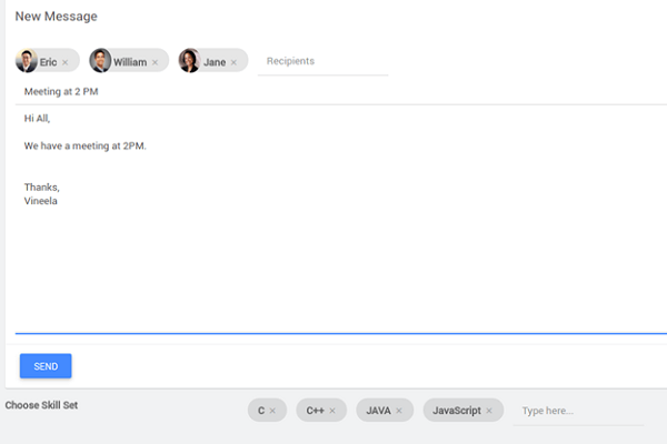
Have a database called ProfileDB and a table named Profile with basic fields like first name, last name, job title, email.
- Drag and drop the chips widget onto the canvas.
- Create a variable based on the database CRUD APIs that is bound to Profile Table. Know more from here.
- Bind this variable to the dataset value property.
- Choose Data Field as email
- Choose Display Field as FirstName
- Drag and Drop a TextArea Field for composing messages
- Create a Java Service for Sending Email.
- Create a variable based on the APIs auto-generated for the methods from the Java service. Know more from here.
- From the Data tab, bind the values to those returned by the Chips widget.
- Drag and Drop a button – Give the caption as Send. On Click of that button trigger the service variable for Java service.
Example 2: Use in Live Form
- Create two more tables in Profile DB namely Hobbies and Skillsets. Have ID and Name as fields in both.
- Create a one-to-many relationship between id - HobbyID
- Create a Live Form based on a data source – ProfileDB.
- From Advanced Settings and set the widget property for the fields Hobbies and Skillset to chips and also display expression as Hobbies and Skillset respectively.
- Now Save and Run the App. You will observe for the Hobbies and Skillsets you are able to enter multiple values.
- The multiple values will have to be delimited before you save the date in live form. This can be done through scripting.
- Go to the Live Form events tab and for the "On before service call" event
- Select JavaScript from the drop-down, and in the script tab, add the code as below.
Example 3: Use a conditional class
- Import the sample hrdb and create a CRUD Variable for the Employee table.
- Drag and drop Chips widget and bind the Dataset Value property to the HRDB employee variable
- Set Data field property to All Fields,
- From the Styles tab bind the Chip item class name to the following expression:
This will check if the employee's department name is an Engineering and applies skyblue class, else applies mustard class.
Here "item" denotes the chip object.


- Add the following class to the app using the Style tab – for skyblue and mustard
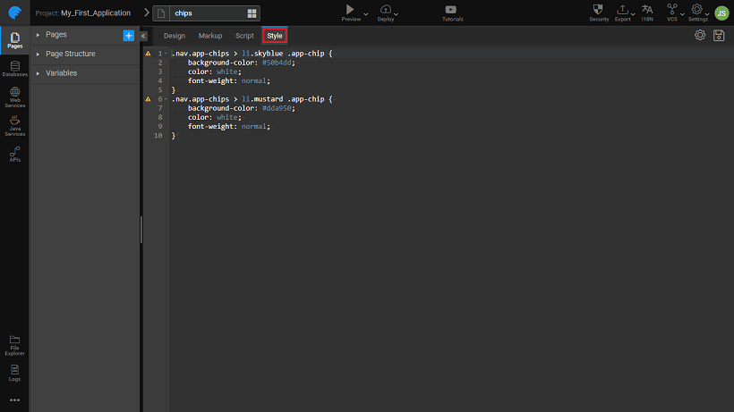
- Preview the page
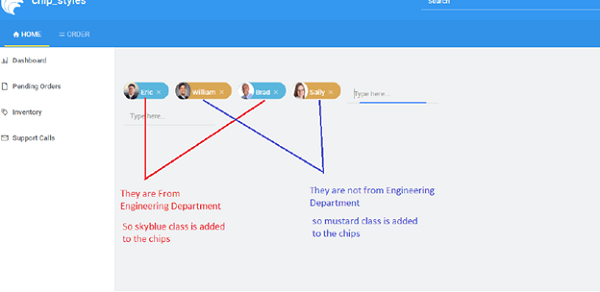
- Setting the chip item class name (or Class Name property) as skyblue, will apply skyblue class to all the chips at runtime.