Button
A button indicates a possible user action. The button provides a styled clickable UI functionality with arbitrary content to indicate the different states.
The button widget can trigger any of the following actions when it is clicked.
- Navigate to another page
- Query a database
- Show or hide a dialog window
- Call a JavaScript function
- Call a web service or Java method
Features
Shortcut key: The shortcut key property specifies a shortcut key to click the button. The way of accessing the shortcut key is varying in different browsers:
| Browser | Shortcut key Trigger |
|---|---|
| Internet Explorer | [Alt] + shortcut key |
| Chrome | [Alt] + shortcut key (Windows/Linux) |
| [Control][Alt] + shortcut key (MAC) | |
| Firefox | [Alt][Shift] + shortcut key (Windows/Linux) |
| [Control][Alt] + shortcut key (MAC) |
Hide/Show Properties
The business logic of an application often requires a certain button to be temporarily enabled/ disabled. WaveMaker button can be configured to the initially disabled or enabled by checking the show or disabled properties from behavior section.
Icon image
The button can accommodate an icon, which enhances the meaning of the text content. The widget provides two ways to add an icon with the class name or with a background image i.e image URL (usually a sprite).
Icon class
In some cases, you may want to use a Button with no text and only an icon inside. You will be provided with two types of icon one is the wavicon and the other is the font awesome icon.
Icon Url
Image icons are applied via the imageUrl property and are displayed as an img element.
Button Class
From the Style tab of Properties panel, you can set the button style. You can also use the Conditional Class property to set the class based upon a condition. See here for How to.
Button Size
From the Style tab of Properties panel, you can also set the button size along with the style as btn-primary btn-xs
Button Properties
| Property | Description |
|---|---|
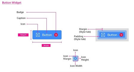
| Caption | The caption is the text that the end user sees on the button. This property can be bound to any variable or another widget. |
| Name | The name is a unique identifier for the button. Special characters and spaces are not allowed in widget name. |
| Type | Specify the type of button: - Button: for most click events, - Reset or Submit: for customizing the Form reset and submit functionality |
| Badge Value | Value to be displayed in the badge span for anchor and button. |
| Accessibility | |
| Hint | Any text you enter for this property will be shown as a tooltip when the mouse hovers over this widget for _1.5 seconds. _It can be bound to a variable or another widget. |
| Tab Index | The tab index attribute specifies the tab order of an element. You can use this property to change the default tabbing order for widget access using the tab key. The value can range from 0 to 32767. The default is 0 and -1 makes the element non-focusable. NOTE: In Safari browsers, by default, Tab highlights only text fields. To enable Tab functionality, in Safari Browser from Preferences -> Advanced -> Accessibility set the option "Press Tab to highlight each item on a webpage". |
| Shortcut Key | Alphabet to act as the Shortcut key. The shortcut key property specifies a key to click the button. The way to activate the shortcut key varies from browser to browser. |
| Layout | |
| Width | The width of your widget can be specified in em, pt, px or % (_i.e _50px, 75%). |
| Height | The height of your widget can be specified in em, pt, px or % (_i.e _50px, 75%). |
| Behavior | |
| Show | Showing determines whether or not a component is visible. It is a bindable property. |
| Load on Demand (visible only when show property is bound to a variable) | When this property is set and show property is bound, the initialization of the widget will be deferred till the widget becomes visible. This behavior improves the load time. Use this feature with caution, as it has a downside (as we will not be able to interact with the widget through script until the widget is initialized). When show property is not bound the widget will be initialized immediately. |
| Disabled | If the disabled property is true (checked) the widget becomes display-only and user input will not be accepted. It can also set programmatically by binding it to a boolean type variable. |
| Animation | This property controls the animation of an element. The animation is based on the CSS classes and works only in the run mode. |
| Graphics | |
| Icon Class | This property defines the class of the icon that is applied to the button. You can use either Icon class or Icon URL. |
| Icon Url | This optional property allows you to add an icon to the left side of your button. You can give URL of the image. You can use either Icon class or Icon URL. |
| Icon Width | Optional property; but you will need this if you are using the button's iconUrl. Please enter the width of your icon. NOTE: It's best to specify size in pt(points), not percent. |
| Icon Height | Optional property; but you will need this if you are using the button's iconUrl. Please enter the height of your icon. NOTE: It's best to specify size in pt(points), not percent. |
| Icon Margin | Optional property; only has meaning if you specify the button's iconUrl. Values should all have "px" next to them. Use this to adjust the space between the icon and the button text. |
| Icon Position | Optional property; Property to set the position of icon in the widget - can be left, top or right |
| Format | |
| Horizontal Align | This property specifies how the elements should be aligned horizontally - left, center or right. |
Events
| Event | Description |
|---|---|
| On focus | This event handler is called each time your element is focused. |
| On blur | This event handler is called each time your focus leaves your element. |
| Mouse Events | |
| On click | It is an HTML button. It is used to generate a click event. For example, save button. |
| On double click | This event handler is called whenever the double click event is triggered on a widget. |
| On mouse enter | This event handler is called whenever the mouse enters the widget. |
| On mouse leave | This event handler is called whenever the mouse leaves the widget. |
| Touch Events | |
| On Tap | This event handler is called whenever the widget is tapped. |
| On Double Tap | This event handler is called whenever the widget is double tapped. |
| On Long Tap | This event handler is called whenever the long tap event is triggered on a widget. Note: Long Tap event is only supported in React Native applications. |
| Keyboard Events | |
| On key down | This event handler is called when the widget is in focus and a key is pressed. |
| On key press | This event handler is called when the widget is in focus and a key is pressed. This event will relay the character pressed |
| On key up | This event handler is called when the widget is in focus and a key is pressed and released. |
Use Cases
- Change button properties from Markup
- To add hint to the given button from the markup
- Change button properties from Script. To Hide button1 use the following code snippet:
- To Capture the show value: