Radioset
Radioset allows you to group a set of radio buttons under a common heading. You need to bind to a dataset to display a radio button for each value.
Change the layout of RadioSet - Vertical or Horizontal
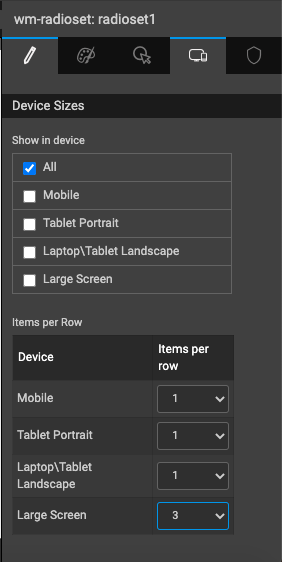
You can easily change the layout of the options inside the RadioSet, so that they are aligned vertifically, horizontally or grouped by a specific number. Items per row determine the number of items that can be shown in each row. This can be specified independently for different target devices, from the device tab of the Properties panel.
Properties
| Property | Description |
|---|---|
| Name | The name is a unique identifier for the button. Special characters and spaces are not allowed in widget name. |
| Accessibility | |
| Tab Index | The tab index attribute specifies the tab order of an element. You can use this property to change the default tabbing order for widget access using the tab key. The value can range from 0 to 32767. The default is 0 and -1 makes the element non-focusable. |
| NOTE: In Safari browsers, by default, Tab highlights only text fields. To enable Tab functionality, in Safari Browser from Preferences -> Advanced -> Accessibility set the option "Press Tab to highlight each item on a webpage". | |
| Layout | |
| Width | The width of your widget can be specified in em, pt, px or % (_i.e _50px, 75%). |
| Height | The height of your widget can be specified in em, pt, px or % (_i.e _50px, 75%). |
| Layout | This property controls how contained widgets are displayed within this widget container - inline or stacked. |
| Default Value | |
| Value | This is the default value to display value for an editor widget. Note that the display value is just what the user sees initially, and is not always the dataValue returned by the widget. |
| Dataset | |
| Value | Set this property to a variable to populate the list of values to display. |
| Use Keys | Use the keys of the live variable object as checkboxset options. |
| Data field | This property sets the dataValue to be returned by a select editor when the list is populated using the dataSet property. |
| Display Field | This property sets the displayValue to show in the select editor when the list is populated using the dataSet property. |
| Display Expression | This is an advanced property that gives more control over what is displayed in the drop-down select list. A Display Expression uses a Javascript expression to format exactly what is shown. |
| Order by | This allows for multiple selections for ordering the display of rows based on fields in asc or desc order - up arrow for asc and down arrow for desc. |
| Validation | |
| Required | A required editor in wm.LiveForm may refuse to save without a required field. |
| Behavior | |
| Read only | Selecting this checkbox property prevents the user from being able to change the data value of a widget. |
| Show | Showing determines whether or not a component is visible. It is a bindable property. |
| Load on Demand (visible only when show property is bound to a variable) | When this property is set and show property is bound, the initialization of the widget will be deferred till the widget becomes visible. This behavior improves the load time. Use this feature with caution, as it has a downside (as we will not be able to interact with the widget through script until the widget is initialized). When show property is not bound the widget will be initialized immediately. |
| Disabled | If the disabled property is true (checked) the widget becomes display-only and user input will not be accepted. It can also set programmatically by binding it to a boolean type variable. |
| Skip on change event from script | When enabled, the Change callback will only trigger when the user updates the value from the UI, and not when it's updated through scripts. This property is disabled by default. |
Events
| Event | Description |
|---|---|
| Change | This event handler is called each time your element's value changes. |
| Mouse Events | |
| On click | It is an HTML button. It is used to generate a click event. For example, save button. |
| On mouse enter | This event handler is called whenever the mouse enters the widget. |
| On mouse leave | This event handler is called whenever the mouse leaves the widget. |
| Touch Events | |
| On tap | This event handler is called whenever the widget is tapped. |
