Version: v11.11.2

Customize Progress Bar


In this documentation, we will see how to customize the progress bar's background with a linear gradient and also customize the tooltip. The Progress Bar widget provides built-in tooltip functionality that can be customized to display relevant information and style the tooltip as needed.

Progress Bar Gradient

Markup

<wm-progress-bar datavalue="32" name="progress_bar1" margin="200px 50px unset 50px"></wm-progress-bar>

Style

.app-progress-bar-bg {
height: 25px;
}

.app-default-progress-bar.app-progress-bar-bg {
background-color: #ccd3ed;
}

.app-progress-bar .app-progress-bar-bg {
background-color: linear-gradient(90deg, #44aaf4, #087fd5);
}

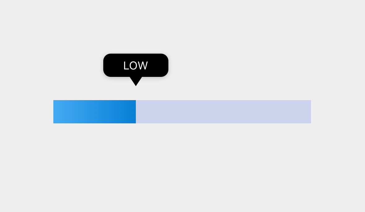
Progress Bar Tooltip

Markup

<wm-progress-bar datavalue="32" name="progress_bar1" margin="200px 50px unset 50px" showtooltip="true" tooltipposition="up" on-tooltiptext="progress_bar1Tooltiptext($event, widget, minVal, maxVal, percentage)"></wm-progress-bar>

Style

.app-progress-bar-tooltip {
background-color: #000;
width: 70px;
height: 25px;
left: -35px;
top: -50px;
border-radius: 8px;
}

.app-progress-bar-tooltip-label {
color: #fff;
}

.app-progress-bar-tooltip-triangle {
border-bottom-color: #000;
}
note

Use border-bottom-color to change the background color of the tooltip triangle.

Script

The progress_bar1Tooltiptext function is called when the tooltip is displayed. The value returned by this function will be used to show the custom text in the tooltip instead of the default progress percentage.

Page.progress_bar1Tooltiptext = function ($event, widget, minVal, maxVal, percentage) {
if (percentage < 35) {
return 'LOW';
} else if (percentage < 70) {
return 'MEDIUM';
} else {
return 'HIGH';
}
};