Designing Tablet Views in Mobile Project
Developing tablet views is now supported in Mobile projects. From the release 10.6, tab screens are available inside Studio.
showindevice
The showindevice property allows you to display the widget only on specific devices.
Viewport API
This API provides the viewport details of the device in which the app is rendered.
Properties
isMobileType
If set to true, the app renders on a mobile device.
isTabletType
If set to true, the app renders on a tablet device.
orientation
This is an object containing the isPortrait and isLandscape values. Set the isPortrait property to true when the screen orientation is portrait. Similarly, you can set the isLandscape property to true when the screen orientation is landscape.
Viewport API Usage
Any device with minimum dimension (i.e. width or height) value greater than 480px and maximum dimension (i.e. width or height) value greater than 768px, is considered as tablet.
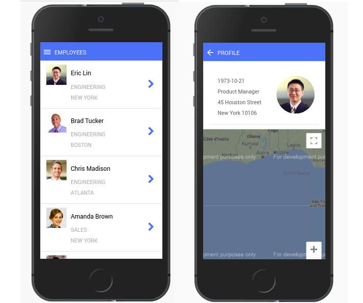
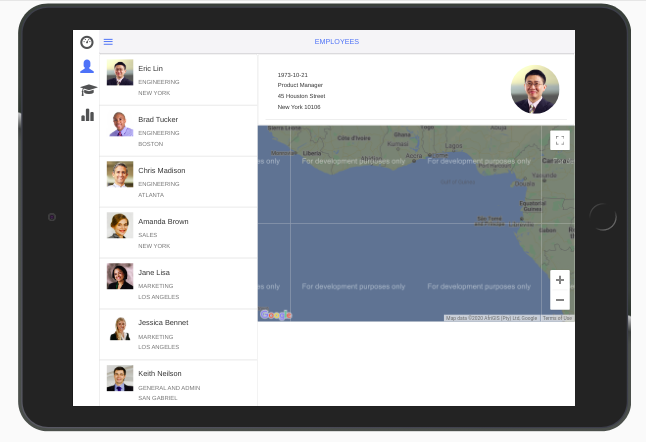
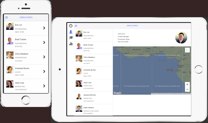
With the help of the properties above, develop an app with the list of employees and their detailed-profile. The view is different for the tablet and mobile as shown below.
Steps for Designing the App
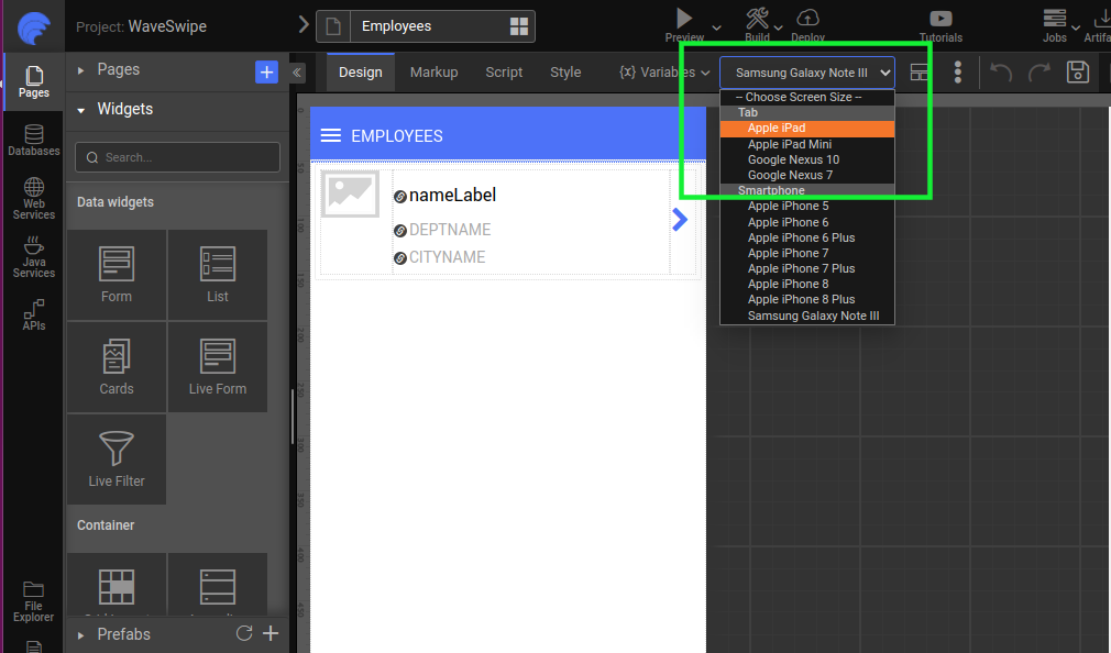
Select a tablet view from the choose screen list.
Drag and drop the Grid layout with two columns. Set one
columnWidthto 4 and the other to 8.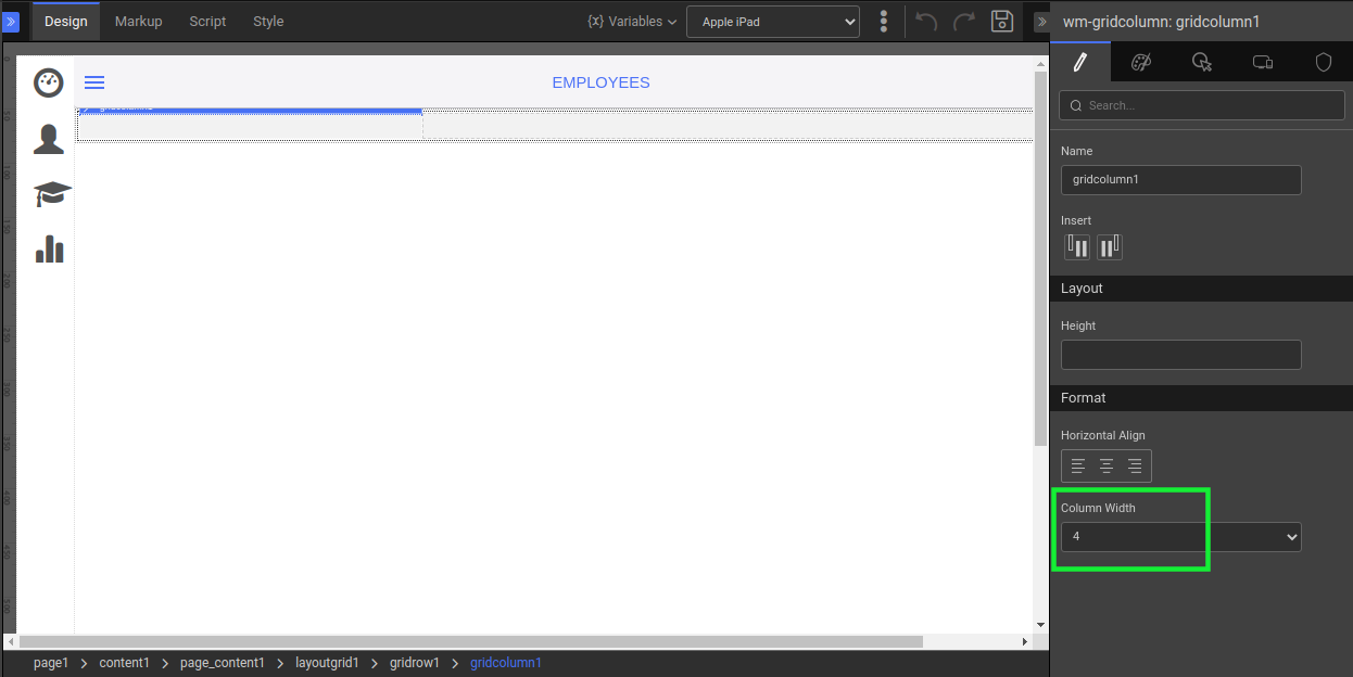
The first column contains the List widget, which is bound to Employees.
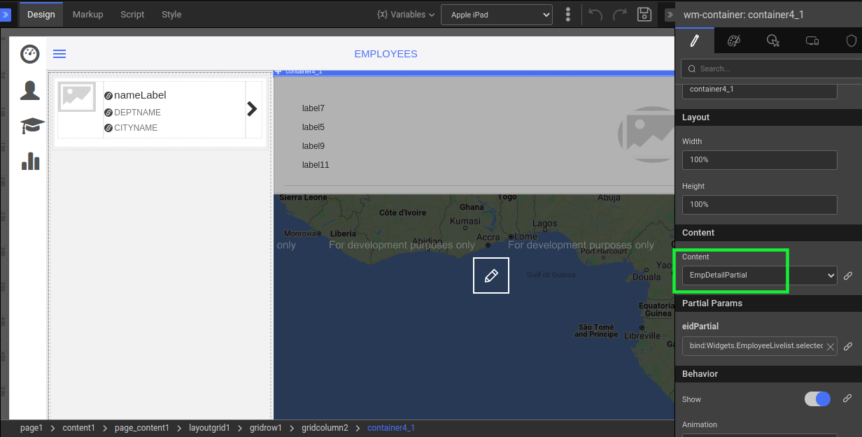
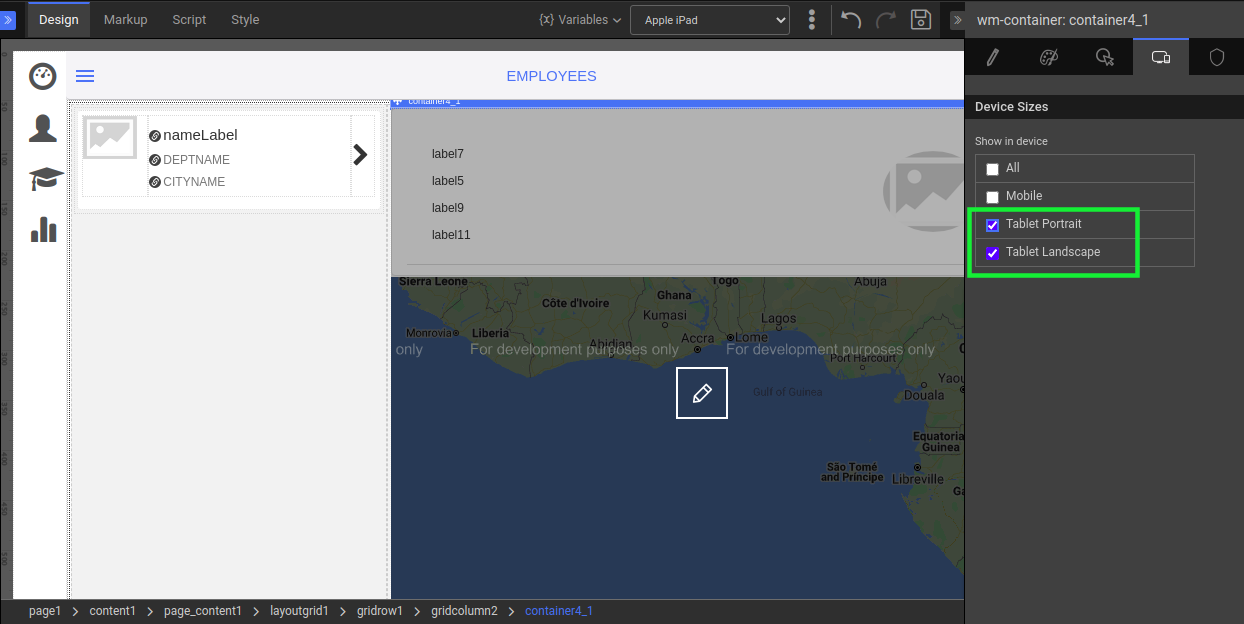
Add a Container to the second column.
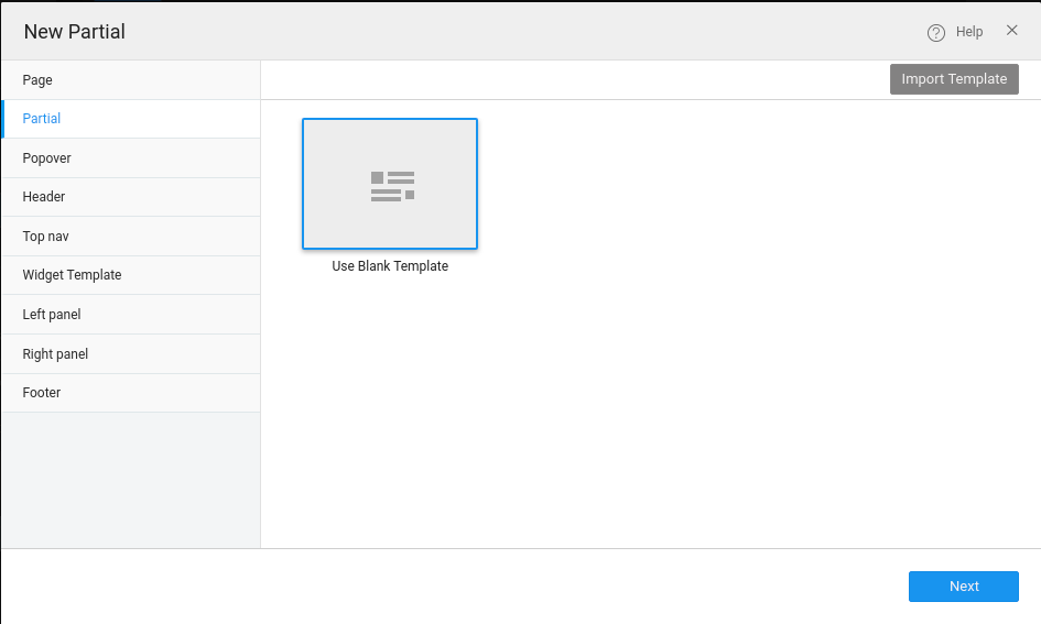
Design a partial page that contains the employee profile in detail with Employee ID Param. Bind this partial to the selected-employee based on the Employee ID Partial Param to display the Employee Profile. For more information, see How to create a Partial.
Bind this partial to the above container that is within the second column.

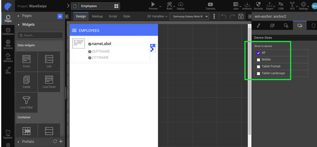
But this second column should be displayed only in tablet view. Therefore, configure this by setting the showindevice property to Tablet Portrait and Tablet Landscape.
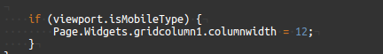
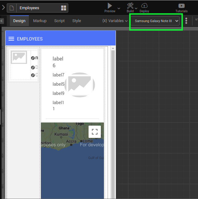
Now, change the screen size to the mobile device.
The second column will not be displayed in the mobile preview as mentioned in step 7.
Hence, in mobile, the first column width has to be set to 12 to occupy the device width.

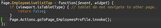
On list item click, navigate to the new page containing the partial.

Run to preview the output on mobile and tablet.