Mobile Navbar
Mobile Navbar is created specifically for hybrid apps to construct page header. It contains an icon, title and a list of actions on left and right sides.
- Mobile Navbar comes as part of the page when the page layout with top navbar is selected. It is not available as a ‘drag n drop’ widget.
- Widgets cannot be dropped on the mobile navbar.
Features
Mobile Navbar always comes at the top of the page. Mobile Navbar has two views:
- Action View - the default view, and
- Search View - can be selected as the Default view. It is also activated when the search button (enabled at design time using the Show search button property) is clicked at run-time. When the search is the main action on the page (for example, a search page) then change the default view as search-view.
Action View
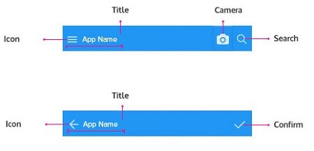
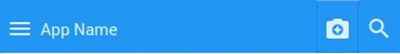
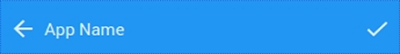
In action view, the widget area is divided into 3 sections:
Left Section
Left section is reserved for 2 buttons.
First button will be visible if there is a left panel in the page. It is used to toggle the left panel. Icon of left panel button can be configured in the properties panel.
Second button is by default acts as a button that takes the user to the last visited page. Following properties for this button are configurable.
- Show Back Button
- Back Button icon class
- Back Button label
Middle Section
Middle section holds icon and title.
- Image for icon can be specified from the Image source property. Icon size is 32 x 32 (px) and images of that size can be set as an icon for the navbar.
- A title can be set from the Title property either static content or bound to another Widget property or a Variable field.
Right Section
In the Right section, widgets can be added using Add Widgets button. Add Widgets provides a widget (like Anchor, Menu, Popover, Button) to be added. Depending upon the widgets added various properties can be set:
- Anchor: can have a hyperlink to specify the destination link, target where the linked document should be opened.
- Menu: can specify the layout, position, and value–action combination. Click here for more on menu usage.
- Popover: can set the content source and content for further action. Click here for Popover usage.
- Button: on click event can be set for page navigation
Search Button
There is also search button available on Mobile Navbar which appears at extreme right. Search text is exposed as an outbound property on Mobile Navbar as ‘query’.
Search View
In search view of the mobile navbar, there is a button for navigating from search view to action-view and a text area for the user to enter the search text.
Properties
| Property | Description |
|---|---|
| Title | Set the title of the widget. |
| Name | The name is a unique identifier for the Navbar. Special characters and spaces are not allowed in widget name. |
| Add Widget | This action button allows you to add widgets within the Navbar. The available options are Anchor, Menu, Popover, or Button. |
| Layout | |
| Height | The height of your widget can be specified in px or % (i.e 50px, 75%). |
| Image Source | This property specifies the source for the brand image. The source can be either a file or a URL: File: enter the directory and filename for the image to display (supported file types include .jpg, .gif and .png). By default, WaveMaker looks for images in the src/main/webapp directory of the project. Every WaveMaker project has a data directory under src/main/webapp, so this is a good place to put pictures. URL: enter a URL to any internet-accessible image. To display the file, foo.jpg, in the project directory src/main/webapp/resources/images/imagelists/, enter the following into the source property:resources/images/imagelists/foo.jpg or simply foo.jpg |
| Behavior | |
| Default View | This property shows the action bar if set to action-view and shows the search bar if set to search view. |
| Show | Showing determines whether or not a component is visible. It is a bindable property. |
| Left Nav Panel Icon Class | This property sets the icon class for Left nav panel toggle button. |
| Show Back Button | Back button is displayed only when this property is set. |
| Back Button Label | This property sets the back button label. |
| Show Search Button | Search button is displayed only when this property is set. |
Callback Events
On Search
This event handler to call when the user clicks ‘enter’ button in the search text box.
On back button click
This event handler to call when the user clicks the back button in action view of Mobile Navbar. If no event handler is specified, then upon clicking the back button, user will be navigated to the last visited page.
Use Cases
Example 1
- Create a page with ‘Two column with top nav’ layout.
- Select the mobile navbar and go to properties panel.
- Mention ‘App Name’ as title
- Check ‘show search button’.
- Add anchor widget using ‘Add Widgets’
- Select the anchor from the canvas.
- Specify ‘camera-enhance’ as icon in the anchor properties
Example 2
- Create a page with a ‘One column with top nav’ layout.
- Select the mobile navbar and go to properties panel
- Mention ‘App Name’ as the title.
- Check ‘show back button’.
- Add anchor widget using ‘Add Widgets’
- Select the added anchor from the canvas.
- Set the Icon Class to either 'wi wi-done' or 'fa fa-check'. You can choose from the list of icons by clicking the search icon next to the Icon Class property
See Also
How to use search widget within leftnav
How to add sliding leftnav