Mobile Tabbar
Tabbar provides a form of navigation between the pages. It comes as a part of page layout and is always at the bottom of the page.
- Mobile Tabbar comes as part of the page when the page layout with tabbar is selected. It is not available as a ‘drag n drop’ widget.
- Widgets cannot be added to a mobile tabbar.
Features
Tabbar is a list of anchor elements. Based on screen size, only limited number of anchor elements are visible. If the number of the anchors is more than the limit, then a more button is shown on right side. Upon clicking more, a dropdown with the remaining anchors is shown.
Following are the limits:
| Screen Size (px) | Limit of anchors |
|---|---|
| < 480 | 4 |
| >= 480 and < 768 | 5 |
| >= 768 and < 1024 | 7 |
| >= 1024 and < 2048 | 10 |
| >= 2048 | 12 |
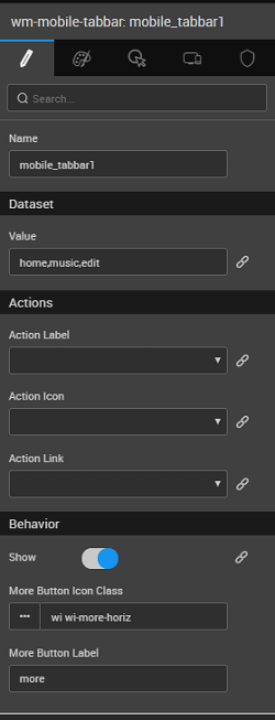
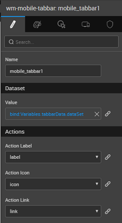
Each anchor requires a label, Icon (icon CSS class) and link. A JSON array containing this information has to be bound to dataset property of the widget, you can create a Model Variable for the same. Corresponding property names should then be mapped for action label, action icon, and an action link. More Button label and icon are configurable via properties panel. See below for use case example.
Properties
| Property | Description |
|---|---|
| Name | The name is a unique identifier for the Tabbar. Special characters and spaces are not allowed in widget name. |
| Dataset | |
| Value | Set this property to a variable or enter comma-separated values to populate the list of values to display. |
| Actions | |
| Action Label | Label for tabbar items to be picked from the fields of the Dataset Value mentioned above or bound to a variable. |
| Action Icon | Icon for tabbar items to be picked from the fields of the Dataset Value mentioned above or bound to a variable. |
| Action Link | Link for tabbar items to be picked from the fields of the Dataset Value mentioned above or bound to a variable. |
| Behavior | |
| Show | Showing determines whether or not a component is visible. It is a bindable property. |
| More Button Icon Class | This property sets the icon for the more button. |
| More Button Label | Sets the label displayed on more items button. |
Callback Events
Following events can be used to modify the behavior of Tabbar:
On select
The event listener to call when an anchor is clicked. Using this event user can write javascript code to execute an action, navigate to a page etc.. Three parameters are passed to the event listener:
- event object,
- the isolated scope of the widget and
- The label of the anchor
$itemon which event happened.
Script Example:
Use Cases
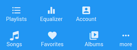
We will create navigation for the following music app pages using tabbar.
- Songs
- Favorites
- Albums
- Playlists
- Equalizer
- Account
(Assume that pages exist with above names)
Step 1: Data
- From the Variable on Workspace Toolbar, access Variables to create a New Model Variable.
- Set the Type property to
Entryand check the Is List option.
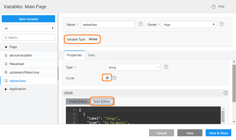
- Use the TEXT EDITOR under the JSON section to enter the following structure. This structure builds the list as given above. Note: In WaveMaker apps, link to an app page with name ‘pageName’ is ‘#/pageName’
Step 2: Design
- Select the tabbar and bind Dataset Value property to the dataset of the Model Variable created earlier.
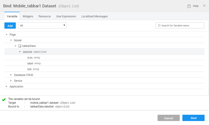
- Set action label, action icon and action link to corresponding fields from the Model Variable
Step 3: Preview App
- Click Run to preview the tabbar.
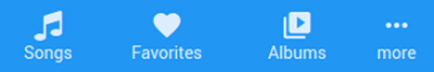
- When more button is clicked, the remaining anchors will be shown.