Apply Animations
Add animations to a widget using an Animate method. WaveMaker platform uses the react-native-animatable library to enable the Animate method, and react-native-animatable is similar to CSS animation. However, animation should be written in JavaScript.
In the following documentation, learn how to define animations in React Native projects.
How to Animate
The Animate method is available for all WaveMaker Widgets. In the following example, see the reference for a WaveMaker widget, which invokes the Animate method.
Page.Widgets.container1.animate({
  animation: {
    0 : {
      opacity: 0
    },
    0.5: {
      opacity: 1
    }
    1: {
      opacity: 0
    }
  },
  iterationCount: 'infinite'
});
Properties to Pass to Animate method
Other properties will be passed down to the underlying component.
| Prop | Description | Default |
|---|---|---|
animation | This is the animation definition. Similar to @Keyframes in CSS. | None |
duration | For how long the animation will run (milliseconds). | 1000 |
delay | Optionally delay animation (milliseconds). | 0 |
direction | Direction of animation, especially useful for repeating animations. Valid values: normal, reverse, alternate, alternate-reverse. | normal |
easing | Timing function for the animation. Valid values: custom function or linear, ease, ease-in, ease-out, ease-in-out, ease-in-cubic, ease-out-cubic, ease-in-out-cubic, ease-in-circ, ease-out-circ, ease-in-out-circ, ease-in-expo, ease-out-expo, ease-in-out-expo, ease-in-quad, ease-out-quad, ease-in-out-quad, ease-in-quart, ease-out-quart, ease-in-out-quart, ease-in-quint, ease-out-quint, ease-in-out-quint, ease-in-sine, ease-out-sine, ease-in-out-sine, ease-in-back, ease-out-back, ease-in-out-back. | ease |
iterationCount | How many times to run the animation, use infinite for looped animations. | 1 |
iterationDelay | For how long to pause between animation iterations (milliseconds). | 0 |
transition | What style property to transition, for example opacity, rotate or fontSize. Use array for multiple properties. | None |
onAnimationBegin | A function that is called when the animation has been started. | None |
onAnimationEnd | A function that is called when the animation has been completed successfully or cancelled. Function is called with an endState argument, refer to endState.finished to see if the animation completed or not. | None |
onTransitionBegin | A function that is called when the transition of a style has been started. The function is called with a property argument to differentiate between styles. | None |
onTransitionEnd | A function that is called when the transition of a style has been completed successfully or cancelled. The function is called with a property argument to differentiate between styles. | None |
useNativeDriver | Whether to use native or JavaScript animation driver. Native driver can help with performance but cannot handle all types of styling. | false |
isInteraction | Whether or not this animation creates an "interaction handle" on the InteractionManager. | false if iterationCount is less than or equal to one |
Example
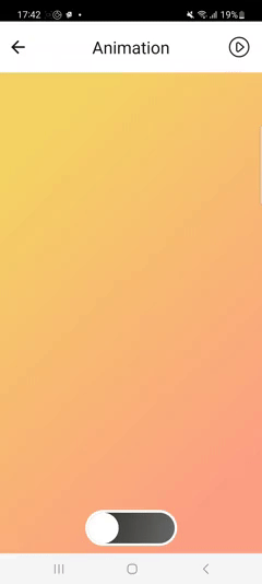
In this example, a toggle is going to be created using containers. Using this toggle, background of the page content can be changed. First create a new page.
Markup
<wm-page name="page1">
    <wm-mobile-navbar name="mobile_navbar1" title="Animation">
        <wm-anchor name="play" iconclass="wm-sl-r sl-button-play" class="navbarAnchorItem" caption="" on-tap="playTap($event, widget)"></wm-anchor>
    </wm-mobile-navbar>
    <wm-content name="content1">
        <wm-page-content columnwidth="12" name="page_content1" class="day">
            <wm-linearlayout direction="column" spacing="4" padding="4px" name="linearlayout1" height="100%">
                <wm-linearlayoutitem flexgrow="1" name="linearlayoutitem1"></wm-linearlayoutitem>
                <wm-linearlayoutitem name="linearlayoutitem2" flexgrow="0" horizontalalign="center">
                  <!-- Outer container of toggle -->
                    <wm-container name="indicator" width="144px" class="toggle-container" on-tap="indicatorTap($event, widget)">
                    <!-- Handle of toggle -->
                        <wm-container width="48px" height="48px" name="toggleHandle" class="toggle-handle" on-tap="toggleHandleTap($event, widget)"></wm-container>
                    </wm-container>
                </wm-linearlayoutitem>
            </wm-linearlayout>
        </wm-page-content>
    </wm-content>
</wm-page>
Script
Page.light = false;
Page.onReady = function() {
    toggleLight();
};

function toggleLight(flag) {
    return Promise.resolve().then(function() {
        if (Page.light) {
            moveToggleToRight();
        } else {
            moveToggleToLeft();
        }
    }).then(function() {
        Page.light = !Page.light;
        Page.Widgets.page_content1.classname = Page.light ? 'day' : 'night';
        Page.Widgets.indicator.classname = 'toggle-container ' + (!Page.light ? 'day' : 'night');
    })
}

function moveToggleToRight() {
    return new Promise(function(resolve) {
        Page.Widgets.toggleHandle.animate({
            animation: {
                0: {
                    left: 0,
                },
                1: {
                    left: 90
                }
            },
            onAnimationEnd: resolve
        });
    });
}

function moveToggleToLeft() {
    return new Promise(function(resolve) {
        Page.Widgets.toggleHandle.animate({
            animation: {
                0: {
                    left: 90,
                },
                1: {
                    left: 0
                }
            },
            onAnimationEnd: resolve
        });
    });
}
Page.toggleHandleTap = function($event, widget) {
    toggleLight();
};
Page.indicatorTap = function($event, widget) {
    toggleLight();
};
Styles
.day .app-container,
.day .app-page-content {
    background-image: linear-gradient(120deg, #f6d365 0%, #fda085 100%);
}
.night .app-container,
.night .app-page-content {
    background-image: linear-gradient(120deg, #2e2d2a 0%, #686868 100%);
}
.toggle-container .app-container,
.toggle-handle .app-container {
    border-radius: 48px;
}
.toggle-container .app-container {
    border:4px solid #fff;
}
.toggle-handle .app-container {
    background-color: #fff;
}
Preview
Preview the app and tap on toggle to change the page background.