Custom Date Picker in Mobile
In this document, learn how to show the custom date picker instead of the native picker in a mobile project.
Custom date picker works similar to the one that renders in the web project. You can use the web version of the date picker for the mobile projects as well. To do this, set the Show Custom Picker property from the properties panel of the Date and Datetime widgets from a mobile project.
Date Pickers in Web and Mobile
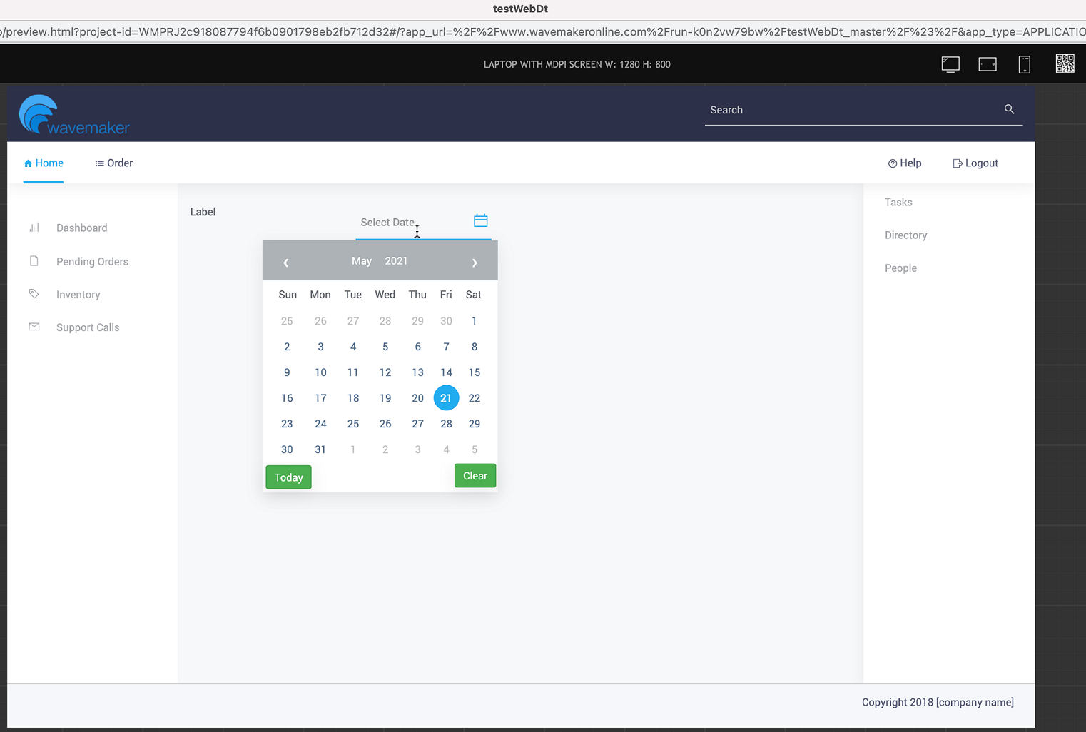
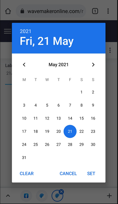
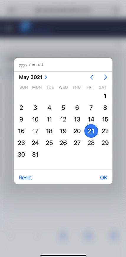
Typically for a web project, on clicking the date, a custom picker opens when it renders on a web browser, and it uses the native picker when it renders on a mobile browser, as shown below.
The following screenshots were taken from android version 7.0 and iPhone version 14. Therefore, the date pickers may vary slightly depending on the device version.
Date Picker in Web
Date Picker in Android
Date Picker in iOS
How it Works
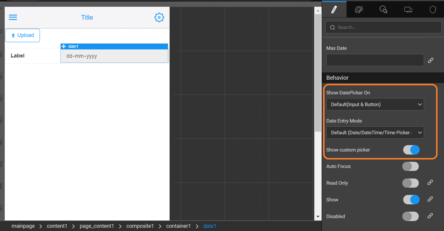
To display the custom date picker like the web version of it, enable the Show Custom Picker property from the properties panel.
When setting the Show Custom Picker property to true, the Show DatePicker On property and Date Entry Mode property will enable. For more information, see datetime properties.
Custom Picker for Web Apps with Mobile View
To show a custom picker instead of a native picker for a web app rendered in a mobile, set the showcustompicker property in the markup as shown below. This applies to Date, Time and Datetime widgets.
The markup extension is specifically for web apps to customize web projects to render mobile views with the custom date picker.


