Date, Time and Datetime
Date, Time and Datetime widgets can be used to capture the date and time-related data from the user. Drag and drop of these widgets result in a composite widget along with a label.
Features
The main properties include
- Date Pattern which defines how the date/time/date time is rendered in the UI, and
- Output Pattern defines the format of output data value returned by these widgets.
- Hour Step and Minute Step defines the time picker UI for the time and datetime widgets.
- For date and datetime widgets, Min Date, Max Date, Exclude Days and Dates can be set. In this case, the date picker will not have the invalid dates available for selection.
WaveMaker supports only Angular DatePipe formats for displaying date/time/date time patterns. For more details, please refer to the Angular documentation.
The following tables show the behavior in various scenarios:
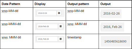
Date Patterns:
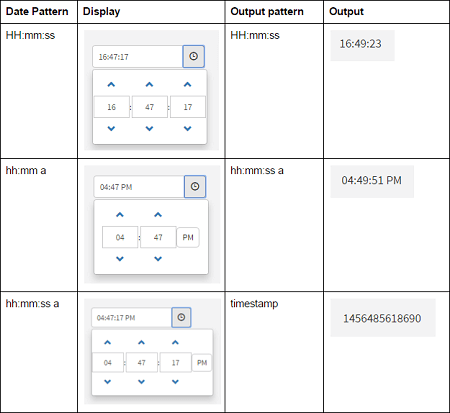
Time Patterns:
Datetime Patterns:

For Time and Datetime widgets the time picker UI based on the time pattern given. For example, if the pattern is ‘hh:mm:ss a’, seconds and AM/PM pattern is displayed in time picker. If the pattern is ‘HH:mm’, 24Hr format is shown. Seconds and AM/PM are not displayed in time picker.
Properties
Date Properties
| Property | Description |
|---|---|
| Name | The name is a unique identifier for Date widget. |
| Placeholder | A placeholder is text to show in the editor when there is no value. A common use of this is a search box that says in faint gray italicized text "Search..." which disappears as soon as the user starts to edit the text box. This is a useful alternative to a caption if you are constrained in space and asking for something simple of the user. |
| Accessibility | |
| Hint | Any text or an HTML you enter for this property will be shown as a tooltip if the mouse hovers over this widget for 1.5 seconds. |
| Tab index | The tab index attribute specifies the tab order of an element. You can use this property to change the default tabbing order for widget access using the tab key. The value can range from 0 to 32767. The default is 0 and -1 makes the element non-focusable. NOTE: In Safari browsers, by default, Tab highlights only text fields. To enable Tab functionality, in Safari Browser from Preferences -> Advanced -> Accessibility set the option "Press Tab to highlight each item on a webpage". |
| Shortcut key | The shortcut key property specifies a shortcut key to activate/focus an element. (*See below for details) |
| Layout | |
| Width | The width of your widget can be specified in px or % (_i.e _50px, 75%). |
| Default Value | |
| Value | This is the default value to display value for an editor widget, it can be set to current date. Note that the display value is just what the user sees initially, and is not always the dataValue returned by the widget. |
| Display Format | |
| Date Pattern | Date pattern lets you override how dates are displayed. Common options are 'dd-MMMM-yyyy', 'yyyy/MM/dd'. |
| Output | |
| Output Format | Defines the format of output datavalue returned by the date widget. Default output format is 'yyyy-MM-dd', which returns the equivalent data value. E.g data value for '19/06/2015' is '2015-06-19'. If the output format is given as 'MMM dd, yyyy', widget returns datavalue as 'Jun 19, 2015'. |
| Validation | |
| Required | A required editor in wm.LiveForm may refuse to save without a required field. |
| Min Date | Enter a minimum date. The dates before this will not be shown in the date picker. The field is bindable. |
| Max Date | Enter a maximum date. The dates after this will not be shown in the date picker. The field is bindable. |
| Exclude Days | Select days which are to be excluded from the selection from the date picker. |
| Exclude Dates | Accepts string and a variable containing dates which will be excluded from the selection from the date picker. |
| Behavior | |
| Show DatePicker on | Using this property you can control the visibility of the Date Picker. You can choose to open it on: - input click and button click (default setting), or - only on button click. |
| Show Week Number | When set, week number will be displayed in the date picker UI. |
| Auto Focus | This property makes the element get focused automatically when the page loads. |
| Read Only | Selecting this checkbox property prevents the user from being able to change the data value of a widget. |
| Show | Showing determines whether or not a component is visible. It is a bindable property. |
| Load on Demand (visible only when show property is bound to a variable) | When this property is set and show property is bound, the initialization of the widget will be deferred till the widget becomes visible. This behavior improves the load time. Use this feature with caution, as it has a downside (as we will not be able to interact with the widget through script until the widget is initialized). When show property is not bound the widget will be initialized immediately. |
| Disabled | If the disabled property is true (checked) the value of the editor cannot change. The widget becomes display-only. |
| Skip on change event from script | When enabled, the Change callback will only trigger when the user updates the value from the UI, and not when it's updated through scripts. This property is disabled by default. |
Datetime Properties
| Property | Description |
|---|---|
| Name | The name is a unique identifier for Date widget. |
| Placeholder | A placeholder is text to show in the editor when there is no value. A common use of this is a search box that says in faint gray italicized text "Search..." which disappears as soon as the user starts to edit the text box. This is a useful alternative to a caption if you are constrained in space and asking for something simple of the user. |
| Accessibility | |
| Hint | Any text or an HTML you enter for this property will be shown as a tooltip if the mouse hovers over this widget for 1.5 seconds. |
| Tab index | The tab index attribute specifies the tab order of an element. You can use this property to change the default tabbing order for widget access using the tab key. The value can range from 0 to 32767. The default is 0 and -1 makes the element non-focusable. NOTE: In Safari browsers, by default, Tab highlights only text fields. To enable Tab functionality, in Safari Browser from Preferences -> Advanced -> Accessibility set the option "Press Tab to highlight each item on a webpage". |
| Shortcut key | The shortcut key property specifies a shortcut key to activate/focus an element. (*See below for details) |
| Layout | |
| Width | The width of your widget can be specified in px or % (_i.e _50px, 75%). |
| Default Value | |
| Value | This is the default value to display value for an editor widget, it can be set to current date. Note that the display value is just what the user sees initially, and is not always the dataValue returned by the widget. |
| Display Format | |
| Date Pattern | Date pattern lets you override how dates are displayed. Common options are 'dd-MMMM-yyyy', 'yyyy/MM/dd'. |
| Hour Step | Number of hours to increase or decrease. |
| Minute Step | Number of minutes to increase or decrease. |
| Output | |
| Output Format | Defines the format of output datavalue returned by the date time widget. Default output format is 'timestamp', which returns the equivalent timestamp integer. E.g timestamp value for '2012-12-12 12:12 PM' is '1355294520000'. If the output format is given as 'yyyy-MM-dd hh:mm a', widget returns datavalue as '2012-12-12 12:12 PM'. |
| Validation | |
| Required | A required editor in wm.LiveForm may refuse to save without a required field. |
| Min Date | Enter a minimum date. The dates before this will not be shown in the date picker. The field is bindable. |
| Max Date | Enter a maximum date. The dates after this will not be shown in the date picker. The field is bindable. |
| Exclude Days | Select days which are to be excluded from the selection from the date picker. |
| Exclude Dates | Accepts string and a variable containing dates which will be excluded from the selection from the date picker. |
| Behavior | |
| Show DateTimePicker on | Using this property you can control the visibility of the DateTime picker. You can choose to open it on: - input click and button click (default setting), or - only on button click. |
| Show Week Number | When set, week number will be displayed in the date picker UI. |
| Auto Focus | This property makes the element get focused automatically when the page loads. |
| Read Only | Selecting this checkbox property prevents the user from being able to change the data value of a widget. |
| Show | Showing determines whether or not a component is visible. It is a bindable property. |
| Load on Demand (visible only when show property is bound to a variable) | When this property is set and show property is bound, the initialization of the widget will be deferred till the widget becomes visible. This behavior improves the load time. Use this feature with caution, as it has a downside (as we will not be able to interact with the widget through script until the widget is initialized). When show property is not bound the widget will be initialized immediately. |
| Disabled | If the disabled property is true (checked) the value of the editor cannot change. The widget becomes display-only. |
| Skip on change event from script | When enabled, the Change callback will only trigger when the user updates the value from the UI, and not when it's updated through scripts. This property is disabled by default. |
Time Properties
| Property | Description |
|---|---|
| Name | The name is a unique identifier for Date widget. |
| Placeholder | A placeholder is text to show in the editor when there is no value. A common use of this is a search box that says in faint gray italicized text "Search..." which disappears as soon as the user starts to edit the text box. This is a useful alternative to a caption if you are constrained in space and asking for something simple of the user. |
| Accessibility | |
| Hint | Any text or an HTML you enter for this property will be shown as a tooltip if the mouse hovers over this widget for 1.5 seconds. |
| Tab index | The tab index attribute specifies the tab order of an element. You can use this property to change the default tabbing order for widget access using the tab key. The value can range from 0 to 32767. The default is 0 and -1 makes the element non-focusable. NOTE: In Safari browsers, by default, Tab highlights only text fields. To enable Tab functionality, in Safari Browser from Preferences -> Advanced -> Accessibility set the option "Press Tab to highlight each item on a webpage". |
| Shortcut key | The shortcut key property specifies a shortcut key to activate/focus an element. (*See below for details) |
| Default Value | |
| Value | This is the default value to display value for an editor widget, it can be set to current date. Note that the display value is just what the user sees initially, and is not always the dataValue returned by the widget. |
| Display Format | |
| Time Pattern | Time pattern lets you override how time is displayed. Common options are 'hh-mm-ss'. |
| Hour Step | Number of hours to increase or decrease. |
| Minute Step | Number of minutes to increase or decrease. |
| Output | |
| Output Format | Defines the format of output data value returned by the time widget. Default output format is 'timestamp', which returns the equivalent timestamp integer. E.g timestamp value for '10:10:00 AM' is '16800000'. If the output format is given as 'hh:mm a', widget returns data value as '10:10 AM'. |
| Validation | |
| Required | A required editor in wm.LiveForm may refuse to save without a required field. |
| Behavior | |
| Show TimePicker on | Using this property you can control the visibility of the Time picker. You can choose to open it on: - input click and button click (default setting), or - only on button click. |
| Auto Focus | This property makes the element get focused automatically when the page loads. |
| Read Only | Selecting this checkbox property prevents the user from being able to change the data value of a widget. |
| Show | Showing determines whether or not a component is visible. It is a bindable property. |
| Load on Demand (visible only when show property is bound to a variable) | When this property is set and show property is bound, the initialization of the widget will be deferred till the widget becomes visible. This behavior improves the load time. Use this feature with caution, as it has a downside (as we will not be able to interact with the widget through script until the widget is initialized). When show property is not bound the widget will be initialized immediately. |
| Disabled | If the disabled property is true (checked) the value of the editor cannot change. The widget becomes display-only. |
| Skip on change event from script | When enabled, the Change callback will only trigger when the user updates the value from the UI, and not when it's updated through scripts. This property is disabled by default. |
Shortcut key: The shortcut key property specifies a shortcut key to click the button. The way of accessing the shortcut key is varying in different browsers:
| Browser | Shortcut key Trigger |
|---|---|
| Internet Explorer | [Alt] + shortcut key |
| Chrome | [Alt] + shortcut key (Windows/Linux) |
| [Control][Alt] + shortcut key (MAC) | |
| Firefox | [Alt][Shift] + shortcut key (Windows/Linux) |
| [Control][Alt] + shortcut key (MAC) |
Events
Date Events
| Event | Description |
|---|---|
| Change | This event handler is called each time your element's value changes. |
| On focus | This event handler is called each time your element is focused. |
| On blur | This event handler is called each time your focus leaves your element. |
| Mouse Events | |
| On click | This event handler is called whenever the click event is triggered on a widget. |
| On mouse enter | This event handler is called whenever the mouse enters the widget. |
| On mouse leave | This event handler is called whenever the mouse leaves the widget. |
| Touch Events | |
| On tap | This event handler is called whenever the tap event is triggered on a widget. |
Datetime Events
| Event | Description |
|---|---|
| Change | This event handler is called each time your element's value changes. |
| On focus | This event handler is called each time your element is focused. |
| On blur | This event handler is called each time your focus leaves your element. |
| Mouse Events | |
| On click | This event handler is called whenever the click event is triggered on a widget. |
| On mouse enter | This event handler is called whenever the mouse enters the widget. |
| On mouse leave | This event handler is called whenever the mouse leaves the widget. |
| Touch Events | |
| On tap | This event handler is called whenever the tap event is triggered on a widget. |
Time Events
| Event | Description |
|---|---|
| Change | This event handler is called each time your element's value changes. |
| On focus | This event handler is called each time your element is focused. |
| On blur | This event handler is called each time your focus leaves your element. |
| Mouse Events | |
| On click | This event handler is called whenever the click event is triggered on a widget. |
| On mouse enter | This event handler is called whenever the mouse enters the widget. |
| On mouse leave | This event handler is called whenever the mouse leaves the widget. |
| Touch Events | |
| On tap | This event handler is called whenever the tap event is triggered on a widget. |