WaveMaker 11.11.5 - Release date: 30 June 2025
WaveMaker's Release 11.11.5 includes Edge-to-Edge UI and a new Bottom Sheet widget for React Native apps, along with key enhancements like page size selection in Data Table, Custom Label marker in Slider Widget, and read-only mode in Form. Several bug fixes improve behavior across Studio, Web, and React Native.
Features
React Native
New Edge-to-Edge App Experience with hideable Top & Bottom Nav
We’ve introduced a powerful new feature set to help you build modern, immersive edge-to-edge mobile apps. These capabilities are now configurable directly from Studio, providing a seamless developer experience.
Features Overview
Edge-to-Edge Apps
Enable full-screen UI experiences by extending app content beneath:
- The Status Bar
- The Navigation Bar (Android) / Home Bar (iOS)
- Device-specific cutouts like notches or camera holes
This enhances immersion and allows your app to utilize 100% of screen real estate.
Auto-Hide Navbars
Automatically hides the Navigation Bar and Tab Bar when users scroll down — giving content more room to breathe. As users scroll up, these bars reappear with a smooth transition.
Edge-to-Edge App
Edge-to-Edge App with Auto Hide Top & Bottom Nav
Benefits
- More usable screen space for content
- Modern visual behavior, consistent with native apps
- Enhanced user engagement and usability
These enhancements collectively aim to bring your app experience on par with modern design guidelines seen in popular native apps.
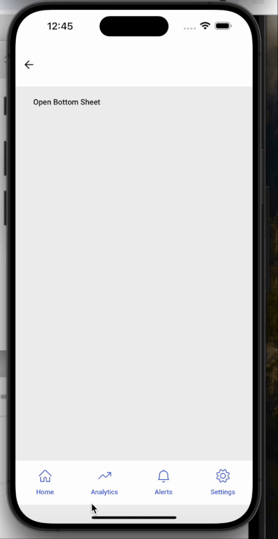
New Widget - Bottom Sheet
A new widget Bottom Sheet has been added for mobile apps. It provides a panel that slides up from the bottom of the screen to present additional content or actions — without navigating away from the current screen.
Key Features:
- Tap Outside to Close: Dismisses automatically when tapping outside the panel.
- Swipe Down to Dismiss: Allows intuitive gesture-based closing.
- Swipe Up to Expand: Expands to a configured height with an upward swipe.
- Smooth Animations: Provides fluid open/close transitions for a seamless user experience.
Bottom sheets are ideal for use cases like filters, media controls, map detail views, and quick user actions.
Enhancements
Web
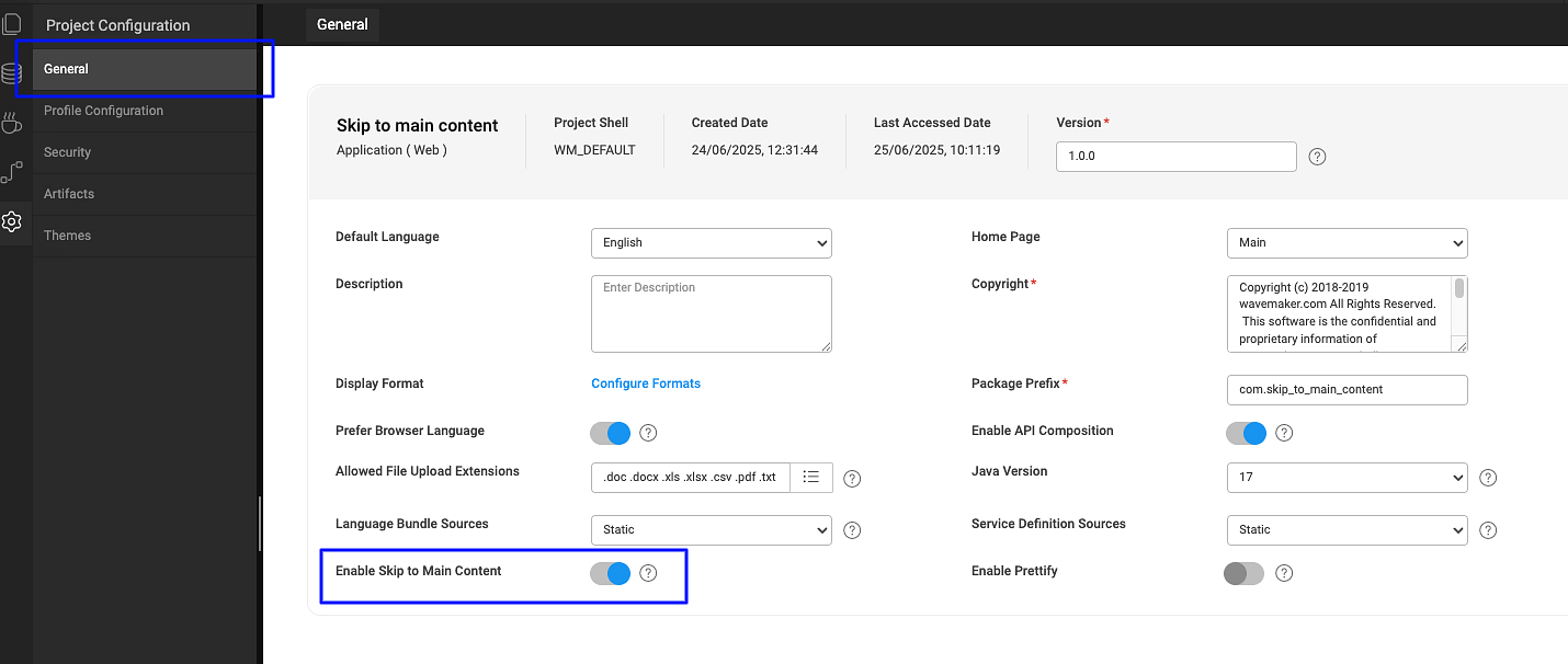
Accessibility Enhancement: “Skip to Main Content” support
Added support for the Skip to Main Content accessibility feature.
Users navigating via keyboard or assistive technologies can now bypass repetitive layout elements and jump directly to the main page content.

It can be configured in Settings -> General -> Enable Skip to Main Content.
Enhanced Data Table footer with additional page size options
The Data Table widget footer has been enhanced to provide users with more control over pagination:
- Items per Page: Displays the selected page size (e.g., "5 items per page").
- Current Page Range: Shows the range of visible items along with the total count (e.g., “1–5 of 10”).
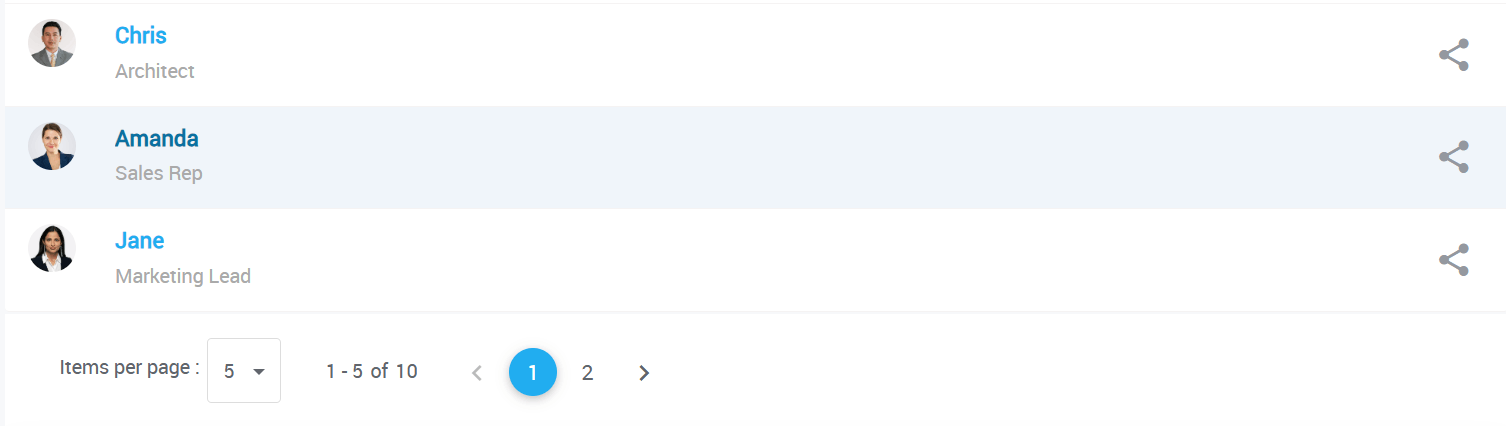
To support this, two new options have been added in the Advanced Settings of the Data Table widget:
- Show Page Size Selection: Toggle to enable or disable the ability to select page size.
- Page Size Options: Allows custom comma-separated values (e.g., 3,7,10,20) to define the dropdown options for items per page.

By default, the page size options are set to: 5,10,20,50,100.
This enhancement is supported in the following widgets:
- Data Table
- Cards
- List
Custom ESLint configuration support added to Inspection Framework
The Inspection Framework now supports custom ESLint configurations via uploaded files, giving greater flexibility in enforcing coding standards.
How to Use
Upload your custom ESLint configuration file named
eslintrc-override.jsto:src/main/webapp/resources/filesThe file must export a valid ESLint config object using
module.exports.
Example :
The uploaded eslintrc-override.js file will be merged with the WaveMaker’s default ESLint configuration. The Issues tab will reflect results based on this combined configuration.
Two copies of the combined configuration will copied to the generated-angular-app at below below locations:
1) generated-angular-app/.eslintrc.js
2) generated-angular-app/resources/files/eslintrc-override.js
The file at first location will be hidden in the studio file workspace.
Plugin Dependencies
If your ESLint config uses custom plugins, upload an package-override.json to the same path:
src/main/webapp/resources/files
Example :
This file will automatically be merged into the project’s default package.json to ensure the required plugins are installed.
Added "Read Only" option for Form widget
A new Read Only property has been added to the Form widget. When enabled, it:
- Makes all form fields read-only
- Disables all action buttons within the form
This feature is useful for scenarios where the form should be displayed in a non-editable mode for review or approval flows.
Improved AM/PM selection in Time and DateTime widgets
The Time and DateTime widgets now support a more intuitive AM/PM selection experience.
By default, A single toggle button was used to switch between AM and PM, as shown below.

To make it more intutive we have introduced a new property: Show AM/PM Buttons.
When enabled, the widget will display two distinct buttons — one for AM and one for PM. Selecting one automatically deselects the other, making the selection process easier to understand and use.

By default, Show AM/PM Buttons is disabled to preserve existing behavior.
Added support to show custom labels in Slider widget
The Slider widget now supports displaying custom labels instead of only numeric values. This is useful for scenarios where predefined labels are more meaningful than numbers.
It also introduces customizable label positioning, allowing you to display labels either above or below the slider.

Two new properties have been added:
- Showmarkers: When enabled, displays labels instead of numbers along the slider.
- Marker Text: Accepts custom labels.
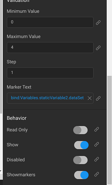
Note: The length of the Marker Text array must match the number of steps in the slider.
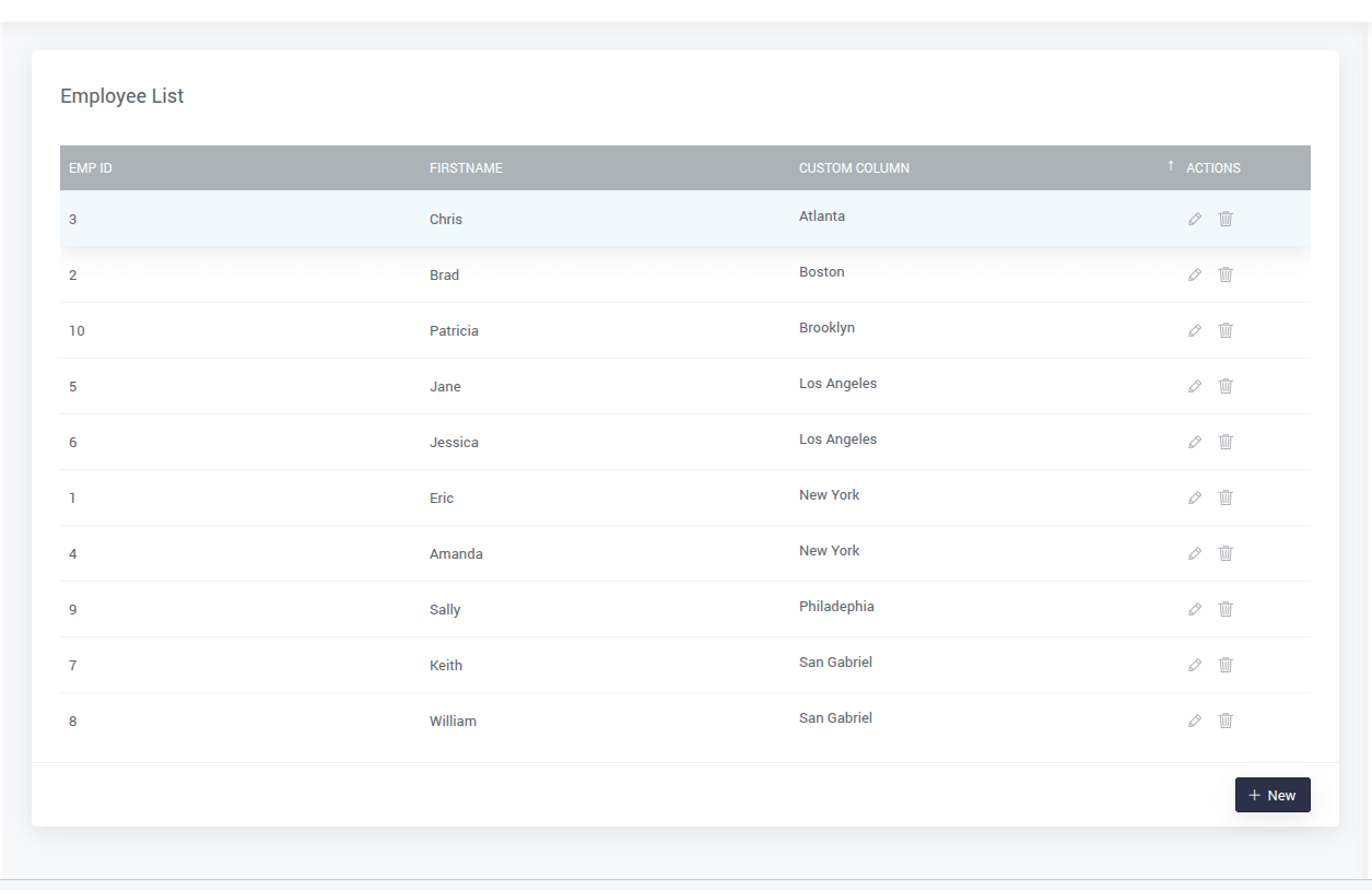
Added support for sorting on custom columns in Data Table
Enhanced the Data Table widget to support sorting on custom fields.
A new Sort By field has been added to the widget’s advanced settings.
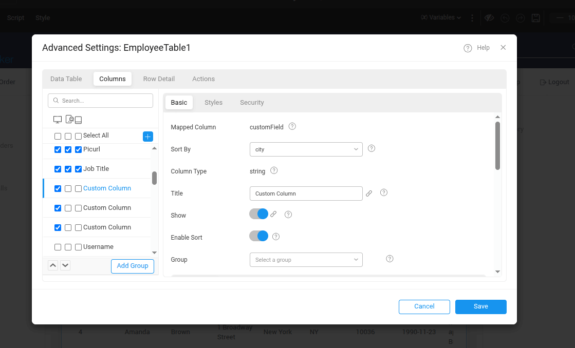
When configured, clicking on a custom column will sort the data based on the Sort By field value.
Example : Here data is sorted in descending order as per Sort By field value of the custom column.
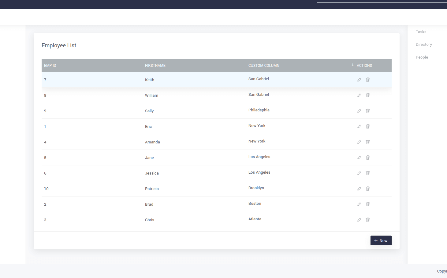
Clinking on it again, will toggle soting order from descending to ascending.
Added hover hints and accessibility labels for row selection in Data Table
A new hint feature has been added to improve usability when selecting rows in the Data Table widget. When Multiselect or Radio Column row selection is enabled, users will now see a tooltip-style hint when hovering over the checkbox or radio button for each row.
To support this, four new properties have been introduced under Advanced Settings of the Data Table:
If Multiselect is enabled:
- Multiselect Hint: Text shown on hover.
- Multiselect Aria-label: Accessibility label for screen readers.
If Radio Column is enabled:
- Radio Column Hint: Text shown on hover.
- Radio Column Aria-label: Accessibility label for screen readers.

Studio
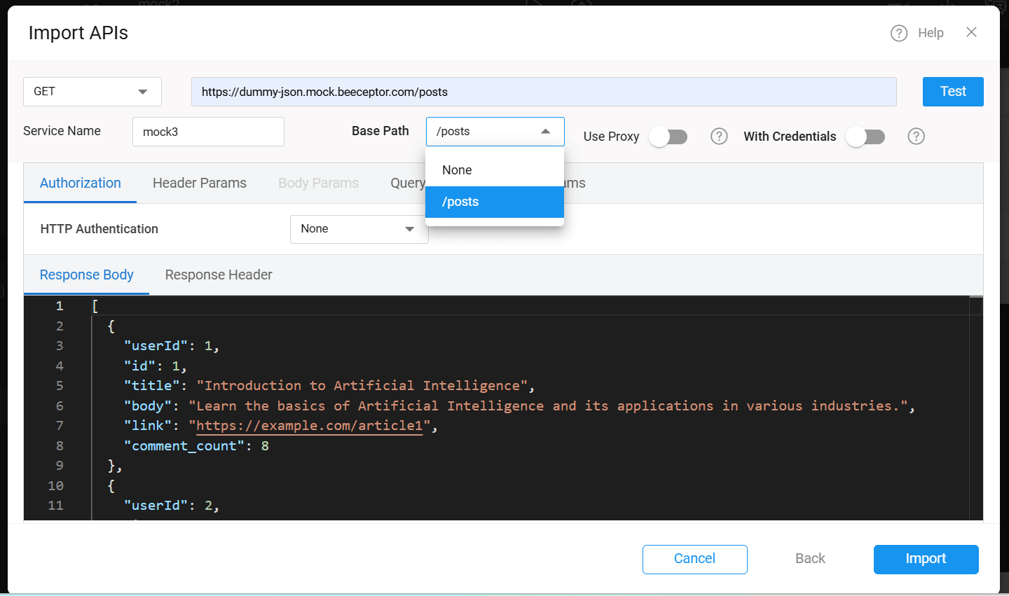
Added "None" option to Base Path in REST API configuration
Enhanced the REST API configuration by introducing a "None" option in the Base Path dropdown.
This allows users to configure an API without automatically prefixing it with any predefined base path, offering greater flexibility.
React Native
Added "Stop at Last" option to control looping in Carousel widget
A new property stopatlast has been added to the Carousel widget. When enabled, the carousel stops at the last slide instead of looping back to the first one.
By default, this property is disabled.
Added support to show custom labels in Slider widget
The Slider widget now supports displaying custom labels instead of only numeric values. This is useful for scenarios where predefined labels are more meaningful than numbers.
It also introduces customizable label positioning, allowing you to display labels either above or below the slider.
A new property have been added:
- Marker Text: Accepts custom labels.
Showmarkers must be enabled to displays labels instead of numbers along the slider.
Note: The length of the Marker Text array must match the number of steps in the slider.
Added onDeselect callback support to List widget
onDeselect callback support to List widgetonDeselect callback event has been added to the List widget in Studio. This callback is triggered whenever an item in the list is deselected, allowing developers to handle custom logic during item deselection.
Added flag to control theme color inheritance in Lottie being used as loader
By default, when a Lottie animation is used as loader in app, it inherits shades of primary color from the app’s theme.
A new flag inheritThemePrimary has been introduced to customize this behavior. To disable theme-based color inheritance, set the following in wm_rn_config.json:
This gives developers greater control over the appearance of the Lottie being used as loader.
Bugs
Web
Fixed issue with page cache not working as expected
Resolved a bug where enabling the cache property for a page did not retain the page instance during navigation. The caching behavior now works correctly.
React Native
Fixed incorrect display of "No Data Found" message during initial load in List widget
The List widget showed a "No Data Found" message while data was still loading, which could be confusing to users. This has been corrected.
Now, a loading animation is shown during the initial data fetch, and the "No Data Found" message appears only if no data is returned after loading completes.
Fixed extra space above Donut chart when Title and Sub Heading are empty
Resolved an issue where the Donut chart reserved vertical space for the Title and Sub Heading even when they were empty, resulting in unwanted spacing above the chart.
Now, if both title and subheading are not set, no extra space is added above the chart.
Fixed issue where dynamic form UI was not updating on data change
Resolved an issue where the dynamic Form widget UI was not reflecting changes when its underlying data was updated, especially when used inside widgets like List or Accordion.
The form now re-renders correctly to reflect the latest data.
Fixed selectItem and deselectItem methods in List widget
selectItem and deselectItem methods in List widgetResolved an issue where the selectItem() and deselectItem() methods on the List widget were not functioning as expected. These methods now work correctly.
Fixed issue where language did not update after changing locale in Select Locale widget in Web Preview
Resolved an issue where changing the language using the Select Locale widget in web preview did not update the app language as expected. The selected language now applies correctly.
Fixed RTL layout issues in Toggle and Progress Bar widgets
Resolved layout and animation issues when the app is using a Right-to-Left (RTL) language:
- Toggle Widget: Fixed incorrect animation direction in RTL mode.
- Progress Bar Widget: Fixed layout misalignment when rendered in RTL mode.
Both widgets now render and behave correctly in RTL layouts.
Fixed app crash on tapping unbound Chart widget
Resolved an issue where tapping a Chart widget without any bound data would cause the app to crash.
The widget now handles unbound states gracefully without triggering errors.
Fixed marker alignment issue in Slider widget
When Showmarkers was enabled in the Slider widget, the first and last markers were partially rendered outside the widget boundaries.
This issue has been fixed, all markers now appear correctly within the slider area.
Fixed border-radius issue on wm-page-content
wm-page-contentResolved an issue where applying border-radius styles to wm-page-content using .app-page-content class had no effect.
Custom border-radius values are now applied as expected.