WaveMaker 11.11.7 - Release date: 28 July 2025
WaveMaker 11.11.7 introduces key features like dynamic i18n messages, mTLS configuration via Studio, and an enhanced React Native splash screen setup. This release also includes several bug fixes across Web and React Native, improving UI flexibility and app stability.
Features
Web
Parameterized i18n Messages
Web apps now supports dynamic values in localized i18n messages using the new templateReplace formatter. This formatter enables injecting dynamic values into i18n message templates by replacing placeholders such as ${amount} or ${receiver} with actual runtime data.
Steps to Configure:
- Define i18n Message with placeholders in Localized Messages dialog.
Eg. LABEL_TRANSACTION_MESSAGE :
${amount} sent to ${receiver} successfully
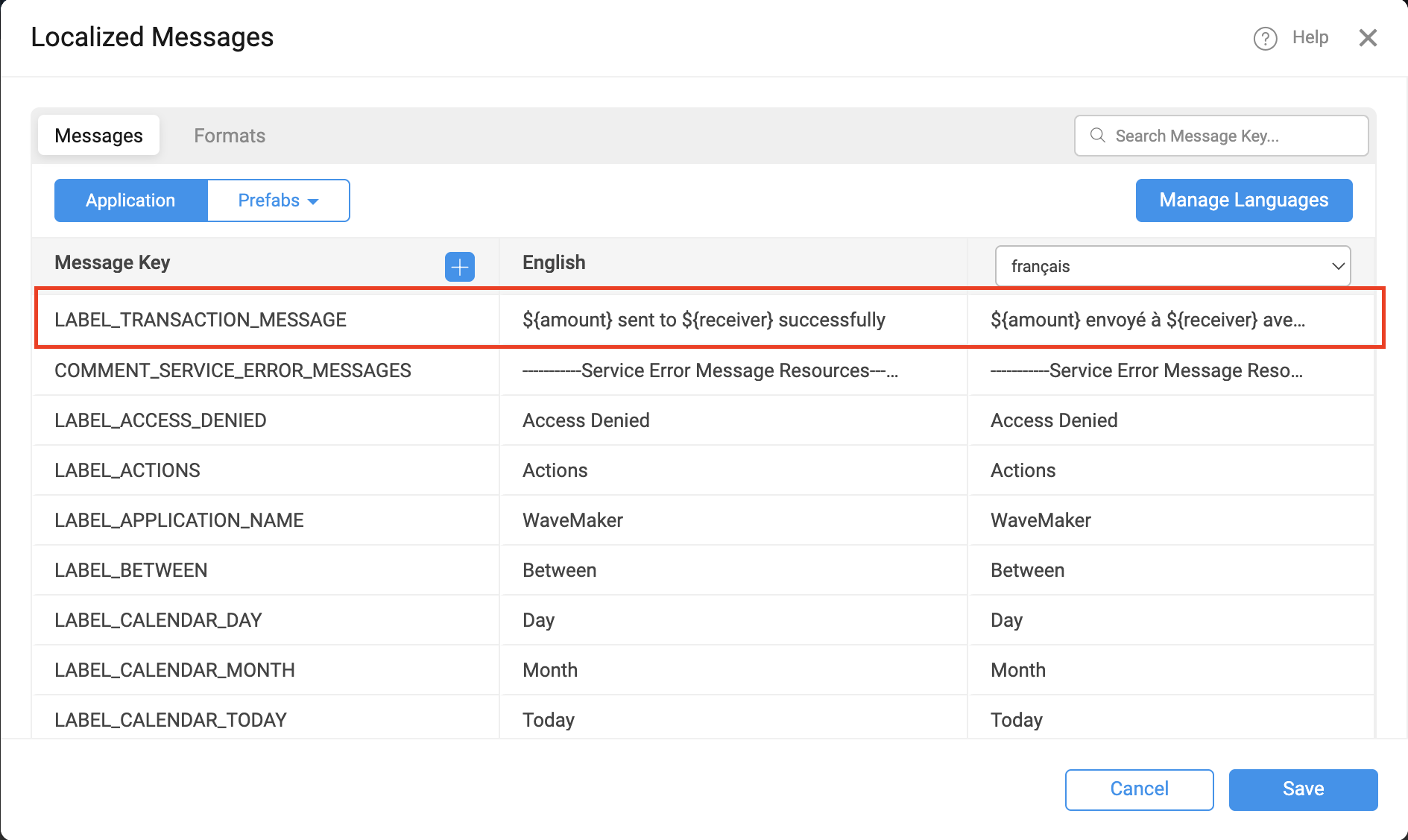
- Open binding dialog where you want to display the created message
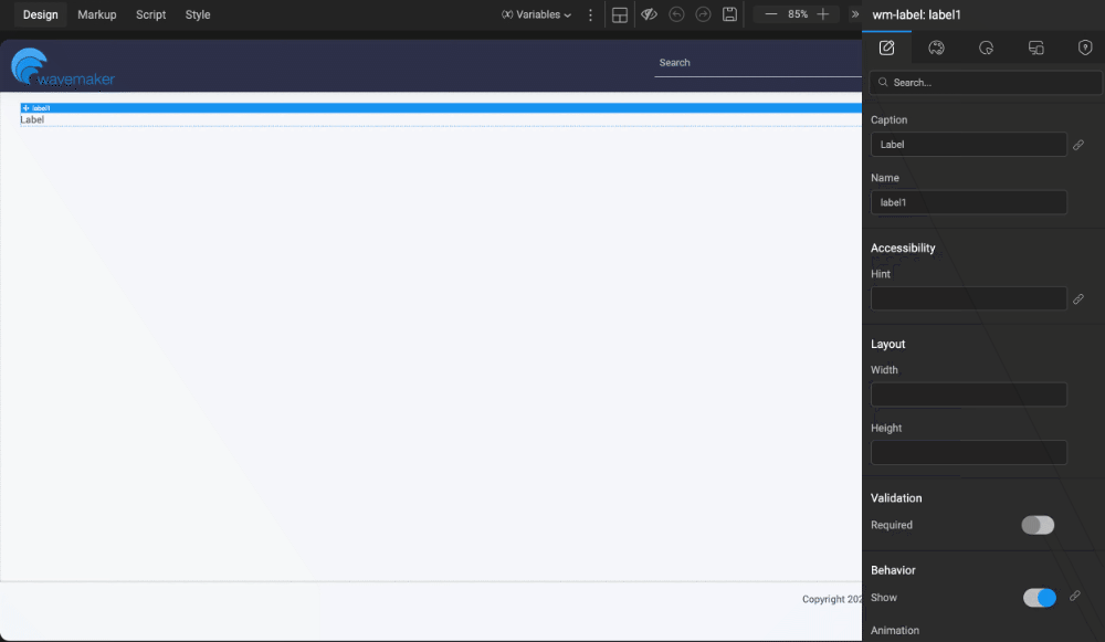
- Choose the message from Localized Messages tab. It will automatically navigate to Use Expression tab and display the message with formatter with key and empty values.
- User has to replace the empty string with desired bindable vlaues or data like
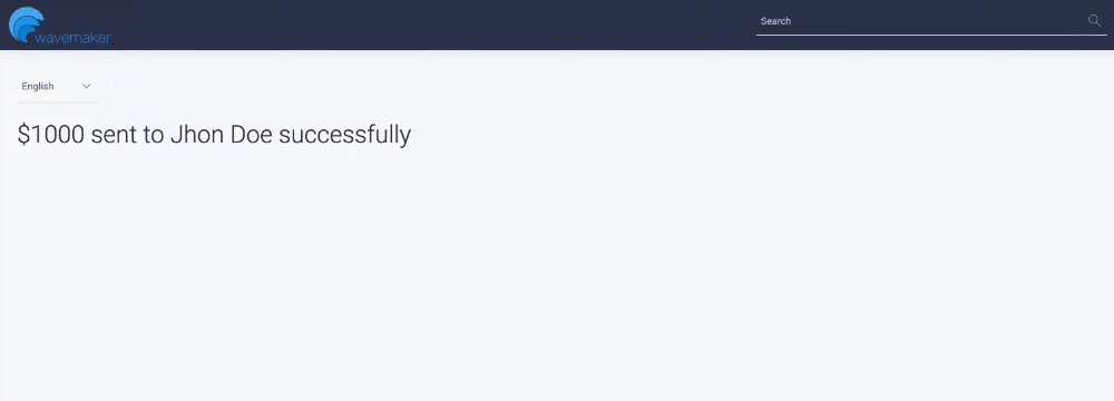
or
- The output will be displayed as
The templateReplace formatter can be used not only with localized messages (i18n) but also with any other bindable string data that contains placeholders. You can configure it from the Use Expression tab under the Formatters section.
This brings flexibility to internationalized applications, especially where messages require dynamic context.
Studio
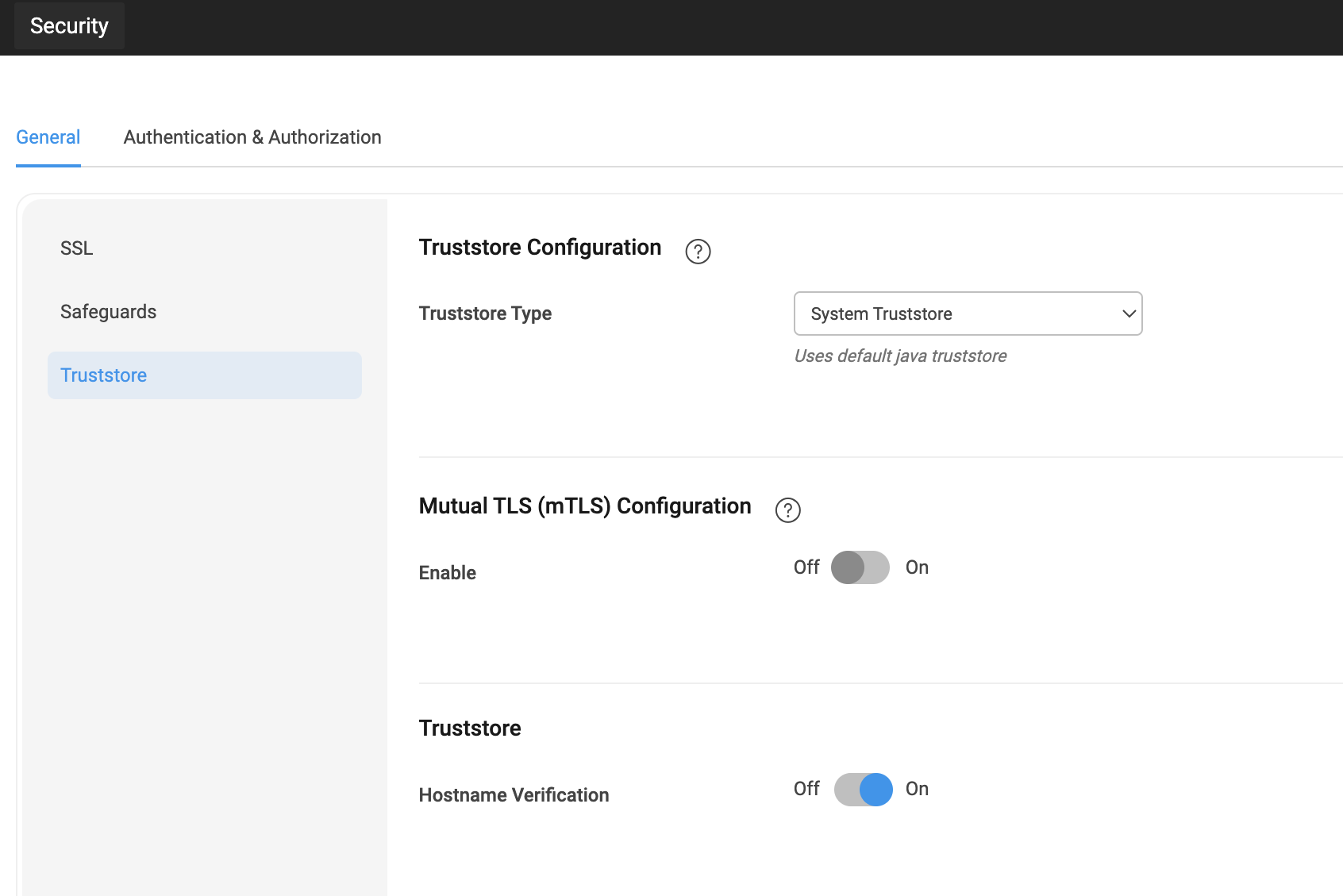
Trust Store & Mutual TLS (mTLS) Configuration via Studio UI
Developers can now easily configure Trust Store and Mutual TLS (mTLS) directly from the Studio UI.
To configure it, navigate to:
Settings → Security → Trust Store
This simplifies secure communication setup with external services by allowing trusted certificates and mTLS to be managed in UI.
Enhancements
Web
Enhanced ESLint Integration: Support for Ignoring CSS and Custom Lint Paths
Two new enhancements have been added to improve ESLint configuration flexibility via the uploaded eslintrc-override.js file:
1. Ignore Specific CSS Files
You can now exclude CSS files from linting by adding a top-level property ignoreCssPatterns in your ESLint override config.
Usage Example:
2. Include Custom File Paths for Linting
You can now include additional files for linting by defining the extraLintPaths property in the override config.
Usage Example:
These enhancements allow more control over what gets linted and what should be ignored during the ESLint process.
Improved Accessibility: Arrow Key Navigation in Wizard widget
The Wizard widget now supports arrow key navigation, allowing users to switch between steps using arrow keys.
If a step is disabled, the arrow keys will not move focus to that step.
This enhancement provides a faster and more accessible way to navigate multi-step Wizards using the keyboard.
Studio
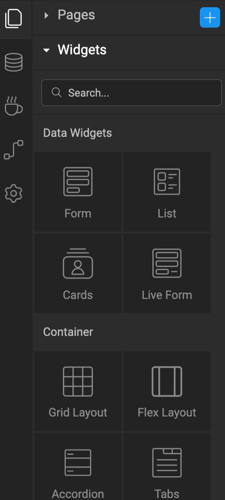
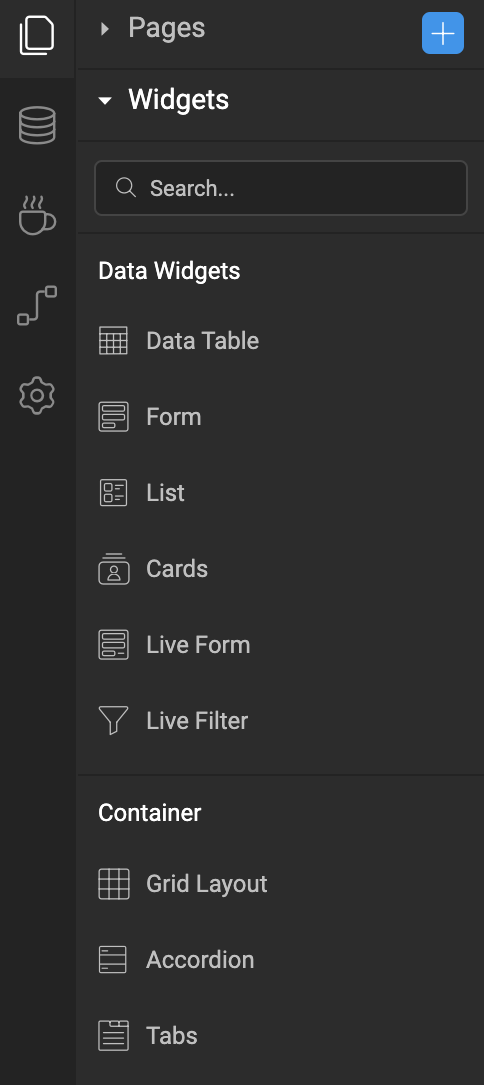
Studio UI enhancements for improved usability
The Widgets and Prefabs sections in the Studio left panel now use a list layout instead of a grid for easier navigation.
Text, hover, and active widget styles have also been refined for better clarity and feedback.
React Native
Added .app-list-item-column-wrapper class for List widget
.app-list-item-column-wrapper class for List widgetA new CSS class .app-list-item-column-wrapper has been introduced for the List widget.
This class targets the row container that holds multiple list items when:
- List Direction is set to Vertical, and
- Items per Row is greater than 1.
It allows developers to style the row container directly, for example, by adding spacing or background styling around grouped list items.
Introduced new styling classes for Switch widget icons
Added two new CSS classes to customize icon styling in the Switch widget:
.app-switch-icon— applies styles to the icon when the switch is in the unselected state..app-switch-selected-icon— applies styles to the icon when the switch is in the selected state.
These classes allow more control over the visual appearance of switch icons based on selection state.
Added responsive support for Items Per Row in List widget
The List widget now supports configuring Items Per Row separately for different screen sizes.
Instead of a single Items Per Row field, Studio now provides three sub-fields:
- Mobile: Set items per row for mobile devices.
- Tablet Portrait: Set items per row for tablets in portrait orientation.
- Laptop/Tablet Landscape: Set items per row for laptops and tablets in landscape mode.
This allows developers to easily create responsive layouts tailored for various device sizes.
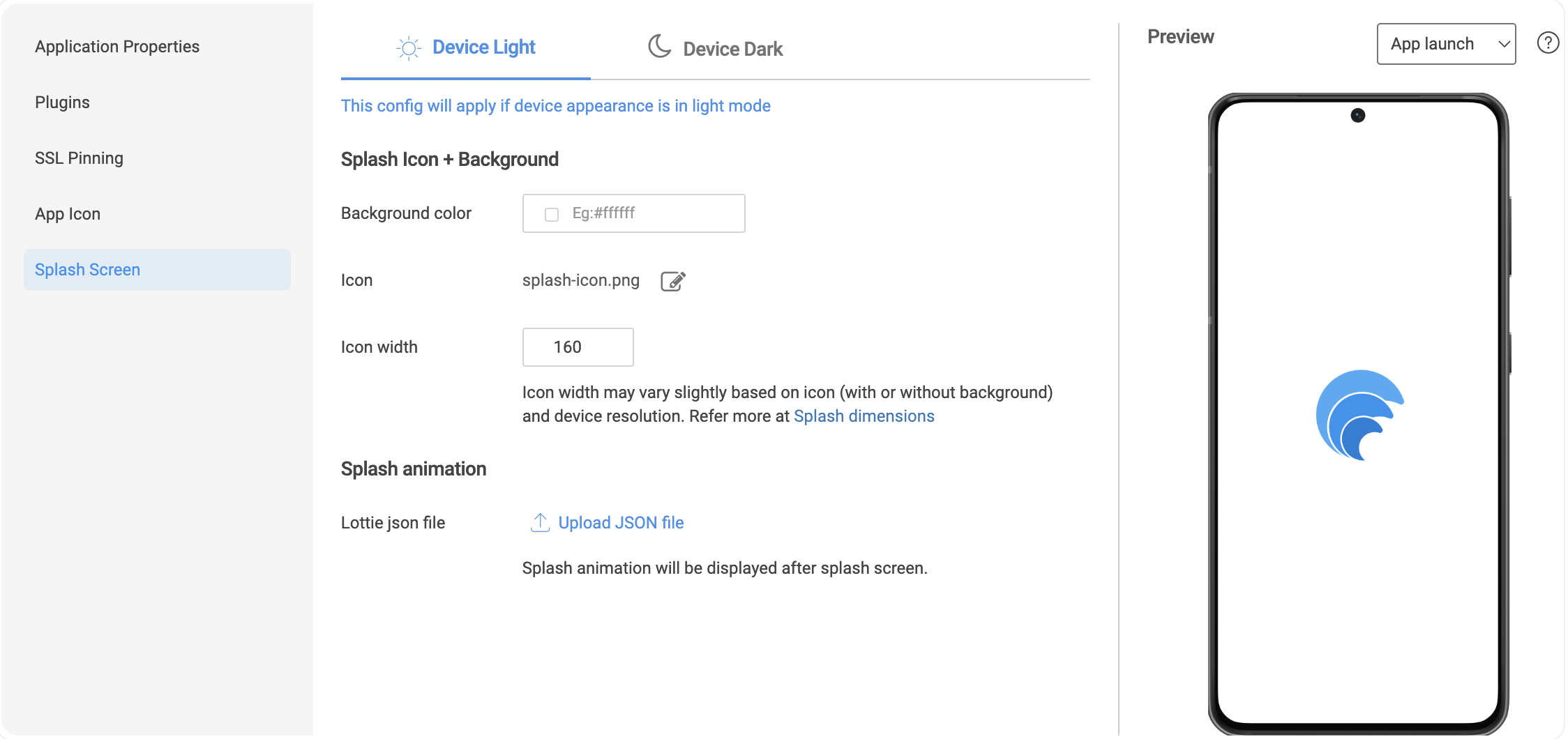
Revamped Splash Screen Configuration with preview
Significant improvements have been made to the Splash Screen Configuration in Studio, enabling a more visual and flexible setup experience.
Key Enhancements
- Background Color: Easily set background color for the splash screen.
- Splash Icon: Choose a custom icon.
- Icon Width: Set desired width for the splash icon.
- Splash Animation: Add a Lottie JSON animation to be shown after the splash screen.
Dark and Light Mode Support
All configurations (background, icon, animation) can now be defined separately for when the user's device is in Light or Dark mode.
Live Preview Modes
A built-in Preview tool lets you visualize splash configurations in real-time:
- Background – Displays the configured splash screen background and icon.
- Animation – Shows the splash animation in isolation.
- App Launch – Simulates a full app launch: splash screen → animation → mock home page.
These updates make splash screen setup intuitive, visual, and aligned with real device behavior.
Bugs
Web
Fixed column metadata not updating on dataset change in Data Table widget
When changing the dataset binding in the Data Table widget, the Columns section in Advanced Settings continued to show fields from the old dataset. This has been fixed now, column metadata now refreshes correctly based on the newly bound dataset.
Fixed selectItem() issue with Multi-Select in Data Table
selectItem() issue with Multi-Select in Data TableResolved an issue where the selectItem() method was not working inside the On Data Render callback when Multi-Select was enabled in the Data Table widget.
It now works as expected.
Fixed: Incorrect Redirect on SSO Session Timeout
When Studio was configured with SSO, session timeouts redirected users to the platform’s default database login instead of the intended SSO login page.
This has been resolved — users are now correctly redirected to the configured SSO login, ensuring a consistent authentication flow.
Fixed: Nested Form Fields Reset on List Dataset Change
Resolved an issue where nested form fields inside a List widget (via partials) were losing values when the list's dataset was modified (e.g., using .splice()).
Now, with two-way binding and form binding to the formdata object, nested form values persist correctly during dataset updates and widget refresh.
Fixed: Focus Not Moving to First Field in Data Table
Resolved an accessibility issue where keyboard focus did not move to the first editable field in a Data Table, when:
- Initial fields were readonly: true, and
- The last column used a number-type edit widget with On Change event.
This prevented proper focus flow in forms. The issue is now fixed, and keyboard navigation behaves as expected.
React Native
Fixed issues related to Slider widget
This update addresses multiple issues in the Slider widget:
- Tooltip and Data Value Mismatch
- The displayed tooltip value was not always in sync with the widget’s actual
datavalue. This mismatch has now been corrected.
- The displayed tooltip value was not always in sync with the widget’s actual
- On iOS, navigating to the page with slider was causing app crash.
Large Range Handling Issues (e.g., Min: 100, Max: 100000)
- The slider was allowing values outside the defined range, and the tooltip was not rendering correctly for large numbers (3–4 digits). Tooltip alignment has also been corrected.
Fixed crash issue with WavePulse debugging when certain styles are used
Resolved an issue where the mobile app would crash when connecting with WavePulse for debugging if specific styles (like box-shadow) were applied in the app.
The app now handles such styles properly, ensuring WavePulse debugging works without causing crashes.
Fixed partial rendering issue in Popover widgets within Prefabs
Fixed an issue where Popover widgets inside Prefabs failed to render their Partials. After this update, Partials nested within Popovers inside Prefabs now render correctly.
Resolved accessibility issues in Picture and Icon widgets
Improved accessibility support for Picture and Icon widgets by fixing compatibility issues with screen readers and other accessibility tools.
These widgets now provide better support for assistive technologies, ensuring more accessible applications.
Fixed crash issue with custom colors in Column and Bar charts
Resolved an issue where binding an array of custom colors to the Custom Colors property in the Column and Bar chart widgets caused the app to crash.
With this fix, custom colors are now correctly applied to both bars and legends without causing crashes.