WaveMaker 11.15.0 - Release date: 8 February 2026
Features
Studio
Profiles & Property Management Simplified
WaveMaker has reworked how application, service, connector, and prefab properties are managed across profiles. Default values are now sourced directly from their respective configuration files, and profile entries are created only when a user explicitly overrides a value.
This change eliminates property duplication, improves version control clarity, and enables consistent, build-once deploy-anywhere workflows. See the detailed documentation for structure changes, migration behavior, and deployment implications. For more information, see Unified Configuration and Profile Management.
Studio Design Update: All Controls Consolidated into a Single Top Nav Bar
The Studio design has been streamlined by merging the secondary top bar into the primary top bar, reducing visual clutter and improving discoverability of frequently used actions.
This update reorganizes menus and controls into a single, consistent header layout while preserving existing functionality. Several items have been repositioned to align better with user workflows, improve canvas focus, and create clearer separation between project context, page actions, and global settings.
Users may notice changes in where certain options appear, but no capabilities have been removed—only consolidated and better organized.
Refer to the image below for a clear understanding of the UI changes and their new locations.
Debounced Auto-Save in Design Workspace
Implemented an Auto-Save mechanism that automatically persists the user's data. The system monitors user interactions (such as typing or canvas interaction) and triggers a save operation after 5 seconds of inactivity(debouncing operation ) following the last user input. This ensures data is saved efficiently and improves user experience.
The auto-save process resets the timer on every interaction, ensuring that data is only saved once the user pauses, preventing frequent or redundant saves during continuous input.
Live save status display in the header showing "Saving..." and "Saved" states based on API responses.
How Auto-Save Works (Use Case) The user starts typing or interacting with the canvas (e.g., drag and drop, delete, copy, paste, template or layout selection, property changes). A 5-second inactivity timer is started. If the user interacts again within 5 seconds: The previous timer is cleared. A new 5-second timer is initiated. While changes are pending and the save request is being prepared: The header displays the status “Saving…”.
If no interaction occurs for 5 seconds: The auto-save API is triggered automatically. Upon successful API response: The data is persisted and synced with the backend. The header status updates to “Saved”, confirming successful completion.
This implementation follows a debounced auto-saving approach, ensuring efficient API usage and a seamless user experience.
Enhancements
Web
Async Support Added to `App.onBeforeServiceCall`
Previously, App.onBeforeServiceCall only worked with synchronous logic. The framework expected the request object to be returned immediately.
That meant any asynchronous modification like generating tokens, fetching keys, or encrypting headers silently failed. The API call triggered before your async code finished, and your changes were ignored.
Earlier Behavior (Async Logic Did NOT Work)
- Async code starts running
- API call is triggered immediately
- Header update finishes too late
- Request is sent without
x-token
What’s New
App.onBeforeServiceCall now supports:
- Synchronous returns
- Promises
- Conditional sync + async logic
async / await
The API call waits until the request is fully resolved.
Supported Usage (All Scenarios)
Case 1: Synchronous Modification
- Works as before
- API call uses the modified request
Case 2: Asynchronous Modification (Promise)
- Promises are fully supported
- API call waits for async completion
Case 3: Conditional Sync or Async Logic
- Works correctly in mixed scenarios
- Always returns the final request
Case 4: Using async / await
- Clean and readable
- Fully supported
- Request is modified before the API call
If you rely on async logic—security headers, tokens, encryption, conditional auth— this hook now behaves the way you always expected it to.
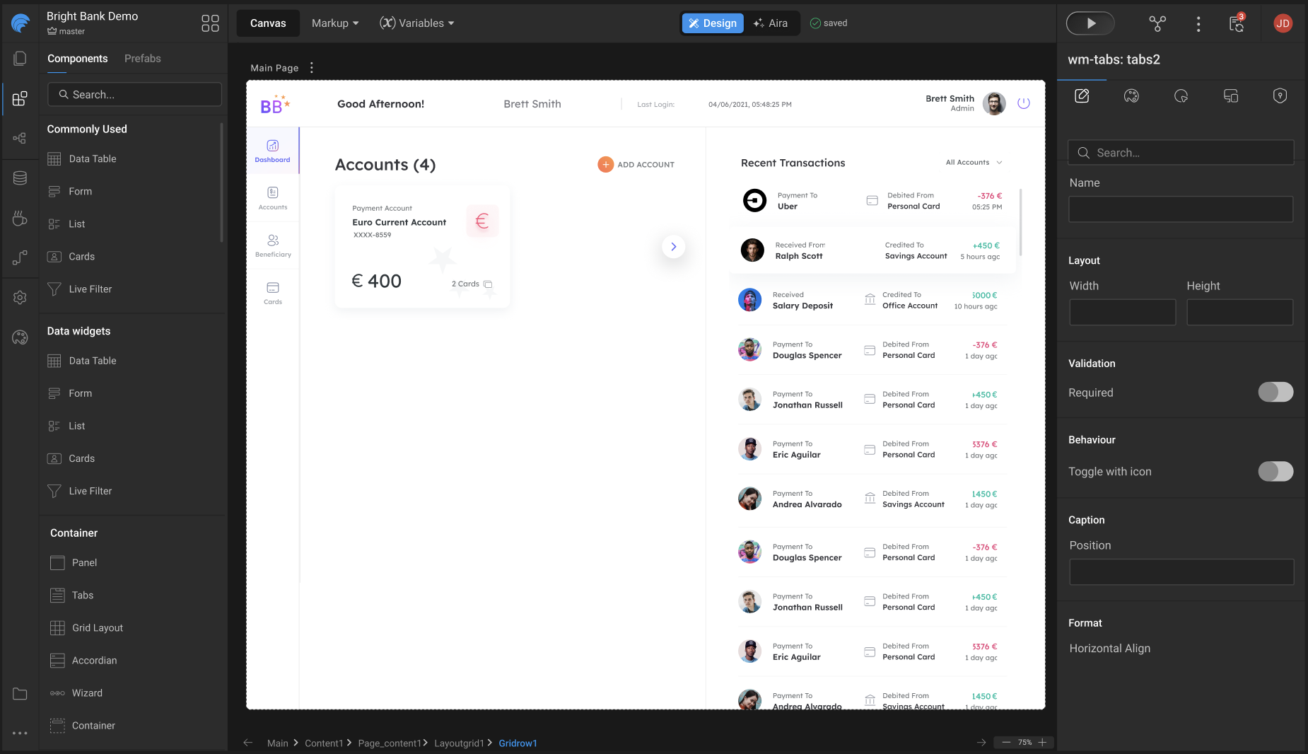
Programmatically Access Widgets in Tabs, Accordions, and Wizards
Accessing widgets inside Dynamic widgets like Tabs, Accordion, and Wizard is tricky. To simplify this, we now expose a dedicated method that allows you to programmatically access internal widgets with ease.
Syntax:
Parameters: widgetName (Required): Name of the widget to access. index (Optional): Zero-based pane index (Tab / Accordion pane / Wizard step).
Returns: With index: An array containing the matching widget from the specified pane. Without index: An array of matching widgets from all panes of the dynamic widget.
Example:
ESLint Inspection Integrated into Angular UI Builds
WaveMaker now supports running ESLint inspections as part of the Angular UI build and deployment process. A new inspection step can be enabled in CI/CD to automatically analyze UI code during build and report linting and code-quality issues.
This inspection is optional, configurable, and runs only for Angular-based builds. Teams can choose to log issues for visibility or enforce strict quality gates by failing the build when critical ESLint errors are detected.
This enhancement helps catch UI issues early in the pipeline, improves consistency across projects, and enables better code-quality enforcement in automated builds. Refer to the detailed documentation for configuration options, build conditions, and enforcement behavior.
React Native
Toggle (Switch) Widget: Consistent Circle Size Across ON and OFF States
Toast Notification Widget: New Customization Options
Panel Widget: Custom Icons for Collapsed and Expanded States
Wizard Widget: Display All Step Titles Simultaneously
Accordion Widget: Subheading Fix and Icon Direction Option
Chip Widget: Enable Styling for Item Text
Select Dropdown Component: Spacing Consistency Across Android and iOS
Accordion Widget: Base View/Class Exposed for Title Styling
A common base view/class has been introduced for the Accordion title, enabling consistent and reusable styling across applications.
- The Accordion title should support:
- A configurable background color
- An icon alongside the title text
- Styling should be applied through a common view or base class, enabling reuse and consistency across applications.
Bug Fixes
Web
Studio Crash When Loading Google Maps Prefab
Fixed an issue where Studio could crash with an out-of-memory error when loading pages containing the Google Maps prefab.
Autocomplete & Popover Issues in CSP-Enabled Projects
Fixed an issue where Autocomplete and Popover components failed to load or displayed styling issues in CSP-enabled projects.
Bar Chart Tooltip Value Formatting
Fixed an issue where bar chart tooltips displayed values in thousands instead of the configured numeric format when using a single Y-axis.
Incorrect Content-Type for multipart/form-data Requests
Fixed an issue where file uploads via the Import APIs tool were sent with an incorrect Content-Type in multipart/form-data requests.
VCS Actions Not Working Outside Page Workspace
Fixed an issue where View Changes, Push, and Pull operations failed in Studio when accessed from non-page workspaces after reloading the app.
React Native
Resolved an issue where WMX widgets were not working after the Expo 54 upgrade.
- Fixed dependency version inconsistencies between the app and WMX widget packages introduced during the Expo 54 upgrade.
Fixed an issue where the Bottom Sheet overlapped the Android system navigation bar on devices using 2-button or 3-button navigation.
- The Bottom Sheet now correctly respects Android navigation bar insets across phones and tablets, in both portrait and landscape orientations, ensuring consistent behavior between Expo Go and prebuilt app builds.
Fixed an issue where enabling Wavepulse via QR did not open the Wavemaker React Native app.
- Deep linking from the Wavepulse companion flow now correctly launches the RN app and enables Wavepulse as expected.
Fixed an issue where the Camera widget did not trigger the onSuccess event after recording a video.
The onSuccess event now fires correctly for video recordings, ensuring dependent workflows, scripts, and bindings execute as expected.
Fixed an issue where an extra white space appeared above the bottom bar when the Bottom Sheet was set to full height.
- Bottom Sheet layout now aligns correctly with the bottom bar, ensuring consistent inset handling without visible gaps.
Design System
Features
Global Color Tokens
- Enabled edit support for derived tokens within Global Color tokens.
- Derived tokens can now be edited individually in the Style workspace.
Token Import / Export
- Improved token import and export flow.
Variants
- Updated variant grouping behavior.
- Enabled edit and create actions for variants directly from the Page workspace.
Auto Layout Alignment Update
Auto Layout containers now apply a default alignment when none is specified, ensuring gap behaves consistently.
What Changed
- Previously, when alignment was not set,
gapwas ignored. - A default alignment (top-left) is now applied so
gapworks as expected. - As a result, some child elements may shrink to content width instead of stretching.
Developer Guidance
- Always set direction and alignment on Auto Layout containers.
- If a child element should remain full-width, explicitly set
width: 100%.
New Widget
Icon Button (Toggleable)
Introduced a new toggleable Icon Button widget for quick, state-based interactions.
Key Features
- Selected Class – Icon class applied when the button is selected
- Unselected Class – Icon class applied when the button is unselected
New Properties on Widgets
Text Widget
The Text Widget now supports additional options for improved interaction and clarity
- Leading Icon – Display an icon at the start of the input field
- Trailing Icon – Display an icon at the end of the input field
- Supporting Text – Show helper or hint text below the input field
- Leading Icon onClick – Trigger actions when the leading icon is clicked
- Trailing Icon onClick – Trigger actions when the trailing icon is clicked
Toggle Widget
- Selected Icon – Displayed when the toggle is selected
- Unselected Icon – Displayed when the toggle is unselected
Slider
The Slider widget now supports icon-based controls for improved usability and accessibility:
- Show Icons – Display increment and decrement icons alongside the slider
- Start Icon – Customize the decrement icon
- End Icon – Customize the increment icon
Newly Added Tokens
| Widgets | Tokens | Old Value | New Value | Developer Action | Migration |
|---|---|---|---|---|---|
| Form Controls | form.mapping.field.padding | (none / not tokenized) | space.2.value | None — token added. For older projects migration sets this to space.0.value. | Done |
| Form Controls | form.caption.display | - | inline-block | If a developer has already defined this property in app.css, that style will continue to take precedence. The token uses the same base value by default, so no action needed. | Done |
| Progress Circle | label.font-size | Hardcoded CSS | label.font-size (token) | Review custom CSS if exists — these tokens may override label styles. | N/A |
| Progress Circle | label.font-family | Hardcoded CSS | label.font-family (token) | Review custom CSS if exists. | N/A |
| Progress Circle | label.font-weight | Hardcoded CSS | label.font-weight (token) | Review custom CSS if exists. | N/A |
| Progress Circle | label.line-height | Hardcoded CSS | label.line-height (token) | Review custom CSS if exists. | N/A |
| Progress Circle | label.letter-spacing | Hardcoded CSS | label.letter-spacing (token) | Review custom CSS if exists. | N/A |
| Popover | border.color | Hardcoded CSS / inline CSS | border.color (token) | Review custom border CSS — these tokens may override existing rules. | N/A |
| Popover | border.width | Hardcoded CSS / inline CSS | border.width (token) | Review custom border CSS. | N/A |
| Popover | border.style | Hardcoded CSS / inline CSS | border.style (token) | Review custom border CSS. | N/A |
Tokens Edited
| Widgets | Tokens | Old Value | New Value | Developer Action | Migration |
|---|---|---|---|---|---|
| Page Content | page.mapping.content.padding | space.0.value | space.6.value | None — migration handled to auto-override to space.0.value for older projects (ignored if override exists). | Auto-overridden to space.0.value |
| Tabs | tabs.nav.border.width | {border.width.base.value} (bottom-only) | {border.width.0.value} {border.width.0.value} {border.width.base.value} {border.width.0.value} | None — updated to full border shorthand to allow configuring all four sides. | Auto-expanded |
| Form Controls | input.group.btn-width | {space.10.value} | {space.7.value} | None — UX correction (input-affordance width change). | N/A |
| Buttons | btn.border.color | none | color.transparent.value | None — migration replaces invalid none value where override existed. | Auto-fixed |
Tokens Removed
| Widgets | Tokens | Old Value | New Value | Developer Action | Migration |
|---|---|---|---|---|---|
| Cards | card.footer.* | Supported (tokens present) | Removed | Use container inside card for footer-like content going forward. Existing cards with footer token overrides will continue to work. | Backward compatible |
| Popover | min-width | token (previously) | Removed | None — min-width now controlled via property panel. | N/A |
| Popover | min-height | token (previously) | Removed | None — min-height now controlled via property panel. | N/A |
Bug Fixes
Added validation for variant creation to enforce consistent naming.
- Variant names must start with a letter (A–Z or a–z)
- Allowed characters: letters, numbers, hyphens (
-), and underscores (_) - Spaces and other special characters are not supported
Technology Stack
WaveMaker Studio
UI Frameworks (Web and Mobile)
| Description | JS Library | Version |
|---|---|---|
| JS Binding | jquery | 3.7.1 |
| jquery-ui* | 1.13.3 | |
| MVC Framework | Angular | 18.2.13 |
| ngx-bootstrap | 9.0.0 | |
| Styles | bootstrap | 3.3.7 |
| Charting | d3 | 7.8.5 |
| nvd3 | 1.8.11 | |
| Fullcalendar | 6.1.15 | |
| Built-in functions | lodash-es | 4.17.21 |
| Device support, gestures | hammerjs | 2.0.8 |
Backend Frameworks (Web and Mobile)
| Description | Java Library | Version | |
|---|---|---|---|
| Spring Framework | 6.2.12 -> 6.2.15 | ||
| Security framework | Spring Security | 6.5.6 -> 6.5.7 | |
| Spring Data | 2025.0.5 -> 2025.0.7 | ||
| Spring Boot | 3.5.6 -> 3.5.9 | ||
| Spring Session | 3.5.2 -> 3.5.4 | ||
| Java JSON utilities | Gson | 2.13.2 | |
| DB Persistence library | Hibernate(Jakarta) | 5.6.15. Final | |
| Sample database | HSQL | 2.7.4 | |
| JSON library | Jackson | 2.20.0 -> 2.20.1 | |
| Logging framework | SLF4j | 2.0.17 | |
| Logging Implementation | Log4j2 | 2.25.2 -> 2.25.3 | |
| Http client library | HttpComponents - httpclient | 5.5.1 | |
| Servlet Framework | 6.0.0 | ||
| Database Connection Pooling | HikariCP | 7.0.2 | |
| Commons Lang3 | 3.19.0 | ||
| Guava | 33.5.0-jre | ||
| Postgresql Driver | 42.7.8 | ||
| Hibernate Validator | 8.0.2.Final | ||
| Jgit | 7.4.0.202509020913-r | ||
| Commons Codec | 1.18.0 | ||
| Commons IO | 2.19.0 | ||
| Commons Text | 1.13.1 | ||
| Antisamy | 1.7.7 | ||
| Freemarker | 2.3.34 | ||
| Apache Tika | 3.2.3 | ||
| Mariadb JDBC Driver | 3.5.2 | ||
| Mongodb Driver | 5.6.1 -> 5.6.2 | ||
| Jakarta Validation Api | 3.1.1 | ||
| commons-validator | 1.10.0 | ||
| json-smart | 2.5.2 |
Web
Runtime Environment
| Description | Version |
|---|---|
| JDK | 21.0.6 |
| WebSphere Liberty | 23.0.0.9+ |
| JBoss Wildfly | 27+ |
| Tomcat | 10.1.39 |
This is the default Tomcat runtime support. Apps can be deployed to any standard Java Web Server running on JDK 11. For more information, see here.
Angular Web
| Description | Version | |
|---|---|---|
| Java | 21.0.6 | |
| Node | 22.18.0 | |
| Maven | 3.9.11 -> 3.9.12 | |
| npm | 10.9.3 | |
| Ant | 1.10.11 |
For more information about building projects with Maven, see here.
Mobile (React Native)
Environment Setup
| Description | Version | |
|---|---|---|
| Java | 17 | |
| Node | 22.11.0 | |
| Maven | 3.9.9 | |
| npm | 10.9.0 | |
| Android Studio | Meerkat 2024.3.1 to Narwhal 4 Feature Drop 2025.1.4 | |
| Xcode | 16.2 to 26 | |
| SDK Build Tools | 36.0.0 | |
| wm-reactnative-cli | 1.9.3 -> 1.9.5 | |
| Android Gradle Plugin (AGP) | 8.14.3 |
SDK Update
| Description | Version |
|---|---|
| Expo | 54.0.12 |
| React Native | 0.81.4 |