Creating Data Table
Overview
Data Table provides a tabular view for database entities through a database service and allows to Create, Update and Delete (CRUD) operations on the entities. It can also be used to display the response data from a web or java service in a tabular form.
Configure Data Table
To bind the Data Table Widget to your back-end services data, drag and drop the Data Table Widget onto the canvas.
STEP 1 – Select Data
There can be different scenarios to deal with when configuring your Data Table Widget with a data source. The data source can be in the form of a service like Database or web or Jave service or from an another widget on the page.
Scenario 1
You do not have any databases or web services available in your project.
- You will be prompted to import either a database or a web service. Click the appropriate button to proceed.
- Once a service is available in your application, you can proceed to bind the widget to data source and follow the same steps as mentioned in scenario 2.
Scenario 2
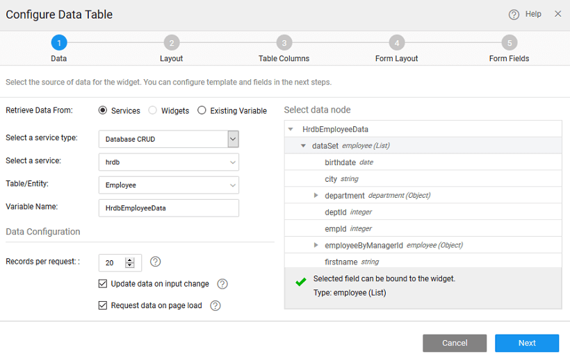
Retrieve Data From: Services is selected by default.
Select a Service: Select a service from the drop-down which lists the services available in your application. Select Database CRUD option for this example.
Select Table of the database or entity in case of web service
Variable Creation: Once you select the service and table/Entity for the service, a default variable will be created for you – see the Variable Name field populated by default which will be holding the dataset of the service. You can change the Variable name.
Select the Data Node: You are given the option of choosing either the entire dataset – when you are binding the widget to a data source or any of the fields in the dataset. Select the data node tree when binding a single widget or a List item to a field in the dataset.
Data Configuration Options: You also have the option of setting the following Data Configuration options:
- Records per request: with an option to enter the number of records to be fetched on each request. The default is 20.
- Update Data on input change: which is checked on by default. This means that whenever there is a change in the input parameter or filter field of the variable the data will be fetched from the service. This option will have an impact on the app performance.
- Request data on Page Load: which is checked on by default. This allows for data to be shown when the page is loaded. If this is not checked, you will not be able to view the data when the page gets loaded. Instead, No Data Found message appears on the widget at runtime.
Scenario 3
If the variables based on database CRUD or web services are already created in the project/
- Retrieve Data From: Select the retrieve data from option as Existing Variable.
- Select a Variable from the drop-down list of the variables available in the application. You can select the one needed to bind the List Widget to. You can also search for a specific variable by typing in select variable option. If you are able to find your variable in the drop-down select the same.
- Once you select the variables, it shows the dataset that it is bound to.
- As Data Configuration options are already set for this variable, you do not see those options in this scenario.
Scenario 4: Binding to widget
- Retrieve Data From: Select the retrieve from data option as widget that was dragged and dropped onto the canvas.
- Select a widget from the drop-down list. This will list the widgets present on this page, you cannot access the widgets from other pages.
- You can select data node to be the entire widget or the selecteditem node in case of another Data Table or List or Cards or result from a Live Filter
- As you are not using a Variable the Data Configuration options will not be available.
Step 2 – Select Layout
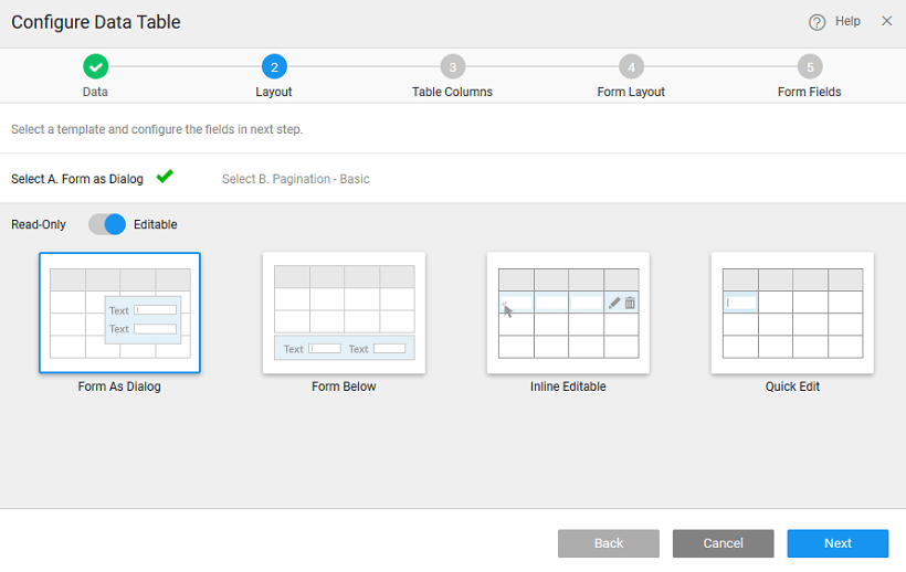
Selecting the Layout includes two sub-steps:
i. Editable Table with
- Form as Dialog: This can be used when you would like to have a data entry form shown as a dialog which will save space as the dialog form will be shown in the Table Layout. For Example: Adding Students to a Course with information such as Skill Level, Expertise to be entered on the dialog form.
- Form Below: This can be used when you want to view data in a Table and edit the selected row from the table using a form. For example, this can be used in use case where editable items are less, for instance, Qty in a shopping cart
- Inline Editable Table: This can be used when you want to add/edit data in a Table like a table rather than in a form. For example, this can be used in use case to create line items of an order detail table.
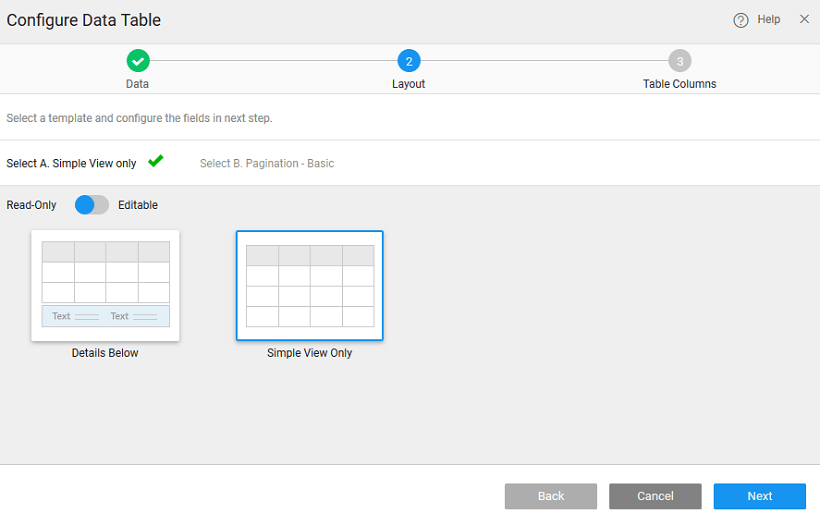
ii. Read-Only Table with
- Details of the selected row displayed below the table: This can be used if you wish to select some specific fields in Data Table and would like to view some special fields in the form below. For Example: Viewing catalog items showing the Basic Tech Specs of each Device in the Data Table and on selecting each row in the grid view the Network and Connectivity related Specs in the Form below.
- Simple Table view: This Data Table provides for Read Only View of the existing Data when you want to show live data constantly refreshed. For example, Stock Trading Views, Election Results, etc.
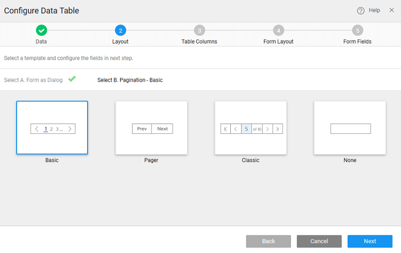
Selecting Pagination Style
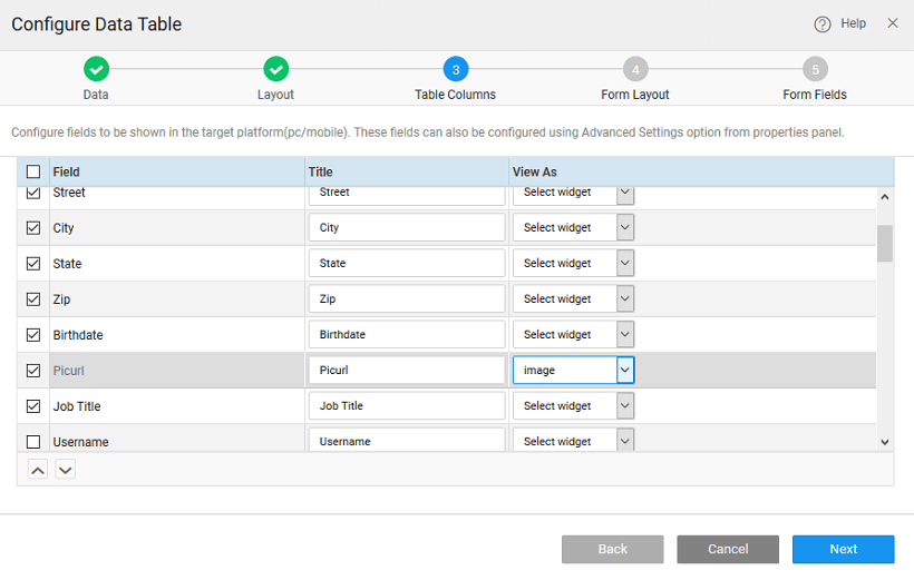
STEP 3 – Select Data Table Columns
This step will allow us to select the fields to be shown in Data Table and once done
- Select your choice of fields to be displayed in Table
- Reorder the fields for display in Table
- Change the Title for the field
- Change the Widget type for the field
If you select the Data Table layout without Form in step 2, the Done button appears after this step. Click the Done button to add the Data Table to the current page. If you select other layouts, then additional two steps to do include select the Form layout and select the Form fields.
STEP 4 – Select Form Layout
If you have selected any of the Data Table layouts that include an inline or a dialog Form this step will allow you to select a Form layout for your inline Form or dialog Form.
- You have the option of choosing 1-column, 2-column or 3-column layout. 3-column layout is selected by default
- You can also set the alignment, position, and size of the caption of the Form fields.
STEP 5 – Select Form Fields
Select the fields and set the title and widget property for each field
- Select the fields to be displayed in the Form
- Change the title for each field
- Change the widget type for display of each field value
- Reorder the fields for display. In case you have selected 2- or 3-column layout, then you can specify the fields to be displayed in each column.
