Forms Overview
A form consists of a group of input fields that connects to a datasource such as a table or a query. Using the Form widget, you can enter, edit, or display data from the data source. For example, a simple contact form, registration form, login form, and more.
Based on your datasource, you can create forms to contain text fields, email, date, dropdown, checkboxes, and more. Plus, you can add validations to the form fields to capture quality and accurate information from the users.
Additionally, build complex forms that contain multiple data widgets inside a single form, and form inside another form called repeated sections.
Forms Types
Use an appropriate type of form to work with different types of datasets. There are two types of forms in WaveMaker; they are Form and Live Form.
Form
Use Form widget to work with a service or procedure based flow. For this, you can use a service variable or CRUD variable through API calls like, REST API, SOAP, and more. You can configure fields to use an appropriate Form Widget. For example, text, number, dropdown, and more.
Live Form
Live Form works similar to a Form. However, Live Form is specific to database CRUD operations when you import a database from an external resource.
Form and Live Form are two different widgets that work similarly. Live Form is used for DB Services with CRUD operations only. For more information, see Live Forms.
How do Forms work
A form contains a group of input fields. Each field binds to the variable metadata that you can configure to the form-field settings. You can design the form to perform business operations and save it to the server.
Handling Form Submission Data
Firstly, to build a form, you should have a dataset. You can use APIs for REST services, java service, and database service. There are multiple ways to build and manage a datasource in WaveMaker.
You can instantly create a form without even having a dataset ready using a model variable. This helps you to plan and design your form structure. For more information, see Build a Form.
Layout and styling options
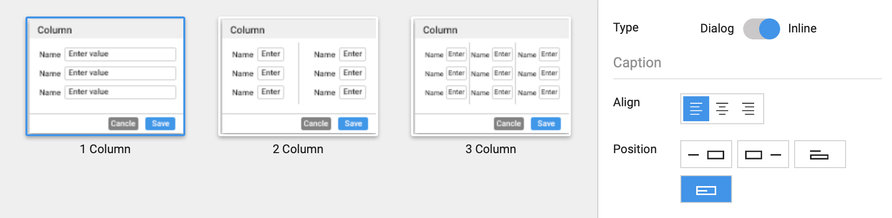
Dialog
You can display form as a dialog. This means the form displays a pop-up when an action occurs.
Inline
To display form inline with a page. This is the default option.
Align
Set the alignment of the form. You can choose from the left, center, right, and floating alignments.
Position
Set the position of the input field and label placement as shown in the image above: {label: field}, {field: label}, {label: field below}.
Layout Style
Select form layout styles. For example, display form fields in a single column, two columns, or three columns.
Configure Form Fields
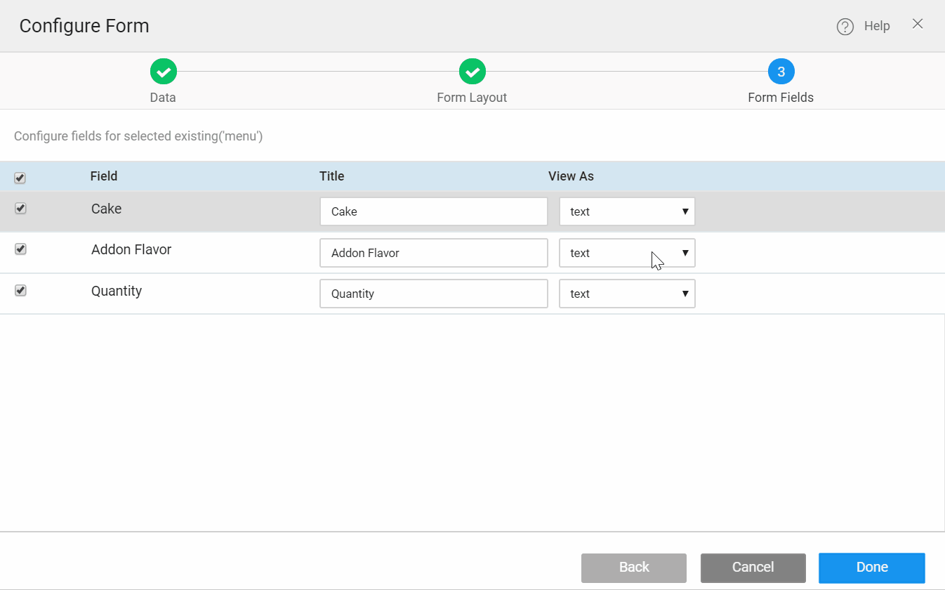
- By default, an appropriate Form Widget is assigned to each field. However, you can select a suitable Form Widget for a field.
- Field input validation. For example, should the field be a required field, or should it contain a regex expression, or more custom field validations.
Form Actions
A typical form contains the following Form actions.
- Reset form field data. For example, to clear entered data, or to start over.
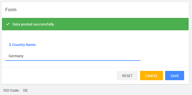
- Allow performing actions. For example, edit, save or submit data, and add a new record.
- Cancel action for Live Form to clear entered-data.