Style App using app.css and Page Styles
In React Native app, styles are expressed as a JavaScript object. Refer https://reactnative.dev/docs/style. These styles are similar to CSS styles but with different names. When compared to CSS properties, reactnative style properties are very limited. Check the list of View Style, Text Style and Image Style.
Styling
In WaveMaker, partial support is added to mention styles in CSS format. Let us take a button as an example. In the button, there are 3 stylable units.
They are:
- container
- text
- icon
For each of these stylable units, unique class names are assigned. They are:
- app-button,
- app-button-text and
- app-button-icon.
Using these class names, you can mention styles in the theme, app.css, and page styles.
In this way, every WaveMaker widget has several stylable units.
There is a link to style documents across each widget in Widgets page.
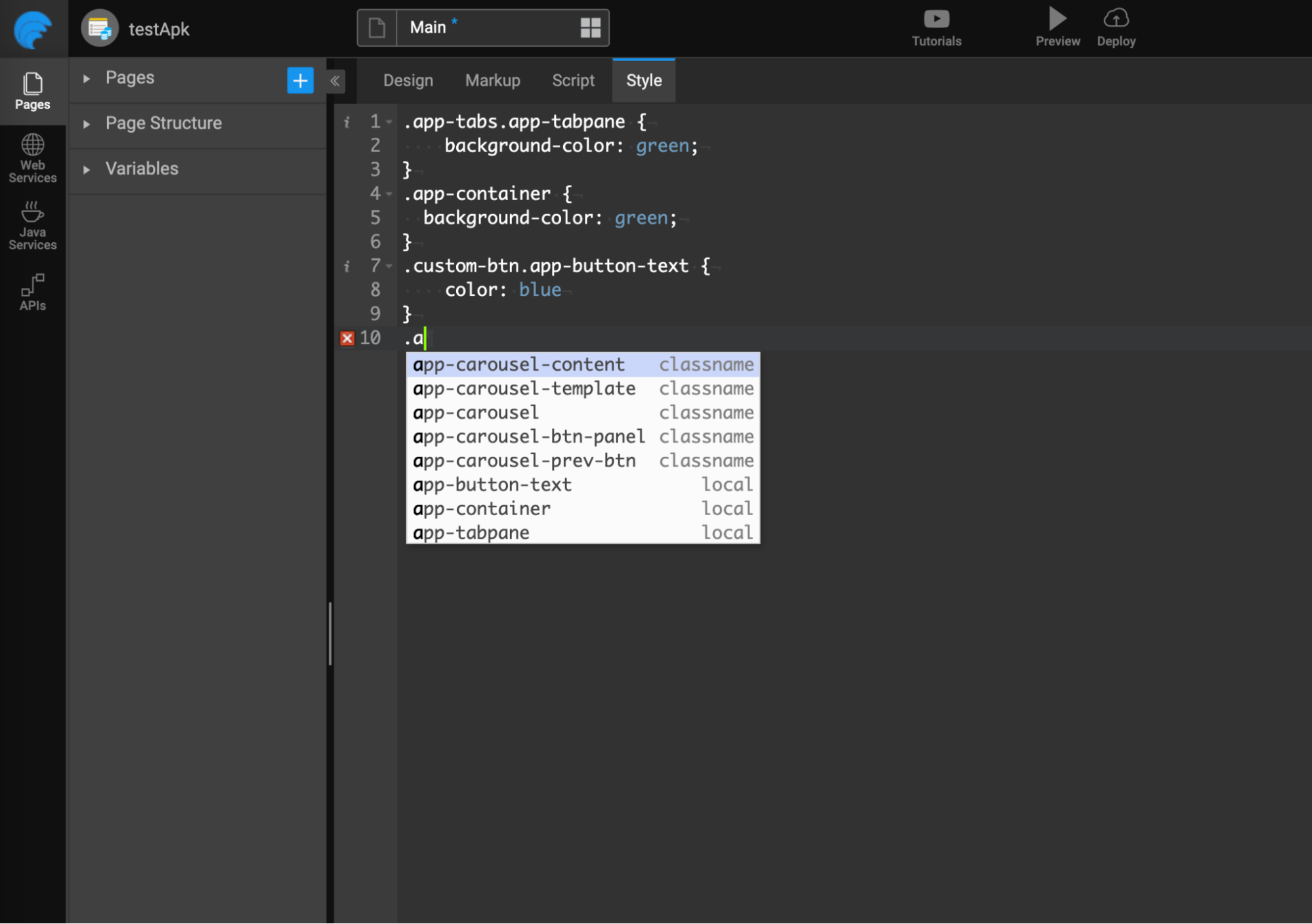
In Studio, auto-suggestions for class names populate in the style editor as you type in page styles.
There is no style property inheritance support in React Native. Due to this, Views shown in the web preview may differ when the app is opened on mobile.
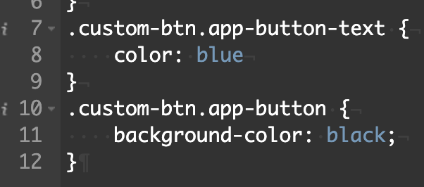
For example, in a sample application, drag and drop a button. If you want to customize this particular button's style, then give a class name to the button (let's say custom-btn) in the properties panel.
Here, you want to change the background-color of the button and the color of the text inside the button.
- For changing the background color, just using the .custom-btn.app-button class will work.
- For changing text color, just using the .custom-btn.app-button-text class will work.
Following is the way to specify styles:
.app-button - will target all buttons
.custom-btn.app-button - will target only buttons that have custom-btn class.
Some widgets use WaveMaker widgets internally. For example, buttons use icons internally. Following is the way to change the color of the icon.
.custom-btn.app-button-icon.app-icon-shape {
 color : red;
}
Limitations
- Users must define styles targeting only auto-suggested class names (or stylable units).
- Expect class names, no other CSS selector definitions are supported. Also, do not write any styles specific to the dom selector.
- Using parent class name selector is not supported. For example, a container has a class ".custom-container". If you need to change the CSS of the button placed inside it, this can be expressed below in normal CSS.
.custom-container > .app-button {
 background-color: ‘red’;
}
Whereas in React Native, you must target the button directly. The styles of the container will not get passed to the button. In this case, a class has to be mentioned on that button, and styles must be specified for that class.
.custom-container.app-container {
 background-color: red;
}
.custom-btn.app-button {
 background-color: red;
}
All these CSS styles are converted to JS objects during code generation.
Order of styles computed (Bottom to top)
- Inline styles
- page.css
- app.css
- Theme
- Runtime default styles
CSS Variables
CSS variables, also known as custom properties, provide a powerful way to define and reuse values in your stylesheets. They allow you to store values such as colors, sizes, or any other CSS value and reuse them by referring throughout your stylesheets. This approach makes it easier to maintain and update styles consistently across your application.
Declaring CSS Variables
To centralize your theme-related CSS variable definitions, you can declare the variables in a specific section in your stylesheet, for example, src/common/styles.less.
/* src/common/styles.css */

:theme-variables {
  --my-label-color: green;
  --my-label-bg-color: var(--secondaryColor);
  --my-label-border-color: rgb(236, 210, 18);
}
Here, --my-label-color, --my-label-bg-color, --my-label-border-color, and --secondaryColor are custom CSS variables that hold color values.
Setting CSS Variables in Script
In Script, you can dynamically set CSS variables using a method, App.setThemeVariables.
App.setThemeVariables({
  "--my-label-color": "yellow",
  "--my-label-bg-color": "var(--primaryColor)",
  "--my-label-border-color": "red",
});
This lets you update CSS variable values based on dynamic conditions or user preferences.
Using CSS Variables in Stylesheets
CSS variables can be used throughout your stylesheets using the var() function.
.label-to-highlight .app-label-text {
  color: var(--my-label-color);
  background-color: var(--my-label-bg-color);
  border: 4px solid #333;
  border-color: var(--my-label-border-color);
}
In this example:
var(--my-label-color)retrieves the value of--my-label-color.var(--my-label-bg-color)retrieves the value of--my-label-bg-color.var(--my-label-border-color)retrieves the value of--my-label-border-color.
CSS Variables Best Practices
When working with CSS variables, the following points are to be considered.
Shorthand Style: When using CSS variables, it's important to note that variables cannot be directly used within style shorthand declarations like
border: 4px solid var(--my-label-border-color);. Instead, each property within the shorthand declaration that uses a variable should be specified individually..label-to-highlight .app-label-text {
color: var(--my-label-color);
background-color: var(--my-label-bg-color);
border: 4px solid #333; /* Correct way to specify border */
border-color: var(--my-label-border-color);
}Explicit Variable Usage: Every variable has to be specified as
${style_name}: var(${variable_name})for example,.label-to-highlight .app-label-text {
color: var(--my-color-variable);
}Case Sensitivity: CSS variables are case-sensitive. Ensure that you reference variables using their exact names, including case sensitivity.