FileUpload
The FileUpload widget can be used to let users upload files to your apps. WaveMaker FileUpload widget generates a Java Service to enable additional file processing functionality.
Features
Following properties can be set for a FileUpload widget:
- Multiple to allow multiple selections for FileUpload, Message to be displayed in case of Multiple FileUpload,
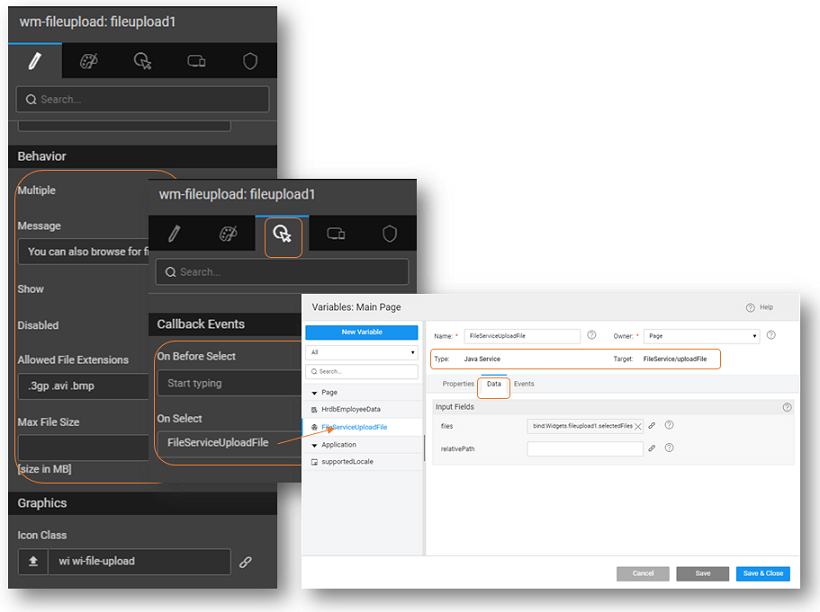
- Allowed File Extensions can be selected from the list (multiple selections are allowed), or bound to space separated file extensions list prefixed with dots Ex: '.html .css .tiff'
- Max File Size of files allowed for upload can be specified in MB, default being 1MB. The max allowed limit is 50MB.
- A Java Service will be created with default methods and service variables. These methods contain the basic functionality related to upload, list, delete and download. You can customize the code as per your requirements. You need to create service variables to invoke these methods.
- Mode to Upload which will upload the file or Select which will select the file but not upload; Upload is the mode set by default.
- Drag and drop of a FileUpload widget creates a service variable, FileServiceUploadFile by default. The service for this variable is set to the Java FileService and the operation as uploadFile. This variable will have a file field in data tab which would be bound to the file select widget by default. Additionally, the relativePath can be set, if the value is set as ‘files’ then the file will be uploaded to ‘/resources/uploads/files’.
- By default, the On Select event of the FileUpload widget will be bound to the above mentioned Service Variable. In run mode, as the user selects the file, the Service Variable kicks in and the upload action is triggered.
- By deleting the Variable from the widget (from the On Select Event), the Widget can be set to Select mode. In this mode, the widget will act as a file selector with no additional modes. There will be no service or operation selection on the widget and hence it will not trigger the upload action internally.
Clear Uploaded Files from UI
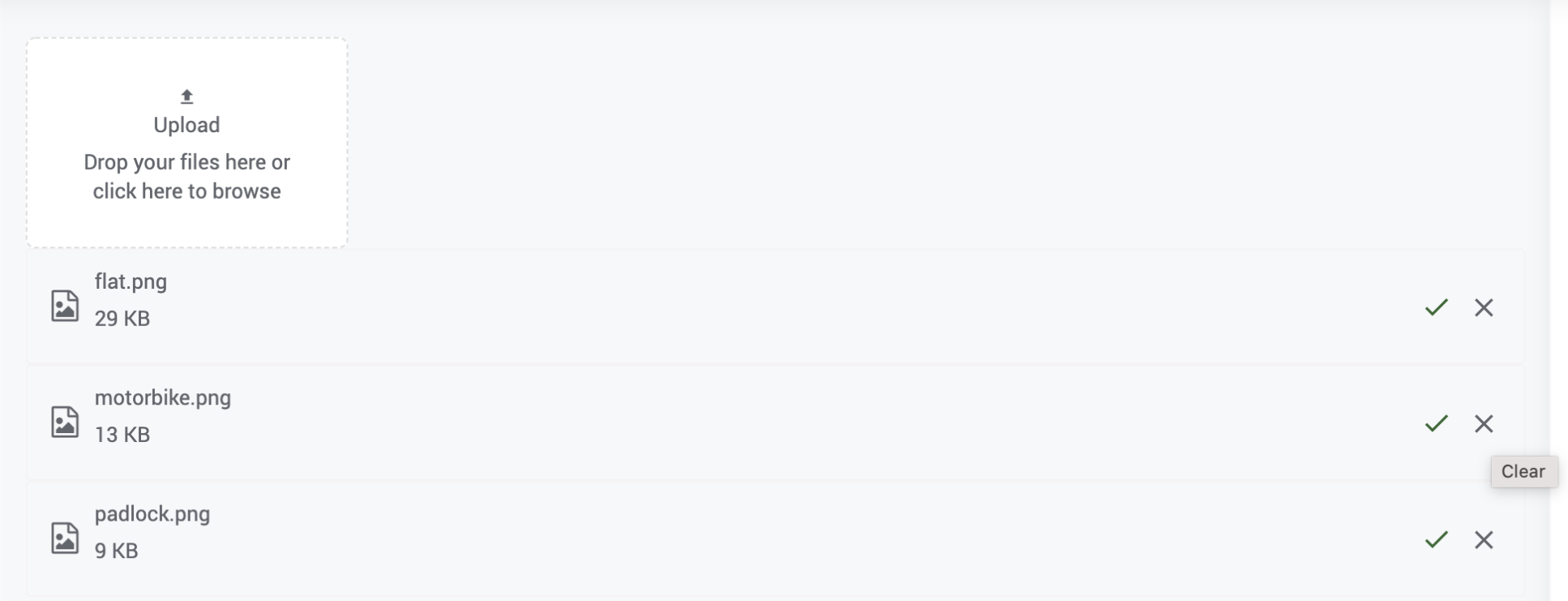
Clear the list of uploaded files from the UI (user interface). For this, you can add the following properties:
- Choose an icon or use a default one.
- Write a hint description on mouse-over.
cleariconclass: Set the class name for the Clear icon, choosing from the icons. The default value of the property is wi wi-clear. To change the default icon, configure the property from the Markup tab or by using the exposed method setClearIconClass.
cleariconhint: You can set the hint property to show a text message when you mouse-over the icon. The default value is set to the text Clear. To change the default hint text, configure the property from the Markup tab or by using the exposed method setClearIconHint(hint).
clear(): Call the clear() method to remove the uploaded files from the UI - all at once.

Properties
| Property | Description |
|---|---|
| Caption | The caption is the text that the end user sees on your label. |
| Name | The name is a unique identifier for FileUpload widget. |
| Accessibility | |
| Hint | Any text or html you enter for this property will be shown as a tooltip if the mouse hovers over this widget for 1.5 seconds. |
| Tab index | The tab index attribute specifies the tab order of an element. You can use this property to change the default tabbing order for widget access using the tab key. The value can range from 0 to 32767. The default is 0 and -1 makes the element non-focusable. NOTE: In Safari browsers, by default, Tab highlights only text fields. To enable Tab functionality, in Safari Browser from Preferences -> Advanced -> Accessibility set the option "Press Tab to highlight each item on a webpage". |
| Layout | |
| Height | The height of your widget can be specified in px or % (i.e 50px, 75%). |
| Width | The width of your widget can be specified in px or % (i.e 50px, 75%). |
| Behavior | |
| Multiple | Enable/Disable to switch between Multiple/Single FileUpload Widget. |
| Message | Message text for file upload while in multi-select mode |
| Show | Showing determines whether or not a component is visible. It is a bindable property. |
| Disabled | If the disabled property is true (checked) the value of the editor cannot change. The widget becomes display-only. |
| Allowed File Extensions | Select the default filter file type in file choose option. It can be bindable to a string having comma separated extensions. Example: '.pdf, .doc, .gif'. |
| Max File Size | If the max file size is set, file upload will restrict the files more than max file size. Default Max file size is 1MB, it can be set up to 50MB. |
| Graphics | |
| Icon Class | This property defines the class of the icon that is applied to the button. By default, it is set to wi wi-file-upload |
| Format | |
| Horizontal Align | This property specifies how the elements should be aligned horizontally. |
Events
| Event | Description |
|---|---|
| Callback Events | |
| On Before Select | This event handler is called before the upload of the file. It can be used to perform any validations before the file is further processed. |
| On Select | This event handler is called when the files are selected. By default, it invokes the Service Variable to upload the selected files. Deleting this variable will set the FileUpload to act as a file selector. |
Apart from the above events attached to the FileUpload widget, the following Service Variable events are invoked after the upload of the files.
| Event | Description |
|---|---|
| Callback Events | |
| On Abort | These events will appear only for the Service Variables targeting an upload service. |
| On Before Update | These events are called just before the variable is triggered to hit the target service. “inputData” contains an object having key-value pairs of input fields (that appear under the “Data” tab of Variable definition dialog). The call to the target service from the variable can be prevented by assigning a JavaScript function to this event and returning false from this function. If input data needs modification or validation, it should be done at this place. |
| On Result | This event is triggered as soon as the variable receives a response from the target service. onResult is called whether or not there was an error generated. An additional last argument as the “operation-name” that holds the invoked operation is present for Database CRUD Variables. |
| On Progress These events will appear only for the Service Variables targeting an upload service. | A progress bar is displayed below the file selector, this is handled by file widget. User can perform actions on the onProgress event. However, the default progress bar shown is not hidden on providing a handler to this event. |
| On Error | This event is called if there is an error generated during the Service call. An additional last argument as the “operation-name” that holds the invoked operation is present for Database CRUD Variables. |
| On Before Dataset Ready | This event is triggered just before the variable’s dataSet property is updated with the data received from the target service (after onResult). This event handler gives you the opportunity to manipulate the data before your variable’s dataSet property is assigned this value. If you want to add rows to a Grid or List or Select, this is a good way to add in extra items into your results before your variable is set and your widget is updated. The new data can be returned from here in order to update the Variable’s dataSet. |
| On Can Update | This event is triggered just before the variable’s dataSet property is updated with the data received from the target service (after onResult). This event handler gives you the opportunity to manipulate the data before your variable’s dataSet property is assigned this value. If you want to add rows to a Grid or List or Select, this is a good way to add in extra items into your results before your variable is set and your widget is updated. The new data can be returned from here in order to update the Variable’s dataSet. |
| On Success | Allows you to trigger an action when the Variable has completed its life cycle. Any component bound to the resultant dataSet of this Variable will be updated just before this event is triggered. So, If you want to trigger another Variable which is dependent on the dataSet of this Variable, the Variable should be triggered by this event. An additional last argument as the “operation-name” that holds the invoked operation is present for Database CRUD Variables. |
