WMX Widgets
Introduction
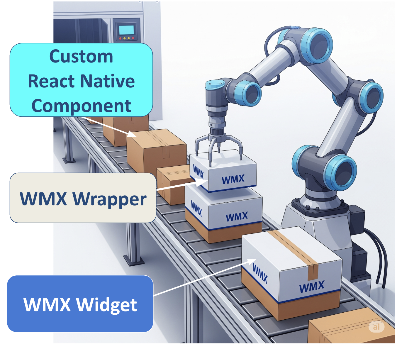
WMX Widgets (WaveMaker Extension Widget) lets you integrate your own custom React Native components into a WaveMaker application while still enjoying all the features of native WaveMaker widgets.
They act as a wrapper around your component, enabling you to leverage all the built-in WaveMaker widget capabilities — including property binding, script access, theme styling, and design token support — while still having full control over the component’s internal React Native code.
Why WMX Widgets Exist
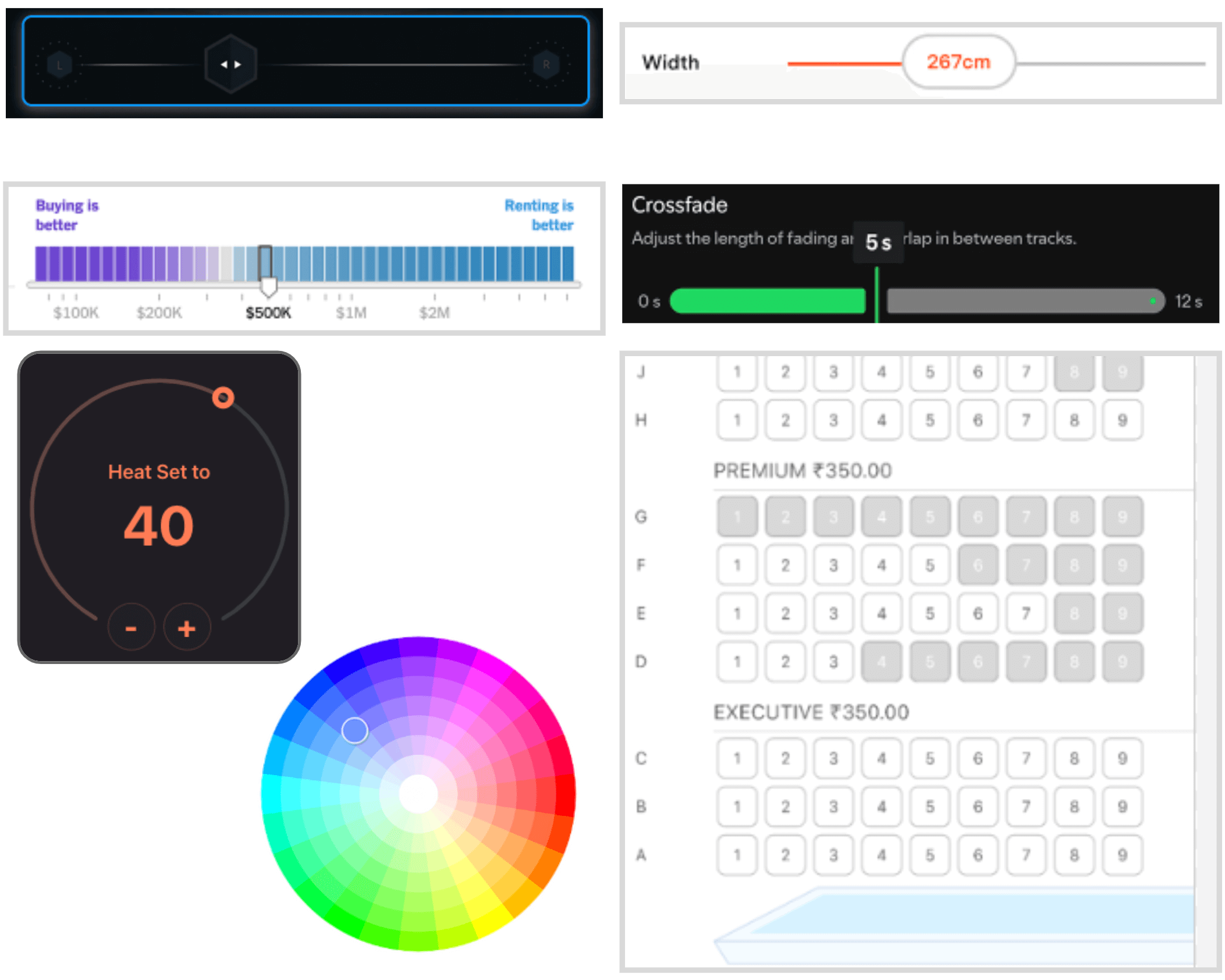
WaveMaker comes with a wide range of ready-to-use widgets, but sometimes you need something highly specific like a unique UI element, an uncommon visual style, or a specialized interactive feature.
WMX Widgets allow developers to:
- Bring in custom-built React Native components.
- Use these components with WaveMaker’s widget features like property binding, event handling, theming, and scripting.
- Avoid workarounds — the component is first-class in your app.
Typical use cases include:
- Custom variations of widgets (e.g., advanced Progress Bar).
- Specialized UI elements not available in WaveMaker (e.g., Color Picker, Circular Slider, Radar Chart).
- Unique, app-specific features (e.g., seat selection for movie booking, VR product preview).
Key Benefits
- Script Access – Your widget can be accessed via
Page.Widgets.<componentName>. - Configurable Props – Any props you define in your component’s metadata (
wmx.json) appear in Studio for easy configuration. - Two-Way Binding – Props can be dynamically bound to values in your app, and vice versa.
- Styling Support – Works with theme, app, and page-level styles.
- Design Token Compatibility – Fully supports WaveMaker’s design tokens.
- WavePulse – Supports debugging using WavePulse.
- Lightweight – Minimal wrapper overhead for maximum performance.
Custom Component Structure
Your component must have two required files:
index.tsx- Must have a default export exporting your React Native component.
wmx.json- Defines the widget’s metadata, including:
- Display name and description.
- Props and their types.
- Default values.
- Bindable properties.
- Defines the widget’s metadata, including:
Detailed Schema for wmx.json
wmx.json WMX JSON schema
| Name | Description | Required |
|---|---|---|
| name | Widget name in lowercase letters. | Yes |
| displayName | Display name shown in Studio. If not set, name is used. | No |
| description | Description shown as help info in Studio. | No |
| iconUrl | Relative path to the SVG icon (e.g., icon.svg). | No |
| webSupport | Can this component render in web preview? Default value is false | No |
| props | Object of properties supported by widget. (see Property Schema below). | No |
| events | Object of events supported by widget. (see Event Schema below). | No |
| styles | Object of styles supported by widget. (see Style Schema below). | No |
Property Schema
| Name | Description | Required |
|---|---|---|
| name | Property name (alphanumeric). | Yes |
| displayName | Display name in Studio. If not set, name is used. | No |
| description | Description shown as help info in Studio. | No |
| type | Property type, valid property type values are number, string, boolean, object. Default value is string | No |
| isList | Set to true if this property is an array. Default value is false | No |
| defaultValue | Default value for this property. | No |
| isRequired | Set to true if this property is required. Default value is false | No |
Event Schema
| Name | Description | Required |
|---|---|---|
| name | Event name (alphanumeric). | Yes |
| displayName | Display name in Studio. If not set, name is used. | No |
| description | Description shown as help info in Studio. | No |
Style Schema
| Name | Description | Required |
|---|---|---|
| name | Style property name (alphanumeric). | Yes |
| style | Default style value. | No |
This custom component is then automatically wrapped by WMX wrapper, creating the WMX Widget, which makes it a fully functional WaveMaker widget, with property binding, script access, and styling features.
Read more about creating the component here.
Steps to create WMX widget and using in your project.
Limitations
- No Studio Rendering: WMX Widgets do not render their actual UI in WaveMaker Studio; a placeholder is shown on the Canvas.
- No Drop-in Containers: Cannot be used to create container widgets that accept child components (e.g., Tabs, Accordions, Layout Containers).
- No Form Integration: Cannot be added inside WaveMaker forms or used as form fields.
- Framework-Specific: Built with React Native and not portable to apps using other frameworks (e.g., Angular, React Web, Lynx).