How to apply Smart Template and Layout for Widgets
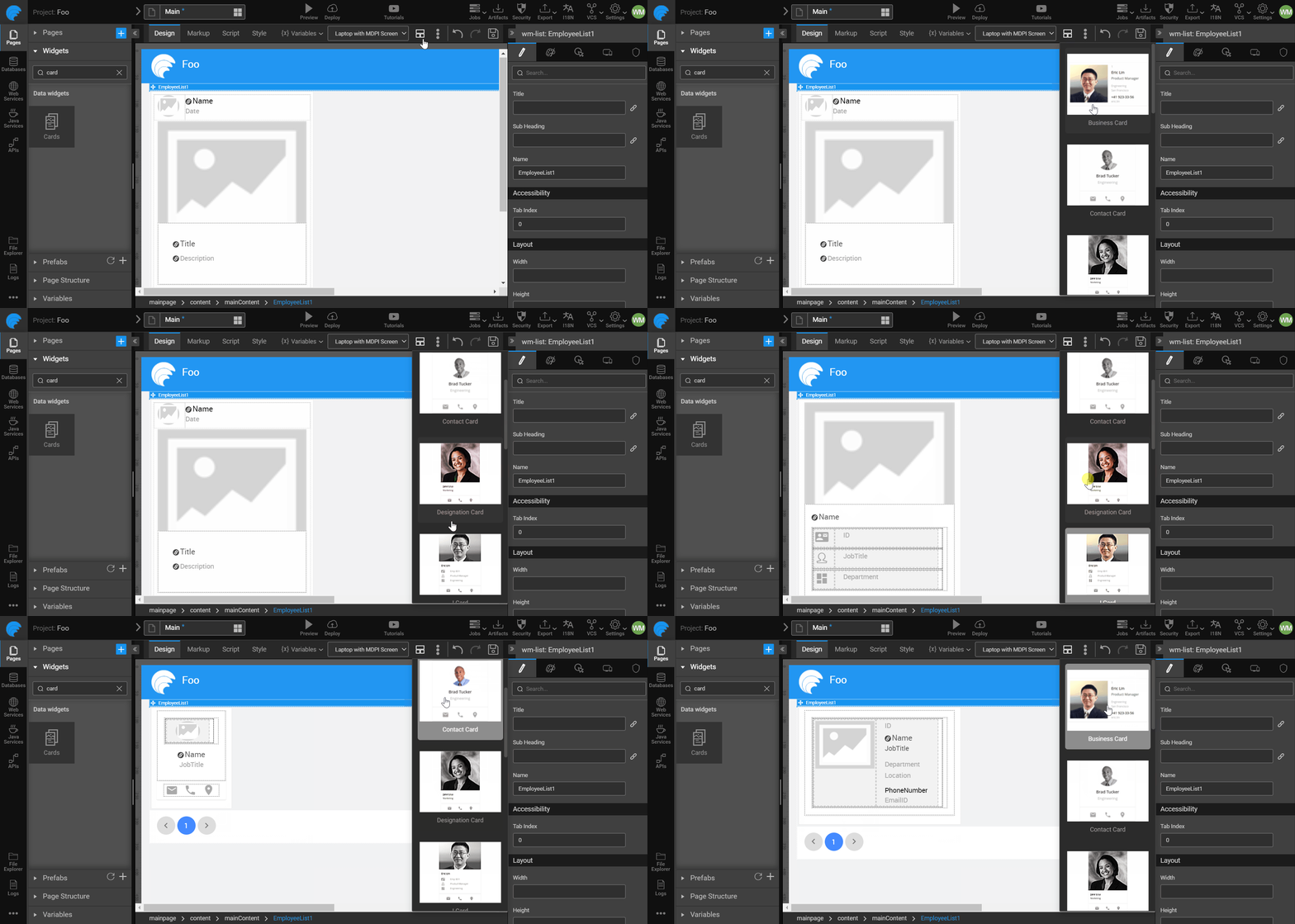
For Cards, List, Wizard, and Breadcrumb widgets, you can choose and apply alternative UI representation while you can visually see the changes on the canvas as you click on the template.

This feature is used to change the template, or the layout of the widget. It identifies some of the most used templates and layouts for the widget.
The following are the two types.
Widget Template: This is the arrangement of the inner elements.
Widget Layout: This is the arrangement of the outer shell.
Choosing Widget Template from Canvas
Drag and drop the List widget, and bind the widget to a dataSet.
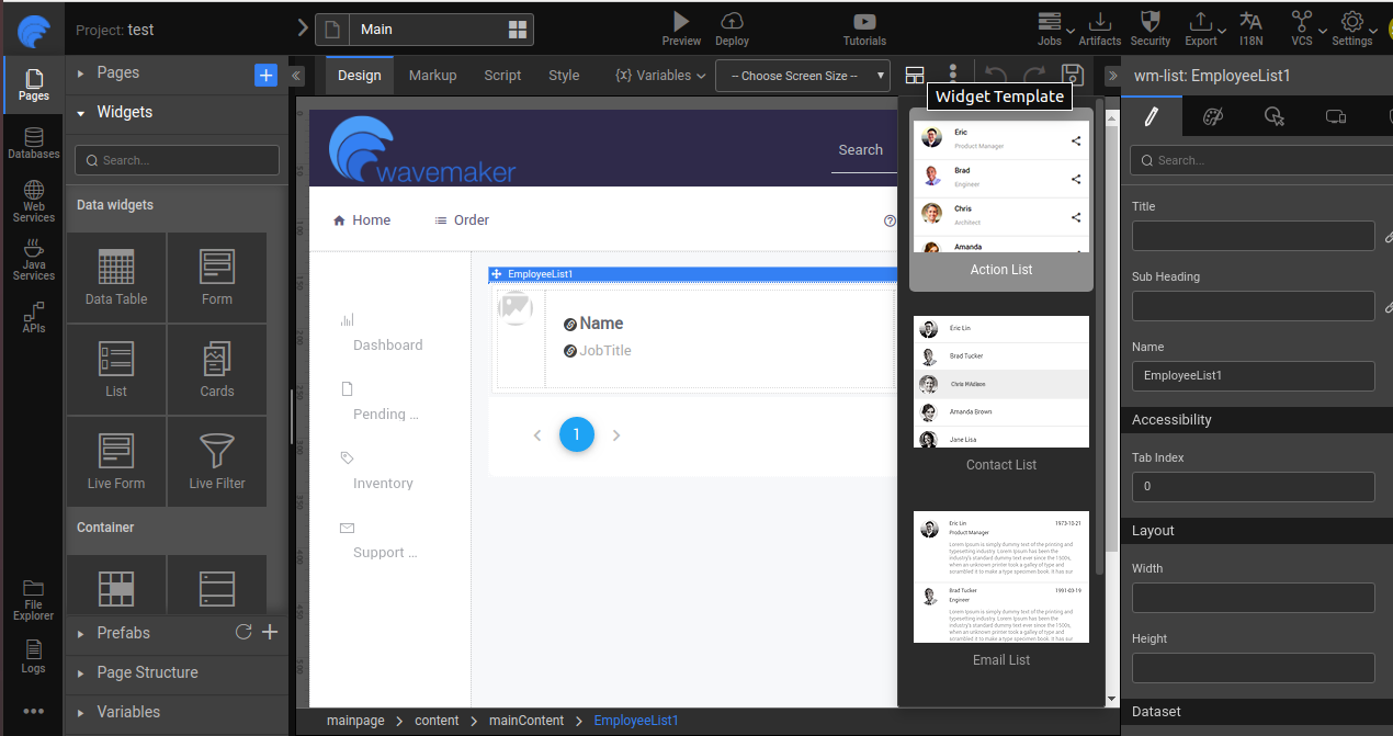
When you select the List widget on the canvas, you can see the template icon on the toolbar. Click the template icon.
![]()
- It opens a dropdown, which displays the list of available widget templates.

- Select the template from the list. The template will be changed and the bindings remain the same from the previous template to the selected-template based on the name of the inner widgets.
Similarly, you can apply a widget template for the Cards widget also.
Choosing Widget Layout from Canvas
Drag and drop a Wizard widget.
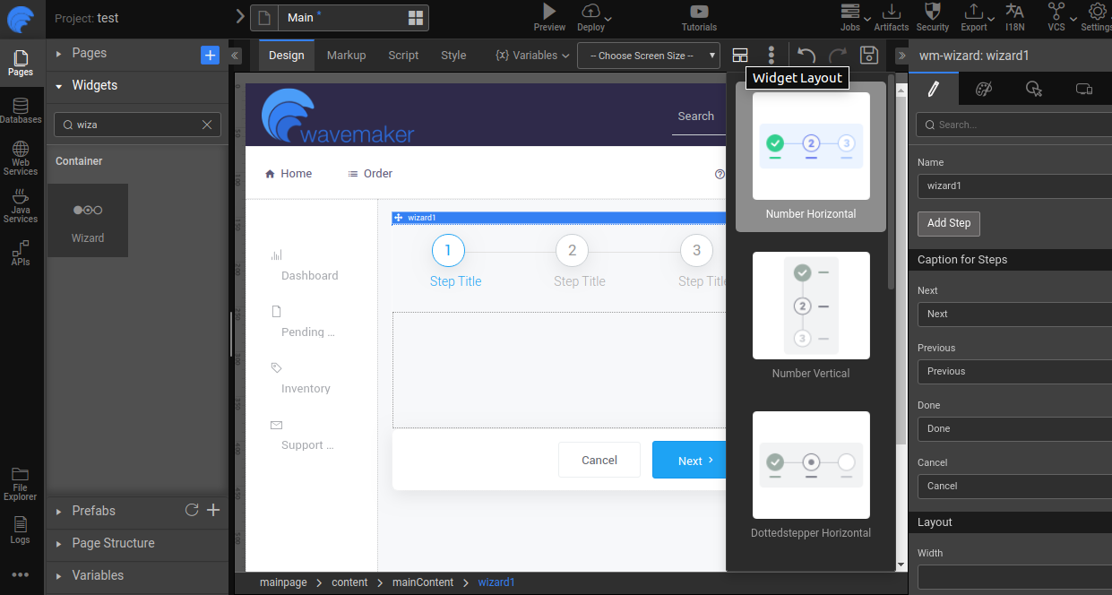
When you select the Wizard widget on the canvas, you can see the layout icon on the toolbar. Click the layout icon.
![]()
- It opens a dropdown; it displays the list of available widget layouts.

- Select the layout from the available list. The layout will be changed and the properties, events, and bindings of the widget remain the same.