Widgets & Prefabs
Find everything about Widgets and Prefabs. Navigate to Widgets' list below and access relative docs and API docs.
Widgets are HTML/Bootstrap based UI components with rich interaction and designed for responsiveness. View the entire list of Widgets in this page.
note
Pages are designed as a composition of widgets. See Design Pages before getting started with widgets.
tip
To learn about widgets workflow, see Widgets Overview.
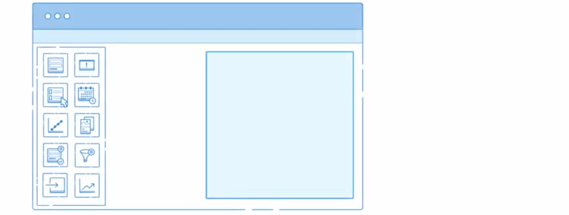
Data Widgets
| Widget | Description | Document | Reference |
|---|---|---|---|
| Cards | Cards is a single unit of content or functionality, presented in a concise visual package, to easily update, maintain, and personalize content area. | Overview | API Docs |
| Data Table | Data Table is a widget that presents a tabular view of data and allows actions. | Overview | API Docs |
| Form | Form is a group of input elements put together to post data, typically updating data through a web service call | Overview | API Docs |
| List | List is a widget that presents a list view of data, which contains a template for designing each list item | Overview | API Docs |
| Live Filter | Live Filter is a widget that allows user to filter the database results, usually used in combination with List or Data Table to display the filtered results | Overview | API Docs |
| Live Form | Live Form is a group of input elements put together to submit data, typically resulting in creating or updating a database row | Overview | API Docs |
Container Widgets
| Widget | Definition | Overview | API Reference |
|---|---|---|---|
| Accordion | Accordion is a stacked list of UI components, with only one component expanded or viewed at any point in time, and the rest collapsed | Overview | API Docs |
| Container | Container is an enclosing element that wraps the widgets placed within, mostly used for embedding partial pages | Overview | API Docs |
| Grid Layout | Grid Layout helps division of pages or content area into cells or grids based on the 12-column fluid grid system, which helps in proper placement of the widgets for responsive design. | Overview | API Docs |
| Panel | Panel has designated sections such as header, body, and footer and can be used to group a set of widgets together. | Overview | API Docs |
| Tabs | Tabs are Multiple UI components placed in a single window, with only one active component and headings allowing navigation to other components | Overview | API Docs |
| Tile | Tile is a form of UI components to group a set of widgets together and to apply a uniform style to the content | Overview | API Docs |
| Wizard | Wizard is a form of UI components to group a set of widgets together and to apply a uniform style to the content | Overview | API Docs |
Form Widgets
| Widget | Description | Overview | Reference |
|---|---|---|---|
| Button | Button is a control that can be clicked to perform an action. | Overview | API Docs |
| *Button Group | Button Group is the arrangement of buttons grouped together. | Overview | API Docs |
| Calendar | Calendar widget allows the user to select a date from the calendar displayed. | Overview | API Docs |
| Checkbox | Checkbox allows the user to choose one or multiple of a predefined set of options. | Overview | API Docs |
| CheckboxSet | CheckboxSet is the arrangement of checkbox widgets grouped together. | Overview | API Docs |
| Chips | Chips allow user to search data and add, delete and edit the same. | Overview | API Docs |
| Color Picker | Color Picker widget is to select the color and translate to a hex value. | Overview | API Docs |
| Currency | Currency is a special text widget to input the currency type data, with the display format based on the currency type. | Overview | API Docs |
| Date | Date widget helps to select a date from a calendar within the date range. | Overview | API Docs |
| Datetime | Datetime is a composite widget of date and time widgets. | Overview | API Docs |
| FileUpload | FileUpload is a widget that pops up a file browsing window to select files and upload. | Overview | API Docs |
| Number | Number allows input of a number. It works with the selected app Locale and displays the number localized format. | Overview | API Docs |
| Radioset | Radioset is the arrangement of radio widgets grouped together. | Overview | API Docs |
| Rating | Rating Widget allows users to input ratings as data. | Overview | API Docs |
| Select | Select provides a drop-down list that with a list of items a user can select from. | Overview | API Docs |
| Select Locale | Select Locale Widget is for Language selection from the list of support languages. | Overview | API Docs |
| Slider | Slider is a widget control with a handle that can be moved right and left (horizontal slider) on a bar to select a value from within the range of allowed values. | Overview | API Docs |
| Switch | Switch widget can help switching between 3 or more different options by pressing a single key. | Overview | API Docs |
| Text | Text allows input of a single line of text. | Overview | API Docs |
| Textarea | Textarea allows for multiple rows of data to be shown and entered. | Overview | API Docs |
| Time | Time widget helps to select a time from within a specified time range. | Overview | API Docs |
| Toggle | Toggle is a widget that can help switching between two different options by pressing a single key. | Overview | API Docs |
Basic Widgets
| Widget | Description | Overview | Reference |
|---|---|---|---|
| Anchor | Anchor is used as a navigation link within the app or an external URL. | Overview | API Docs |
| Audio | Audio widget is to embed an audio player into the project. | Overview | API Docs |
| HTML | HTML is a widget to display HTML content or to render the text content using HTML. | Overview | API Docs |
| Icon | Icon widget is for displaying a comprehensible symbol or graphic. | Overview | API Docs |
| Iframe | Iframe is a widget to display a web page content in a separate frame, without affecting the current page content or styles. | Overview | API Docs |
| Label | Label is a uneditable text as a heading or to describe another widget. | Overview | API Docs |
| Message | Message is a widget to display success, info, loading, error or warning messages to the user. | Overview | API Docs |
| Picture | Picture is a widget to display images in the project. | Overview | API Docs |
| Progress Bar | Progress Bar is an actual indicator of activity progress with time/percentage. | Overview | API Docs |
| Richtext Editor | Richtext Editor is an input control for formatted text content, optionally including media (WYSIWYG). | Overview | API Docs |
| Search | Search within a data source and give results. | Overview | Reference |
| Spinner | Spinner is a widget for a visual indicator of activity in progress. | Overview | API Docs |
| Tree | Tree widget can be used to display data in a hierarchical format. | Overview | API Docs |
| Video | Video is a widget to embed a media player into the project. | Overview | API Docs |
Chart Widgets
There are marginal differences in the various usage scenarios for the various chart types, which is highlighted in the overview and API documentation.
| Widget | Description |
|---|---|
| Line | Line chart displays information as a series of data points called 'markers' connected by straight line segments. |
| Column | Column charts display vertical bars going across the horizontal axis. |
| Area | Area chart is a line chart with the areas below the lines filled. |
| Pie | Pie chart is a type of graph in which a circle is divided into sectors that each represent a proportion of the whole. |
| Bar | Bar chart presents grouped data with horizontal bars with lengths proportional to the values that they represent. |
| Cumulative | Cumulative Line is a line chart displays information as a series of data points, each data point is a cumulative sum of the data points of the preceding series. |
| Donut | Donut is a type of graph in which a circle is divided into sectors that each represent a proportion of the whole, with an inner circle showing summary. |
| Bubble | Bubble chart is a type of chart that displays three dimensions of data. |
Navigation Widgets
| Widget | Description | Overview | Reference |
|---|---|---|---|
| Breadcrumb | Breadcrumb is an indicator or nav link to the current page's location within the app's hierarchy. | Overview | API Docs |
| Dropdown Menu | Dropdown Menu is a pull-down menu interface used for defining navigation structure within the app or for external links. | Overview | API Docs |
| Nav | Nav widget represents navigation link or anchor, typically used for building navigation for multi-page apps. | Overview | API Docs |
| Nav Bar | Nav Bar is a grouping of nav widgets for navigation capabilities. | Overview | API Docs |
| Popover | Popover is a container-type graphical control element that opens in its parent window and blocks any other interaction until selected. | Overview | API Docs |
Advanced Widgets
| Widget | Description | Overview | Reference |
|---|---|---|---|
| Carousel | Carousel displays two or more items either images, text or any content, that transitions in a cyclic order. | Overview | API Docs |
| Login | Login is used for taking credentials for authentication, embedded within a page. | Overview | API Docs |
| Marquee | Marquee is a container to keep scrolling content. The scrolling can be in horizontal or in the vertical direction. | Overview | API Docs |
Modal Dialog/ Dialog Widgets
| Widget | Description | Overview | Reference |
|---|---|---|---|
| Alert | Alert Dialog is a special dialog that is displayed when the user needs to take an immediate action. | Overview | API Docs |
| Confirm | Confirm Dialog gives a special dialog box that is displayed which requires user’s consent to complete the action. | Overview | API Docs |
| Design | Design Dialog gives a small window that communicates information to the user and prompts them for a response. The content of the dialog is customizable. | Overview | API Docs |
| Iframe | Iframe Dialog is a dialog box that loads an external webpage. | Overview | API Docs |
| Page | Page Dialog is a dialog box that loads the partial page content. | Overview | API Docs |
| Login | Login Dialog is a dialog box that allows you to customize the login dialog. | Overview | API Docs |
Prefabs - Custom Widgets & Extensions
For an overview on Prefabs and how you can create Prefabs see here.
| Widget | Description | Document | Reference |
|---|---|---|---|
 | The YouTube prefab connects with YouTube and displays a video on the web page. | Overview | |
 | The Googlemaps prefab connects with Google Maps and displays the map on your page. | Overview | |
 | This Prefab is no longer available from version 10. | ||
 | QRCode prefab that ships with WaveMaker can be used to add any text or url to your app in the QRCode format. | Overview | |
| OAuth Prefabs | |||
 | Use this Prefab to enable user authorization using their Box credentials. | Overview | |
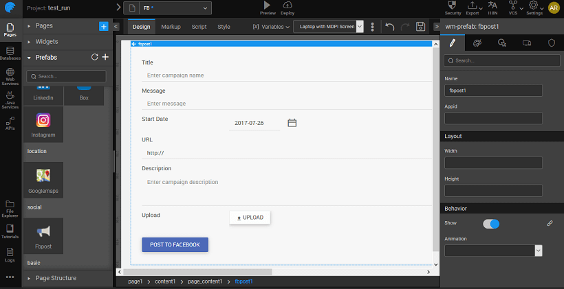
 | Use this Prefab to enable user authorization using their FaceBook credentials. | Overview | |
 | Use this Prefab to enable user authorization using their Google credentials. | Overview | |
 | Use this Prefab to enable user authorization using their Instagram credentials. | Overview | |
 | Use this Prefab to enable user authorization using their LinkedIn credentials. | Overview |
Mobile & Device Widgets
| Widget | Description | Document | Reference |
|---|---|---|---|
| Media List | Media List displays a list of pictures. The media can be displayed in a single-row mode or grid mode and can be opened to full screen by touching the media. | Overview | API Docs |
| Segmented Control | Segmented Control group of buttons to toggle Segmented Content containing the page content. | Overview | API Docs |
| Barcode scanner | Barcode scanner can be used for scanning barcode. | Overview | API Docs |
| Camera | Camera can be used to access the device camera for taking pictures and videos. | Overview | API Docs |