Create Prefab using Angular, React Components
WaveMaker framework is a pure javascript based runtime, making it compatible with most of the open web standards. The developers can include jquery based ui plugins, visualization libraries or any other javascript based code units to extend or complement the rich component library provided by the WaveMaker framework.
The components developed in one of the js frameworks are normally not compatible with other frameworks and cannot be directly used inside standard HTML markup with framework or build bundles. Inorder to make these components work across web, it needs to be converted into a framework agnostic module. Web Components is one of such open standards. It relies on standard browser APIs such as CustomElements, Shadow DOM enabling its support across browsers & frameworks. As mentioned earlier, WaveMaker works greatly with Open Standards thus with Web Component/Custom Elements as well.
Most of the modern javascript frameworks have support for packaging the components as Web Components. WaveMaker supports the use of Web Components inside its projects & recommends its integration through Prefabs. Its recommended to refer documentation to know more about Prefabs in detail.
The developers with Angular or React based components can leverage them in the WaveMaker project by exporting them as Web Components & importing through Prefabs.This documentation helps you understand the process with the help of Sample Component(PosterWidget) developed in both React & Angular. The source code is also shared for reference.
The shared PosterWidget uses OMDB API to fetch resources. If you are planning to try out the source code of component, please get the API key & replace in the source code before build.
Convert Angular Component into Prefabs
Angular Framework recommends Angular Elements to export its components as Web Componenets. The documentation covers the process in detail with sample code as well.
Sample Angular Component
For this demonstration we will use a PosterWidget Component developed with Angular version 9. The code for the component can be found in the Github repository. The repo has the Angular elements configured for the project. So, on building it generates Web Component artefacts for the PosterWidget angular component.
However, you can download the artefacts directly from here & continue with the rest of the steps. The artefact is a zip file & on extracting it provides following files,
- polyfills-*.js
- vendor-*.js
- runtime-*.js
- styles-*.js
- main-*.js
Before importing the Angular based Web Component into WaveMaker Prefabs/Projects, please validate that the components have no render issues or errors by including them in an plain HTML files.
Create Prefab
Once we have the artefacts, we can create a Prefab for it with the help of below steps,
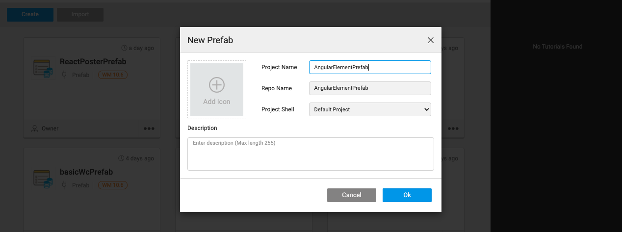
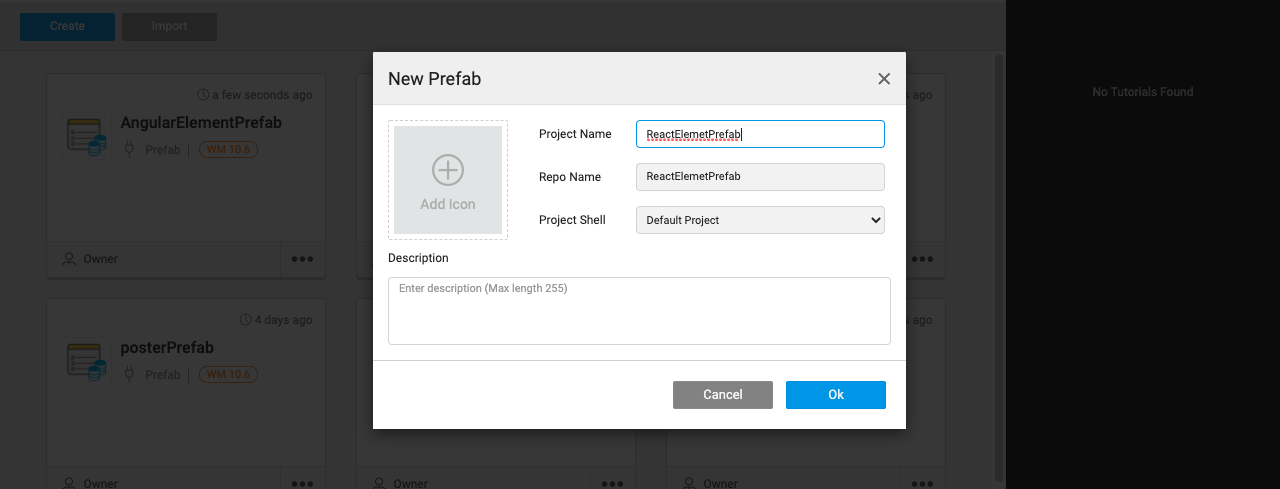
- Create a Prefab project using the Prefab tab of the Project Dashboard.
- Enter a Name and Description for the Prefab
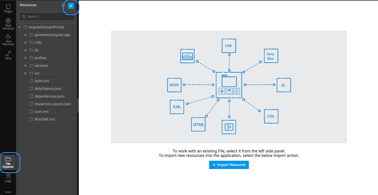
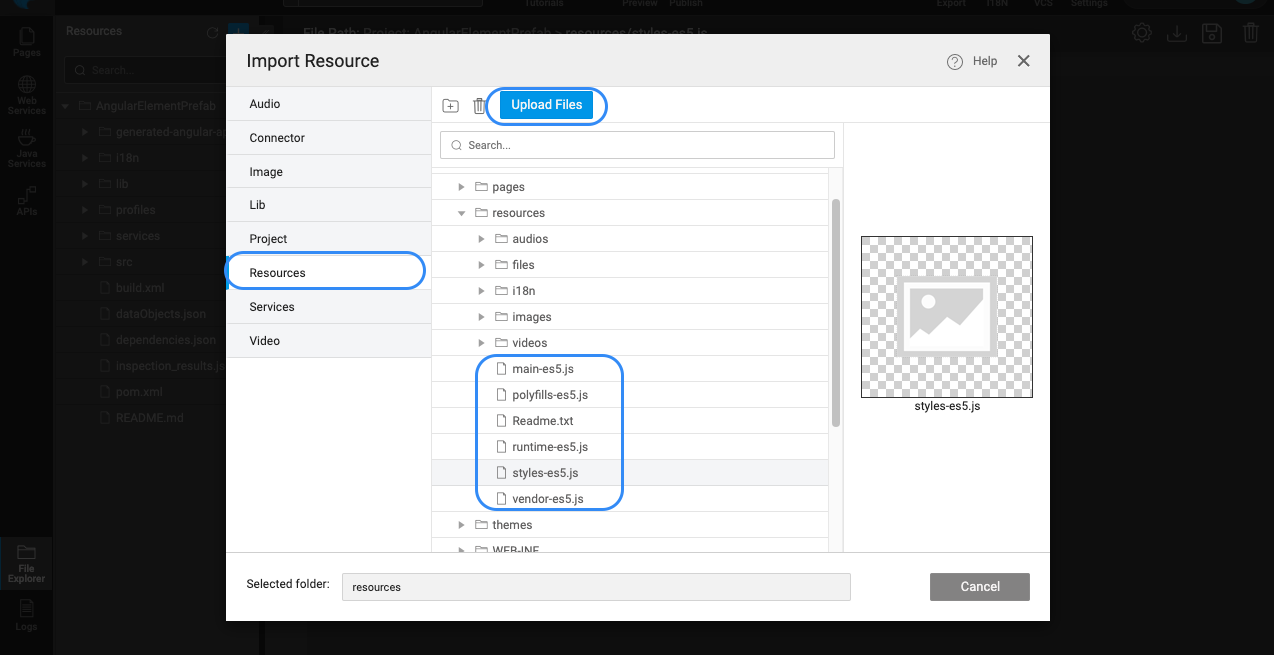
- Upload the artefacts into the
Resourcesfolder of project as shown below.
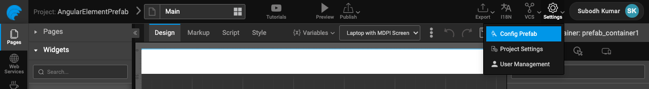
- From the Project Screen, choose Config Prefab under Settings. In the Resources tab, update Scripts with the JS file imported in the previous step.

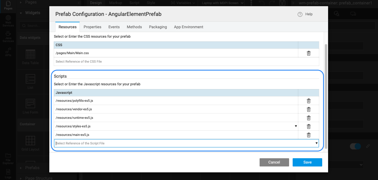
- Please ensure the Javascript sction the scripts in the below order
polyfills-*.jsvendor-*.jsruntime-*.jsstyles-*.jsmain-*.js
- Open the
index.htmlof the Prefab project and add the below Web Component polyfills to ensure support for all the browsers
- Open the markup of
Mainpage of Prefab and add the below code to useposter-widget-angularWeb Component in the page markup.
- Inorder to specify
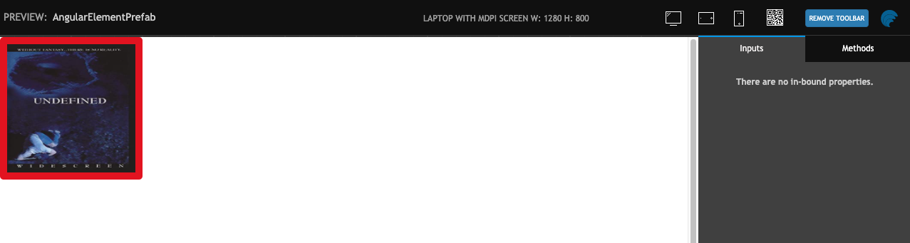
poster-widget-angularis a Web Component & not built in components, please add an additional attributehtml-custom-element="true". - Click on Preview, to check if the Web component is rendered without any issues.
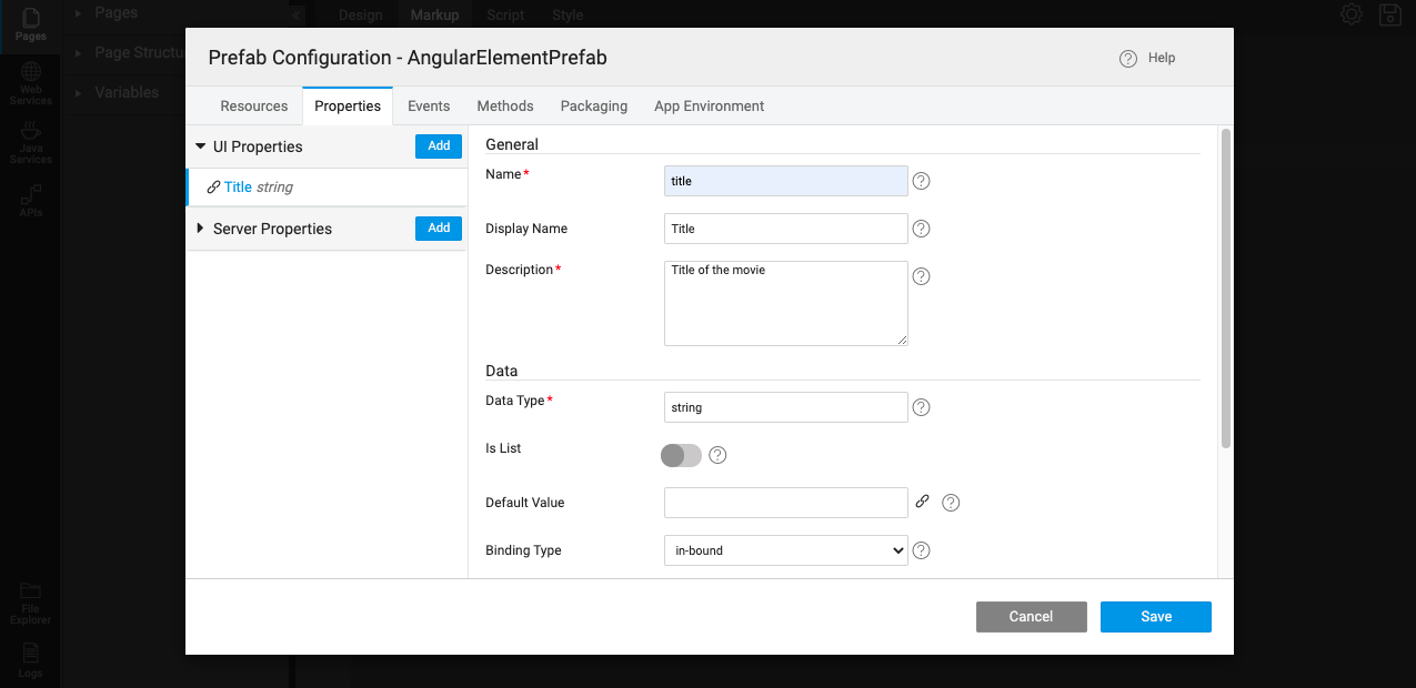
- Once the component is rendered, we need to configure the input attribute
titlefor the component. - Inorder to communicate with web components, Prefab has an option called
Propertiesunder Prefab Configurations as shown below. - Add a new property named
titleusing the interface as shown below.
- This property can be used as a bridge between the external inputs or bindings to dynamically update the attribute of the WebComponent.
- Once the property is added, we can write the script to update the Web Component's attribute on change of the property as shown below.
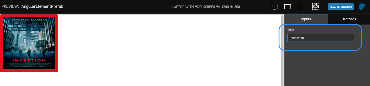
- Now test the Prefab using Preview option again. Try with updating the
titlevalue in Inputs section of Properties. The Web Component should update accordingly.
Publish Prefab
- Save & Publish the Prefab. You can set the version for the Prefab and Publish it. Know more about publishing Prefabs from here.
- Once approved, the Prefab will be available for use across the Projects. An entry will appear in the Artefacts list from the Developer Utilities on the Project Workspace. The Prefab needs to be imported before it can be used from the Widget Toolbox.
Convert React Component into Prefab
Unlike Angular, currently there is no official support from React to develop Web Components. However, there are several community backed projects which can help in achieving it. Alternatively, developers can build Custom Element wrapper classes over existing react components as well. Lots of community blogs are available for both approaches which can be referred.
Sample React Component
For this demonstration we will use a PosterWidget Component developed with React Version 17. The sample React component is converted into a Web Component using Custom Element Wrapper approach in which each lifecycle event of React is mapped to corresponding event in CustomElement. The code for the component can be found in the Github repository. The repo has all the details to build & generate Web Component artefacts for the PosterWidget React component.
However, you can download the artefacts directly from here & continue with the rest of the steps. The artefact is a zip file & on extracting it provides following files,
react-poster-widget.min.jsreact-poster-custom-element-wrapper.min.js
Before importing the React based Web Component into WaveMaker Prefabs/Projects, please validate that the components have no render issues or errors by including them in an plain HTML files.
Create Prefab
Once we have the artefacts, we can create a Prefab for it with the help of below steps,
- Create a Prefab project using the Prefab tab of the Project Dashboard.
- Enter a Name and Description for the Prefab
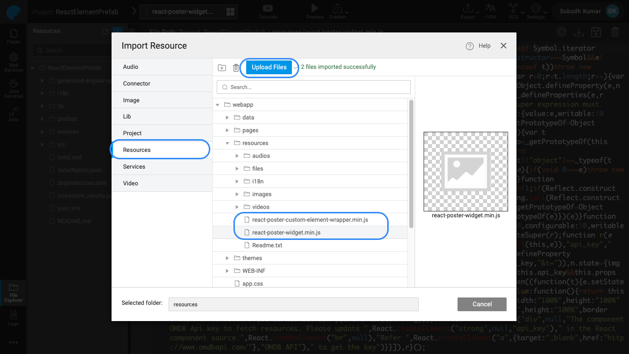
- Upload the artefacts into the
Resourcesfolder of project as shown below.
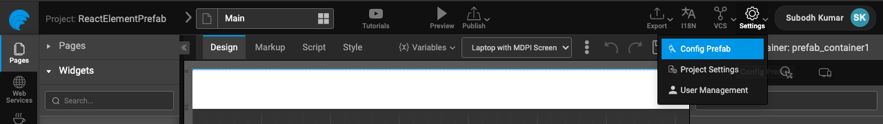
- From the Project Screen, choose Config Prefab under Settings. In the Resources tab, update Scripts with the JS file imported in the previous step. As we are rendering React elements inside out custom element wrapper, we should import React & React DOM libs as well.

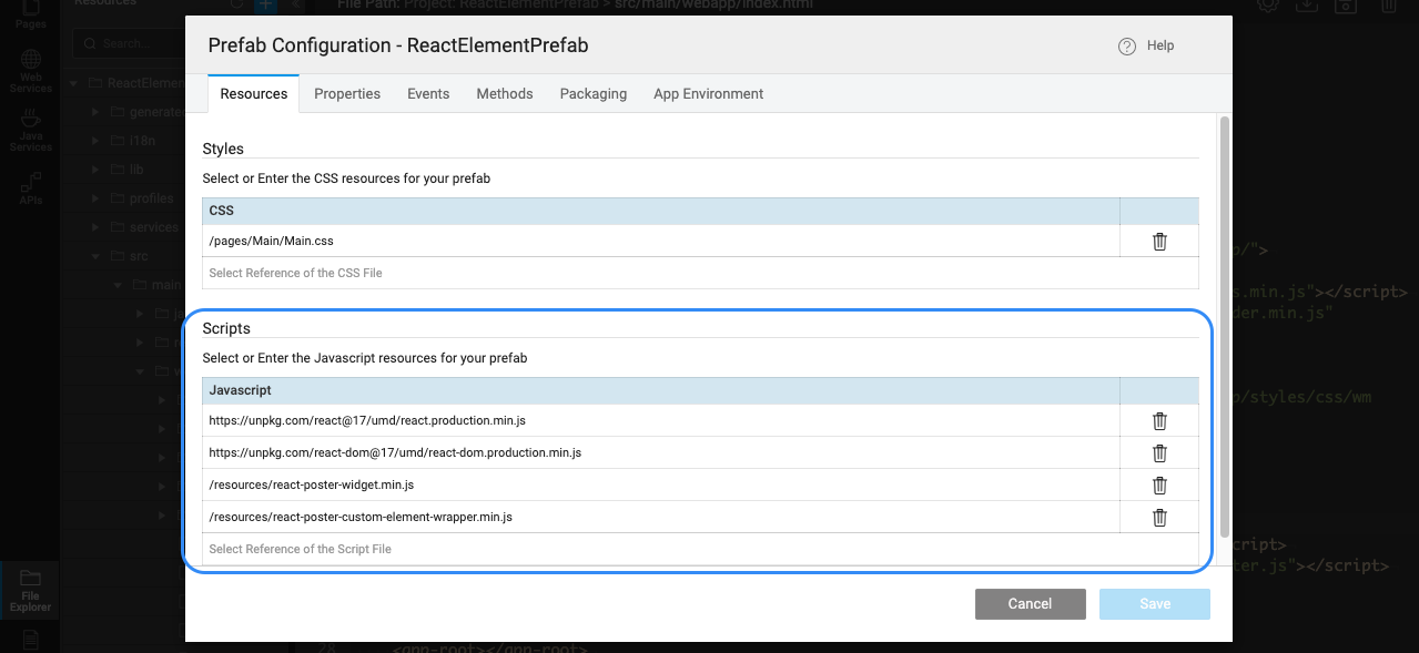
- Please ensure the Javascript sction the scripts in the below order
https://unpkg.com/react@17/umd/react.production.min.jshttps://unpkg.com/react-dom@17/umd/react-dom.production.min.jsreact-poster-widget.min.jsreact-poster-custom-element-wrapper.min.js
- Open the
index.htmlof the Prefab project and add the below Web Component polyfills to ensure support for all the browsers
- Open the markup of
Mainpage of Prefab and add the below code to useposter-widget-reactWeb Component in the page markup.
- Inorder to specify
poster-widget-reactis a Web Component & not built in components, please add an additional attributehtml-custom-element="true". - Click on Preview, to check if the Web component is rendered without any issues.
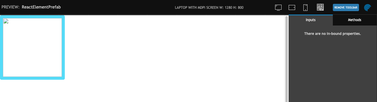
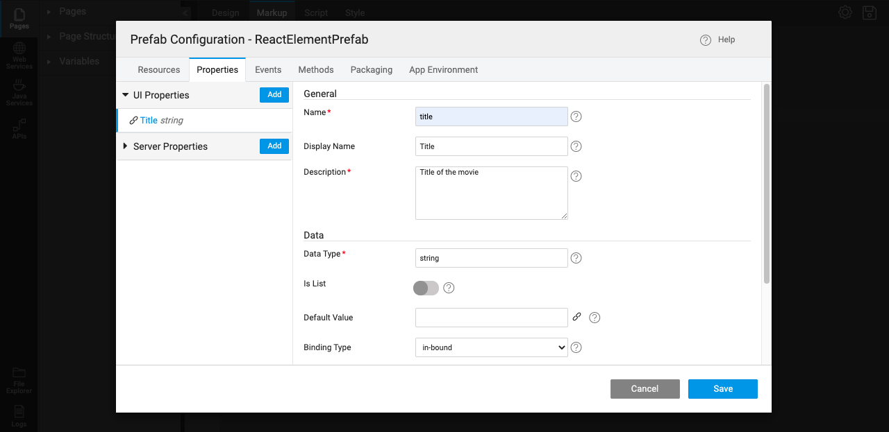
- Once the component is rendered, we need to configure the input attribute
titlefor the component. - Inorder to communicate with web components, Prefab has an option called
Propertiesunder Prefab Configurations as shown below. - Add a new property named
titleusing the interface as shown below.
- This property can be used as a bridge between the external inputs or bindings to dynamically update the attribute of the WebComponent.
- Once the property is added, we can write the script to update the Web Component's attribute on change of the property as shown below.
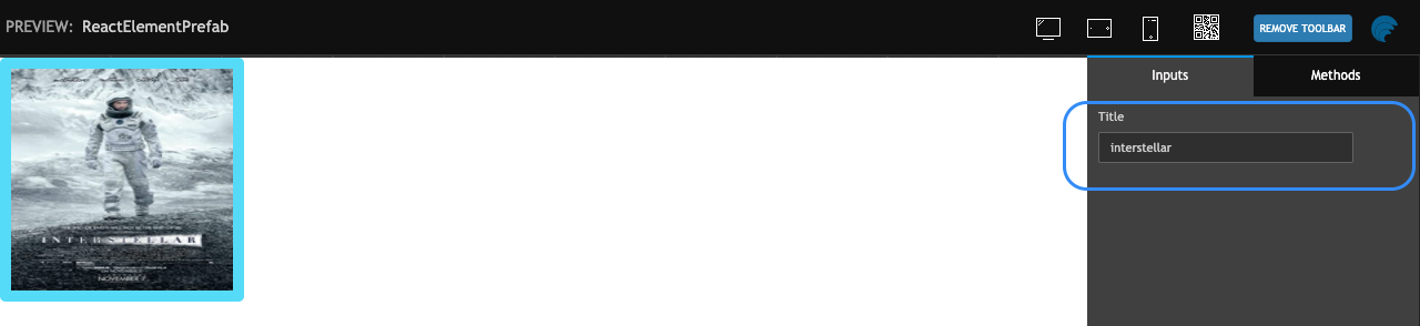
- Now test the Prefab using Preview option again. Try with updating the
titlevalue in Inputs section of Properties. The Web Component should update accordingly.
Publish Prefab
- Save & Publish the Prefab. You can set the version for the Prefab and Publish it. Know more about publishing Prefabs from here.
- Once approved, the Prefab will be available for use across the Projects. An entry will appear in the Artefacts list from the Developer Utilities on the Project Workspace. The Prefab needs to be imported before it can be used from the Widget Toolbox.
Using Prefab inside the Project
- Open/Create a Project to use the Prefabs.
- Open the
index.htmlof the Project and add the below Web Component polyfills to ensure support for all the browsers
- Drag & Drop
AngularElementPrefab,ReactElementPrefab(names may vary depending on what users have saved their prefabs with) Prefabs onto the page.
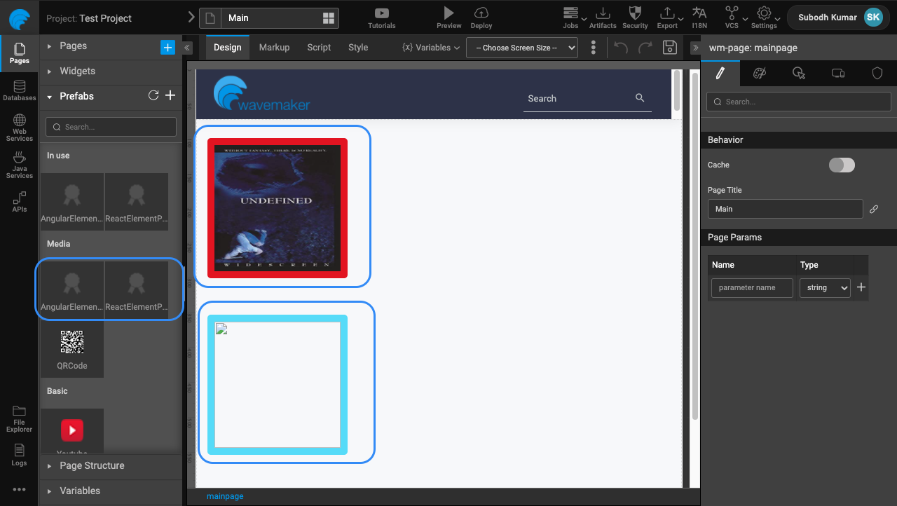
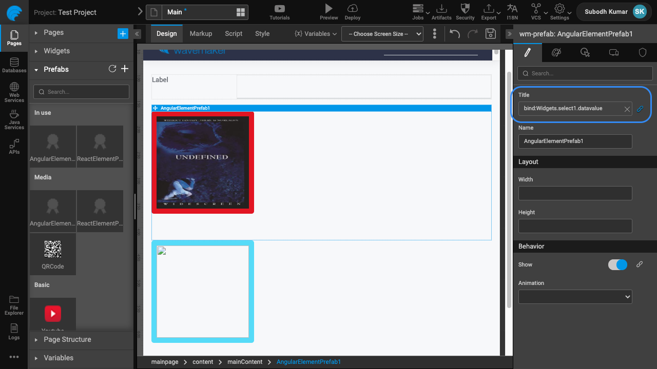
- Drag & Drop a Select widget into the page, & provide static list of movie title as its Dataset value. We will be binding the selected title as the input for Prefabs.
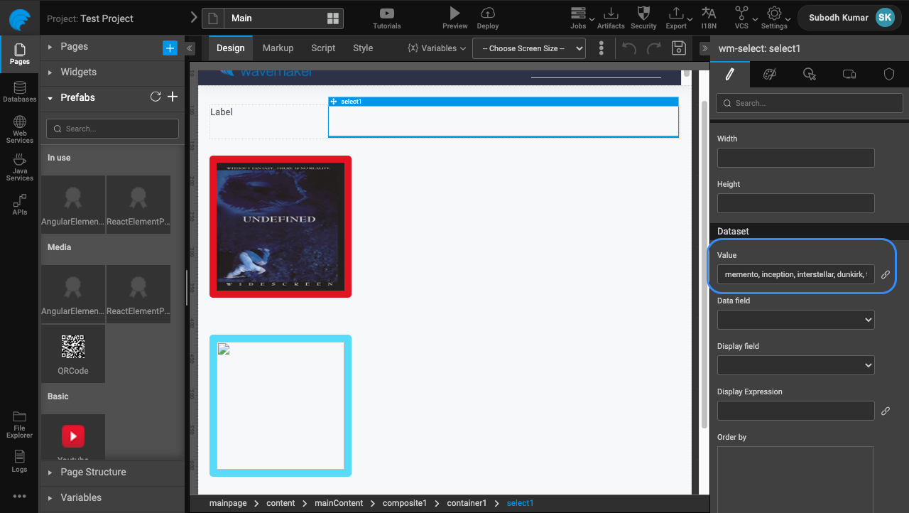
- Bind
Titleproperty value on the Prefab to value from Select widget.
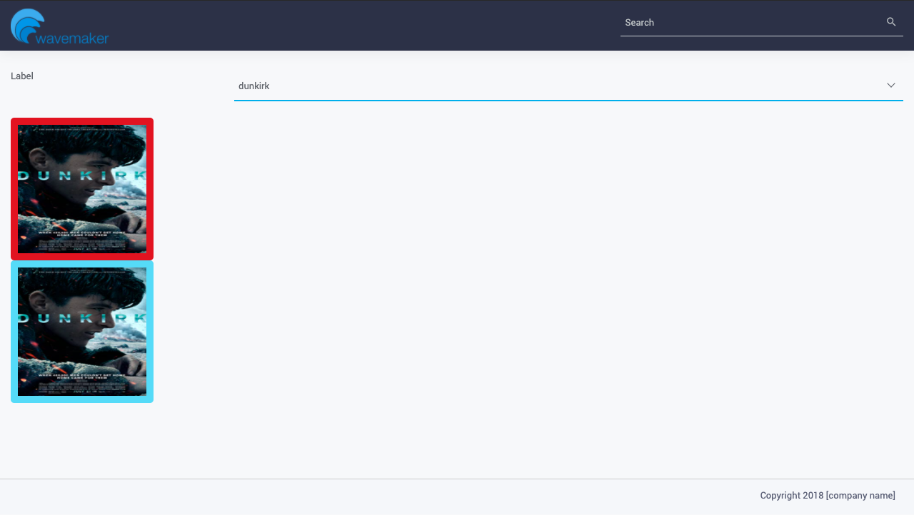
- Preview & Deploy the application to validate Prefabs created from Angular & React Components.
See Also
Prefab to compare two strings
Prefab using 3rd Party UI Widgets
Prefab Using D3 & NVD3 Charts
Prefab Using D3 Library (DataMaps)